
Assigned to depict the rich, cultural experiences faced by a group of adventurous teachers, illustrator Janice Kun put her mixed-media toolkit to work. Created for the Ontario College of Teachers and in collaboration with Studio 141 art director Hannah Browne this series offers plenty of captivating detail as well as Janice’s classic inviting and tactile interpretation.
Read MoreThom Sevalrud for The Journal of the Norwegian Medical Association
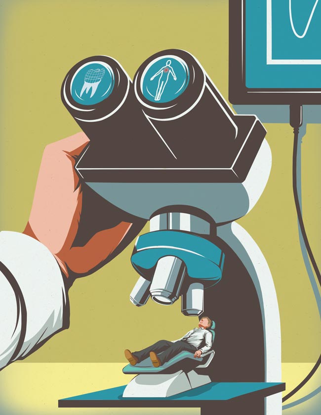
Thom Sevalrud had the pleasure of illustrating yet another cover for The Journal of the Norwegian Medical Association this past month. Art director Lotte Gronneberg chose the prefect topic for Thom's style.
Thom's piece depicts how technology will change the role of patient care in the years to come. As Thom often does, he gives us the sense of the enormity of these decisions and how very personal they can be.
'Patient Technology' by Thom Sevalrud
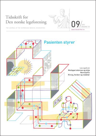
Cover of The Journal of Norwegian Medical Association
See more conceptual illustration by Thom Sevalrud. Thom Sevalrud is represented by i2i Art Inc.
Dave Murray for National Magazine
When tech collides with the standard way of doing things. Illustrator Dave Murray is often asked to visually interpret this concept. Most recently, art director Tony Delitala of Delitala Design, assigned Dave to illustrate two high tech articles for the Canadian Bar Association's National Magazine.
Dave's strong use of symbolism, conceptual intelligence and graphical style invites the reader to dive into these stories.
Technology can help make justice more accessible

Heavy workload? There’s an app for that.

Check out more of Dave's work. Represented by i2i Art Inc.
Eric Chow for Remodeling Magazine
With ever-changing rules and regulations, remodeling you home or office is no picnic. Remodeling Magazine tackled this topic in the feature article "Watch Your Step" for their March 2015 issue.
The design team at Hanley Wood knew a conceptual solution would be best to illustrate the fine line contractors walk between safety and regulations. Illustrator Eric Chow worked closely with them to come up with this clever tightrope analogy.
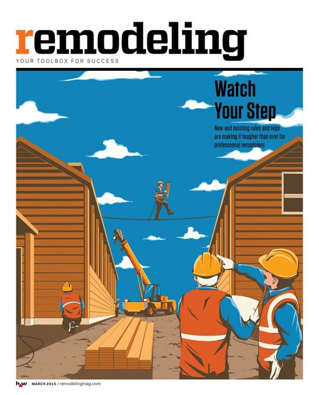
Eric chose to put a menacing face to the dangers of lead paint removal for the inside story.

Looking for a new way to tell your next story? Visit Eric Chow's complete portfolio at i2i Art.
Mark Hoffmann's Mural at the Montserrat Gallery
The exhibition SEVEN: A Peformative Drawing Project at the Montserrat Gallery was a perfect opportunity for illustrator Mark Hoffmann to spread his creative wings even further. Mark, along with six other artists, put their creative process on display by executing a large mural on one of the gallery's walls in an open studio environment. The mural itself was meant to be the "residue of an artistic performance." We found both the process and the final product pretty spectacular.
Mark Hoffmann's 'Men of Mountains' Mural

Close up of Mark Hoffmann's lettering

We chatted with Mark Hoffmann after the show...
i2i Art: How were you approached with this project?
Mark: Leonie Bradbury (the gallery director at Montserrat College of Art, where I teach) contacted me in the fall to see if I had any interest. They usually try to get one faculty member involved and thought I would be a good fit with the other artists.
i2i Art: Was this your first mural?
Mark: Yes, and it was quite overwhelming.
i2i Art: Tell us about the piece. What was your inspiration?
Mark: I really wanted to paint a giant horse and started to research. Somehow I ended up reading about the early exploration of what would later become the first national park of the U.S., Yellowstone. In my research I found the story of the Cook, Folsom, Peterson expedition to explore and survey the land. I thought this might make a fun image with them, a horse, and geysers. I also had a previous color palette worked out that I wanted to apply to the piece.
i2i Art: What was it like working on that scale?
Mark: Difficult. It's hard to get a sense of the scale until it is right in front of you. I found that I had to stand back and look at it a lot, otherwise I wouldn't take the scale into full consideration.
i2i Art: The gallery was open while you were working on the piece, tell us about the atmosphere.
Mark: As I was working, quite a few folks stopped in to look, but very few chatted with me. They later told me they were afraid to interrupt. I must look deep in thought when I paint. It was nice to have the freedom to paint and explore at that scale and really knock people over with an image.
i2i Art: Do you have any tips, tricks or lessons learned you want to share?
Mark: I realized that some of the techniques I planned to use are hard on that scale and surface. Use a paint with primer in it (I used house paints) so you don't have to apply it twice to get good coverage. Bring plenty of Aleve and Tylenol, the work can be a little back breaking.
Hyperlapse: Watch Mark Hoffmann's mural come to life
http://youtu.be/RNxRIeZmY-Y
On view through March 28, 2015 at the Montserrat Gallery.
Mark Hoffmann offers a playfulness to his americana, folk art style. View Mark's entire portfolio.
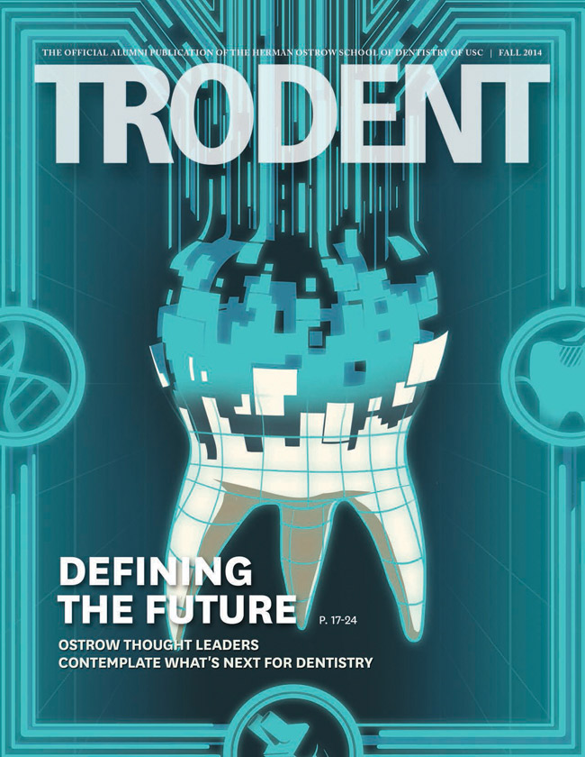
Eric Chow for TroDent
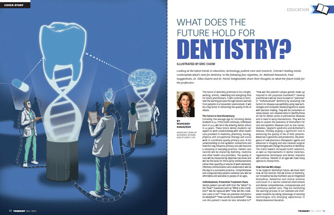
There's a revolution in the fields of diagnostics and treatment that is changing the face of dentistry. To depict new advances in the field would take an illustrator with a fertile imagination and strong conceptual skills. Many thanks to John Hobbs, editor of TroDent (a USC School of Dentistry publication), for recognizing Eric Chow's talent and giving him the perfect creative brief to illustrate the cover story, What does the future hold for Dentistry? Below are the enlightening results. To see more of Eric Chow's illustration visit his portfolio here.
Cover Image: What dentistry will look like in 25 years?
Eric Chow's visual depiction of DNA in dentistry.
Eric Chow's visual depiction of the future of IT in dentistry.

Eric Chow's visual depiction of the future treatment of cavities.
Eric Chow's visual depiction of gene therapy for the prevention of cavities.
Rémy Simard for Animal Sheltering Magazine
Art director Jamie Mitchell wanted to take the need for a diagrammatic illustration for the article "Do a good scan, Stan!" and have a little fun with it.
He chose Rémy Simard for his ability to do just this! Jamie envisioned "...a very cute, funny dog in multiple positions/facial expressions, being scanned by a microchipwand." Our favorite part of this illustration is in fact the dogs facial expressions.
Here is a peek into Rémy Simard's process. Upon receiving Jamie's brief, Rémy began sketches for presentation.

Remy Simard Animal Sheltering Magazine Sketches
...and after a bit of back and forth as Jamie and Rémy tweaked the sketches, here is the finished art

Remy Simard Animal Sheltering Magazine
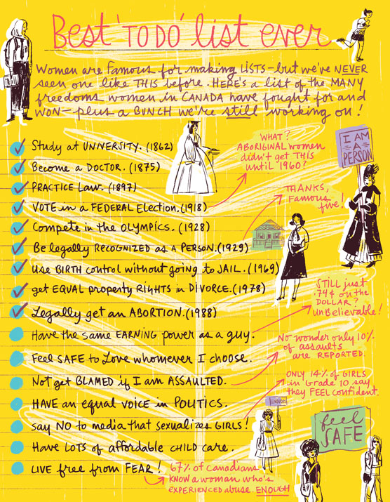
Katy Dockrill for SHE Magazine
Katy Dockrill contributed this illustration to SHE Magazine published by the Canadian Women's Foundation. We think this illustration tells a remarkable story of strength and optimism with Katy's confident line and hand lettering over the brilliantly optimistic yellow background. When we asked Katy about her inspiration she said: "I felt it was important to illustrate this list of women's accomplishments: Being a woman in 2014 is very different from being a woman 150 years ago and I have all the women before me to thank. I take all these hard won freedoms for granted because I grew up knowing no different. I think that's where we need to get to in order to check off the others on this list, keep voicing opinions and share the dialogue with our children."
To see more of Katy's hand lettering and illustration, check out her updated portfolio here.
Thom Sevalrud makes Luerzer's Archive Best Illustrator list, again.
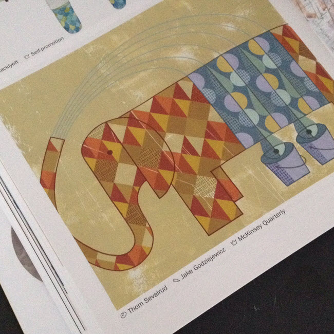
How do you manage to be named one of the top 200 Best Illustrators Worldwide by Luerzer's Archive, for a second time? We asked Thom Sevalrud, a master of conceptual illustration, to help us understand his methods and inspiration for his most recent award-winning image 'The Elephant' depicting big data analytics.
i2i Art: Let's start from the beginning. How were you approached to create an illustration representing Big Data Analytics?
Thom Sevalrud: This image was created for the McKinsey Quarterly publication. It was to be a double-page spread to accompany a whole ‘section’ in the journal examining big data analytics. The AD, Jake Godziejewicz, had sent me the articles and a short brief that explained what they needed; including some very specific examples of mine that showed the approach they preferred.
i2i Art: Why an elephant?
Thom Sevalrud: I wanted to nail a perfect image of something big, yet something multi-faceted. It all came together fairly quickly once the water provided the metaphor for ‘washing away the complexities’ of data. I sent the idea to Jake and explained that the elephant image would be a perfect way to ‘over-fill’ a double page spread with both sides of the creature being cropped off the page……like it didn’t fit. I'm glad Jake loved the idea.
i2i Art: Was this painted traditionally?
Thom Selvarud: It was acrylic on paper, then I added a subtle binary code into random areas of some of the diamond shapes in the elephant using digital tools.
i2i Art: And how did you get the nod from Luerzer's Archive?
Thom Selvarud: At about the time I was working with McKinsey Quarterly, I was invited to once again submit to Luerzer’s Archive 200 Best Illustrators Worldwide. Illustrators are first nominated and screened before they are invited to enter. Their work is then taken to another level of judging and are chosen from an international collection of work, where my elephant made the cut. I have now been included in 2 of the 5 collections of The Best Illustrators by Luerzer’s Archive.
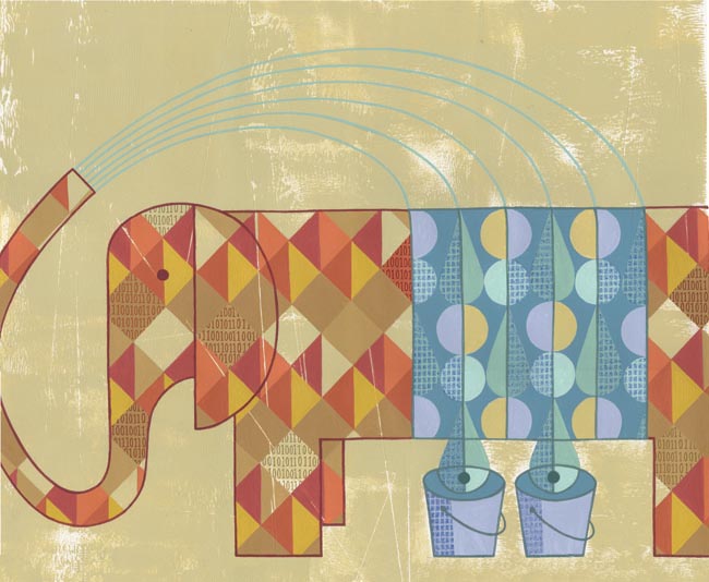 'The Elephant' as it appears in Luerzer's Archive 200 Best Illustrators Worldwide
Thom Sevalrud is represented by i2i Art Inc. | View Thom Sevalrud's complete portfolio
©Gary Alphonso_GA675_i2iArt
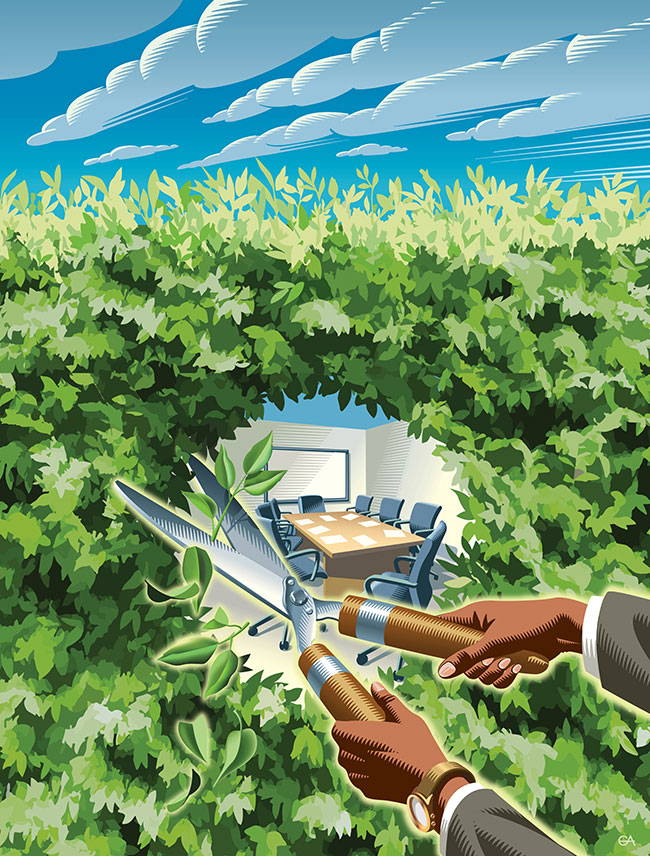
Gary Alphonso for ACC Docket
Gary Alphonso created this brilliant conceptual cover illustration for the award winning ACC Docket Magazine, July-August 2014 issue. The feature article, “The Chief Opportunity Counsel: How to Increase Your Value Through Participation in Strategic Business Conversations” is illustrated by use of a hedge as metaphor for the barrier that can be broken down exposing fresh opportunities for open and transparent communication. To see more of Gary Alphonso's powerful illustrations check out his updated portfolio here.
Katy Dockrill: Map Out Your Best Summer Ever
Winner of the CASEVIII Grand Gold Award and Alberta Magazines Silver Award for Illustration Katy Dockrill created the cover and interior illustrations for the Spring 2014 Feature: Map Out Your Best Summer Ever, for the University of Alberta's Alumni Magazine, New Trail. Katy's playful style and summery palette is the perfect touch to inspire summer fun! When I asked art director Marcey Andrews what the response to the issue was, she said, "It’s been fantastic, truly. We even received a very complimentary email from another illustrator we’ve worked with, Raymond Biesinger (who is a UofA alumni). When he received his issue of the magazine, he sent us a very nice message, saying, ‘killer cover’." Thank you for the 'killer' compliment Raymond! To see more of Katy's whimsical illustrations visit her portfolio.
Opener for Map Out Your Best Summer Ever

©Katy Dockrill_KD390_i2iArt

©Katy Dockrill_KD395_i2iArt
'Rivers Not Roads''Take Up Birdwatching'

©Katy Dockrill_KD387_i2iArt

©Katy Dockrill_KD403_i2iArt
Summertime Biking'What Bears Do in the Woods'. Ever wondered?

©Katy Dockrill_KD386_i2iArt
To check out the magazine online visit the New Trail site here.
Tim Zeltner for Marriott Magazine
Tim Zeltner created these beautiful illustrations with dramatic compositions that draw one into the story for Marriott Magazine. Tim's trademark paintings on wood reveal the richness and intrigue of the worlds they depict.
Aspire to be Inspired

©Tim Zeltner_TZ410_i2iArt
All Aboard!

©Tim Zeltner_TZ411_i2iArt
Thom Sevalrud for Global Brief

©Thom Sevalrud_TS284_i2iArt
©Thom Sevalrud_TS285-a_i2iArt
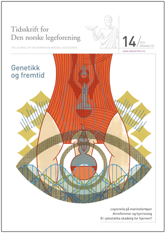
Thom Sevalrud for Journal of the Norwegian Medical Association
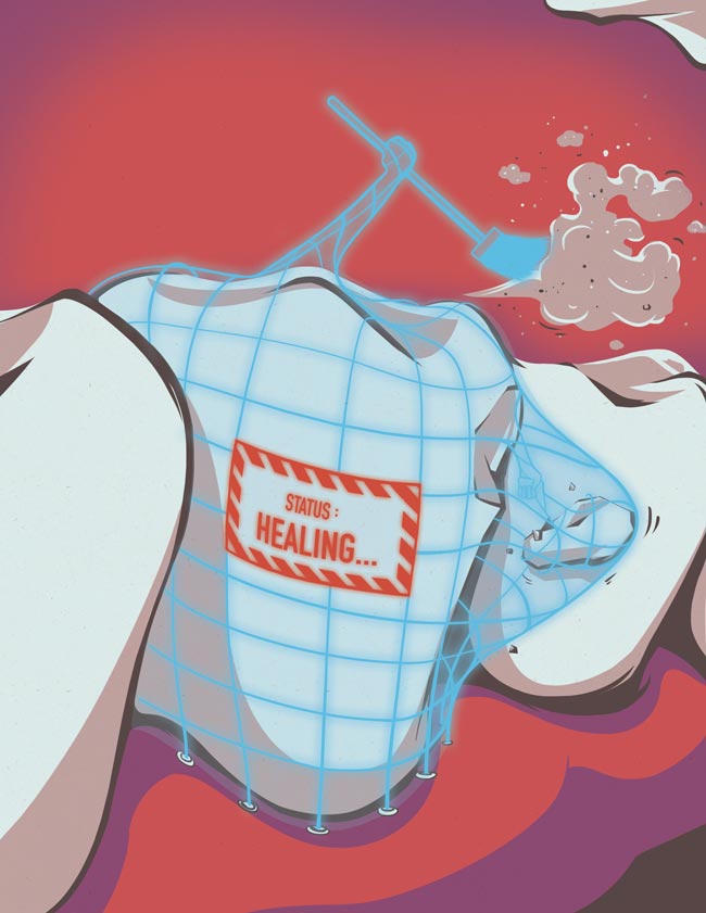
Thom Sevalrud created this powerful image for the cover of the Journal of the Norwegian Medical Association. This is Thom's fourth cover for the JNMA, working with art director Emma Dalby, who seems to match him perfectly with topics that speak to his visual vocabulary. Conceptually, Thom addresses many aspects of whole genome sequencing, which is becoming more and more accessible to us all.

Tim Zeltner for Emory University
The king of landscapes, city-scapes and make-believe kingdoms, Tim Zeltner works his magic for Emory to accompany a story about the Rollins School of Public Health.

Emory_©TimZeltner_i2iart