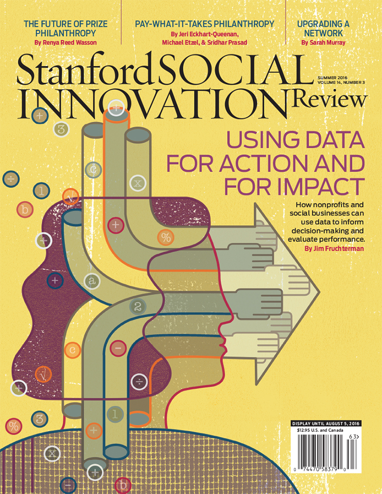
Thom Sevalrud for Stanford Social Innovation Review

The Stanford Social Innovation Review tackles some of the more interesting questions asked in the social sector today and thoughtful, conceptual illustration plays an important role in creating a visual understanding of these topics. And so art director David Herbick chose illustrator Thom Sevalrud for the Review's latest cover; a story on how nonprofits and social businesses can use data for action and for impact. Thom's elegant use of symbolism, strong lines and composition truly captures the transforming nature of this article. 

Dave Murray for William & Mary

We are in "a new universe of information overload" and our education needs to reflect that. The College of William & Mary was excited to share their strategy for addressing this new age of information and enlisted the help of illustrator Dave Murray to do so.

Featured in the W&M Alumni Magazine, Dave captures the rich potential of a liberal arts degree from this prestigious school. "The liberal arts is, in fact, going to be necessary to navigate the coming world." Dave's colorful palette and mosaic of elements brings out the wonder and complexity William and Mary is preparing it's students for.

Lift Off! An education to prepare you for a new universe of information overload.

Lift Off! An education to prepare you for a new universe of information overload.

A liberal arts degree will be a necessity in navigating the coming world.

A liberal arts degree will be a necessity in navigating the coming world.

It's a matter of training your mind in a new way.

It's a matter of training your mind in a new way.

Gary Alphonso for Canada Post: Unveiling New Community Mailboxes

In response to the shrinking demand for snail mail, Canada Post has begun to phase in an expansion of it's Community Mailboxes (CMB's) vs door-to-door delivery.  The process of developing the CMB's was carefully executed with a strategy that involved lots of consumer input through focus testing at various stages in the development.  Canada Post was looking for the perfect CMB to take it's customers into the 21st Century.  One of the key criteria for the new CMB's was to develop an art wrap that would hopefully work as an anti-graffiti barrier.  This is where the call for Gary Alphonso's illustration talents came in.  

Working with the team at Ove Brand | Design, headed up by creative director Peter Baker, Gary Alphonso was given an open creative brief as they embarked on an exploration of various abstract directions.  The art evolved into a beautiful ethereal design that incorporated the maple leaf (a ubiquitous Canadian symbol), floating as if being carried by a gentle wind.   The process was a real contest but in the end, we are proud to report that Gary Alphonso's floating leaf design was among the most popular in focus testing.

Gary Alphonso's illustration applied as a wrap to the mailboxes.
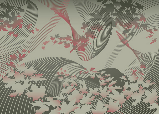
©Gary Alphonso_GA672_i2iArt
Here are some pics of the mailboxes in communities across the country.

image-1


CommunityMailbox_GA

View Gary Alphonso's entire portfolio here!

Thom Sevalrud selected for 200 Best Illustrators Worldwide

Thom Sevalrud is featured in Luerzer's Archive - 200 Best Illustrators Worldwide. A selection of top art directors worldwide identifies a list of illustrators for the publication.  After an illustrator is selected, they are then invited to enter work commissioned from the prior 18 month period.  Thom's winning illustration (below) is on page 210 in the 2011/12 volume.  

KermaA copyRGB
KermaA copyRGB