
Illustrator Greg Stevenson makes going with the flow look better than ever. In search of a vector-based artist, Foresters Financial commissioned Greg to create a library of illustration to complement their brand. B2B and forward-facing marketing materials expertly combine text, photography and illustration, each element interacting to create a sense of space and movement. Simple at first glance, the execution of these continuous line illustrations is more complex than meets the eye.
Read More
Katy Dockrill illustrates for Victoria Symphony
The Victoria Symphony 2017/18 season has begun and illustrator Katy Dockrill has mirrored the excitement with a dynamic and contemporary feel for their signature brochure. With art direction from Lara Minja at Lime Design, Katy worked with a sophisticated, limited palette and beautiful bold lines to create some timeless musical metaphors
Read MoreDave Murray illustrates Toronto for Airbnb
The folks at trevor//peter were coordinating a series of events for Airbnb this summer and they needed a wow factor. Taking place in the heart of Toronto, Canada the team decided a map of the city - 10 feet x 15 feet - would be the perfect way to draw the crowd to their booth.
Illustrator Dave Murray, a proud Torontonian, was chosen to work on the project. Dave quickly assembled a brilliant collage of Toronto's coolest neighborhoods and points of interest. Graphic, bold, colorful, the piece beckons you to point out where you live or where you need to visit.


Check out more of Dave Murray's illustration. Represented by i2i Art Inc.
Katy Dockrill for LCBO 'Hello Spring' Campaign
Nothing symbolizes Spring quite like a cherry blossom. When you walk into any LCBO this month you will be greeted by the bright and simple beauty of this bloom. Brad MacIver, creative director at the Liquor Control Board of Ontario, had worked with illustrator Katy Dockrill in the past and knew the wow-factor her lines could create.
The bold signage for the 'Hello Spring' campaign adorns the shelves and windows of the stores, beckoning you to pick up a bottle of something for those evenings on the porch.


See more of Katy's beautiful work. Represented by i2i Art Inc.
Greg Stevenson's Poster for 'The Audience'
It was great to connect with our longstanding client, art director Wade Gilpin at Rossignol Design, for this special assignment. Illustrator Greg Stevenson, with his ability to create an uncanny likeness, was the natural choice for this poster of Fiona Reid as Queen Elizabeth II in the upcoming Mirvish production of "The Audience". Not a small feat, to create two likenesses in one portraiture, but Greg pulls is off beautifully. With the use of luminous, rich color the illustration is undeniably regal and with that smile Fiona's character shines through.

View more of Greg Stevenson's illustration. Greg is represented by i2i Art Inc.
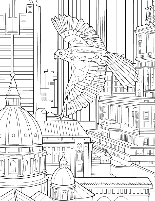
Birds of the World: Adult Coloring Book by Remy Simard
Often labelled as a way to tap into your inner child I'm here to say that adult coloring books deliver more. Much more. When our artist Remy Simard was approached by Blue Star Coloring Books to illustrate a new adult coloring book I was pretty intrigued. A quick Google search revealed a wealth of information about the stress relieving properties of these little books. Could coloring release the tension I carry around each day? Worth a shot.
The experience was pretty transforming. My multi-tasking ways melted away as I became engrossed in the art of staying in the lines. A sense of accomplishment washed over me at the end. A masterpiece? Not quite, but that didn't matter much. I had a greater prize, a sense of calm. Coloring is my new meditation.
Remy Simard chose to center his first coloring book with Blue Star around the topic of birds; birdwatching being Remy's own form of relaxation. So grab your pencil crayons and dive into 30 beautifully illustrated pages crying out for some color.
Birds of the World is available for purchase on Amazon.com >

Available now through Amazon.com

Remy's applies color to one of his own creations

Pigeons in Paris
Soaring through the City

Peacock
Remy Simard is a celebrated illustrator. See more of Remy's work.
Greg Stevenson for Avenue Magazine
Greg Stevenson recently showcased his vector-based line drawing in a feature for Avenue Magazine, art directed by Venessa Brewer. The article on Calgary's growing communities gave Greg the opportunity to capture family fun along with city and streetscapes. Greg's continuous line art, intermingled with photography captures the expression and movement of Calgary perfectly.


Greg Stevenson’s Poster Series for Open Mic Night
Nothing better than catching some live music at the local pub, right? Greg Stevenson has been a regular at Scallywags for quite some time and over the years he’s been responsible for a lot of their terrific poster art. The assignment to brand and help promote their new Open Mic Night was right up Greg’s alley.
Greg used his signature hand-drawn lineart with plenty of color and texture when he designed and illustrated this poster series. Greg’s unique way of contextualizing photos perfectly captures what we know will be a good time.

Check out more of Greg’s illustration work. Represented by i2i Art Inc.

Greg Stevenson for Dreams on Wheels Reader

Dream on Wheels_best_72
Greg Stevenson created these instructional illustrations combining his playful doodles, line-work and hand lettering with a photo-collage approach for educational publisher Developmental Studies. SIPPS (Systematic Instruction in Phonological Awareness, Phonics, and Sight Words) is a program for new and struggling readers from kindergarten through grade 12. The main criteria for the art was to decode the stories to visually assist the reader with comprehension.
Check out Greg Stevenson's versatile portfolio.
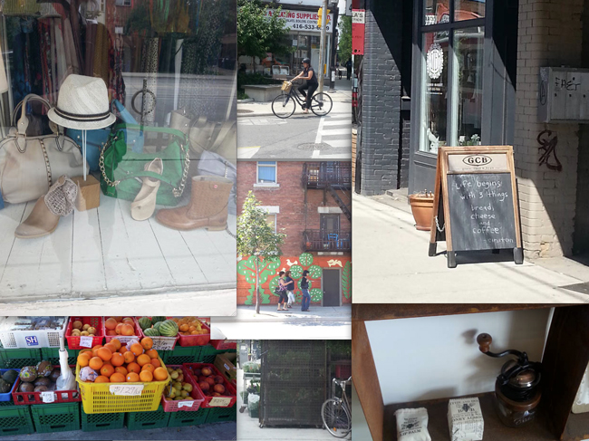
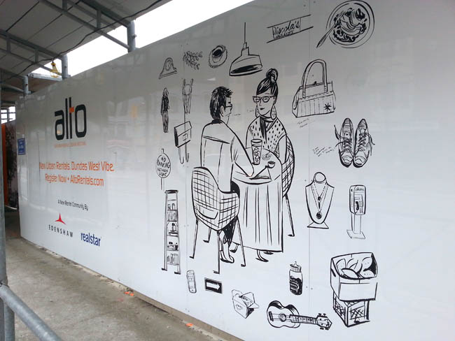
Katy Dockrill for ALTO
Creative director at Drive Agency, Mark Bulloch, chose Katy Dockrill for the ALTO marketing campaign because her illustration style suited the hip lifestyle drawings he envisioned for the brand. ALTO is a gorgeous new rental condo development located in the heart of trendy Little Portugal, in Toronto. The art needed to speak to the young urbanite seeking to live there.
We spoke to Katy about her work on this campaign and she shared some interesting insights on her process:
i2i Art: At the outset, this campaign looked like it would involve four major illustrations and hundred's of small icons. What was your first response to this request?
Katy Dockrill: Firstly, I saw the direction that Drive agency was working towards, because they gave me a preliminary visual concept, and I loved it. I loved the simplicity, the icons, the central figure idea. I love drawing individual things, and because it was black and white, I could simply focus on the line work.
i2i Art: Can you describe your process?
Katy Dockrill: I felt completely at home, taking pictures of the hood, sitting and sketching. I drew from my pictures, once I got home. I also needed to figure out who was going to be in the middle of all these icons, which took more time because the client was looking for someone in a certain age range, and wanted them doing things that might be particular to them and the neighbourhood.
i2i Art: The art needed to be able to reproduce at any size--blown up huge for signage and small for brochures and Internet advertising. Knowing that you sketch and draw by hand, how did you approach the final art to accommodate these specifications?
Katy Dockrill: I knew that these were going to be reproduced at a large size, but I work quite small, with brush and ink. My process in these cases requires I scan all my art as bitmap tiffs and then vector my line work in illustrator so that it most closely resembles the original work.
i2i Art: What's your impression of the finished campaign materials onsite? If you were looking for a rental condo, do the marketing materials portray an appealing lifestyle choice? In what way?
Katy Dockrill: I'm biased in that I really love how the work onsite turned out. I'm hoping with the icons that surround these figures (who are of a certain age range), that they appeal to the bookworm, the foodie, the nester, the cat lover, the musician, the pal, the mother. Since most of what I drew came from life, the sidewalks and the stores in that neighbourhood I also hope that perhaps someone sees a bit of their story in there too.
A montage of photos Katy took while researching the neighbourhood.
One of the panels with Katy's art mounted on construction hoarding onsite.
ALTO advertising with two of Katy's illustrations.

The art I call 'Lunching', up close.

This hipster musician would fit right in at Alto.

A day in the life of a mom.
 To see more of Katy Dockrill's delightful illustrations visit her profile here.

©Greg Stevenson_GS679-b_i2iArt
Greg Stevenson for: Positive Side
Greg Stevenson was commissioned by the Canadian AIDS Treatment Information Exchange (CATIE) for their publication called The Positive Side. This illustration is about how a low viral load can cut the risk of HIV transmission was art directed by David Vereschagin to have an overall optimistic tone. Greg says, "The candle was meant to imply a ‘re-kindling” of desire in both partners (one positive and one negative) while practicing safety and awareness." Notice how the very subtle ('Rothko-esque') variations in the background add beautifully to the mood of the piece.