
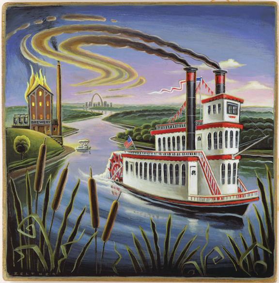
Murder mysteries with a twist. Tim Zeltner puts his unique folk art spin on a series of covers for Harlequin Enterprises. Art directed by the amazing creative team at Harlequin, these inviting covers offer a glimpse of what’s to come. Wander through each scene and get lost in the charming details and hidden gems buried among the brushstrokes.
Read More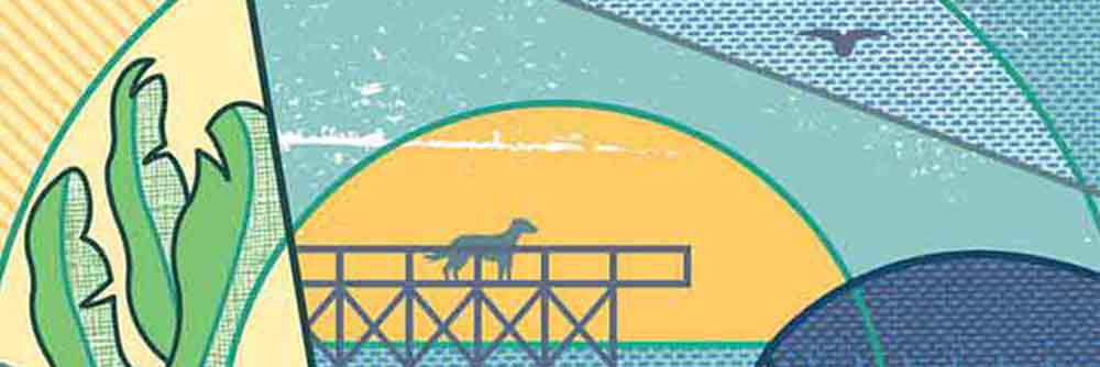
i2i Art illustrators collaborate with Harlequin Enterprises
Everyone loves a good murder mystery and no one has a better mystery book collection than Harlequin Enterprises. The same can be said about the cover art for Harlequin’s Worldwide Mystery Series. A dynamic collaboration between i2i Art illustrators and Harlequin’s design team, these covers are a labour of love. The artists enjoy getting their creativity flowing and teaming up with Art Director extraordinaire Tara Scarcello.
Read More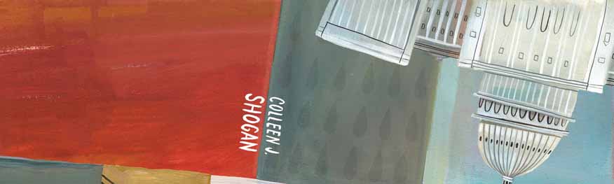
Mark Hoffmann illustrates for Harlequin Worldwide
Mystery unfolds on the pages of this Harlequin Worldwide Mystery mini-series illustrated by Mark Hoffmann. ‘A Washington Whodunit’ 3 part series that follows D.C. staffer, Kit Marshall through her adventures in the capital.
Read More
Talya Baldwin illustrates for Harlequin Worldwide Mystery
A beautiful mystery, is how we would describe illustrator Talya Baldwin’s recent book cover for Harlequin Worldwide Mystery. Commissioned by art director Kathleen Oudit, Talya's delicate use of watercolor and fine details created just the right mood for this detective novel.
Read MoreGary Alphonso Mystery Book Covers for Harlequin
Gary Alphonso began his career as a scratchboard illustrator in the 1980s. That is where Gary learned the precision of line and shadow evident in his work today. As Gary evolved his technique, he began creating 'scratchboard' art in Adobe Illustrator, in both black and white and full color.
These cover illustrations for Harlequin's Worldwide Mystery Series featuring Vicki Delany's Constable Molly Smith showcases Gary's ability to create drama through perspective and lighting in a retro poster art style. His technique, perfected over many years, creates a stunning outcome.
The latest in the series, Negative Image will be in stores March 2016.

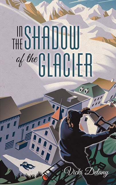
Tim Zeltner's mystery book covers for Llewellyn Worldwide
Tim Zeltner has now created two incredible covers with art director Lynne Menturweck at Llewellyn Worldwide. Tim’s whimsical illustrations, handpainted on wood, set just the right tone for these novels by Loretta Ross. Let the detail in these beautiful illustrations draw you into the mystery that unfolds within the pages.
Death and the Redheaded Woman, Ross’ debut, can be enjoyed now and Death and the Brewmaster’s Widow is available for pre-order.


Mystery Book Covers: Clare Owen for Harlequin
Clare Owen has now created three gorgeous covers with art director Sean Kapitain at Harlequin. The front cover for Hunting Sweetie Rose and Honestly Dearest, You're Dead are featured below. Stay tuned to see the third in the series--to be released in March 2015. Clare's illustrations are so inviting but be careful, with these mystery covers, the devil is in the details.

©Clare Owen_CO183-a_i2iArt
I just love the details like the wind blowing the curtain and the steam rising on the coffee. They seem to bring the story to life.

9780373269020_DIR.indd
For much more delightful Clare Owen illustration visit her portfolio here.
Tim Zeltner for Harlequin
Art director, Sean Kapitain with Harlequin, has a keen eye for quality illustration and knows how to choose the perfect style to capture just the right mood for the novel. The backdrop for The Lost Artist is a 19th Century New England farmhouse with a nasty storm brewing. Who better to illustrate a moody landscape than Tim Zeltner? Tim painstakingly builds the atmostphere of a painting with his unique combination of layering on wood with: paint, glazes and stains. Sean Kapitain had this to say about Tim Zeltner's art, "We actually heard back from the author about this cover which is rare! She loved the package and thought Tim's art was absolutely spot on. Great work, Tim!". Thank you Sean for the wonderful feedback.
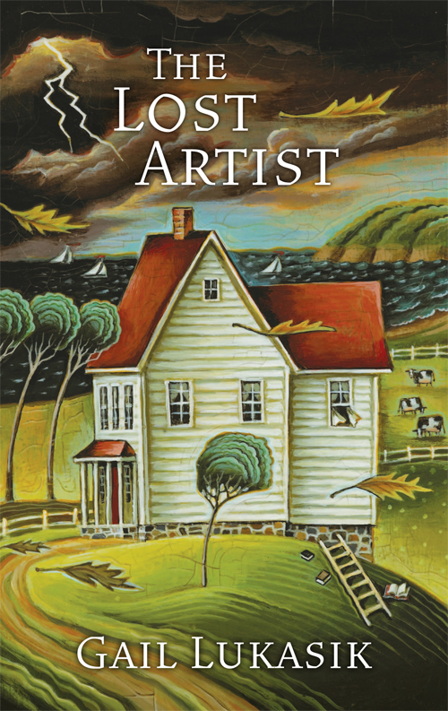
I love the way Sean has used parts of the illustration for the spine and back cover.

To see more of Tim Zeltner's delightful illustrations take a look at this portfolio.

CryBaby-900
Janice Kun for Harlequin
Gary Alphonso for Harlequin
Gary Alphonso created a cover for the paperback edition of Hazards of the Game by Norma Tadlock Johnson. The art director wanted a very graphic feel to the cover where type would be a major element. They decided to place the text within the shape of the sand trap since the story takes place on a golf course. Another requirement of the illustration was to include some of the clues to the mystery: the pink golf ball, the discarded putter and the Siamese cat. The challenge was to design the illustration with the type from the early rough stages as opposed to creating the illustration and having the designer apply type after the fact. Here are two versions to show the importance of type - an early draft and the tweaked type that became the cover.

Hazards of the Game Art-1st

950-Hazards of the Game Final Cover
For all you mystery loving knitters out there!
Doug Martin continues to provide beautiful and detail rich paintings for the covers of the Seaside Knitters Series, written by national bestselling author Sally Goldenbaum. You can see the other four books in the series - all illustrated by Doug Martin- at Sally's site and browse knitting patterns and recipes as well.

A Timely Alibi - paperback version now out
Margaret Lee worked with Art Director Kathleen Oudit of Harlequin to create the new paperback version of A Timely Alibi by Ilsa Mayr.
