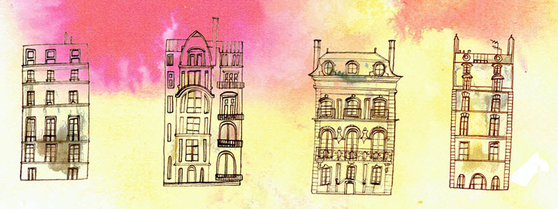
Illustrator Talya Baldwin recently had the pleasure to work alongside art director Melissa Kaita, applying her unique style to Paris architecture for this very special book cover. Talya's line art shows the same loving attention to historic monuments as to unassuming, run-of-the-mill walk-up flats.
Read MoreWelcome illustrator Talya Baldwin
Welcome to the illustrated world of Talya Baldwin. Armed with her inks, paints, biros, coloured pencils, pastels, wax crayons and felt tips Talya astounds us with her technical brilliance and the beauty she sees in the most interesting of subjects. We had to find out more about Talya.
What first inspired you to be an illustrator?
When I was three or four, my dad made me a tiny and very beautiful wooden table and chair. I kept my crayons and paper on them and that’s where I’d sit for hours, drawing castles and witches and fairies. My desk is slightly bigger these days, but essentially I’m still doing the same thing.
Can you give us some insight into your creative process?
My creative process is intense and a bit chaotic but always the same: I wake up in the middle of the night and think ‘I know EXACTLY how I want this drawing to look. I can see the colours and the direction of the lines and the way there’s so much energy in it it’s almost humming with life.’ And then I leap out of bed in the morning and make such a pale, disappointing imitation of that image that I feel completely bereft and inadequate. It was a relief to discover, over the years, that almost all artists feel this way, and that the trick is to keep working - you’ll never re-create the shining image in your head, but you might get a bit closer!
Whatever was imagined, we find Talya's efforts extraordinary.
How would you describe your work?
For me, it’s mostly about making the invisible visible. I like drawing things that might otherwise be overlooked because they aren’t grand or celebrated, like weeds, feral pigeons and minor characters from the edges of fairy tales. As a child I was always fascinated by the last prince in the story of the Six Swans; the one who was left with a single white wing because the magical jersey he was meant to put on to regain his human form had a missing sleeve. What on earth happened to him in later life? How did he explain it to people? And how did he ever open a tin of beans? I draw him over and over again because he seems to represent everything I’m interested in: fragility, tenacity and not quite fitting in with everyone else.
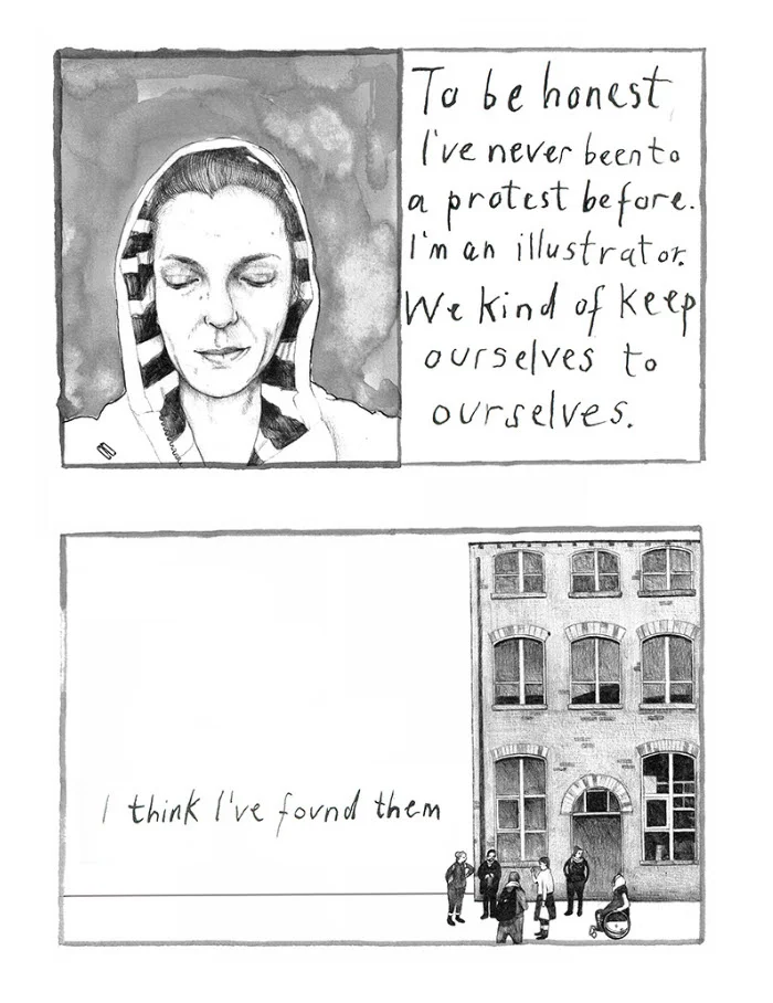
Talya Baldwin has been recording the stories of asylum seekers at Yarl's Wood Immigration Centre, and at the refugee camps in Calais. Yarl's Wood is effectively a women's prison for migrants, except that none of them have committed any crime. These illustrations below are a testament to Talya's commitment to make the invisible visible.
Are there certain themes you enjoy illustrating?
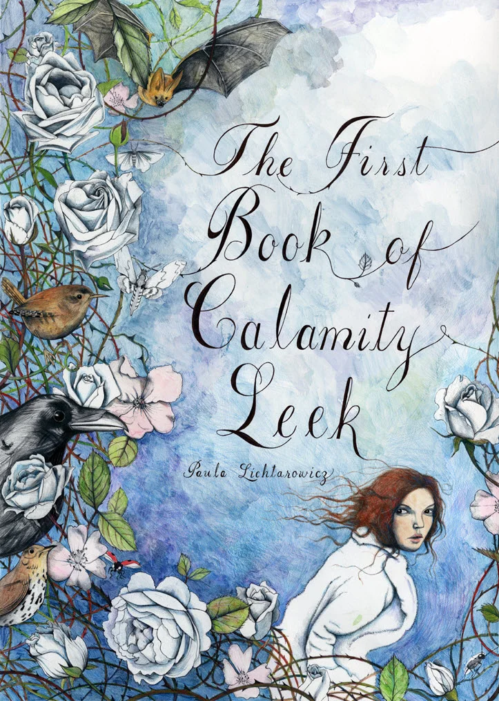
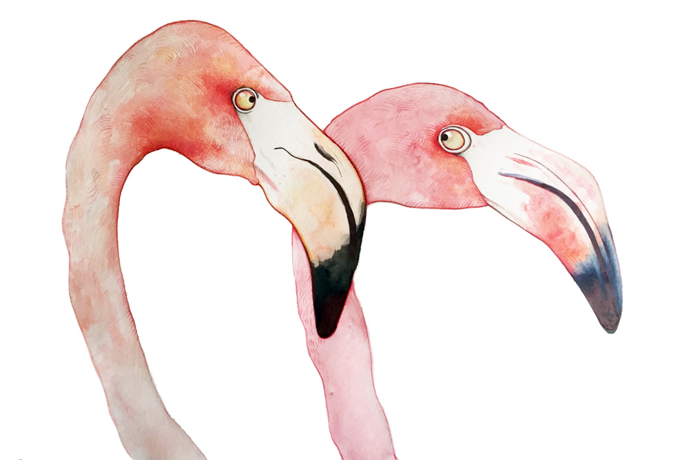
I draw birds endlessly. I love corvids - crows and ravens especially - because they’re so mistrusted. Our culture is full of images of ravens as bad omens and symbols of death, witchcraft and so on, but in reality they’re hugely intelligent and I’ve always thought they were very beautiful, too.
What are you working on currently?
I’m part of the NOMAD collective which makes art in unconventional spaces; we’ve been working on the Phytology Project, an apothecary garden on an East London estate in which all the plants are weeds with proven medicinal properties. At the moment, I’m also working on a new project with illustrator Simon Manfield in collaboration with the Scottish Seabird Centre. We’re raising awareness of endangered sea birds by making a series of drawings, copies of which will be floated at sea in tiny, GPS-tagged boats.
I also work on arts and health initiatives with children. These are creative projects designed to raise self-esteem, give children a sense of pride in their work and help them generate artworks that bring communities together.
Interior illustrations from Talya's recent picture book, Fox's Party, below.
Talya Baldwin studied at the Wimbledon School of Art, and then later at Edinburgh, and Saint Martin’s (in London) for her Master's degree. Talya is represented by i2i Art Inc.
Janice Kun for Reader's Digest
Janice Kun's latest illustrations for Reader's Digest were a big hit and so we asked Janice to tell us, in her own words, why this assignment was so successful.
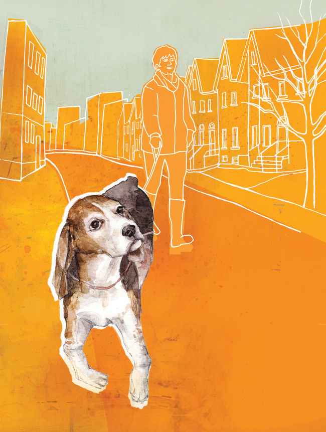
"It was a pleasure working again with Annelise Dekker, Art Director for Reader's Digest. As always, she provided clear and detailed direction, and her keen sense for pulling out the perfect combination of my mixed media skills really helped me stretch in this particular project.
For these illustrations, I was asked to take a simple approach, but with a boost in color, and a lighter tone. It was a bit challenging at first to work this way– blending simple line drawings with more fleshed-out painted elements, thrown into colorful planes– as it was counter-intuitive to my usual complex digital layering and subtle palette. In the end, this project really opened my eyes to a new way of adding clean lines, bold colors and a refreshing sense of minimalism to my work."
The article "An Uncomplicated Love", written by Elizabeth Abbott tells the story of our bond with dogs.
Janice Kun has been busy creating. Check out Janice's updated portfolio.
Janice Kun for the Government of Ontario
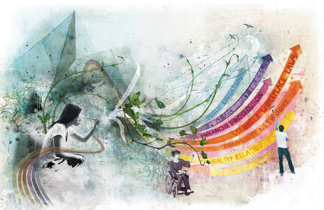
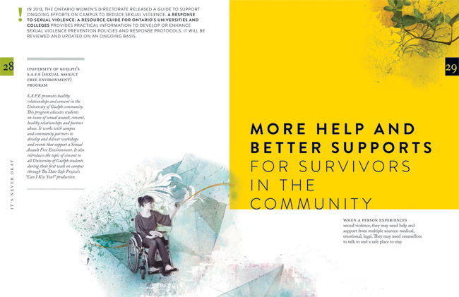
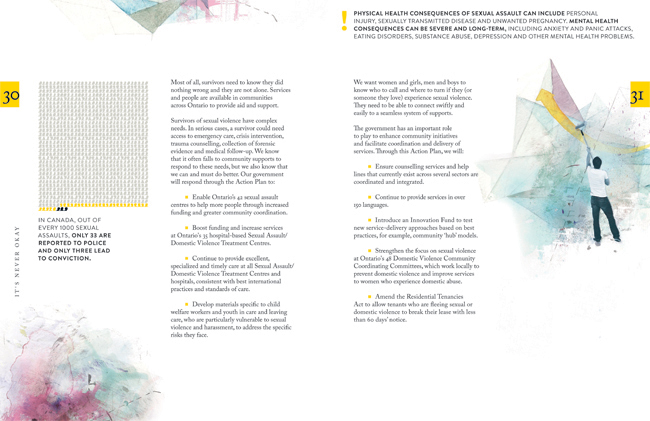
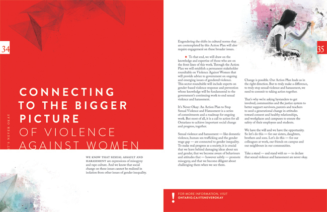
Janice Kun collaborated with Deirdre Hughes, creative director with Agency59, to create the illustration used for Kathleen Wynne's Government of Ontario Sexual Violence and Harassment Action Plan. Both an honour and a challenge, the art needed to show the optimism the new Action Plan promises, while at the same time representing the struggle and the work to be done on this important societal problem.
To accomplish all of this, Janice's illustration needed to take a conceptual approach in showing the urgency and the action to be taken on the issue of sexual violence and harassment. Through her unique blend of photography, hand rendering and digital collage, Janice's mixed media illustration set out to do all this.
Below in the main double page spread of the report, three figures work together to reshape a landscape that moves rhythmically from the darkness of an abstracted, geometric background, into one of brighter, bolder colours, and organic shapes. Their dialogue sparks the process of change by writing a new script, painting a new horizon, and cultivating new growth.
Katy Dockrill for National Drapery
When art director Lila Graham first contacted us to work on the new website she was designing for National Drapery, it was an exciting opportunity for Katy Dockrill to bring her flair for sewing and love of home decor to an illustration assignment! The new ND website was the inspirational vision of Natalie Hartman, who was a delight to work with. Visit the ND homepage and see how Lila and Katy literally brought Natalie's vision to life here.
The new website design also included a series of drawings to highlight the many custom products National Drapery offers. Katy adores creating for surface design, so when Natalie asked her to include an indication of patterns to depict various textiles and bring some flair to these more technical illustrations, she was happy to oblige. The result? These little gems...we've combined a few of our faves here:
Janice Kun - Black History Stamps
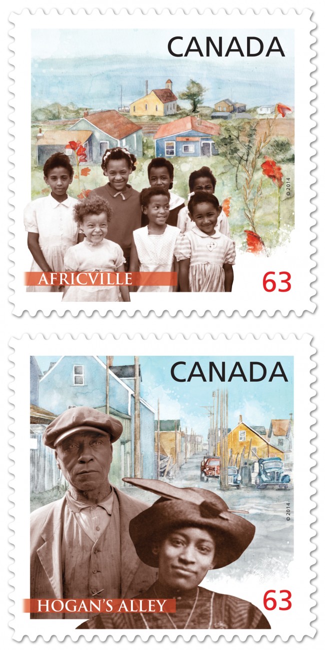
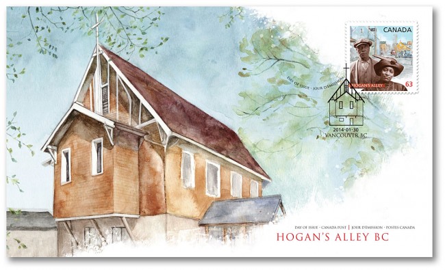
Canada Post celebrates Black History Month by commemorating two distinctive and historic African-Canadian communities: Vancouver's Hogan's Alley and Halifax's Africville.
Working closely with designer, Karen Smith, Janice Kun created the background watercolors depicting historical churches, central to these communities. Typical of Janice Kun's style, the pairing of the paintings with supplied historical photographs is a delicate dream-like balance between these real people and remembered communities.
Janice Kun for Royal Ontario Museum
Art director Tara Winterhalt chose Janice Kun to create a double page spread illustration for the article Threads That Bind which first appeared in ROM, the magazine of the Royal Ontario Museum, Summer 2012 issue. The story is a true account of an archaeologist's search for human origins which became deeply personal. Janice's pictographic method of weaving the elements of the story together is reminiscent of it's ancient references.
[pinterest]
Eili-Kaija Kuusniemi: 'Sunny'
The lightness and unique use of color in Eili-Kaija's watercolour style evoke a sunny summer afternoon on a beach. Perfect for an article about staying safe in the sun, done for the Finnish magazine 'Apu'.
Harvey Chan and 'Close Strangers'
Recently featured in a post on the popular Design Sponge blog, is one of Harvey Chan's pieces from his Close Strangers series. Jacqui Oakley, a fellow illustrator and designer Jamie Lawson's apartment was featured. Jacqui is quoted as saying, "The fireplace in the living room was one of the selling points of this apartment — we love the blue tiles and dramatic mantel. We’re so lucky to have a Harvey Chan original to contemplate from our comfy vantage point." Below is a video taken from the opening night of Harvey's Show.
http://www.youtube.com/watch?v=9OhoZZBz-bo
Eili-Kaija Kuusniemi Illustrates The Perfect Legal Personality
Eili-Kaija was asked to take a slightly more conceptual approach with her rich patterned style to illustrate the cover and feature article in ACC Docket, "The Perfect Legal Personality".
New Illustrations by Eili-Kaija Kuusniemi
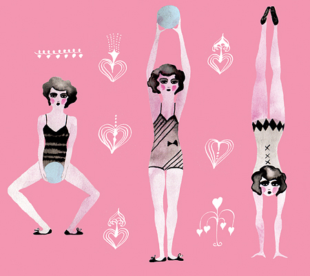
Eili-Kaija has created some playful new pieces which showcase her talent for making vintage look new! Check out her updated portfolio for more.
Janice Kun - Shedding Layers for Spring
Janice Kun has created these two new pieces which include elements of drawing, collage, watercolor, and photography. The elements are digitally manipulated in Photoshop and combined with multiple effects layers. Janice wanted to allude to the search for a truer sense of self and the shedding of the layers of constraint. Spring often seems to be a natural time for transformation and transition- a stripping away of the old to make way for the new.

