
Chemistry. It’s a subject most of us leave behind in high school. Not so for illustrator Dave Murray. Dave often finds inspiration for his art in science and technology, so the chance to collaborate with creative director Michal Waissmann at Mount Royal University’s Summit Magazine for the article ‘The Chemistry Between Us’ was a perfect opportunity.
Read More
Carl Wiens illustrates 'Wild Buildings and Bridges'
We think you will agree, Carl Wiens’ illustration amazes in his recent book collaboration, Wild Buildings and Bridges authored by Etta Kaner and published by Kids Can Press. As the name suggests, this reference book dives deep into how architecture is inspired by the wild wonders in nature and with over 40 stunningly detailed illustrations by Carl, the connections are clear. Some of the most recognizable architectural wonders in the world are made even more interesting by they’re inspiration, from lotus flowers to bird’s nest, to honeycombs and waterfalls.
Read More
Mark Hoffmann illustrates the future for Macalester Today
There are few ideas more serious than environmental sustainability. That's why it was such a treat when art director Brian Donahue from bedesign inc. choose Mark Hoffmann with his whimsical style and at times down right silly approach to illustrate this concept for Macalester Today.
Read More
Thom Sevalrud illustrates the modern world
Conceptual illustrator Thom Sevalrud excels at bringing the abstract into focus. The more abstract the idea the better; deconstructing large, complex theories into beautifully succinct visuals is his speciality.
Read More
Illustrator Eric Chow featured in Communication Arts Illustration Annual
A BIG congratulations to illustrator Eric Chow for being featured in Communication Arts Illustration Annual 2018! Eric’s work for The Infinite Bad, a role-playing horror comedy podcast created by Definitely Human Productions promotes the series online and through social media.
Read More
James Minchall illustrates for Strategy Magazine
Illustrator James MInchall recently had the opportunity to pair up once again with Strategy Magazine's art director Tim Davin. The magazine’s annual agency survey article called for a conceptual piece and James was just the right fit!
Read More
Carl Wiens' conceptual illustration for Wiley medical journal
Illustrator Carl Wiens has been quietly working away on a series of covers for the Clinical Pharmacology and Therapeutics Journal and the time has come to show off his work!
Read More
Eric Chow illustrates the Cyber Attack Survival Manual
Eric Chow's conceptual illustrations pack a punch in this very topical Cyber Attack Survival Manual written by Nick Shelby and Heather Vescent, published by Weldon Owen. Image after image Eric's work quickly communicates the issues at hand in simple yet powerful ways.
Read More
Dave Murray illustrates for USC inMotion Magazine
The digital world is continuing to change how we work, live our lives and more than ever how we learn. And that can be really good! Illustrator Dave Murray was recently commissioned by art director John Hobbs at inMotion Magazine to conceptually represent the reality of online learning in the Physical Therapy Division of USC.
Read More
Eric Chow illustrates for Canadian Business
Canadian Business magazine recently published it's Investor's Guide 2017. With a wonderful mix of metaphors Eric Chow's illustration accompanies some great advice on investment strategies and picking the right stocks and brokerage firm.
Read More
Thom Sevalrud illustrates for Nobles Magazine
In their latest issue, Nobles magazine, published by the Noble and Greenough School, brings us a fascinating look at teens and their social networks. With some exceptional art direction from 2 Communique, Thom Sevalrud's illustration captures our curiosity on the subject.
Read MoreDave Murray illustrates for Canadian Business
Inspired by the upcoming summer weather illustrator Dave Murray has created some pretty clever 'sand and surf' metaphors for investing now featured in the Canadian Business Investor 500 Guide. Art directed by John Montgomery.
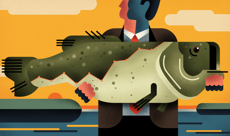
Stock picks from the pros. How to land the next big fish.

Screening out ordinary equities.

Five-star stocks that have nearly doubled the market's average annual return.
See more of Dave Murray's conceptual illustration. Represented by i2i Art Inc.
Janice Kun for USC Dornsife Magazine
Our genetic blueprint is still a very mysterious concept. For the article "Molecular You" in the most recent issue of USC Dornsife magazine, Janice Kun captures that mystery and intrigue in a series of beautifully atmospheric illustrations. Using a combination of line drawing, watercolor and photography Janice's imagery provides layers of subtle, yet powerful, detail. With incredible art direction by Daniel Knapp we are given the chance to ponder the impact of our DNA through Janice's work.


See more of Janice Kun's illustration. Represented by i2i Art Inc.
Thom Sevalrud for Stanford Social Innovation Review
The Stanford Social Innovation Review tackles some of the more interesting questions asked in the social sector today and thoughtful, conceptual illustration plays an important role in creating a visual understanding of these topics. And so art director David Herbick chose illustrator Thom Sevalrud for the Review's latest cover; a story on how nonprofits and social businesses can use data for action and for impact. Thom's elegant use of symbolism, strong lines and composition truly captures the transforming nature of this article.
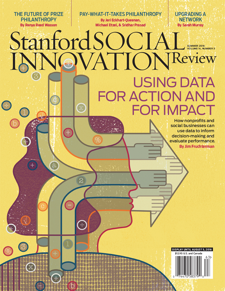

See more of Thom Sevalrud's conceptual illustration. Represented by i2i Art Inc.
Thom Sevalrud for Maryland and Virginia Milk Producers Cooperative
For the Maryland and Virginia Milk Producers Cooperative Association, the theme is change and The Design Office of Ann Marie Ternullo called on Thom Sevalrud to help illustrate this conversation.
For the cooperative's 2015 annual report Thom's clean lines and stylized approach provided a future-forward look at the client's complex industry. The fresh green color palette invites the reader and the illustration is cleverly carried throughout. The report is also printed (what a treat!) in an impressive 10"x13" format creating a stunning impact.
We have a special place in our hearts for great design. The collaboration between Ann Marie Ternullo and Thom Sevalrud created a truly special artifact.


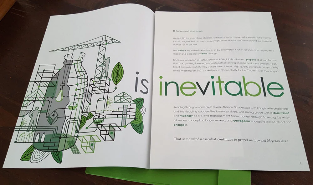

See more of Thom Sevalrud's illustration. Represented by i2i Art Inc.