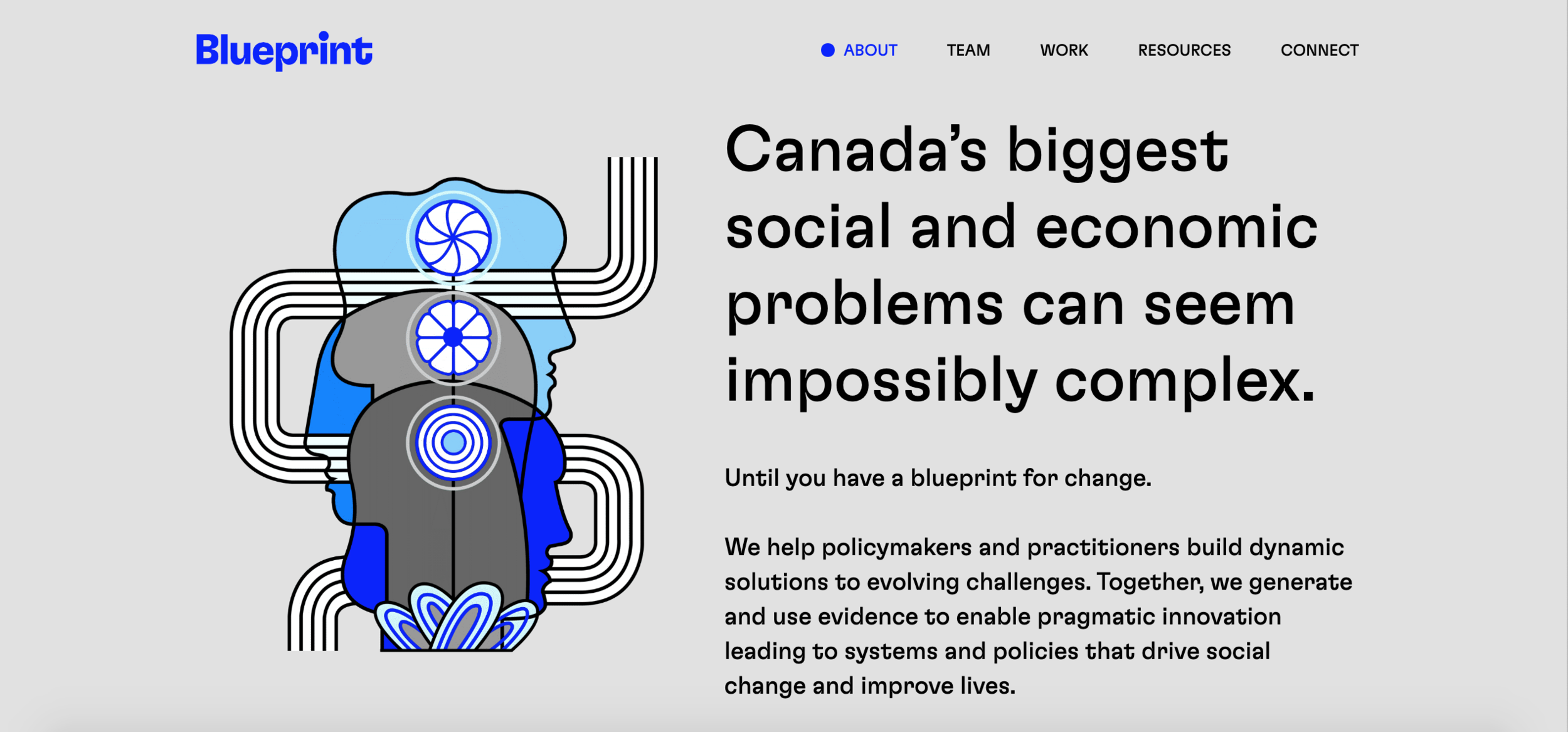
Thom Sevalrud illustrates for Blueprint ADE
Research and development consulting firm Blueprint ADE turned to illustrator Thom Sevalrud to create a clear and refreshed set of branded visuals for their website. Selected for his strong conceptual creativity and distinct graphic style, Thom expertly tackles these complex ideas. His seamless line work establishes a flow that draws the eye through the illustration and transforms each concept into clear icons. The bold hyperlink blue in the original series is a standout colour and signature to the Blueprint brand. But Thom took these illustrations one step further. Once the assignment was complete, he decided to explore an alternate colour palette to create a completely different look. His ingenious use of colour blocking provides just the right combination of soothing tones to bring the series together in a new way. We are completely hypnotized by the movement and psychedelic vibes of this groovy series.
We encourage you to wander through and get lost in Thom’s illustration.
Capabilities section on the Blueprint ADE website
Resource Hub on the Blueprint ADE website
Insight section on the Blueprint ADE website
Reports section on the Blueprint ADE website
View more of Thom Sevalrud’s illustration. Represented by i2i Art Inc.


