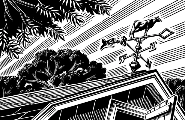
Illustrator Daria Lada joins i2i Art
i2i is thrilled to announce that Canadian-based Ukrainian illustrator Daria Lada has joined our talented roster. During her short time working in Canada, Daria’s stunning work has gained international recognition from World Illustration Awards, American Illustration, Applied Arts, Hiii Illustration Awards, and more. Incredibly conceptual and stunningly executed Daria has the ability to communicate ideas quickly and beautifully.

Welcome illustrator Kuba Ferenc
We’d like to give a warm i2i Art welcome to incredibly talented conceptual illustrator, Kuba Ferenc. Graphically composed and wonderfully compelling, Kuba’s illustration offers a unique perspective. Passionate about communicating complex ideas his work is well thought out and meticulously constructed. Addressing a variety of topics from politics to psychology, Kuba’s sophisticated yet subtle use of forms, shading and colour bring his illustration to life.

Greg Stevenson illustrates for Foresters Financial
Illustrator Greg Stevenson makes going with the flow look better than ever. In search of a vector-based artist, Foresters Financial commissioned Greg to create a library of illustration to complement their brand. B2B and forward-facing marketing materials expertly combine text, photography and illustration, each element interacting to create a sense of space and movement. Simple at first glance, the execution of these continuous line illustrations is more complex than meets the eye.

Rémy Simard illustrates for Crave
Funny and relatable. Just a couple of things that illustrator Rémy Simard has in common with iconic 90’s sitcom F · R · I · E · N · D · S. The focus of a recent marketing project by Bell Media for Crave, Rémy's illustration depicts some of the most memorable episodes of the series. His distinct comic style gives way to an endearing comedic flair that perfectly captures the humour in each familiar icon. Which, when combined reveals a famous F · R · I · E · N · D · S episode. The one with the….

Thom Sevalrud illustrates for Blueprint ADE
Research and development consulting firm Blueprint ADE turned to illustrator Thom Sevalrud to create a clear and refreshed set of branded visuals for their website. Selected for his strong conceptual creativity and distinct graphic style, Thom expertly tackles these complex ideas. His seamless line work establishes a flow that draws the eye through the illustration and transforms each concept into clear icons. The bold hyperlink blue in the original series is a standout colour and signature to the Blueprint brand. But Thom took these illustrations one step further.

Eric Chow illustrates for The Atlantic
In this age of online shopping, selling goods online has become a way of life for many. That’s why it was so interesting to see The Atlantic’s story of the Amazon seller, told through the conceptual illustrations of Eric Chow. Eric’s creativity never disappoints and this series is no exception.

