Dave Murray for Reader's Digest, "Birders Unite!"

Hipsters: known for ransacking vintage stores, perfecting their beards and gentrifying neighborhoods with their artisanal food stores. It seemed likely they should revitalize some old school hobbies while they are at it. Like bird watching.  

This month's Reader's Digest article, "Birders Unite!" written by Julia Zarankin, dives into the phenomena of the bird watching millennials.  Needing to combine the tattooed with the wilderness, art director Annelise Dekker picked the perfect artist in Dave Murray.


Caution: These are not your grandfather's illustrations:


Dave Murray illustration Birders Unite for Readers Digest


Dave Murray Illustration Birders Unite ©Dave Murray_DM195b_i2iArt

Uniquely stylized, award-winning illustration.  We invite your to check out more of Dave Murray's illustration.


Clare Owen for Everyone Loves Paris

teNeues has published a lovely new collection of all things Paris.  Everyone Loves Paris is edited by the talented Leslie Jonath--who fell in love with Clare Owen's Paris illustrations.  Leslie artfully curated this wonderful collection from renowned illustrators around the world.  Needless-to-say, Clare (a self proclaimed Francophile) was delighted to contribute her art!  

teNeues has this to say about the collection, Everyone Loves Paris includes tributes from over 50 illustrators from around the world. From grand landmarks—such as the Eiffel Tower, Sacré-Cœur Basilica, and the Louvre Pyramid—to the small pleasures of daily life, each image expresses the joys of this marvelous city through the perspective of each artist’s brush...Everyone Loves Paris is a delightful meander that will inspire you to view the City of Light from a new angle and in a multitude of styles."

Here now is the cover featuring a lovely ©Emma Block Illustration

Ramelli Paris Cover 3.indd

Clare Owen's Chat Noir and Aujour d'hui

©Clare Owen_CO135_i2iArt©Clare Owen_CO138_i2iArtFeast your eyes on Clare Owen's delightful portfolio.

Rémy Simard for apple Magazine

It's never easy to explain a complex theory, never mind making it an enjoyable experience.  When Editor Terry Bullick at apple magazine was tasked with a story about brain development she turned to illustrator Rémy Simard to help her communicate this intricate topic to her readers.  

Rémy's fun, lighthearted, comic book style was the perfect way to break this story down into easy to understand concepts. A quick 5 minute read and you too will be an expert on brain development.

Impression


Impression Impression Impression

Visit Rémy Simard's portfolio for more examples of his unique illustration.

Janice Kun for the Government of Ontario

  Janice Kun collaborated with Deirdre Hughes, creative director with Agency59, to create the illustration used for Kathleen Wynne's Government of Ontario Sexual Violence and Harassment Action Plan.  Both an honour and a challenge, the art needed to show the optimism the new Action Plan promises, while at the same time representing the struggle and the work to be done on this important societal problem.


To accomplish all of this, Janice's illustration needed to take a conceptual approach in showing the urgency and the action to be taken on the issue of sexual violence and harassment.  Through her unique blend of photography, hand rendering and digital collage, Janice's mixed media illustration set out to do all this.

SVHAP cover

Below in the main double page spread of the report, three figures work together to reshape a landscape that moves rhythmically from the darkness of an abstracted, geometric background, into one of brighter, bolder colours, and organic shapes. Their dialogue sparks the process of change by writing a new script, painting a new horizon, and cultivating new growth.

Eng spread


LadyWheelchair


ManPainting


FemalePainter

Visit Janice Kun's entire portfolio.

Mark Hoffmann's Mural at the Montserrat Gallery

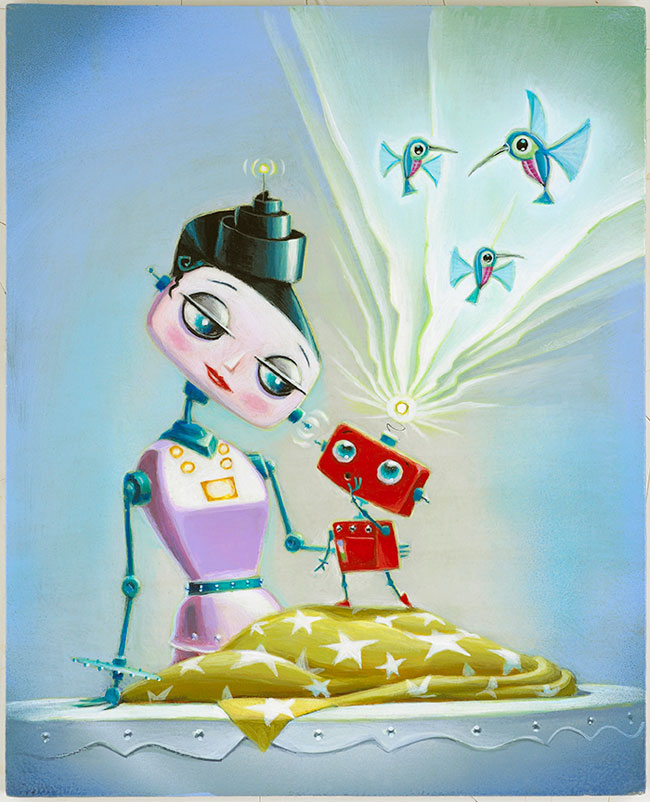
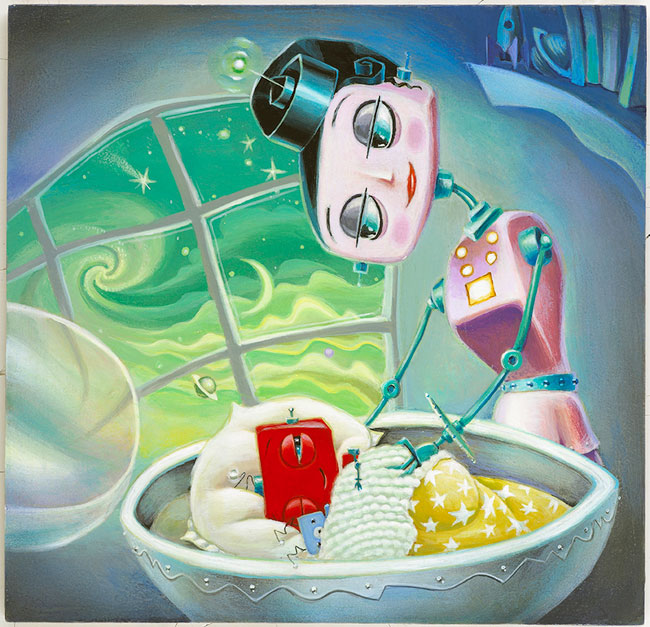
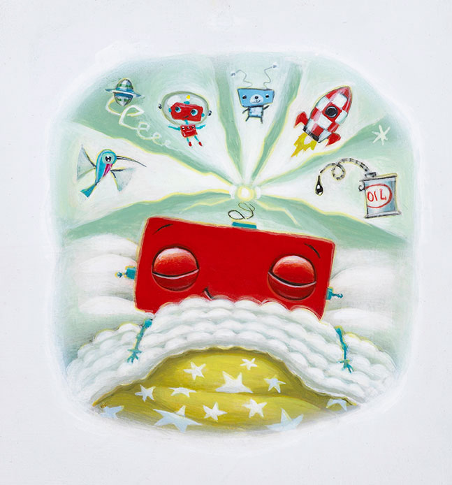
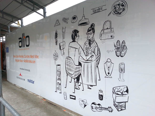
The exhibition SEVEN: A Peformative Drawing Project at the Montserrat Gallery was a perfect opportunity for illustrator Mark Hoffmann to spread his creative wings even further. Mark, along with six other artists, put their creative process on display by executing a large mural on one of the gallery's walls in an open studio environment. The mural itself was meant to be the "residue of an artistic performance." We found both the process and the final product pretty spectacular.  

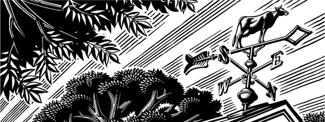
Mark Hoffmann's 'Men of Mountains' Mural

Mark Hoffmann Mural

 Close up of Mark Hoffmann's lettering

Mark Hoffmann Mural Close Up


We chatted with Mark Hoffmann after the show...


i2i Art: How were you approached with this project?

Mark: Leonie Bradbury (the gallery director at Montserrat College of Art, where I teach) contacted me in the fall to see if I had any interest.  They usually try to get one faculty member involved and thought I would be a good fit with the other artists.


i2i Art: Was this your first mural?

Mark: Yes, and it was quite overwhelming.


i2i Art: Tell us about the piece.  What was your inspiration?

Mark: I really wanted to paint a giant horse and started to research. Somehow I ended up reading about the early exploration of what would later become the first national park of the U.S., Yellowstone. In my research I found the story of the Cook, Folsom, Peterson expedition to explore and survey the land. I thought this might make a fun image with them, a horse, and geysers. I also had a previous color palette worked out that I wanted to apply to the piece.


i2i Art: What was it like working on that scale?

Mark: Difficult. It's hard to get a sense of the scale until it is right in front of you. I found that I had to stand back and look at it a lot, otherwise I wouldn't take the scale into full consideration.


i2i Art: The gallery was open while you were working on the piece, tell us about the atmosphere.

Mark: As I was working, quite a few folks stopped in to look, but very few chatted with me. They later told me they were afraid to interrupt. I must look deep in thought when I paint. It was nice to have the freedom to paint and explore at that scale and really knock people over with an image.


i2i Art: Do you have any tips, tricks or lessons learned you want to share?

Mark:  I realized that some of the techniques I planned to use are hard on that scale and surface. Use a paint with primer in it (I used house paints) so you don't have to apply it twice to get good coverage. Bring plenty of Aleve and Tylenol, the work can be a little back breaking.

Hyperlapse: Watch Mark Hoffmann's mural come to life

http://youtu.be/RNxRIeZmY-Y


On view through March 28, 2015 at the Montserrat Gallery.

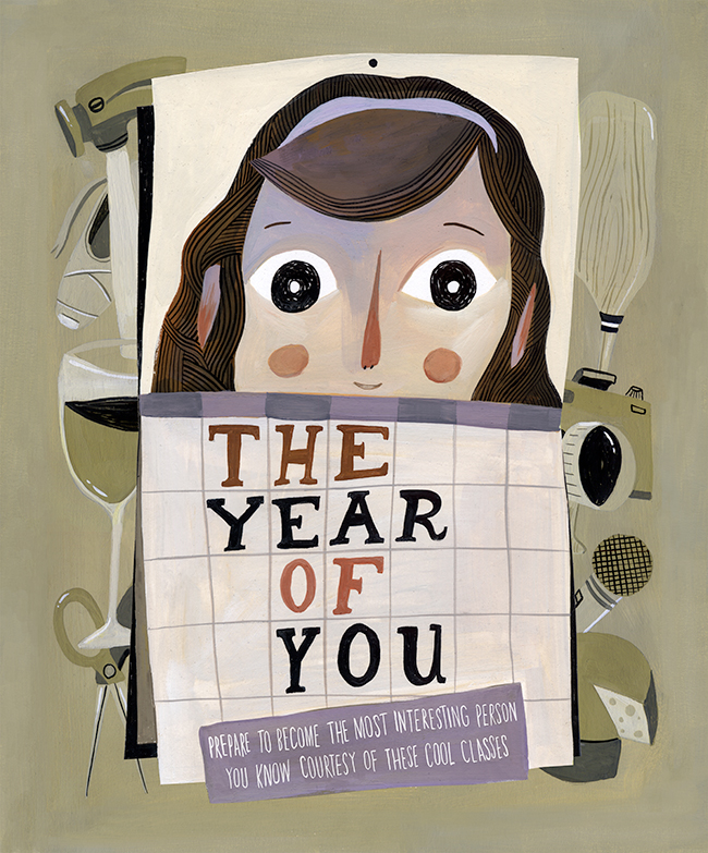
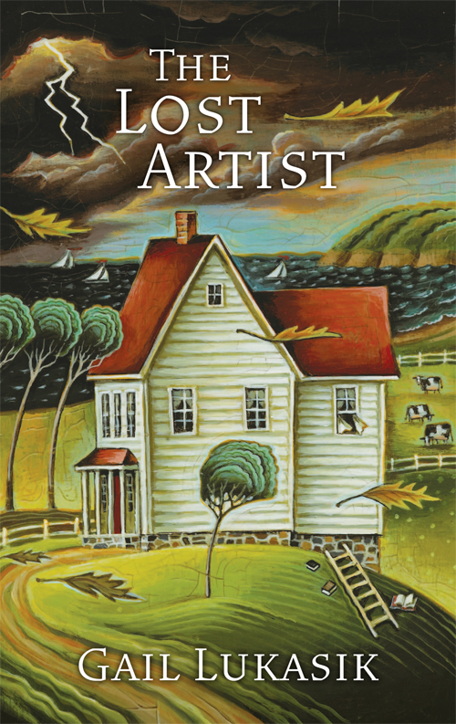
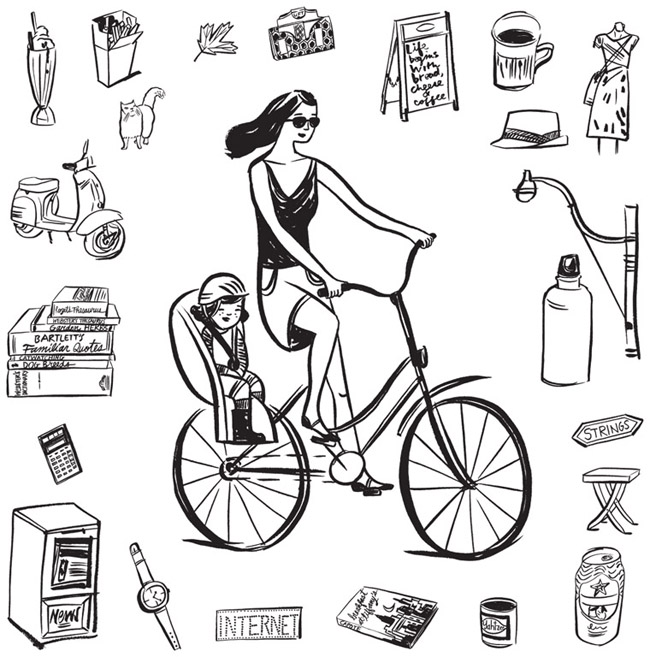
Mark Hoffmann offers a playfulness to his americana, folk art style.  View Mark's entire portfolio.


Tim Zeltner for Henry Holt's Power Down Little Robot

  Power Down Little Robot, is a very special children's picture book lovingly illustrated by Tim Zeltner and written by Anna Staniszewski.  When it's time to power down for the night, Little Robot is not ready and he quickly opens his stalling program.  From there, the story is very familiar to avoidance experts everywhere (mombots and dadbots), and told with one fun twist after another.  In the end Mom Unit knows how to get him tucked in to his module as he finally powers down.


Sally Doherty, Executive Editor for Henry Holt Books for Young Readers, fell in love with Tim Zeltner's art.  Power Down, Little Robot is the second picture book she has commissioned him to illustrate.  Upon receiving Tim's final art for the book Sally's reaction was, "Wow!  You've done it again--you've really knocked us out with your extraordinary vision for this story.  I just love everything about what you've done:  the colors, the style, the expressions.  Fantastic!"  Well deserved praise for Tim Zeltner's beautiful hand painted illustrations on wood.

TZ467a_PowerDownLittleRobot

"Now hurry and clean your cogs.", says Mom Unit.  The Little Robot says to himself, "I try to brush them at half my normal rate, but nothing gets past Mom Unit's sharp eye."
©Tim Zeltner_TZ447_i2iArt
"But I'm not tired!  Look.  My power level is still at yellow."

©Tim Zeltner_TZ464_i2iArt

"But I need to tell you a secret!...Did you know that a hummingbot flaps its wings a million times a second?"

©Tim Zeltner_TZ446_i2iArt

"The sleep module is soft and warm.  Maybe I could close my eyes for a millisecond..."
©Tim Zeltner_TZ457_i2iArt
"Dream sequence initiated."

©Tim Zeltner_TZ459_i2iArt

Check out Tim Zeltner's entire portfolio.

Dave Murray for Canadian Grocer

The always enthusiastic Dave Murray jumped at the chance to work with art director Lindsay Maclachlan again on a feature article for Canadian Grocer. Dave often illustrates technological innovations so the brave new world of in-store technology at our local grocer was a perfect match for Dave's style.

The Future of the Grocery Store

Dave Murray Illustration for Canadian Grocer

smartphones and tablets could dominate our grocery shopping experience

Dave Murray spot illustrations Canadian Grocer

Gary Alphonso: Creates Facebook and Twitter Banners

Recently, Gary Alphonso was asked by The Design Office of Ann Marie Ternullo to create this art for Maryland & Virginia Milk Producers Cooperative Association’s Facebook and Twitter pages.  The art was originally created for the co-op's annual report.  Ann Marie’s idea was to have the art modified by Gary, to create digital banners for their social media marketing–a very effective use of the art.  Elements within the art were moved around to accommodate the Facebook and Twitter logos while maximizing the impact of the image area.  Aside from offering a custom solution for their social media marketing it also took advantage of the branding established by the annual report, creating a nice continuity across platforms.  

As a master with Adobe Illustrator, Gary Alphonso creates everything from futuristic high tech art to vintage woodcut illustration--but it's always his dynamic compositions that carry his trademark style into any application so perfectly.

GA622-a-Weathervane-i2i-Banner
This is the original illustration Gary created for the Annual Report that was modified for use as in social media banners.

©Gary Alphonso_GA622_i2iArt

Check out Gary Alphonso's entire portfolio.


Mystery Book Covers: Clare Owen for Harlequin

Clare Owen has now created three gorgeous covers with art director Sean Kapitain at Harlequin.  The front cover for Hunting Sweetie Rose and Honestly Dearest, You're Dead are featured below.  Stay tuned to see the third in the series--to be released in March 2015.  Clare's illustrations are so inviting but be careful, with these mystery covers, the devil is in the details.

©Clare Owen_CO183-a_i2iArt
I just love the details like the wind blowing the curtain and the steam rising on the coffee. They seem to bring the story to life.
9780373269020_DIR.indd

The Year of You: Mark Hoffmann for D Magazine

Did you make a resolution this year?  If not, you still can! How about, "prepare to become the most interesting person you know"?  That was the inspiration for Mark Hoffmann's latest commission for D Magazine.  Art director, Jamie Laubhan-Oliver took advantage of Mark's amazing lettering and whimsical style for the article The Year of You which outlines a long list of cool classes available in Dallas, TX for those ready to learn something new.  

So whether your passion is art and photography, fitness and dance or just "making something", check out what's offered in your neighborhood and become just a little more interesting in 2015.

Mark Hoffmann Year of You

Year of You Classes Mark Hoffmann i2i ArtGet inspired by Mark Hoffmann, visit his online portfolio today.

Tim Zeltner for Harlequin

Art director, Sean Kapitain with Harlequin, has a keen eye for quality illustration and knows how to choose the perfect style to capture just the right mood for the novel.  The backdrop for The Lost Artist is a 19th Century New England farmhouse with a nasty storm brewing.  Who better to illustrate a moody landscape than Tim Zeltner?  Tim painstakingly builds the atmostphere of a painting with his unique combination of layering on wood with: paint, glazes and stains.  Sean Kapitain had this to say about Tim Zeltner's art, "We actually heard back from the author about this cover which is rare! She loved the package and thought Tim's art was absolutely spot on. Great work, Tim!".  Thank you Sean for the wonderful feedback.

9780373269259_DIR.indd
I love the way Sean has used parts of the illustration for the spine and back cover.

9780373269259_DIR.indd

To see more of Tim Zeltner's delightful illustrations take a look at this portfolio.

Ozzie Award for Diabetic Living Story Illustrated by Janice Kun

Congratulations to Diabetic Living, on the Folio Ozzie Award for Consumer Publications: Best Use of Digital Imagery for the “Let’s Go to Camp” story illustrated by Janice Kun.  Many thanks to art director, Michelle Bilyeu who shared the news with Janice, "Our team loved how this story turned out and you did a fantastic job making it come alive!".  Working closely with Michelle Bilyeu, Janice Kun artfully incorporated the many photographic moments with illustrated elements highlighting this true-to-life portrayal of camp life.

JK247a_Diabetic_Living_2
Incorporating kids' letters and handwriting really helps make this their personal story.
©Janice Kun_JK248-a_i2iArt
Love the subtle use of a black and white photo with spots of color (top center).

©Janice Kun_JK250-a_i2iArt

To see more of Janice Kun's playful illustrations integrating photographic elements, check out her updated portfolio.


Katy Dockrill for ALTO

Creative director at Drive Agency, Mark Bulloch, chose Katy Dockrill for the ALTO marketing campaign because her illustration style suited the hip lifestyle drawings he envisioned for the brand.  ALTO is a gorgeous new rental condo development located in the heart of trendy Little Portugal, in Toronto.  The art needed to speak to the young urbanite seeking to live there.


We spoke to Katy about her work on this campaign and she shared some interesting insights on her process:

i2i Art:  At the outset, this campaign looked like it would involve four major illustrations and hundred's of small icons.  What was your first response to this request?

Katy Dockrill:  Firstly, I saw the direction that Drive agency was working towards, because they gave me a preliminary visual concept, and I loved it. I loved the simplicity, the icons, the central figure idea.  I love drawing individual things, and because it was black and white, I could  simply focus on the line work.

i2i Art: Can you describe your process?

Katy Dockrill:  I felt completely at home, taking pictures of the hood, sitting and sketching. I drew from my pictures, once I got home. I also needed to figure out who was going to be in the middle of all these icons, which took more time because the client was looking for someone in a certain age range, and wanted them doing things that might be particular to them and the neighbourhood.

i2i Art: The art needed to be able to reproduce at any size--blown up huge for signage and small for brochures and Internet advertising.  Knowing that you sketch and draw by hand, how did you approach the final art to accommodate these specifications?

Katy Dockrill:  I knew that these were going to be reproduced at a large size, but I work quite small, with brush and ink. My process in these cases requires I scan all my art as bitmap tiffs and then vector my line work in illustrator so that it most closely resembles the original work.

i2i Art:  What's your impression of the finished campaign materials onsite?  If you were looking for a rental condo, do the marketing materials portray an appealing lifestyle choice?  In what way?

Katy Dockrill:  I'm biased in that I really love how the work onsite turned out. I'm hoping with the icons that surround these figures (who are of a certain age range), that they appeal to the bookworm, the foodie, the nester, the cat lover, the musician, the pal, the mother.  Since most of what I drew came from life, the sidewalks and the stores in that neighbourhood I also hope that perhaps someone sees a bit of their story in there too.

A montage of photos Katy took while researching the neighbourhood.
KatyALTO_researchpics
One of the panels with Katy's art mounted on construction hoarding onsite.
√diners1_onsite
ALTO advertising with two of Katy's illustrations.

KD432a_alto_lifestyle_lofts

The art I call 'Lunching', up close.

dinnercouple_alto

This hipster musician would fit right in at Alto.

musician_FINAL

A day in the life of a mom.

cyclist_FINALTo see more of Katy Dockrill's delightful illustrations visit her profile here.

Eric Chow for TroDent

There's a revolution in the fields of diagnostics and treatment that is changing the face of dentistry.  To depict new advances in the field would take an illustrator with a fertile imagination and strong conceptual skills.  Many thanks to John Hobbs, editor of TroDent (a USC School of Dentistry publication), for recognizing Eric Chow's talent and giving him the perfect creative brief to illustrate the cover story, What does the future hold for Dentistry?  Below are the enlightening results.  To see more of Eric Chow's illustration visit his portfolio here.

Cover Image:  What dentistry will look like in 25 years?

Trodent

Eric Chow's visual depiction of DNA in dentistry.

Trodent_Dentistry_Spread

Eric Chow's visual depiction of the future of IT in dentistry.
EC169_The_Future_of_Communication_in_Dentistry_650
Eric Chow's visual depiction of the future treatment of cavities.

EC170_The_Future_of_Fillings_650

Eric Chow's visual depiction of gene therapy for the prevention of cavities.

EC171_Gene_Therapy_in_the_Prevention_of_Cavities_ 650


Dave Murray: Illlustration 57 Reception, SOI, NYC

Big congratulations to Dave Murray on his Indie Alehouse poster illustration--Glory & Consequences, selected for the Society of Illustrators' Illustration 57 annual.  Last week Dave Murray attended an opening reception of the exhibition at the SOI in NYC.  Of this great honor the SOI website says, "the exhibit features works by leading contemporary illustrators worldwide, selected by a prestigious jury of professionals".  If you're in New York this month, drop by and check out the show.  You won't be disappointed.  Details on the show, which runs until January 31, 2015, are on the SOI website.  

We caught up with Dave to get his reflections on the experience and share some of his pics from the opening reception:

i2i Art:  What comes to mind from the SOI reception in speaking with fellow illustrators and art directors?

Dave Murray:   I got a real feeling of community from everyone there. It was my first time at the SOI (and in the annual), so it was a completely new experience. It was pretty amazing just to soak in the atmosphere. I had a bit of a chuckle talking to one illustrator who's work is currently being displayed in the NYC Subway system, but never manages to catch a train that has the work in it. I saw it on nearly every train I took over the few days I was there.

i2i Art:  Did any trends or themes emerge for you in looking at the advertising and institutional art on display at the show?

Dave Murray:  Themes were harder to nail down - I feel like the SOI does a great job of varying the style of the selections - no one style was represented more than another.

i2i Art:  What did you think of the overall quality of the art in the show?

Dave Murray:  The quality of the art on display was amazing. Conceptually and technically, pretty much everything blew me away. Going back to the variety of work - there was such a mix of styles and media...Coming home, I feel incredibly re-energized and inspired.

i2i Art:  What piece of art by a fellow illustrator was the highlight of the show for you?

Dave Murray:  My personal favorite from the show - Andie Dinkins' absolutely unreal "New Years Eve at the Beverley Hills Hotel" piece.

Dave with the poster he designed and illustrated for Indie Alehouse's Glory & Consequences, hanging on those historic SOI walls.

DaveMurray_Profile

DaveMurray

Dave's personal fave, Andie Dinkin's, New Years Eve at the Beverley Hills Hotel.

Otherpiece

To see more of Dave Murray's award winning illustration, visit his portfolio here.


Holiday gift ideas featuring Greg Stevenson art!

For the person on your list who has everything, check out Greg's online store with over 1,500 print-on-demand products with surface designs by Greg Stevenson!

Screen Shot 2014-12-18 at 4.33.26 PM

I'll give you a sneak peek here...two of my favorite gifts...but check it out for yourself.

You must know a little pooch that needs a special holiday T-Shirt!

Screen Shot 2014-12-18 at 4.54.01 PM

And half a dozen of these peace dove ornaments would look beautiful on any tree!

Screen Shot 2014-12-18 at 4.43.43 PM

If you like what you see here check out Greg Stevenson's entire updated illustration portfolio here.

Mark Hoffmann for D Home Magazine

Ever found your kid hanging from a candelabra or climbing a giant holiday decoration?  In his best playful style, Mark Hoffmann illustrated the story Babes in Toyland:  Activities that will make your kids' holiday season more merryfor art director Jamie Laubhan-Oliver, at D Home Magazine. If you like this image, there are a lot more fun Mark Hoffmann illustrations here.

©Mark Hoffmann_MH447_i2iArt

Monika Melnychuck adds to the Naked Flock

Monika Melnychuk has designed and illustrated a delightful fourth sku for the growing Naked Flock brand.  The premium cider maker Jonathan Hull (aka Apple Dave) says, "Our Cider is for people who crave unique flavor and are on the hunt for quality." For the interesting story behind the brewers of the Naked Flock Brand, check out this post from the Great Brewers blogRead reviews about the new Citra Premium Hard Cider here.  And for those of you who missed our story on the first three skus of Naked Flock cider, check it out here.

Monika_Melnychuk_Naked_Flock_CitraTo see much more of Monika's illustration check out her portfolio here.