How Gary Alphonso became a Scratchboard Illustrator

We recently asked Gary Alphonso how he got his start creating Scratchboard/Woodcut style illustrations:
"During my early years a creative director approached me with an opportunity that would lead to my career as a “Scratchboard/woodcut” artist.
The time was the late 80’s just before scratchboard illustration enjoyed a huge surge in popularity. The client was a national clothing store chain called “Beaver Canoe”. It was at the time a major competitor to “Roots”, with an earthy outdoors feel to it’s product line.
The idea was to create a series of diamond shaped logos that would be very illustrative with a wood cut feel to them. They would represent the various product line, and be used in advertising, graphics on the clothing, and on in-store P.O.P. They became their trademark.

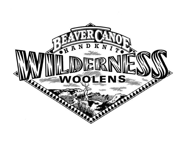
Gary's first traditional scratchboard illustrations (above)
That year (1988) they were featured in “Studio Magazine’s” Awards Annual. The timing couldn’t have been better. Scratchboard was about to become wildly popular in the 90’s. I quickly (and I use that term loosely because of how labour intensive the style is) began creating new samples on my own. I discovered and fell in love with early 20th century wood engravers and printmakers like Lynd Ward, Rockwell Kent, Frans Masereel, Giacomo Patri ...and the likes of. This was added to the passion I already had for the Art Deco period, the propaganda art that came out of Eastern Europe at the time, and the advertising and editorial art from the “West”.
At first the work was mostly black and white because of the nature of the scratchboard medium. This meant a lot of design (logo) packaging, and newspaper editorial work. As I slowly introduced colour to the mix, the advertising, magazine editorial, book, Annual report etc. work would follow. The phone kept ringing. I never looked back.
After years of success as a scratchboard illustrator it was hard to resist the role of the computer in the digital age. Very reluctantly at first, I began trying to adapt my style to the digital realm. As I became comfortable with this it became evident that carving shapes and lines out of black ink and clay had it’s limitations. With the computer I could keep this conceptual way of working (creating negative space while leaving the positive space behind) and carve these shapes out of colour instead of just black. This simple fact opened up many more doors creatively. The result was that I am able to keep evolving the style beyond the limitations of traditional scratchboard."


The evolution of Gary's work continues, however, sometimes the more things change, the more they stay the same--evidenced by a recent logo icon he created for a Bespoke Letterpress Printer in Chicago, Illinois. The retro appeal lives on!