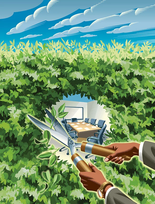
Gary Alphonso illustrates for Oolitic American Gin
Digital scratchboard master Gary Alphonso is at it again! This time, for Oolitic American Gin. Gary collaborated with Art Director Lars Lawson of Timber Design Co. to capture the origin and history of this Indiana made, limestone filtered gin. No detail spared, Gary’s illustrative precision is evident in each stroke, collectively illuminating the highlights, shadows and depth of the 1920’s American quarry

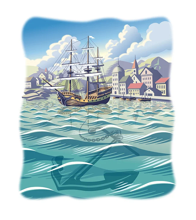
Gary Alphonso illustrates for TD Canada Trust
i2i Art Inc. has had the privilege of working with Creative Director Thomas Howlett of The Farm for many years on an annual creative assignment. The project? Traditionally, a limited edition signed framed print presented to recipients of the TD Canada Trust Employee Award. This year illustrator Gary Alphonso was honoured to be commissioned for the job.

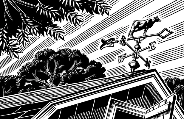
Gary Alphonso illustrates for The College of William & Mary
Illustrator Gary Alphonso's digital scratch board technique honors a historic process while incorporating the benefits of modern advances, much like his subject matter, The College of William and Mary.