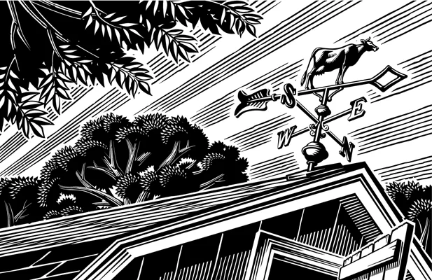
Over this past year illustrator Greg Stevenson had the honour to work with The College of William & Mary, one of the oldest universities in America. Each year W&M Alumni Magazine selects an artist to feature in their quarterly issues. Proud to have been selected and working alongside art director Michael Bartolotta, Greg utilized a unique scratchboard technique that combines digital and traditional methods, each stroke creating depth and adding detail.
Read MoreCarl Wiens illustrates for Belgian Moon
Are you The Ritualist? The Catchphaser? The Last Caller? With a cold Belgian Moon in our hand it's hard not to let your 'happy hour' personality shine through.
Read MoreGary Alphonso Mystery Book Covers for Harlequin
Gary Alphonso began his career as a scratchboard illustrator in the 1980s. That is where Gary learned the precision of line and shadow evident in his work today. As Gary evolved his technique, he began creating 'scratchboard' art in Adobe Illustrator, in both black and white and full color.
These cover illustrations for Harlequin's Worldwide Mystery Series featuring Vicki Delany's Constable Molly Smith showcases Gary's ability to create drama through perspective and lighting in a retro poster art style. His technique, perfected over many years, creates a stunning outcome.
The latest in the series, Negative Image will be in stores March 2016.
Gary Alphonso for TroDent Magazine
In this summer’s issue TroDent magazine tells the stories of some of their military alumni in the featured “The Military Dentists.” Art director John Hobbs wanted a cover illustration that really captured these special individuals sense of duty and pride. Gary Alphonso used a very classic retro style of illustration to create a powerful cover that evokes our patriotism and reverence for the individuals that serve in our armed forces.
Gary Alphonso for Ensign Magazine
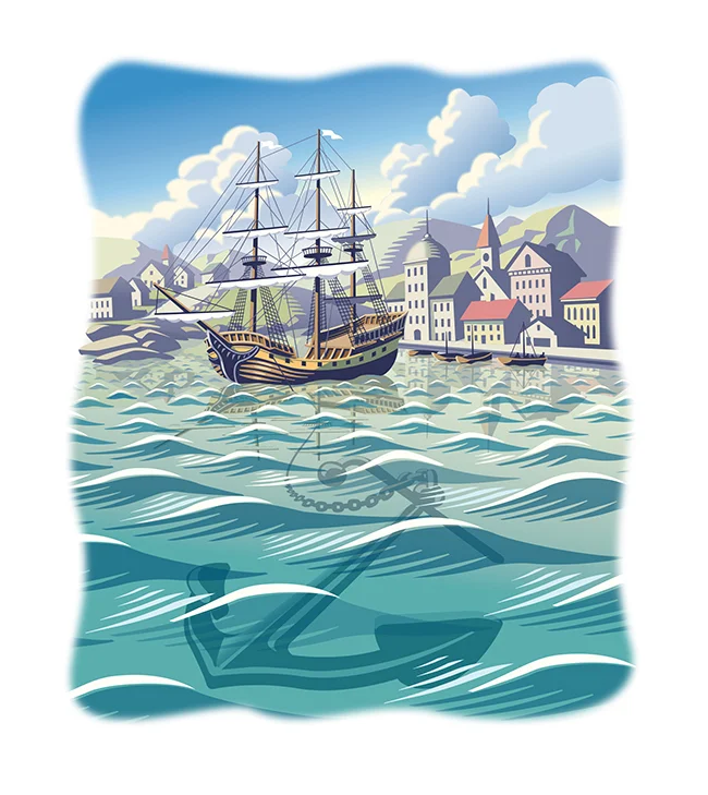
Scott Knudsen, art director for Ensign Magazine, came to Gary Alphonso with a story of faith and sacrifice. Looking at the opening paragraph, the metaphor that inspired these beautiful pieces was clear -- "A ship is safe in the harbor, but that's not what ships are for."
The article, "Faith to leave the harbor" showcases Gary's classic, digitally rendered, scratchboard style and the nautical theme highlights Gary's real ability to capture motion and light in his illustrations.
Gary Alphonso: Creates Facebook and Twitter Banners
Recently, Gary Alphonso was asked by The Design Office of Ann Marie Ternullo to create this art for Maryland & Virginia Milk Producers Cooperative Association’s Facebook and Twitter pages. The art was originally created for the co-op's annual report. Ann Marie’s idea was to have the art modified by Gary, to create digital banners for their social media marketing–a very effective use of the art. Elements within the art were moved around to accommodate the Facebook and Twitter logos while maximizing the impact of the image area. Aside from offering a custom solution for their social media marketing it also took advantage of the branding established by the annual report, creating a nice continuity across platforms.
As a master with Adobe Illustrator, Gary Alphonso creates everything from futuristic high tech art to vintage woodcut illustration--but it's always his dynamic compositions that carry his trademark style into any application so perfectly.
This is the original illustration Gary created for the Annual Report that was modified for use as in social media banners.
Check out Gary Alphonso's entire portfolio.
Gary Alphonso for Tim Hortons
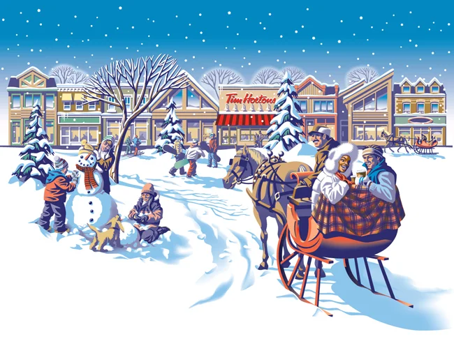
Everyone loves Tim Hortons coffee and doesn't everybody notice the art they use on the Holiday cup every year? The answer is a resounding 'Yes', isn't it?
Commissioned by Tim Hortons' branding and design agency, *PIGEON, Gary Alphonso illustrated the art for Tim Hortons' classic holiday campaign! Working with the Pigeon team, the art came together beautifully and was applied to the hot drink cups, bakery bags and boxes.
Everyone was thrilled with how it turned out and we are proud to share with you Gary's art and a few pics of the finished products.
Gary Alphonso for Northeastern Law Magazine
Art director Mark Gabrenya, chose Gary's powerfully evocative style for this Northeastern Law Magazine cover to illustrate the revisiting of U.S. labor rights after 75 years. [pinterest]
Gary Alphonso for the ROM's "God's Among Men" Exhibition
Gary was commissioned by Hambly and Wooley to create an illustration for research testing of an ad campaign for the Royal Ontario Museum (ROM). The results of the testing would determine the final concept direction for the "Gods Among Men" (Mayan Civilization) exhibition at the ROM. The client wanted to explore a more colorful vibrant direction that would only be possible with illustration, with the focal point being a Mayan King in full flamboyant costume, in the context of a Mayan village with pyramids and lush scenery. Gary says "The challenging part was to take bits and pieces from the mountains of research material provided by the ROM and depict how colorful these these "Gods among Men" would dress. The strange gestural pose was not accidental! It was important to show the stance these kings would strike to differentiate themselves from mere mortals." In the end the ROM, opted for a more photo based approach. Click here to see more of Gary's illustration.
Gary Alphonso for Harlequin
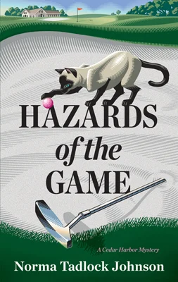
Gary Alphonso created a cover for the paperback edition of Hazards of the Game by Norma Tadlock Johnson. The art director wanted a very graphic feel to the cover where type would be a major element. They decided to place the text within the shape of the sand trap since the story takes place on a golf course. Another requirement of the illustration was to include some of the clues to the mystery: the pink golf ball, the discarded putter and the Siamese cat. The challenge was to design the illustration with the type from the early rough stages as opposed to creating the illustration and having the designer apply type after the fact. Here are two versions to show the importance of type - an early draft and the tweaked type that became the cover.
Gary Alphonso: Cover Image for ACC Docket
Gary worked with Jamie Mitchell, Creative Director at Bussolati, to create this powerful cover image for ACC Docket, The Journal of the Association of Corporate Counsel, on "How Tomorrow Moves: CSX Uses Scorecards to Help Outside Counsel Stay on Track". He uses the analogy of a child's toy train to illustrate how legal firms stay 'on track' with this program.
Gary Alphonso Illustrates the Village Voice 9/11 Cover
When John Dixon, art director for the Village Voice, called, he said, "We want a really powerful cover for this story about who has profited off of 9/11. We're naming names and dollar amounts." Gary Alphonso quickly got to work on the cover and I think his style was the perfect media for the message.
Gary Alphonso illustrates for SmartMoney
Gary has produced another trademark, heroic landscape for an article in the June issue of SmartMoney on Germany and their current explosion in exports - the bullet train being one of their many exports.
How Gary Alphonso became a Scratchboard Illustrator
We recently asked Gary Alphonso how he got his start creating Scratchboard/Woodcut style illustrations:
"During my early years a creative director approached me with an opportunity that would lead to my career as a “Scratchboard/woodcut” artist.
The time was the late 80’s just before scratchboard illustration enjoyed a huge surge in popularity. The client was a national clothing store chain called “Beaver Canoe”. It was at the time a major competitor to “Roots”, with an earthy outdoors feel to it’s product line.
The idea was to create a series of diamond shaped logos that would be very illustrative with a wood cut feel to them. They would represent the various product line, and be used in advertising, graphics on the clothing, and on in-store P.O.P. They became their trademark.
Gary's first traditional scratchboard illustrations (above)
That year (1988) they were featured in “Studio Magazine’s” Awards Annual. The timing couldn’t have been better. Scratchboard was about to become wildly popular in the 90’s. I quickly (and I use that term loosely because of how labour intensive the style is) began creating new samples on my own. I discovered and fell in love with early 20th century wood engravers and printmakers like Lynd Ward, Rockwell Kent, Frans Masereel, Giacomo Patri ...and the likes of. This was added to the passion I already had for the Art Deco period, the propaganda art that came out of Eastern Europe at the time, and the advertising and editorial art from the “West”.
At first the work was mostly black and white because of the nature of the scratchboard medium. This meant a lot of design (logo) packaging, and newspaper editorial work. As I slowly introduced colour to the mix, the advertising, magazine editorial, book, Annual report etc. work would follow. The phone kept ringing. I never looked back.
After years of success as a scratchboard illustrator it was hard to resist the role of the computer in the digital age. Very reluctantly at first, I began trying to adapt my style to the digital realm. As I became comfortable with this it became evident that carving shapes and lines out of black ink and clay had it’s limitations. With the computer I could keep this conceptual way of working (creating negative space while leaving the positive space behind) and carve these shapes out of colour instead of just black. This simple fact opened up many more doors creatively. The result was that I am able to keep evolving the style beyond the limitations of traditional scratchboard."
The evolution of Gary's work continues, however, sometimes the more things change, the more they stay the same--evidenced by a recent logo icon he created for a Bespoke Letterpress Printer in Chicago, Illinois. The retro appeal lives on!
Gary Alphonso's Dramatic Landscapes
Here's just a sampling of some of Gary's new work, check out his portfolio to see more,
"Alaska to Russia Bridge" was created for READ issue 16 - stories about the Future.
"Energy Stocks" - was done for SmartMoney as well as the image below, "Money Excavator" - both projects were art directed by Carly Tushingham.