Gary Alphonso: Creates Facebook and Twitter Banners

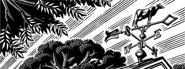
Recently, Gary Alphonso was asked by The Design Office of Ann Marie Ternullo to create this art for Maryland & Virginia Milk Producers Cooperative Association’s Facebook and Twitter pages.  The art was originally created for the co-op's annual report.  Ann Marie’s idea was to have the art modified by Gary, to create digital banners for their social media marketing–a very effective use of the art.  Elements within the art were moved around to accommodate the Facebook and Twitter logos while maximizing the impact of the image area.  Aside from offering a custom solution for their social media marketing it also took advantage of the branding established by the annual report, creating a nice continuity across platforms.  

As a master with Adobe Illustrator, Gary Alphonso creates everything from futuristic high tech art to vintage woodcut illustration--but it's always his dynamic compositions that carry his trademark style into any application so perfectly.

GA622-a-Weathervane-i2i-Banner
This is the original illustration Gary created for the Annual Report that was modified for use as in social media banners.

©Gary Alphonso_GA622_i2iArt

Check out Gary Alphonso's entire portfolio.


Gary Alphonso for Canada Post: Unveiling New Community Mailboxes

In response to the shrinking demand for snail mail, Canada Post has begun to phase in an expansion of it's Community Mailboxes (CMB's) vs door-to-door delivery.  The process of developing the CMB's was carefully executed with a strategy that involved lots of consumer input through focus testing at various stages in the development.  Canada Post was looking for the perfect CMB to take it's customers into the 21st Century.  One of the key criteria for the new CMB's was to develop an art wrap that would hopefully work as an anti-graffiti barrier.  This is where the call for Gary Alphonso's illustration talents came in.  

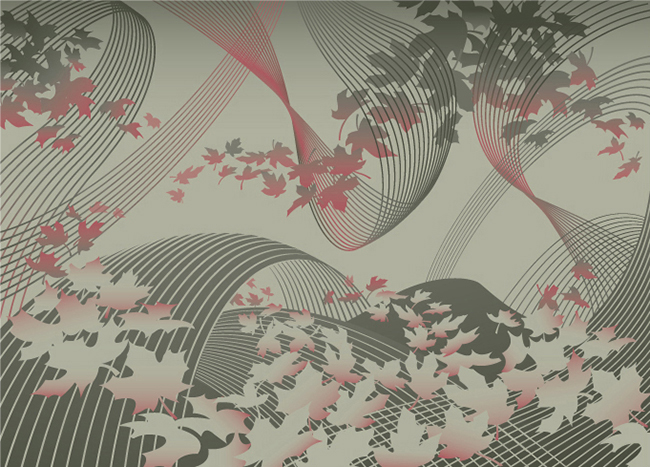
Working with the team at Ove Brand | Design, headed up by creative director Peter Baker, Gary Alphonso was given an open creative brief as they embarked on an exploration of various abstract directions.  The art evolved into a beautiful ethereal design that incorporated the maple leaf (a ubiquitous Canadian symbol), floating as if being carried by a gentle wind.   The process was a real contest but in the end, we are proud to report that Gary Alphonso's floating leaf design was among the most popular in focus testing.

Gary Alphonso's illustration applied as a wrap to the mailboxes.
©Gary Alphonso_GA672_i2iArt
Here are some pics of the mailboxes in communities across the country.

image-1


CommunityMailbox_GA

View Gary Alphonso's entire portfolio here!