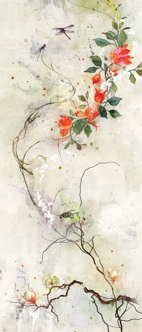
Please join us in welcoming the extraordinarily talented Sabina Fenn to our i2i Art roster! Thrilled to have her join the ranks we are even more pleased to share her work. Inspired by travels to sunny destinations Sabina’s illustration exudes warmth and tranquility. Working with watercolour, Sabina’s use of soft colours combined with gorgeous texture, tone and endearing subject matter make for illustrations that keep you coming back for more.
Read MorePour your heart out with Jane Austen and illustrator Clare Owen
Illustrator Clare Owen was recently asked to "team up" with one of her favorite authors, Jane Austen, and lend her beautiful visuals to the inspirational journal, 'Pour Your Heart Out'. Designed by Jessica Jenkins, Dana Li and Samira Iravani at Penguin Young Readers this journal invites its users to share their stories and aspirations with fun, thought provoking tasks.
Read MoreClare Owen: Paris Card for Papyrus
Clare Owen illustrated all things Parisian to form the handmade calligraphy for Paris on this greeting card. It features delightful icons which form the letters including a croissant, baguette, the Eiffel tower, a post lamp, champagne and a delicious café au lait. Beautifully produced by Papyrus, the special finishes bring Clare's art to life through the use of 3D tip-ons, foil stamping and glitter accents. Love the croissant pattern on the inside of the envelope--just one last delicious detail to make this card a perfect gem.
Want to see more? Visit Clare Owen's portfolio.
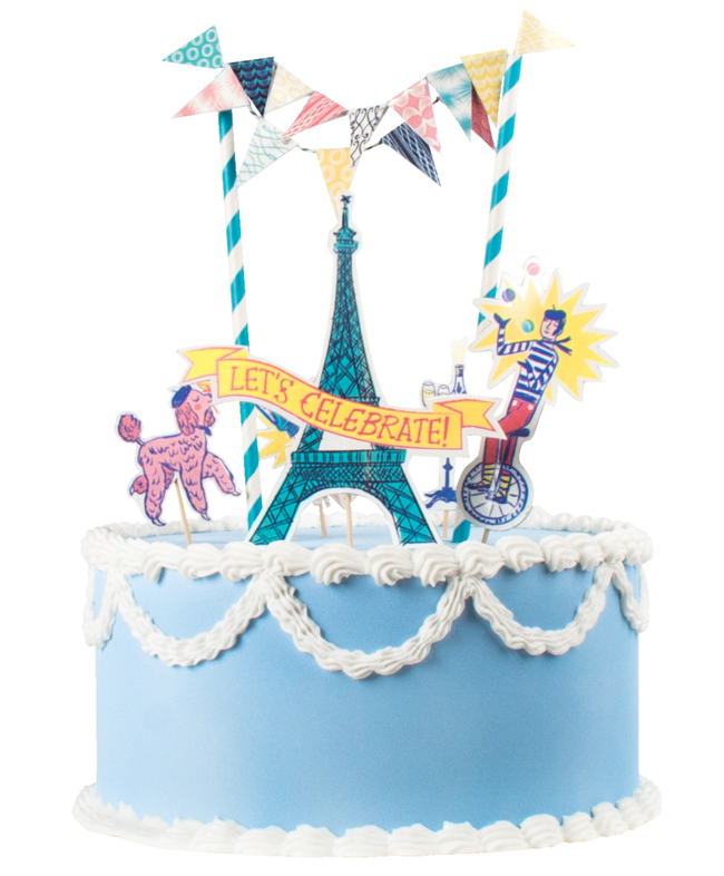
Katy Dockrill: Let's Celebrate!
What could be more fun than a soirée Parisian style? Katy Dockrill's whimsical illustration style will help you set the stage perfectly. Designer Timothy Siciliano of Party Partners, asked Katy to create the Let's Celebrate mini cake decorating set to add to the already successful Make a Wish and Queen for a Day party kits.
Want to see more? Visit Katy Dockrill's portfolio.
Mark Hoffmann's Mural at the Montserrat Gallery
The exhibition SEVEN: A Peformative Drawing Project at the Montserrat Gallery was a perfect opportunity for illustrator Mark Hoffmann to spread his creative wings even further. Mark, along with six other artists, put their creative process on display by executing a large mural on one of the gallery's walls in an open studio environment. The mural itself was meant to be the "residue of an artistic performance." We found both the process and the final product pretty spectacular.
Mark Hoffmann's 'Men of Mountains' Mural
Close up of Mark Hoffmann's lettering
We chatted with Mark Hoffmann after the show...
i2i Art: How were you approached with this project?
Mark: Leonie Bradbury (the gallery director at Montserrat College of Art, where I teach) contacted me in the fall to see if I had any interest. They usually try to get one faculty member involved and thought I would be a good fit with the other artists.
i2i Art: Was this your first mural?
Mark: Yes, and it was quite overwhelming.
i2i Art: Tell us about the piece. What was your inspiration?
Mark: I really wanted to paint a giant horse and started to research. Somehow I ended up reading about the early exploration of what would later become the first national park of the U.S., Yellowstone. In my research I found the story of the Cook, Folsom, Peterson expedition to explore and survey the land. I thought this might make a fun image with them, a horse, and geysers. I also had a previous color palette worked out that I wanted to apply to the piece.
i2i Art: What was it like working on that scale?
Mark: Difficult. It's hard to get a sense of the scale until it is right in front of you. I found that I had to stand back and look at it a lot, otherwise I wouldn't take the scale into full consideration.
i2i Art: The gallery was open while you were working on the piece, tell us about the atmosphere.
Mark: As I was working, quite a few folks stopped in to look, but very few chatted with me. They later told me they were afraid to interrupt. I must look deep in thought when I paint. It was nice to have the freedom to paint and explore at that scale and really knock people over with an image.
i2i Art: Do you have any tips, tricks or lessons learned you want to share?
Mark: I realized that some of the techniques I planned to use are hard on that scale and surface. Use a paint with primer in it (I used house paints) so you don't have to apply it twice to get good coverage. Bring plenty of Aleve and Tylenol, the work can be a little back breaking.
Hyperlapse: Watch Mark Hoffmann's mural come to life
http://youtu.be/RNxRIeZmY-Y
On view through March 28, 2015 at the Montserrat Gallery.
Mark Hoffmann offers a playfulness to his americana, folk art style. View Mark's entire portfolio.
Gary Alphonso for Canada Post: Unveiling New Community Mailboxes
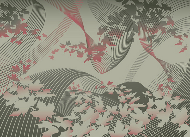
In response to the shrinking demand for snail mail, Canada Post has begun to phase in an expansion of it's Community Mailboxes (CMB's) vs door-to-door delivery. The process of developing the CMB's was carefully executed with a strategy that involved lots of consumer input through focus testing at various stages in the development. Canada Post was looking for the perfect CMB to take it's customers into the 21st Century. One of the key criteria for the new CMB's was to develop an art wrap that would hopefully work as an anti-graffiti barrier. This is where the call for Gary Alphonso's illustration talents came in.
Working with the team at Ove Brand | Design, headed up by creative director Peter Baker, Gary Alphonso was given an open creative brief as they embarked on an exploration of various abstract directions. The art evolved into a beautiful ethereal design that incorporated the maple leaf (a ubiquitous Canadian symbol), floating as if being carried by a gentle wind. The process was a real contest but in the end, we are proud to report that Gary Alphonso's floating leaf design was among the most popular in focus testing.
Gary Alphonso's illustration applied as a wrap to the mailboxes.
Here are some pics of the mailboxes in communities across the country.
View Gary Alphonso's entire portfolio here!
Mark Hoffmann for Land of Nod
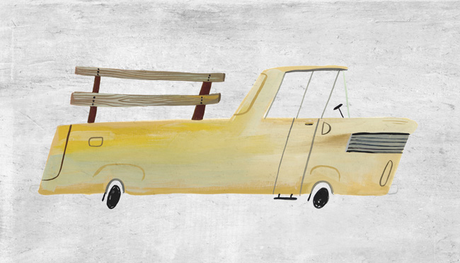
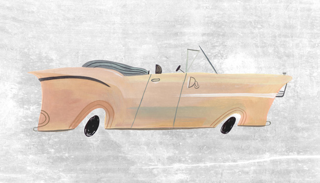
These very cool images by Mark Hoffmann are now available in framed prints! Land of Nod invites you to "Give your walls a tune up with this automotive wall art. Each print features a classic vehicle exclusively illustrated for us by artist Mark Hoffman and is framed in a distressed wood frame for a vintage feel." So whether it's a little kid (or big), who would love to have these unique limited edition prints, visit Land of Nod's online store here to purchase them.
Bus
Truck
Police Car
Convertible
i2i Art Inc. is proud to represent Mark Hoffmann and we'd love you to see his entire portfolio here.
Janice Kun for Hewlett Packard
These images are a sample of the art created by Janice Kun that comprised the 'Card of Good Intentions' for HP. With audio design by Randy Knott, Janice's award winning art was animated to count the days of Good Intentions for HP throughout the month of December. An ode to the holiday season! To see more of Janice's ethereal art take a peek at her updated portfolio here.
Katy Dockrill for Party Partners
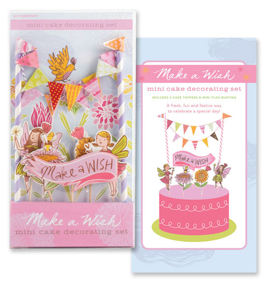
Katy Dockrill illustrated the Make a Wish and Queen for a Day bunting kits that are as sweet as the cake they're designed to adorn! Art director Timothy Siciliano of Party Partners fell in love with Katy's work when he discovered her surface design patterns and prints. Her line work is absolutely flirtatious and brings such a fun touch, fit for a party at any age! To see more of Katy's illustration visit her updated portfolio here.
Katy Dockrill for National Drapery
When art director Lila Graham first contacted us to work on the new website she was designing for National Drapery, it was an exciting opportunity for Katy Dockrill to bring her flair for sewing and love of home decor to an illustration assignment! The new ND website was the inspirational vision of Natalie Hartman, who was a delight to work with. Visit the ND homepage and see how Lila and Katy literally brought Natalie's vision to life here.
The new website design also included a series of drawings to highlight the many custom products National Drapery offers. Katy adores creating for surface design, so when Natalie asked her to include an indication of patterns to depict various textiles and bring some flair to these more technical illustrations, she was happy to oblige. The result? These little gems...we've combined a few of our faves here:
Our debut at Surtex 2013
Here we are ready for day one!
Featuring prints and patterns from participating artists: Sarah Beetson, Alanna Cavanagh, Harvey Chan, Katy Dockrill, Betsy Everitt, phil, Mark Hoffmann, Monika Melnychuk, Ian Phillips, Thom Sevalrud, Tracy Walker and Tim Zeltner.
From left: Ian Phillips, me (Shelley Brown), Tracy Walker, Betsy Everitt and Alanna Cavanagh.
Our pillow and plate presentation drew a LOT of oohh's & aahh's! Thank you Ian Phillips, for doing such a fabulous job of designing our booth!
Ian holds up two of our custom pillows seated below our fabulous plates! We held a draw for the pillows and plates following the show.
Tina Roth Eisenberg aka Swiss miss checking out our artists' work for some Tattlys!
Me (Shelley Brown) with Arren Williams, Creative Director at the Hudson's Bay Company.
Print and Pattern features Katy Dockrill!
SURTEX is only a few days away, and we are super excited to share the post Print and Pattern featured on Katy Dockrill. If you would like to see more of her bright and beautiful work in person, please visit us at booth #340 at the Javits Center in NYC from May 19-21.
i2i art's first ever exhibition at SURTEX!
If you're attending SURTEX next week, we hope you'll come by say hello and meet the artists. You can get a tiny sneak peek here, but when you visit us in person, we'll share our newest collections! If you'd like to arrange to sit down and chat about your needs, we're happy to set aside some time for you. Just call or text Shelley Brown at 416-505-6847, or email shelley@i2iart.com.
Bring on Spring!
Time to look forward to sunny days in the garden!
See more of Katy Dockrill's sunny illustrations here.
'In the Garden' by Katy Dockrill.
Happy Howlidays from Monika Melnychuk!
After illustrating the Dogbook app, Monika Melnychuk was asked by Geoffrey Roche, of Poolhouse Enterprises, to dress up the dogs for the 'howlidays'! Monika had tons of fun doing the illustrations (cards designed by Poolhouse). To check out the poodle sporting a string of holiday bling to the mischievous gift ripping duo, and the adorable Chiuaua aka"Rudolph's brother from another mother", click here to get to visit the Dogbook Facebook page (and while you're there go ahead and send a free e-card to your favorite 'pet'!).
i2i Artists Support LGBT Youth Line
i2i artists Thom Sevalrud, Ian Phillips and John Webster are 3 of 20 artists and designers commissioned by Shaun Moore of MADE to create custom auction paddles for the Lesbian, Gay, Bi, Trans, Youth Line's upcoming yearly Line Art Auction taking place November 6th at the Neubacher Shor Gallery. Ian Phillips' paddles inspired by his beloved dog and muse, Fancy Polanski, RIP.
John Webster's paddles, everything Webster wonderful...do I hear bling, bling?
Thom Sevalrud says, "The concept for my paddles was influenced by Semaphore signalling flags. I used the Semaphore alphabet to create the word YOUTH. Then I took liberties with the designs by 'complicating' them with flamboyant and crazy patterns that I made myself. The overlaying word QUEER is meant to complete the visual statement to go along with the symbolic representations to form the words QUEER YOUTH. Defiant, colorful and individual!".
[pinterest]
Who's growing a new stache for MOVEMBER?
About a month from now, men from around the globe will be sharpening their shaving tools of choice, to clear way for a fresh Movember canvas. Mo Bros., with the support of their Mo Sistas, work towards a well groomed stache to prompt private and public conversation around the often ignored issue of men’s health, specifically prostate cancer and male mental health initiatives. Looking for some stache ideas? The surface design pattern below, by Ian Phillips was created with fabric and wallpaper in mind, but it may inspire the perfect design for you. All the fun aside Bros., we hope to inspire you to get your pledge machines fired up and grow for the cause.
[pinterest]
Monika Melnychuk for Dogbook iPhone App.
Monika says, "I have been a dog geek forever. When I was a teenager I drew x-mas and birthday cards with dogs. Then I worked dogs into any assignment I could. For example in first year illustration we had to design a shopping bag and mine of course, was all dogs. Before I became an illustrator I tried being a dog portrait artist. Wow, I am a nerd, but I just love dogs!" Fast forward... Geoffrey Roche, partner at Poolhouse, saw some of Monika's dog drawings and he had to have her illustrate the landing page for the new Dogbook iPhone App. Can you spot *your* dog? If you're looking to connect with like minded doggie lovers get the free app here. Also below, see a recent piece on the theme, created for surface design applications.
We think it would make a cool wallpaper or fabric for your favorite dog house.
Monika and her dog Boogaloo share a breathtaking moment in their beautiful world.
Thom Sevalrud in Season Opener: Art Show + Launch Party
Garrison Creek Bat Co. is kicking it off in style with an art show! Come check out the custom-painted bats by a ton of great illustrators and artists tonight (April 26th) at AWOL Gallery, 76 Ossington Ave. Opening runs from 7pm to 10pm--more info here. Here's a sneak peek of Thom Sevalrud's bat in progress.
Meet Mark Hoffmann
Graduate, BFA, from Rhode Island School of Design in illustration. He's just gone live on our website so you can check out his work here. A great big i2i welcome to our new artist Mark Hoffmann!
