It’s the most wonderful time of the year and Canada Post’s highly anticipated Holiday stamp has arrived! Tim Zeltner was selected to work his folk-art magic alongside Jocelyn Saulnier from Joce Creative, to design a timeless series of collection-worthy stamps. Featuring three distinct and unique regions in Canada, the seamless horizon navigates through a cross-country wintery wonderland. Traveling from perilous mountain peaks to whimsical lighthouses, Tim enchants and enthrals like never before.
Read MoreDave Murray illustrates for the Heritage Classics
Dave Murray’s ongoing passion for hockey is no secret. If you’re familiar with his work, it’s easy to see why NHL VP of Creative Paul Conway and Fanbrandz Creative Director Bill Frederick commissioned Dave to illustrate this incredible series for the 2022 Tim Hortons NHL Heritage Classic. Taking into consideration the Steeltown history of the game’s location in Hamilton Dave set to work, infusing each illustration with an industrial edge. Dave’s unique graphic style and use of texture give these players depth and movement. Talk about a perfect match!
Read MoreIllustrator Thom Sevalrud Awarded 3x3 Magazine's Educator of the Year
We are thrilled to announce that our very own Thom Sevalrud has been named this year’s Illustrator/ Educator of the Year by 3x3 Magazine.
Thom’s bold colour choices and geometric patterns are just a few elements that make his illustration so intriguing. Thom attributes his light and airy style to growing up in the open space of the prairies. Combing his unique use of line and texture, Thom’s conceptual illustration has an added a layer of depth that draws you in and tells a story.
Read MoreMonika Melnychuk for Owl Magazine
It always pays to be prepared! Owl Magazine, art directed by Jill Monsod, has put together a pretty handy guide to the 'great outdoors' for their Summer issue. i2i Art illustrator Monika Melnychuk knew quite a bit about this topic already, spending much of her leisure time biking through the backwood trails in Whitehorse, Canada.
And Monika's illustrations give a humorous twist on those all too important survival lessons. Have a quick read and smile along the way as Monika's characters show us a thing or two about those great outdoors.
See more of Monika's endearing characters and illustrations. Monika Melnychuk is represented by i2i Art Inc.
Mark Hoffmann for The Square Magazine
Mark Hoffmann, New Hampshire resident and illustrator, knows there is nothing better on a nice summer day than some fresh fish on the waterfront. Chip Allen, art director of The Square Magazine and Meganne Febrega, author of the article "Hit the Decks" knew Mark's folk art style would capture the scene perfectly.
With Mark's distinctive lettering, whimsical imagery and sophisticated color palette used to highlight the premier eateries, you will want to book one more road trip this summer--I certainly did!
See more of Mark Hoffmann's work. Mark is represented by i2i Art Inc.
Clare Owen for Cooking Light's Summer Cookbook
Food is a favorite subject matter for Clare Owen so when given the opportunity to contribute her illustrative talents Cooking Light's Summer Cookbook Clare was thrilled.
The "Farmer's Market" edition was art directed by Sheri Wilson and showcases three fabulous city markets every foodie should know: Portland's market at PSU, Chicago's Logan Square and Philadelphia's Headhouse market.
Clare's main illustration accompanies an article on "how to shop" and features all the elements you look for in a great farmer's market. Clare's rich color palette and use of texture brings the 'scene' to life. Her contemporary style shows just how hip shopping at the market can be.
Hungry for more? View Clare's complete portfolio. Clare Owen is represented by i2i Art Inc.
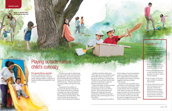
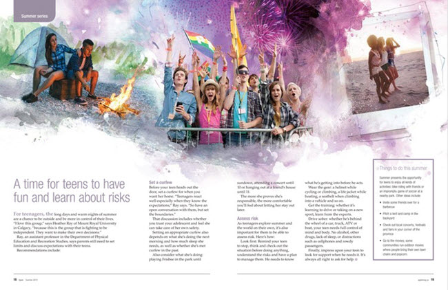
Janice Kun for apple Magazine
Amy Sawchenko, art director at apple Magazine recently commissioned Janice Kun to illustrate a six-page feature on summer activities for all ages. Amy definitely wanted to capture the fun and excitement the season brings.
Janice combined photography with her bright and beautiful watercolor backgrounds to create these playful and exciting digital collages.
Janice always strives to create the perfect composition; balancing hand-drawn elements and watercolors with photography and other mixed media. Her photo-illustrations range from somber to evocative to fun.
View Janice Kun's portfolio, represented by i2i Art Inc.
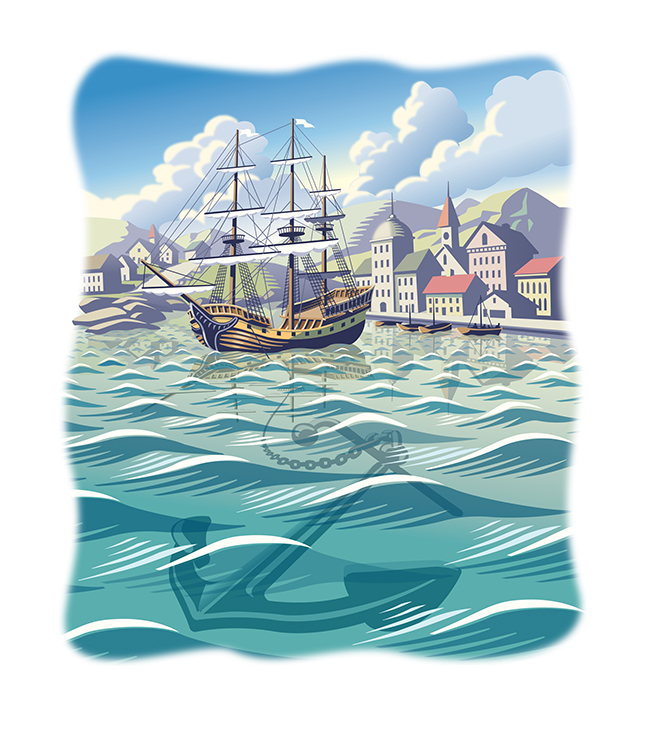
Gary Alphonso for Ensign Magazine
Scott Knudsen, art director for Ensign Magazine, came to Gary Alphonso with a story of faith and sacrifice. Looking at the opening paragraph, the metaphor that inspired these beautiful pieces was clear -- "A ship is safe in the harbor, but that's not what ships are for."
The article, "Faith to leave the harbor" showcases Gary's classic, digitally rendered, scratchboard style and the nautical theme highlights Gary's real ability to capture motion and light in his illustrations.
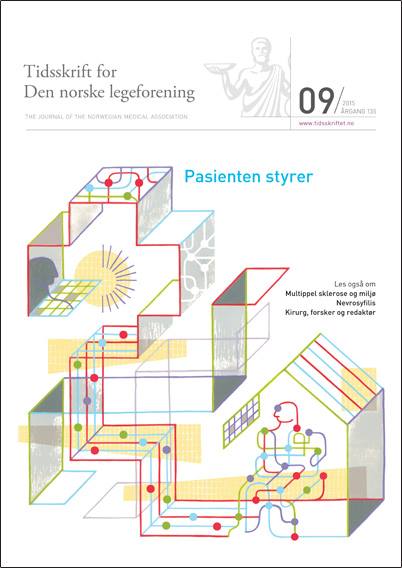
Thom Sevalrud for The Journal of the Norwegian Medical Association
Thom Sevalrud had the pleasure of illustrating yet another cover for The Journal of the Norwegian Medical Association this past month. Art director Lotte Gronneberg chose the prefect topic for Thom's style.
Thom's piece depicts how technology will change the role of patient care in the years to come. As Thom often does, he gives us the sense of the enormity of these decisions and how very personal they can be.
'Patient Technology' by Thom Sevalrud
Cover of The Journal of Norwegian Medical Association
See more conceptual illustration by Thom Sevalrud. Thom Sevalrud is represented by i2i Art Inc.
Dave Murray for National Magazine
When tech collides with the standard way of doing things. Illustrator Dave Murray is often asked to visually interpret this concept. Most recently, art director Tony Delitala of Delitala Design, assigned Dave to illustrate two high tech articles for the Canadian Bar Association's National Magazine.
Dave's strong use of symbolism, conceptual intelligence and graphical style invites the reader to dive into these stories.
Technology can help make justice more accessible
Heavy workload? There’s an app for that.
Check out more of Dave's work. Represented by i2i Art Inc.
Eric Chow for Remodeling Magazine
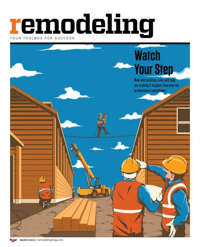
With ever-changing rules and regulations, remodeling you home or office is no picnic. Remodeling Magazine tackled this topic in the feature article "Watch Your Step" for their March 2015 issue.
The design team at Hanley Wood knew a conceptual solution would be best to illustrate the fine line contractors walk between safety and regulations. Illustrator Eric Chow worked closely with them to come up with this clever tightrope analogy.
Eric chose to put a menacing face to the dangers of lead paint removal for the inside story.
Looking for a new way to tell your next story? Visit Eric Chow's complete portfolio at i2i Art.
Monika Melnychuk for Wine & Spirits Magazine
The Wine & Spirits 26th Annual Restaurant Poll is out this month with their famed list of the top 50 wines Americans love most. This year's cover showcases the elite bunch of sommeliers that help make these decisions. The sophisticated playfulness of Monika Melnychuk's illustration style couldn't have been a better choice to capture the group's likeness.
Armed with all the pics art director Michael Rush could get his hands on, Monika meticulously drew each somm's portrait, happily revealing a little (or a lot) of each personality and style.
Dave Murray for Reader's Digest, "Birders Unite!"
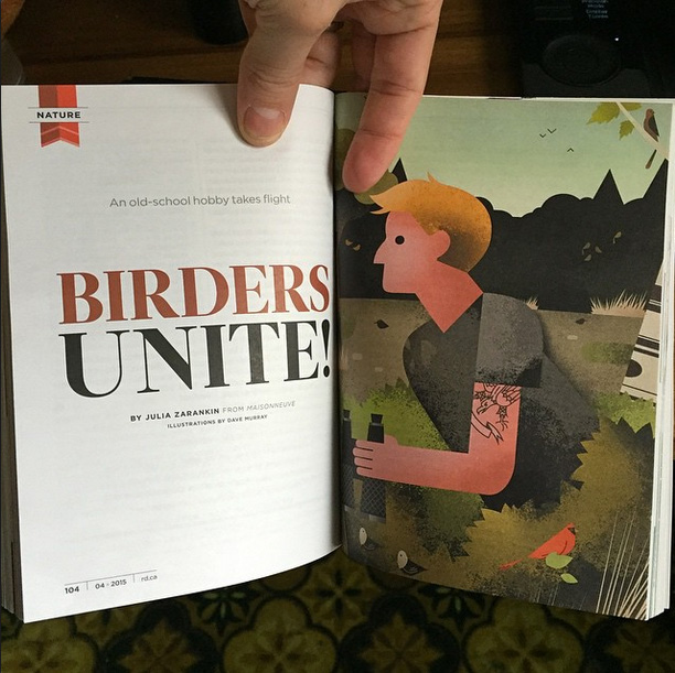
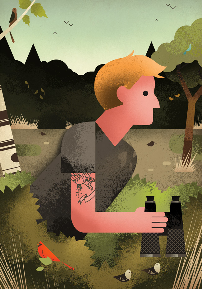
Hipsters: known for ransacking vintage stores, perfecting their beards and gentrifying neighborhoods with their artisanal food stores. It seemed likely they should revitalize some old school hobbies while they are at it. Like bird watching.
This month's Reader's Digest article, "Birders Unite!" written by Julia Zarankin, dives into the phenomena of the bird watching millennials. Needing to combine the tattooed with the wilderness, art director Annelise Dekker picked the perfect artist in Dave Murray.
Caution: These are not your grandfather's illustrations:
Uniquely stylized, award-winning illustration. We invite your to check out more of Dave Murray's illustration.
Clare Owen for Everyone Loves Paris
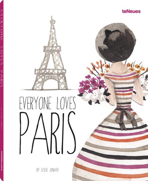
teNeues has published a lovely new collection of all things Paris. Everyone Loves Paris is edited by the talented Leslie Jonath--who fell in love with Clare Owen's Paris illustrations. Leslie artfully curated this wonderful collection from renowned illustrators around the world. Needless-to-say, Clare (a self proclaimed Francophile) was delighted to contribute her art!
teNeues has this to say about the collection, Everyone Loves Paris includes tributes from over 50 illustrators from around the world. From grand landmarks—such as the Eiffel Tower, Sacré-Cœur Basilica, and the Louvre Pyramid—to the small pleasures of daily life, each image expresses the joys of this marvelous city through the perspective of each artist’s brush...Everyone Loves Paris is a delightful meander that will inspire you to view the City of Light from a new angle and in a multitude of styles."
Here now is the cover featuring a lovely ©Emma Block Illustration
Clare Owen's Chat Noir and Aujour d'hui
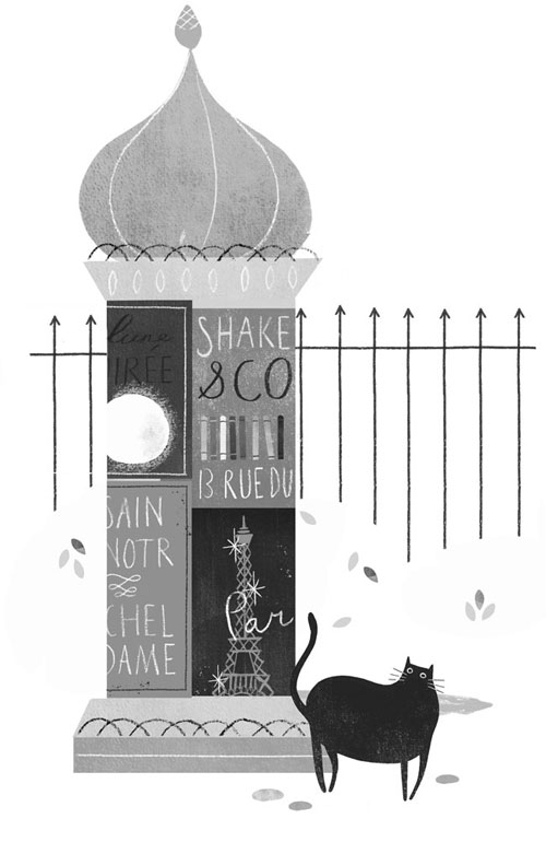
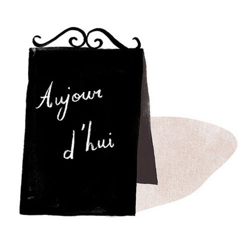 Feast your eyes on Clare Owen's delightful portfolio.
Rémy Simard for apple Magazine
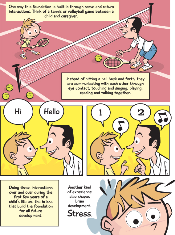
It's never easy to explain a complex theory, never mind making it an enjoyable experience. When Editor Terry Bullick at apple magazine was tasked with a story about brain development she turned to illustrator Rémy Simard to help her communicate this intricate topic to her readers.
Rémy's fun, lighthearted, comic book style was the perfect way to break this story down into easy to understand concepts. A quick 5 minute read and you too will be an expert on brain development.
Visit Rémy Simard's portfolio for more examples of his unique illustration.
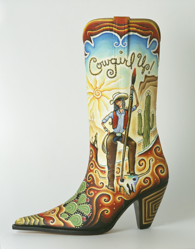
Tim Zeltner for Cowgirl Up: 10th Anniversary Art Exhibition
Typically Tim Zeltner paints his illustration on wood, but when the Desert Caballeros Western Museum approached him to paint on a leather boot for the annual Cowgirl Up award, he was up for the challenge! This boot would become the 'glass slipper' to be awarded to a woman who captures the spirit and the lifestyle of the West each year at the popular springtime exhibition.
The 2015 exhibition is opening today. Join the Desert Caballeros Western Museum as they celebrate the 10th Anniversary of Cowgirl Up! As a special offering this year, the museum asked Tim to paint another boot with a 10th Anniversary painted on it! Check back--we'll share more news and pics of the event next week.
Check out Tim Zeltner's entire portfolio.
Janice Kun for the Government of Ontario
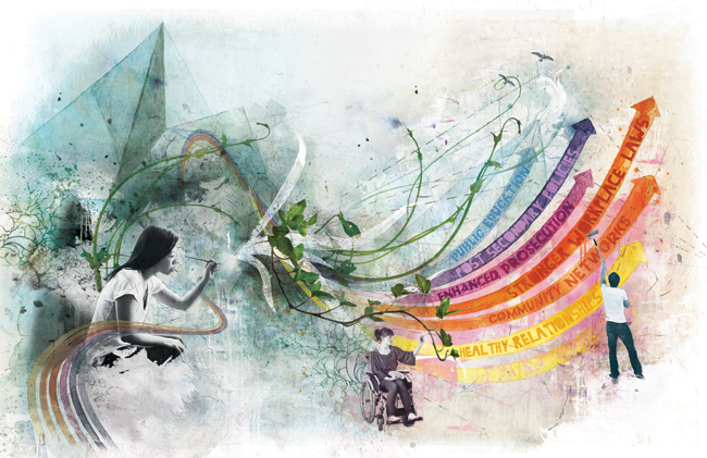
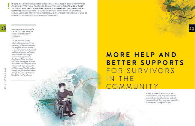
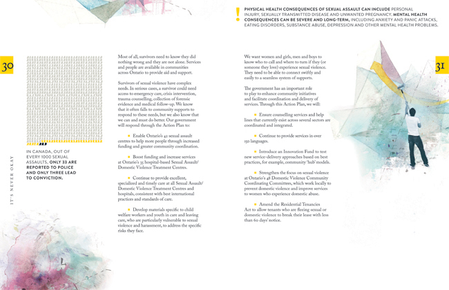
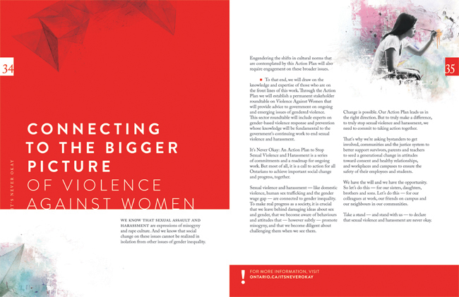
Janice Kun collaborated with Deirdre Hughes, creative director with Agency59, to create the illustration used for Kathleen Wynne's Government of Ontario Sexual Violence and Harassment Action Plan. Both an honour and a challenge, the art needed to show the optimism the new Action Plan promises, while at the same time representing the struggle and the work to be done on this important societal problem.
To accomplish all of this, Janice's illustration needed to take a conceptual approach in showing the urgency and the action to be taken on the issue of sexual violence and harassment. Through her unique blend of photography, hand rendering and digital collage, Janice's mixed media illustration set out to do all this.
Below in the main double page spread of the report, three figures work together to reshape a landscape that moves rhythmically from the darkness of an abstracted, geometric background, into one of brighter, bolder colours, and organic shapes. Their dialogue sparks the process of change by writing a new script, painting a new horizon, and cultivating new growth.
Tim Zeltner for Henry Holt's Power Down Little Robot
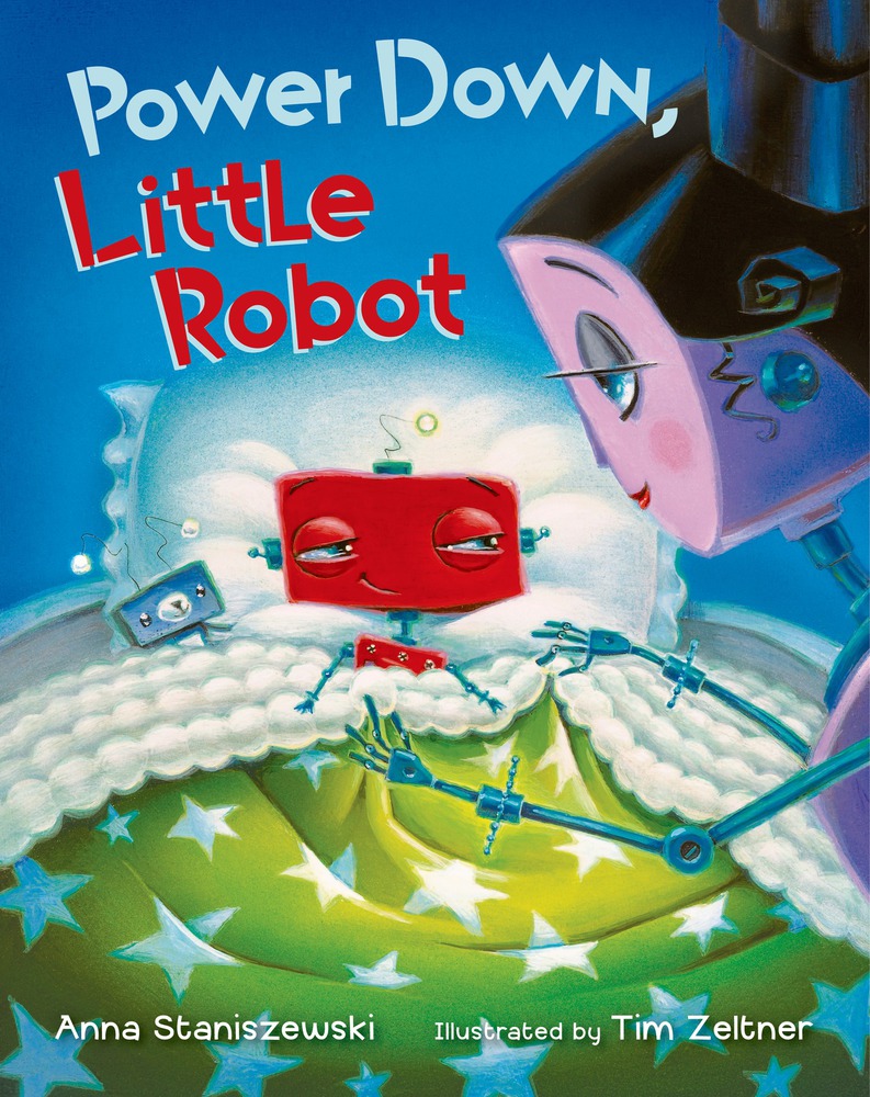
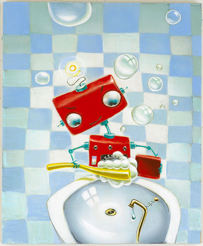
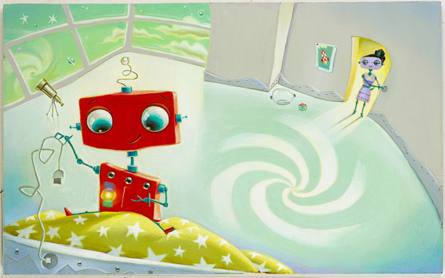
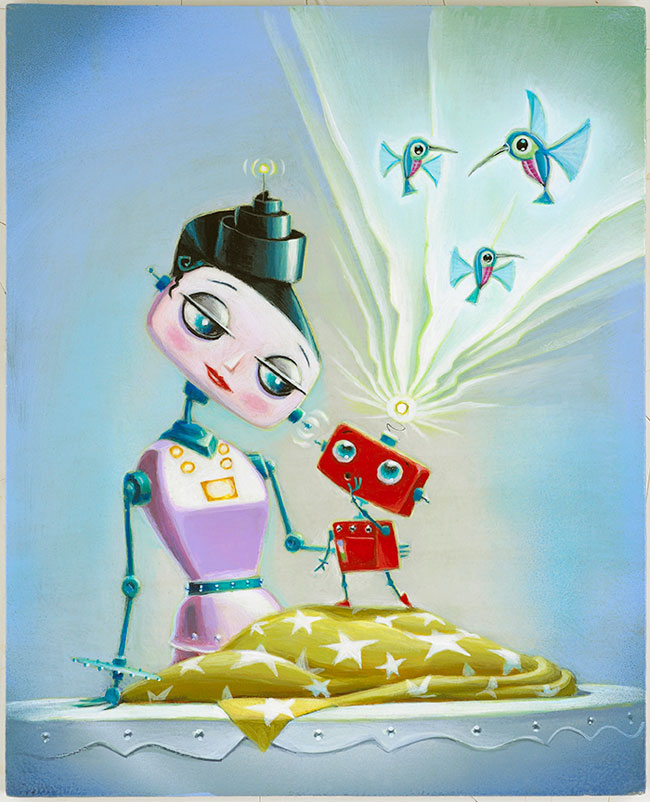
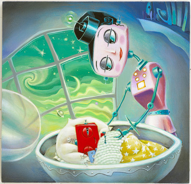
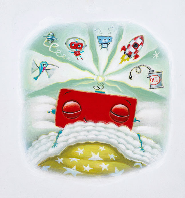
Power Down Little Robot, is a very special children's picture book lovingly illustrated by Tim Zeltner and written by Anna Staniszewski. When it's time to power down for the night, Little Robot is not ready and he quickly opens his stalling program. From there, the story is very familiar to avoidance experts everywhere (mombots and dadbots), and told with one fun twist after another. In the end Mom Unit knows how to get him tucked in to his module as he finally powers down.
Sally Doherty, Executive Editor for Henry Holt Books for Young Readers, fell in love with Tim Zeltner's art. Power Down, Little Robot is the second picture book she has commissioned him to illustrate. Upon receiving Tim's final art for the book Sally's reaction was, "Wow! You've done it again--you've really knocked us out with your extraordinary vision for this story. I just love everything about what you've done: the colors, the style, the expressions. Fantastic!" Well deserved praise for Tim Zeltner's beautiful hand painted illustrations on wood.
"Now hurry and clean your cogs.", says Mom Unit. The Little Robot says to himself, "I try to brush them at half my normal rate, but nothing gets past Mom Unit's sharp eye."
"But I'm not tired! Look. My power level is still at yellow."
"But I need to tell you a secret!...Did you know that a hummingbot flaps its wings a million times a second?"
"The sleep module is soft and warm. Maybe I could close my eyes for a millisecond..."
"Dream sequence initiated."
Dave Murray for Canadian Grocer
The always enthusiastic Dave Murray jumped at the chance to work with art director Lindsay Maclachlan again on a feature article for Canadian Grocer. Dave often illustrates technological innovations so the brave new world of in-store technology at our local grocer was a perfect match for Dave's style.
The Future of the Grocery Store
smartphones and tablets could dominate our grocery shopping experience
Greg Stevenson for Dreams on Wheels Reader
Greg Stevenson created these instructional illustrations combining his playful doodles, line-work and hand lettering with a photo-collage approach for educational publisher Developmental Studies. SIPPS (Systematic Instruction in Phonological Awareness, Phonics, and Sight Words) is a program for new and struggling readers from kindergarten through grade 12. The main criteria for the art was to decode the stories to visually assist the reader with comprehension.
Check out Greg Stevenson's versatile portfolio.
