Welcome illustrator Talya Baldwin

Welcome to the illustrated world of Talya Baldwin.  Armed with her inks, paints, biros, coloured pencils, pastels, wax crayons and felt tips Talya astounds us with her technical brilliance and the beauty she sees in the most interesting of subjects. We had to find out more about Talya. 

What first inspired you to be an illustrator? 

When I was three or four, my dad made me a tiny and very beautiful wooden table and chair. I kept my crayons and paper on them and that’s where I’d sit for hours, drawing castles and witches and fairies. My desk is slightly bigger these days, but essentially I’m still doing the same thing.

Can you give us some insight into your creative process? 

My creative process is intense and a bit chaotic but always the same: I wake up in the middle of the night and think ‘I know EXACTLY how I want this drawing to look. I can see the colours and the direction of the lines and the way there’s so much energy in it it’s almost humming with life.’ And then I leap out of bed in the morning and make such a pale, disappointing imitation of that image that I feel completely bereft and inadequate. It was a relief to discover, over the years, that almost all artists feel this way, and that the trick is to keep working - you’ll never re-create the shining image in your head, but you might get a bit closer!

Whatever was imagined, we find Talya's efforts extraordinary.

How would you describe your work?

For me, it’s mostly about making the invisible visible. I like drawing things that might otherwise be overlooked because they aren’t grand or celebrated, like weeds, feral pigeons and minor characters from the edges of fairy tales. As a child I was always fascinated by the last prince in the story of the Six Swans; the one who was left with a single white wing because the magical jersey he was meant to put on to regain his human form had a missing sleeve. What on earth happened to him in later life? How did he explain it to people? And how did he ever open a tin of beans? I draw him over and over again because he seems to represent everything I’m interested in: fragility, tenacity and not quite fitting in with everyone else.

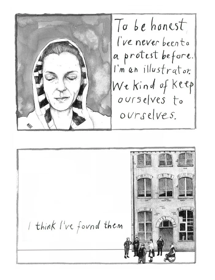
Talya Baldwin has been recording the stories of asylum seekers at Yarl's Wood Immigration Centre, and at the refugee camps in Calais. Yarl's Wood is effectively a women's prison for migrants, except that none of them have committed any crime. These illustrations below are a testament to Talya's commitment to make the invisible visible.

Are there certain themes you enjoy illustrating? 

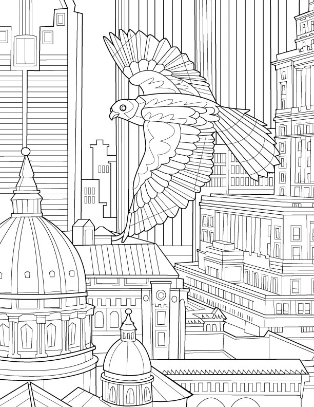
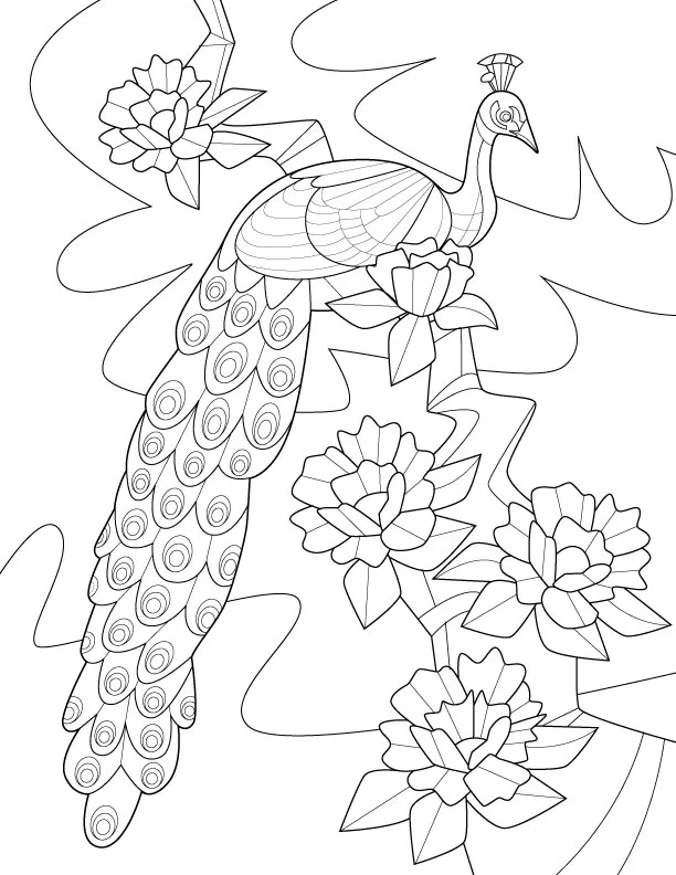
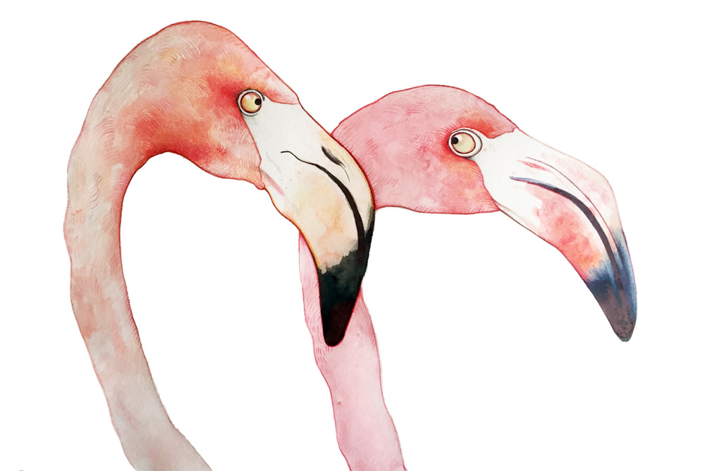
I draw birds endlessly. I love corvids - crows and ravens especially - because they’re so mistrusted. Our culture is full of images of ravens as bad omens and symbols of death, witchcraft and so on, but in reality they’re hugely intelligent and I’ve always thought they were very beautiful, too.

What are you working on currently? 

I’m part of the NOMAD collective which makes art in unconventional spaces; we’ve been working on the Phytology Project, an apothecary garden on an East London estate in which all the plants are weeds with proven medicinal properties. At the moment, I’m also working on a new project with illustrator Simon Manfield in collaboration with the Scottish Seabird Centre. We’re raising awareness of endangered sea birds by making a series of drawings, copies of which will be floated at sea in tiny, GPS-tagged boats.

I also work on arts and health initiatives with children. These are creative projects designed to raise self-esteem, give children a sense of pride in their work and help them generate artworks that bring communities together.

Interior illustrations from Talya's recent picture book, Fox's Party, below.

Talya Baldwin studied at the Wimbledon School of Art, and then later at Edinburgh, and Saint Martin’s (in London) for her Master's degree. Talya is represented by i2i Art Inc. 

Dave Murray illustrates Toronto for Airbnb

The folks at trevor//peter were coordinating a series of events for Airbnb this summer and they needed a wow factor. Taking place in the heart of Toronto, Canada the team decided a map of the city - 10 feet x 15 feet - would be the perfect way to draw the crowd to their booth. 

Illustrator Dave Murray, a proud Torontonian, was chosen to work on the project. Dave quickly assembled a brilliant collage of Toronto's coolest neighborhoods and points of interest. Graphic, bold, colorful, the piece beckons you to point out where you live or where you need to visit. 

Check out more of Dave Murray's illustration. Represented by i2i Art Inc. 

Dave Murray illustrates for Canadian Business

Inspired by the upcoming summer weather illustrator Dave Murray has created some pretty clever 'sand and surf' metaphors for investing now featured in the Canadian Business Investor 500 Guide. Art directed by John Montgomery. 

Stock picks from the pros. How to land the next big fish.

Stock picks from the pros. How to land the next big fish.

Screening out ordinary equities.

Screening out ordinary equities.

Five-star stocks that have nearly doubled the market's average annual return.

Five-star stocks that have nearly doubled the market's average annual return.

Janice Kun for USC Dornsife Magazine

Our genetic blueprint is still a very mysterious concept. For the article "Molecular You" in the most recent issue of USC Dornsife magazine, Janice Kun captures that mystery and intrigue in a series of beautifully atmospheric illustrations. Using a combination of line drawing, watercolor and photography Janice's imagery provides layers of subtle, yet powerful, detail. With incredible art direction by Daniel Knapp we are given the chance to ponder the impact of our DNA through Janice's work.  

See more of Janice Kun's illustration. Represented by i2i Art Inc

Thom Sevalrud for Stanford Social Innovation Review

The Stanford Social Innovation Review tackles some of the more interesting questions asked in the social sector today and thoughtful, conceptual illustration plays an important role in creating a visual understanding of these topics. And so art director David Herbick chose illustrator Thom Sevalrud for the Review's latest cover; a story on how nonprofits and social businesses can use data for action and for impact. Thom's elegant use of symbolism, strong lines and composition truly captures the transforming nature of this article. 

Katy Dockrill for LCBO 'Hello Spring' Campaign

Nothing symbolizes Spring quite like a cherry blossom. When you walk into any LCBO this month you will be greeted by the bright and simple beauty of this bloom. Brad MacIver, creative director at the Liquor Control Board of Ontario, had worked with illustrator Katy Dockrill in the past and knew the wow-factor her lines could create.

The bold signage for the 'Hello Spring' campaign adorns the shelves and windows of the stores, beckoning you to pick up a bottle of something for those evenings on the porch.

Thom Sevalrud for Maryland and Virginia Milk Producers Cooperative

For the Maryland and Virginia Milk Producers Cooperative Association, the theme is change and The Design Office of Ann Marie Ternullo called on Thom Sevalrud to help illustrate this conversation.

For the cooperative's 2015 annual report Thom's clean lines and stylized approach provided a future-forward look at the client's complex industry. The fresh green color palette invites the reader and the illustration is cleverly carried throughout. The report is also printed (what a treat!) in an impressive 10"x13" format creating a stunning impact.

We have a special place in our hearts for great design. The collaboration between Ann Marie Ternullo and Thom Sevalrud created a truly special artifact.

Adirondack Icons by Phil

When I first spoke with art director Kelly Hofschneider at Adirondack Life Magazine she told me Phil's work has been pinned up at her desk for years. That's when you know it's a perfect match. Phil's nostalgic style captures the spirit of the beautiful Adirondack region. Described as rustic, naive and iconic Phil's illustration tells the story of the area through its landscape, animals and people.

Monika Melnychuk Posters for 24 Hours of Light

"Ride all night long in the glow of the midnight sun" is the enticing caption to this year's 24 Hours of Light. This is a mountain biking event held each summer in the rugged wilderness of Whitehorse, Yukon. Mountain biking is one of Monika Melnychuk's biggest passions--illustration being the other.

When asked to create the posters for this event Monika tapped into her funky sense of style to illustrate some out of this world bike designs along with a couple kick-butt characters. Wild pops of color, original lettering, great expression and a serious sense of whimsy typifies Monika Melncyhuk's illustration.

Check out more of Monika Melnychuk's illustration. Represented by i2i Art Inc.

Mark Hoffmann for Cooking Light

Not an easy task, illustrating a story about love, loss, and fruit salad. The author and copy director for Cooking Light, Susan Roberts McWilliams, "wanted the article to have a lot of hope and thankfulness to it." Mark Hoffmann's illustration was the perfect compliment to this touching story about how we respond with food when someone loses a loved one.

Delight in the details and composition of these richly painted down-home pieces. Feature art directed by Sheri Wilson and 2015 winner of the SPD merit award for Single/Spread Illustration in the Lifestyle, Travel/Food/Shelter category.

SPD merit award for Single/Spread Illustration

SPD merit award for Single/Spread Illustration

Love, Loss & Fruit Salad

Love, Loss & Fruit Salad

Friends, Family and Casserole

Friends, Family and Casserole

Pot Pie With Love

Pot Pie With Love

Home is Where the Slow Cooker Is

Home is Where the Slow Cooker Is

Greg Stevenson's Poster for 'The Audience'

It was great to connect with our longstanding client, art director Wade Gilpin at Rossignol Design, for this special assignment. Illustrator Greg Stevenson, with his ability to create an uncanny likeness, was the natural choice for this poster of Fiona Reid as Queen Elizabeth II in the upcoming Mirvish production of "The Audience". Not a small feat, to create two likenesses in one portraiture, but Greg pulls is off beautifully. With the use of luminous, rich color the illustration is undeniably regal and with that smile Fiona's character shines through.

 View more of Greg Stevenson's illustration. Greg is represented by i2i Art Inc.

Dave Murray for William & Mary

We are in "a new universe of information overload" and our education needs to reflect that. The College of William & Mary was excited to share their strategy for addressing this new age of information and enlisted the help of illustrator Dave Murray to do so.

Featured in the W&M Alumni Magazine, Dave captures the rich potential of a liberal arts degree from this prestigious school. "The liberal arts is, in fact, going to be necessary to navigate the coming world." Dave's colorful palette and mosaic of elements brings out the wonder and complexity William and Mary is preparing it's students for.

Lift Off! An education to prepare you for a new universe of information overload.

Lift Off! An education to prepare you for a new universe of information overload.

A liberal arts degree will be a necessity in navigating the coming world.

A liberal arts degree will be a necessity in navigating the coming world.

It's a matter of training your mind in a new way.

It's a matter of training your mind in a new way.

Carl Wiens for National Underwriter Property & Casualty Magazine

Security for cyber coverage, not an easy subject to illustrate and Tim Schafer, art director at National Underwriter Property & Casualty magazine, didn't want any of the typical metaphors. So conceptual illustrator Carl Wiens created this clever image. What could be a better metaphor for the diligence needed to protect oneself from the creep of cyber threats then the ever-present task of mowing your lawn. With bright color and sophisticated shapes the article demands that the reader take notice and quickly the connection is made - you can't let either lapse.

Additional spot illustrations by Carl Wiens use the same bright palette and intriguing imagery to highlight some key tips.

Let Carl Wiens tackle your next assignment. See more of Carl's work.

Gary Alphonso Mystery Book Covers for Harlequin

Gary Alphonso began his career as a scratchboard illustrator in the 1980s. That is where Gary learned the precision of line and shadow evident in his work today.  As Gary evolved his technique, he began creating 'scratchboard' art in Adobe Illustrator, in both black and white and full color. 

These cover illustrations for Harlequin's Worldwide Mystery Series featuring Vicki Delany's Constable Molly Smith showcases Gary's ability to create drama through perspective and lighting in a retro poster art style. His technique, perfected over many years, creates a stunning outcome.

The latest in the series, Negative Image will be in stores March 2016. 

Katy Dockrill for Oregon Home

Illustrator Katy Dockrill is often inspired by the color, texture and lines found in her garden, so the "Tiny Gardens" article in Oregon Home magazine was a great opportunity to emulate nature's flora. Art directed by Snow Blackwood, Katy imagined four different tiny garden spaces and with a lot of attention to detail and her gorgeous hand lettering Katy educates us on the right tiny plants to fit each space.

Want to see more? Visit Katy Dockrill's portfolio

Birds of the World: Adult Coloring Book by Remy Simard

Often labelled as a way to tap into your inner child I'm here to say that adult coloring books deliver more. Much more. When our artist Remy Simard was approached by Blue Star Coloring Books to illustrate a new adult coloring book I was pretty intrigued. A quick Google search revealed a wealth of information about the stress relieving properties of these little books. Could coloring release the tension I carry around each day? Worth a shot. 

The experience was pretty transforming. My multi-tasking ways melted away as I became engrossed in the art of staying in the lines. A sense of accomplishment washed over me at the end. A masterpiece? Not quite, but that didn't matter much. I had a greater prize, a sense of calm. Coloring is my new meditation.

Remy Simard chose to center his first coloring book with Blue Star around the topic of birds; birdwatching being Remy's own form of relaxation. So grab your pencil crayons and dive into 30 beautifully illustrated pages crying out for some color. 

Birds of the World is available for purchase on Amazon.com > 

Available now through Amazon.com

Available now through Amazon.com

Remy's applies color to one of his own creations

Remy's applies color to one of his own creations

Pigeons in Paris

Pigeons in Paris

Soaring through the City

Soaring through the City

Peacock

Peacock

Remy Simard is a celebrated illustrator.  See more of Remy's work. 

Phil's handcrafted calendar for Gay Lea Foods

Creative director Andrew Gillingham of Agency59 chose the perfect artist to execute this unique idea to promote Gay Lea Foods' products.

Phil was given carte blanche in building an advent calendar and creating the art that adorns each door. If you look closely at the distressed quality of the construction and paintings you'd swear you were looking at a family heirloom.

You can see this advent calendar at work in the Gay Lea  Foods Facebook app. Each day a new door opens to reveal a festive cookie recipe.  

A little imagination is all this illustrator needs to manifest your dream content.  Check out more handpainted illustration by Phil the art guy.

Clare Owen: Paris Card for Papyrus

Clare Owen illustrated all things Parisian to form the handmade calligraphy for Paris on this greeting card. It features delightful icons which form the letters including a croissant, baguette, the Eiffel tower, a post lamp, champagne and a delicious café au lait.  Beautifully produced by Papyrus, the special finishes bring Clare's art to life through the use of 3D tip-ons, foil stamping and glitter accents. Love the croissant pattern on the inside of the envelope--just one last delicious detail to make this card a perfect gem. 

Want to see more?  Visit Clare Owen's portfolio.

Katy Dockrill: Let's Celebrate!

What could be more fun than a soirée Parisian style? Katy Dockrill's whimsical illustration style will help you set the stage perfectly.  Designer Timothy Siciliano of Party Partners, asked Katy to create the Let's Celebrate mini cake decorating set to add to the already successful Make a Wish and Queen for a Day party kits.


Want to see more? Visit Katy Dockrill's portfolio

Carl Wiens for Global Brief

"To Do or Not To Do" was the inspiration for this cover illustration by Carl Wiens for Global Brief magazine, art directed by Louis Fishauf of Fishauf Design. Carl's illustration perfectly captures the complexity and confusion in the discussion of action vs. inaction when it comes to international crises. 

In the same issue Carl was asked to create another powerful piece for the article, "Man and His Economic-Financial Crises." The lowly repairman about to ascend into this massive machine again punctuates the enormity of the issue outlined. 

In both pieces, intricate symbolism in the machinery and compasses, a signature of Carl's work, form bold, undeniable visual statements and tell the story in an instant.

See more of Carl Wiens' conceptual illustration. Represented by i2i Art Inc.