Check out Tim's American Gothic spoof used as cover art for Jay Zell's CD, Country World. Notice Tim's trademark patina created by layering paint and varnishes on wood.
Jillian Ditner: TIFF 2012 Walking Map for Timberland
A little while back marketing agency trevor peter communications contacted us about a walking map for Timberland, an official sponsor of TIFF (The Toronto International Film Festival). When Jillian Ditner was chosen, we were pretty excited about this great opportunity! Creative Director, Alexandra MacDonald and Jillian, along with Josh McKellar, Marketing Manager for Timberland, began the collaborative process of creating the first ever eco friendly tool for navigating TIFF. The initial direction was for Jillian to create her own artistic interpretation of Toronto, the TIFF ‘playground’ and the area venues downtown that host the Festival. One of the key objectives for this user-friendly map was to inspire TIFF-goers to ‘get outside’, walk the festival, and connect with the community. The finished map below is available as a downloadable pdf at the Timberland online Community here. Enjoy the Festival!
Here is a glimpse into Jillian's process.
Mark Hoffmann for Macalester Today
Mark Hoffmann was asked by art director Brian Donahue of Be Design, to illustrate a feature article on 'Food's Future' for Macalester Today's summer issue. Macalester College alumni weighed in on organic farming and food technology debates. The combination of Mark's 'organic' art (often painted on recycled wood), along with his brilliant ability to communicate hard-hitting ideas with wit, made him a great fit for this assignment. Brian was a great supporter of the project, and encouraged the realization of Mark's art becoming the first ever illustrated cover for the magazine.
Giulio Iurissevich's Latest Image
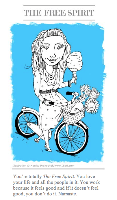
Monika illustrates "Professional Types" for Registered Graphic Designers (RGD)
What type are you? The RGD Ontario has been doing a national survey of Design and Communications Professionals on billing and salaries. To make it fun, they set up a site called stoptheguessing.ca where you can take a quiz to find your own "professional archetype". Monika Melnychuk created the fun illustrations for each "archetype". Those that continued to take the survey on billing and salaries were entered in a draw for free registration at this years DesignThinkers conference 2010, to be held in Toronto on November 11 and 12.
Tim Zeltner's whimsical landscape in Yankee Magazine, July 2010
Tim Zeltner had a great article to work with for this detailed ramble down small town Main Street. Yankee Magazine has been writing a series on community- in the article "Hardwick and the New Frontier of Food", Bill McKibben discusses how buying and growing local can build community.
Gary Alphonso's Dramatic Landscapes
Here's just a sampling of some of Gary's new work, check out his portfolio to see more,
"Alaska to Russia Bridge" was created for READ issue 16 - stories about the Future.
"Energy Stocks" - was done for SmartMoney as well as the image below, "Money Excavator" - both projects were art directed by Carly Tushingham.
FamilyFun Organizing Tips illustrated by Betsy Everitt
Betsy created these lovely, whimsical images (plus three more) for an article on how to organize various "zones" of your house.
Check out FamilyFun's April 2010 issue for tips on how to organize a house with kids!
What to Wear for the Rest of Your Life - illustrated by Alanna Cavanagh
In bookstores now -Kim Johnson Gross's newest fashion advice book, What to Wear for the Rest of Your Life: Ageless Secrets of Style.
Alanna has provided her own fabulous fashion sense and love of pattern to the interior illustrations.
Alanna even provided a fabulous "interior" for the author's photo.
Hear Kim Johnson Gross speaking about her new book
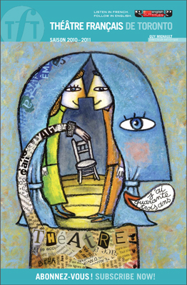
Theatre Francais 2010-2011 Season
 Philippe Béha created a fun line-up of images for the 2010-2011 Théâtre Français season. Whether you speak French fluently or not, these French plays can be appreciated by all as the theatre provides sub-titles in English.
Tracy Walker illustrates for Yoga Journal
 Tracy Walker created this beautiful image to accompany an article in the May Yoga Journal on connecting with the flow of your breath.
A Great Summer Read for Tweens
 Just in time for the summer of the 2010 (Year of the Tiger), Anne Horst has illustrated the cover of Alison Lloyd's debut novel, Year of the Tiger, published by Holiday House. The story takes place during the Year of the Tiger in ancient China during the Han Dynasty. Two boys, Hu and Ren, develop a friendship across class divisions while practicing for an archery tournament- their skills and friendship aid them when their city is invaded by Barbarians.
"My son's 'troubling'behaviours"- Thursday, May 6, 2010 Globe and Mail
Jillian Ditner has created a beautiful and quietly powerful image to accompany Rae Blackburn's story about her son, her own intuition and the attempts by various professionals to diagnose her son with a learning disability where none existed - just a different tempo to his development. For the full story, check out Facts and Arguments in Thursday, May 6, 2010 issue of the Globe and Mail. On the subject of "square pegs in a world of round holes" there is also an inspiring, funny talk on Ted - Sir Ken Robinson on the role of creativity in schools - it was posted back in 2006 and is still very relevant.
Hi-Tech Gadgets for Mom and Dad
Elton John Benefit Performance Celebrating the Life and Legacy of Ryan White
Greg Stevenson lent his elegant line style (art directed by Megan Dana of Borshoff) to the invitations for the Elton John Benefit Performance celebrating the life of Ryan White done in collaboration with the Children's Museum of Indianapolis, to be held this April 28, 2010. For more information on Ryan's story -please read the recent Washington Post article.
Girl in the Know - new book illustrated by Monika Melnychuk
Illustrated by Monika Melnychuk written by Anne Katz, published by Kids Can Press
Monika's latest tween book for Kids Can Press, just released. Girl in the Know is a straight-talking little manual packed with everything a girl should know about the many changes she can expect in puberty. Girls will find advice on everything from sexuality, mood swings, crushes, health and much more! I wish there was a manual for menopause!
Elaine Black writes in the School Library Journal (May 1, 2010): " This well-done primer will help guide irls through the physical and emotional changes that come with growing up. Using straightforward language and a no-nonsense approach. Katz's text explains puberty in a relaxed tone. The comprehensive section on nutrition, or "fueling up" is particularly good. Melnychuk's wonderful multicultural illustrations stand out as well. They are beautifully global and strike a great balance between cartoon and realistic art. These renderings combined with Kat's reassuring tone make this basic guide one of the better additions to the genre."


