A big i2i Art welcome to the incredibly talented conceptual illustrator and animator, Ane Arzelus! Graphically composed and wonderfully witty Ane’s illustrations have a story to tell. Passionate about communicating complex ideas with a concise delivery, her work is well thought out with a feminine undertone. Tackling topics from anxiety to meditation, Ane is inspired by the narrative behind each concept she shares. She enjoys bringing her illustration to life with a touch of motion and bright colour palettes that deliver bold messages.
Read MoreKelsey Davis illustrates for Transcend Education
Whether you’re heading to school in person or online for virtual learning, this year has looked a little different. In collaboration with Van Ness Elementary School, Transcend Education sought to create social story booklets to help students navigate their time at school. Brought on by Pop Ed Consulting’s Stephanie Thai, Kelsey Davis was selected to illustrate the complete series.
Read MoreJanice Kun - Black History Stamps
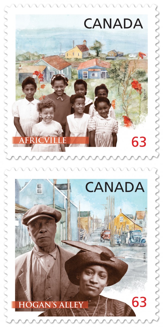
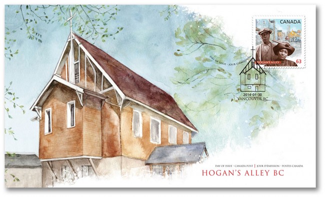
Canada Post celebrates Black History Month by commemorating two distinctive and historic African-Canadian communities: Vancouver's Hogan's Alley and Halifax's Africville.
Working closely with designer, Karen Smith, Janice Kun created the background watercolors depicting historical churches, central to these communities. Typical of Janice Kun's style, the pairing of the paintings with supplied historical photographs is a delicate dream-like balance between these real people and remembered communities.
Print and Pattern features Katy Dockrill!
SURTEX is only a few days away, and we are super excited to share the post Print and Pattern featured on Katy Dockrill. If you would like to see more of her bright and beautiful work in person, please visit us at booth #340 at the Javits Center in NYC from May 19-21.
i2i art welcomes illustrator and surface designer Katy Dockrill
i2i art is proud to welcome Katy Dockrill into our family of artists. Her work is fresh and fun and full of irresistible personality!
Below is a small sample of her illustration and surface designs. To see more please visit Katy's new i2i art portfolio here.
This image (above) called Friends, caught my eye when I first saw it screen printed on a tote bag!
Love the retro car in this illustration!
This is one of her lovely surface design patterns. Can you just imagine it on children's bedding or curtains?
Janice Kun for Royal Ontario Museum
Art director Tara Winterhalt chose Janice Kun to create a double page spread illustration for the article Threads That Bind which first appeared in ROM, the magazine of the Royal Ontario Museum, Summer 2012 issue. The story is a true account of an archaeologist's search for human origins which became deeply personal. Janice's pictographic method of weaving the elements of the story together is reminiscent of it's ancient references.
[pinterest]
Kevin Ghiglione: Fine Art Opening
There are so many sides to Kevin Ghiglione. For those who have not been introduced to his fine art, you are in for a treat! Fable, Kevin's most recent body of encaustic paintings, opens at MUSE Gallery this Friday October 19th from 6-9pm and runs through November 8th, 2012. Fable is about stories that conjure the wonder of discovery and for those local folks who would like to drop by the gallery to see his art in the flesh, Kevin says, "The true life of the artworks can only be fully experienced in person where one can delve into the luminosity of layered wax and passively feel the three dimensional qualities exposed with incidental light.".
Margaret Lee for AAA Traveler Magazine
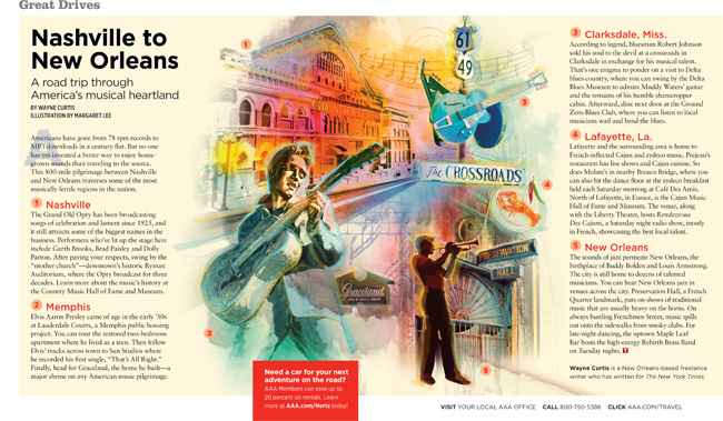
Lymari Acevedo, art director for AAA Traveler, repurposed an image created by Margaret Lee exploring the musical heritage from Nashville to New Orleans.
Thom Sevalrud: Journal for the Norwegian Medical Association
Art Director Emma Dalby commissioned Thom Sevalrud for a third cover for the award winning Journal. His masterful conceptual skills communicate to the scientific community Leukemia's treatments and how to identify the disease through family history and biological markers.
Gary Alphonso for Northeastern Law Magazine
Art director Mark Gabrenya, chose Gary's powerfully evocative style for this Northeastern Law Magazine cover to illustrate the revisiting of U.S. labor rights after 75 years. [pinterest]
Mark Hoffmann in Enormous Tiny Art Show!
Size does matter in Portsmouth, New Hampshire from September 7th to October 1st, where the 12th Enormous Tiny Art Show is underway. A huge selection of tiny pieces of art (no larger than 10" x 10"), from artists around the world, are on display at the Nahcotta Gallery and online here. The first biannual Enormous Tiny Art Show opened in the winter of 2007 and not surprisingly has an enormous following! The organizers' goal is to share their love of art and make it accessible to everyone. As a first time exhibitor in this fall show, Mark Hoffmann says he has already begun preparing more tiny art for the upcoming winter show. Below are a few of our favorites from the twelve (almost sold out) pieces Mark has in the show. We're with the ETAS peeps in their exclamation, "Viva la tiny art!".
Phil for Country Gardens
Phil, working with design director Nick Crow, created this illustration for Country Gardens' fall 2012 Slow Lane column. His impressionistic style tells the story about the migration pattern of the black feathered, white beaked Coot, and a real life altercation between 30 of them encountering a hungry bald-eagle, during a brief stop over on their way south. Phil brings drama to the illustration with the menacing shadow of the eagle, contrasted by the calm and collected demeanor of the Coot, who ultimately see their way to victory.
Sarah Beetson: Interview with Russell Brand
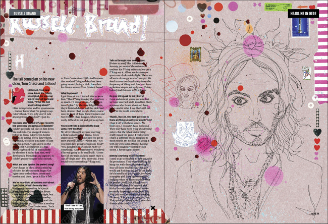
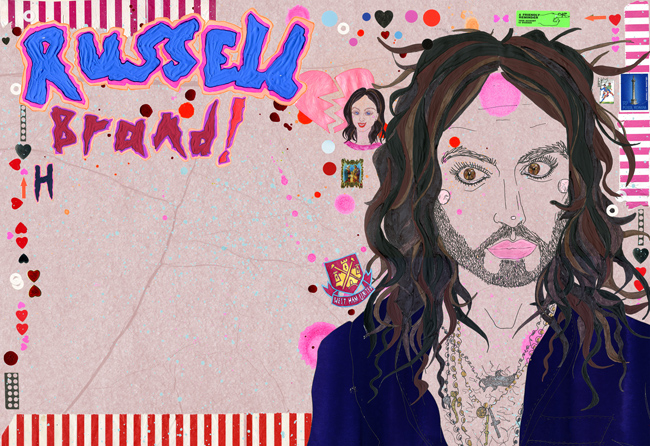
Sarah Beetson was illustrated a double page spread for UK Magazine Nuts', interview with the provocative Russell Brand. Below is her sketch with type and the final art. We think her 'out there' approach to the illustration is a perfect send-up for Mr. Brand! For a peek at the process below is Sarah's art at the rough stage.
Here is the final art.
Monika Melnychuk for Dogbook iPhone App.
Monika says, "I have been a dog geek forever. When I was a teenager I drew x-mas and birthday cards with dogs. Then I worked dogs into any assignment I could. For example in first year illustration we had to design a shopping bag and mine of course, was all dogs. Before I became an illustrator I tried being a dog portrait artist. Wow, I am a nerd, but I just love dogs!" Fast forward... Geoffrey Roche, partner at Poolhouse, saw some of Monika's dog drawings and he had to have her illustrate the landing page for the new Dogbook iPhone App. Can you spot *your* dog? If you're looking to connect with like minded doggie lovers get the free app here. Also below, see a recent piece on the theme, created for surface design applications.
We think it would make a cool wallpaper or fabric for your favorite dog house.
Monika and her dog Boogaloo share a breathtaking moment in their beautiful world.
Tim Zeltner: CD Cover Art
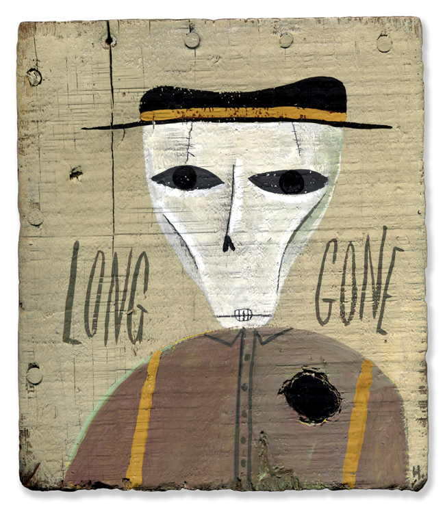
Check out Tim's American Gothic spoof used as cover art for Jay Zell's CD, Country World. Notice Tim's trademark patina created by layering paint and varnishes on wood.
Jillian Ditner: TIFF 2012 Walking Map for Timberland
A little while back marketing agency trevor peter communications contacted us about a walking map for Timberland, an official sponsor of TIFF (The Toronto International Film Festival). When Jillian Ditner was chosen, we were pretty excited about this great opportunity! Creative Director, Alexandra MacDonald and Jillian, along with Josh McKellar, Marketing Manager for Timberland, began the collaborative process of creating the first ever eco friendly tool for navigating TIFF. The initial direction was for Jillian to create her own artistic interpretation of Toronto, the TIFF ‘playground’ and the area venues downtown that host the Festival. One of the key objectives for this user-friendly map was to inspire TIFF-goers to ‘get outside’, walk the festival, and connect with the community. The finished map below is available as a downloadable pdf at the Timberland online Community here. Enjoy the Festival!
Here is a glimpse into Jillian's process.
Anne Horst: 'Happy'
A new personal piece by Anne Horst, capturing beautifully, the whimsical care-free spirit of a child!

Mark Hoffmann for Macalester Today
Mark Hoffmann was asked by art director Brian Donahue of Be Design, to illustrate a feature article on 'Food's Future' for Macalester Today's summer issue. Macalester College alumni weighed in on organic farming and food technology debates. The combination of Mark's 'organic' art (often painted on recycled wood), along with his brilliant ability to communicate hard-hitting ideas with wit, made him a great fit for this assignment. Brian was a great supporter of the project, and encouraged the realization of Mark's art becoming the first ever illustrated cover for the magazine.
Greg Stevenson for Nexus
Recently, Greg was asked by the University of Toronto's law magazine Nexus, to create 3 photo illustrations for their contributors page. Using supplied photography, which lacked a consistency, the photo-illustration technique applied, brought a unique continuity to the contributors page. An interesting solution to a recurring problem encountered by art directors.
Monika Melnychuk for New Jersey Monthly
Monika was asked by New Jersey Monthly to contribute her expressive narrative style, to a serious issue around social ostracizing and bullying in NJ. Under New Jersey's strict new anti-bullying law, any school employee that hears of a bullying incident must tell the principal, which starts the clock running on an investigation. Gregory Crippin art directed the piece, which appeared in NJ Monthly's May 2012 issue.
