Gary Alphonso for Ensign Magazine

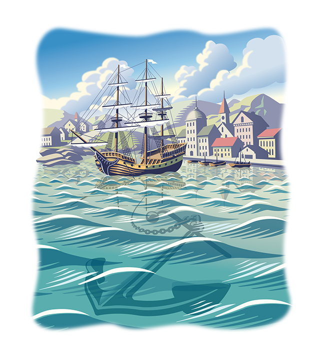
Scott Knudsen, art director for Ensign Magazine, came to Gary Alphonso with a story of faith and sacrifice. Looking at the opening paragraph, the metaphor that inspired these beautiful pieces was clear -- "A ship is safe in the harbor, but that's not what ships are for."  

The article, "Faith to leave the harbor" showcases Gary's classic, digitally rendered, scratchboard style and the nautical theme highlights Gary's real ability to capture motion and light in his illustrations.

Safe Harbor by Gary Alphonso

Ship at Sail by Gary AlphonsoLighthouse by Gary AlphonsoView more of Gary Alphonso's work at i2i Art Inc.

Dave Murray for National Magazine

When tech collides with the standard way of doing things. Illustrator Dave Murray is often asked to visually interpret this concept. Most recently, art director Tony Delitala of Delitala Design, assigned Dave to illustrate two high tech articles for the Canadian Bar Association's National Magazine.  

Dave's strong use of symbolism, conceptual intelligence and graphical style invites the reader to dive into these stories.

Technology can help make justice more accessible

Dave Murray for the National Magazine

Heavy workload? There’s an app for that.

©Dave Murray_DM205_i2iArt

Check out more of Dave's work. Represented by i2i Art Inc.

Eric Chow for Remodeling Magazine

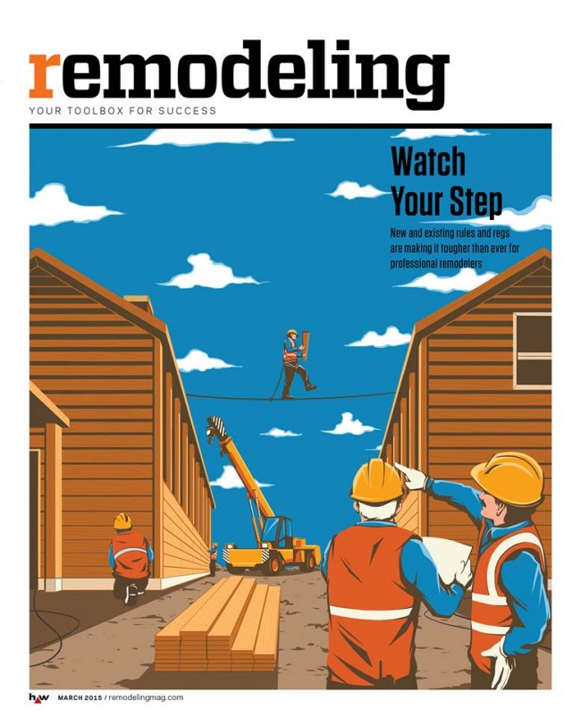
With ever-changing rules and regulations, remodeling you home or office is no picnic. Remodeling Magazine tackled this topic in the feature article "Watch Your Step" for their March 2015 issue.  

The design team at Hanley Wood knew a conceptual solution would be best to illustrate the fine line contractors walk between safety and regulations. Illustrator Eric Chow worked closely with them to come up with this clever tightrope analogy.

Eric Chow Remodeling Magazine Cover

Eric chose to put a menacing face to the dangers of lead paint removal for the inside story.

Eric Chow Lead Paint Remodeling Magazine


Looking for a new way to tell your next story?  Visit Eric Chow's complete portfolio at i2i Art.

Mark Hoffmann's Mural at the Montserrat Gallery

The exhibition SEVEN: A Peformative Drawing Project at the Montserrat Gallery was a perfect opportunity for illustrator Mark Hoffmann to spread his creative wings even further. Mark, along with six other artists, put their creative process on display by executing a large mural on one of the gallery's walls in an open studio environment. The mural itself was meant to be the "residue of an artistic performance." We found both the process and the final product pretty spectacular.  

Mark Hoffmann's 'Men of Mountains' Mural

Mark Hoffmann Mural

 Close up of Mark Hoffmann's lettering

Mark Hoffmann Mural Close Up


We chatted with Mark Hoffmann after the show...


i2i Art: How were you approached with this project?

Mark: Leonie Bradbury (the gallery director at Montserrat College of Art, where I teach) contacted me in the fall to see if I had any interest.  They usually try to get one faculty member involved and thought I would be a good fit with the other artists.


i2i Art: Was this your first mural?

Mark: Yes, and it was quite overwhelming.


i2i Art: Tell us about the piece.  What was your inspiration?

Mark: I really wanted to paint a giant horse and started to research. Somehow I ended up reading about the early exploration of what would later become the first national park of the U.S., Yellowstone. In my research I found the story of the Cook, Folsom, Peterson expedition to explore and survey the land. I thought this might make a fun image with them, a horse, and geysers. I also had a previous color palette worked out that I wanted to apply to the piece.


i2i Art: What was it like working on that scale?

Mark: Difficult. It's hard to get a sense of the scale until it is right in front of you. I found that I had to stand back and look at it a lot, otherwise I wouldn't take the scale into full consideration.


i2i Art: The gallery was open while you were working on the piece, tell us about the atmosphere.

Mark: As I was working, quite a few folks stopped in to look, but very few chatted with me. They later told me they were afraid to interrupt. I must look deep in thought when I paint. It was nice to have the freedom to paint and explore at that scale and really knock people over with an image.


i2i Art: Do you have any tips, tricks or lessons learned you want to share?

Mark:  I realized that some of the techniques I planned to use are hard on that scale and surface. Use a paint with primer in it (I used house paints) so you don't have to apply it twice to get good coverage. Bring plenty of Aleve and Tylenol, the work can be a little back breaking.

Hyperlapse: Watch Mark Hoffmann's mural come to life

http://youtu.be/RNxRIeZmY-Y


On view through March 28, 2015 at the Montserrat Gallery.

Mark Hoffmann offers a playfulness to his americana, folk art style.  View Mark's entire portfolio.



Dave Murray for Canadian Grocer

The always enthusiastic Dave Murray jumped at the chance to work with art director Lindsay Maclachlan again on a feature article for Canadian Grocer. Dave often illustrates technological innovations so the brave new world of in-store technology at our local grocer was a perfect match for Dave's style.

The Future of the Grocery Store

Dave Murray Illustration for Canadian Grocer

smartphones and tablets could dominate our grocery shopping experience

Dave Murray spot illustrations Canadian Grocer

Thom Sevalrud: Big Data

  The Wikipedia definition of Big Data is:  "a collection of data sets so large and complex that it becomes difficult to process using on-hand database management tools..."

Thom Sevalrud has a way with taking just this type of complexity and in his very unique visual vocabulary communicating the idea clearly, like no other.  That's why  Brian Donahue of Be Design called upon Thom to illustrate Why Big Data is a Big Deal for Macalester Today.  Brian is also a big fan of Thom's hand lettering so he also asked him to illustrate the headline for this feature as well.

MacTodayWinter1_Thom_Sevalrud_i2iart
MacTodayWinter2_ThomSevalrud_i2iart
MacTodayWinter3_ThomSevalrud_i2iart

Harvey Chan and 'Close Strangers'

Recently featured in a post on the popular Design Sponge blog, is one of Harvey Chan's pieces from his Close Strangers series.  Jacqui Oakley, a fellow illustrator and designer Jamie Lawson's apartment was featured.  Jacqui is quoted as saying, "The fireplace in the living room was one of the selling points of this apartment — we love the blue tiles and dramatic mantel. We’re so lucky to have a Harvey Chan original to contemplate from our comfy vantage point." Below is a video taken from the opening night of Harvey's Show.

http://www.youtube.com/watch?v=9OhoZZBz-bo


Gary Alphonso for the ROM's "God's Among Men" Exhibition

Gary was commissioned by Hambly and Wooley to create an illustration for research testing of an ad campaign for the Royal Ontario Museum (ROM). The results of the testing would determine the final concept direction for the "Gods Among Men" (Mayan Civilization) exhibition at the ROM.  The client wanted to explore a more colorful vibrant direction that would only be possible with illustration, with the focal point being a Mayan King in full flamboyant costume, in the context of a Mayan village with pyramids and lush scenery.  Gary says "The challenging part was to take bits and pieces from the mountains of research material provided by the ROM and depict how colorful these these "Gods among Men" would dress.  The strange gestural pose was not accidental!  It was important to show the stance these kings would strike to differentiate themselves from mere mortals." In the end the ROM, opted for a more photo based approach.  Click here to see more of Gary's illustration.

Eili-Kaija Kuusniemi for 'Folk!' Website

Eili-Kaija's illustrations are woven into the new website for Folk!- an advertising agency based in Helsinki. She created the portraits that accompany the staff bio's and a map on the contact page. The handmade, approachable quality of Eili-Kaija's work was chosen to help brand the site with the company's down-to-earth and participatory work style.

folk_people
folk_people

Gary Alphonso for Harlequin

Gary Alphonso created a cover for the paperback edition of Hazards of the Game by Norma Tadlock Johnson. The art director wanted a very graphic feel to the cover where type would be a major element.  They decided to place the text within the shape of the sand trap since the story takes place on a golf course.  Another requirement of the illustration was to include some of the clues to the mystery: the pink golf ball, the discarded putter and the Siamese cat. The challenge was to design the illustration with the type from the early rough stages as opposed to creating the illustration and having the designer apply type after the fact. Here are two versions to show the importance of type - an early draft and the tweaked type that became the cover.

Hazards of the Game Art-1st
950-Hazards of the Game Final Cover