If you’ve ever wanted to see your name in lights then you’ve come to the right place. Animator and illustrator Weld Williams joined i2i Art earlier this year and he’s shaking things up with his unique style and eye catching colours. His recent portrait of country rap sensation Lil Nas X for The New Yorker (art directed by Neeta Patel) is no exception.
Read MoreKaty Dockrill for LCBO 'Hello Spring' Campaign
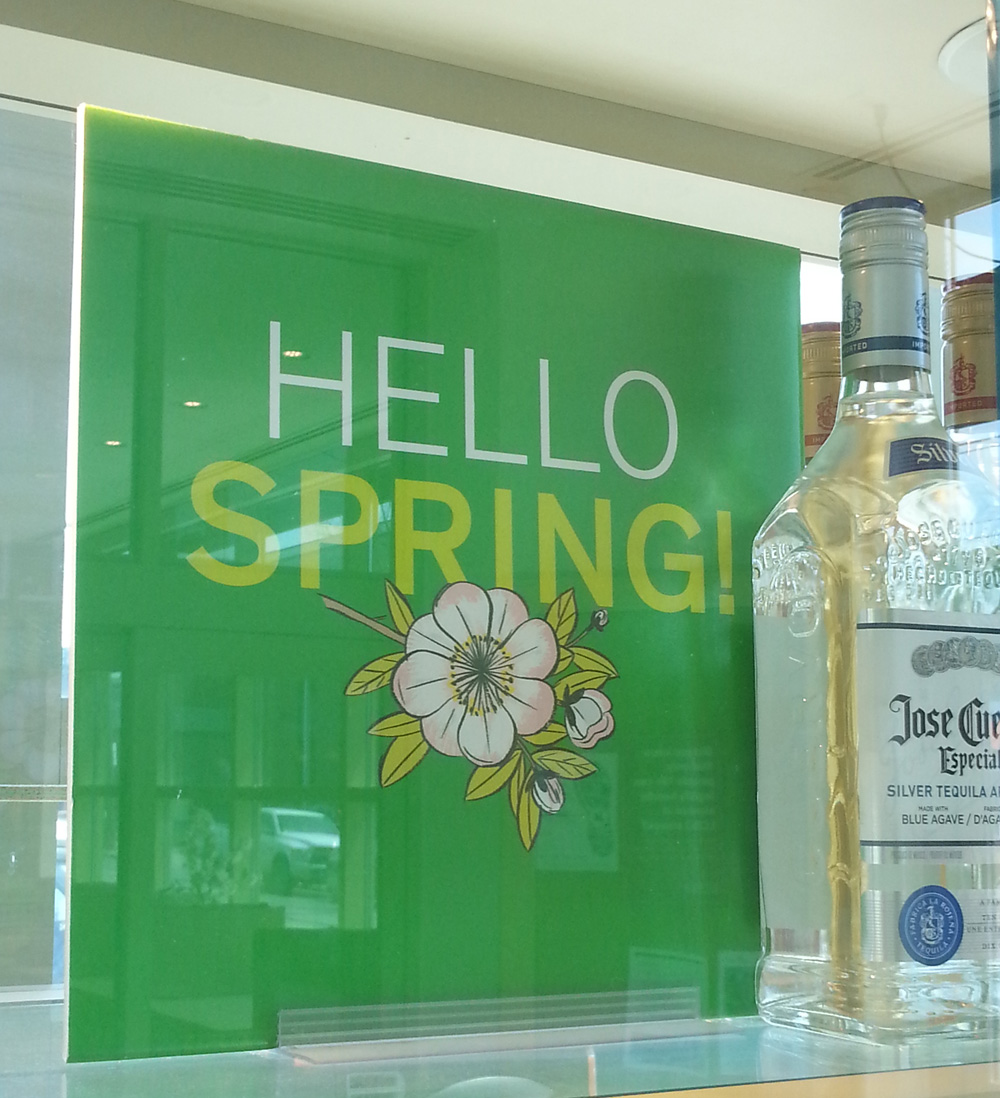
Nothing symbolizes Spring quite like a cherry blossom. When you walk into any LCBO this month you will be greeted by the bright and simple beauty of this bloom. Brad MacIver, creative director at the Liquor Control Board of Ontario, had worked with illustrator Katy Dockrill in the past and knew the wow-factor her lines could create.
The bold signage for the 'Hello Spring' campaign adorns the shelves and windows of the stores, beckoning you to pick up a bottle of something for those evenings on the porch.
See more of Katy's beautiful work. Represented by i2i Art Inc.
Katy Dockrill for ALTO
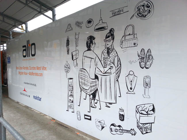
Creative director at Drive Agency, Mark Bulloch, chose Katy Dockrill for the ALTO marketing campaign because her illustration style suited the hip lifestyle drawings he envisioned for the brand. ALTO is a gorgeous new rental condo development located in the heart of trendy Little Portugal, in Toronto. The art needed to speak to the young urbanite seeking to live there.
We spoke to Katy about her work on this campaign and she shared some interesting insights on her process:
i2i Art: At the outset, this campaign looked like it would involve four major illustrations and hundred's of small icons. What was your first response to this request?
Katy Dockrill: Firstly, I saw the direction that Drive agency was working towards, because they gave me a preliminary visual concept, and I loved it. I loved the simplicity, the icons, the central figure idea. I love drawing individual things, and because it was black and white, I could simply focus on the line work.
i2i Art: Can you describe your process?
Katy Dockrill: I felt completely at home, taking pictures of the hood, sitting and sketching. I drew from my pictures, once I got home. I also needed to figure out who was going to be in the middle of all these icons, which took more time because the client was looking for someone in a certain age range, and wanted them doing things that might be particular to them and the neighbourhood.
i2i Art: The art needed to be able to reproduce at any size--blown up huge for signage and small for brochures and Internet advertising. Knowing that you sketch and draw by hand, how did you approach the final art to accommodate these specifications?
Katy Dockrill: I knew that these were going to be reproduced at a large size, but I work quite small, with brush and ink. My process in these cases requires I scan all my art as bitmap tiffs and then vector my line work in illustrator so that it most closely resembles the original work.
i2i Art: What's your impression of the finished campaign materials onsite? If you were looking for a rental condo, do the marketing materials portray an appealing lifestyle choice? In what way?
Katy Dockrill: I'm biased in that I really love how the work onsite turned out. I'm hoping with the icons that surround these figures (who are of a certain age range), that they appeal to the bookworm, the foodie, the nester, the cat lover, the musician, the pal, the mother. Since most of what I drew came from life, the sidewalks and the stores in that neighbourhood I also hope that perhaps someone sees a bit of their story in there too.
A montage of photos Katy took while researching the neighbourhood.
One of the panels with Katy's art mounted on construction hoarding onsite.
ALTO advertising with two of Katy's illustrations.
The art I call 'Lunching', up close.
This hipster musician would fit right in at Alto.
A day in the life of a mom.
 To see more of Katy Dockrill's delightful illustrations visit her profile here.


