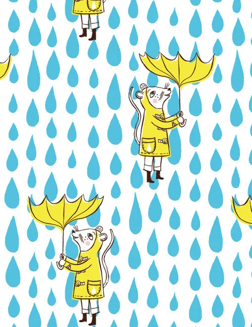
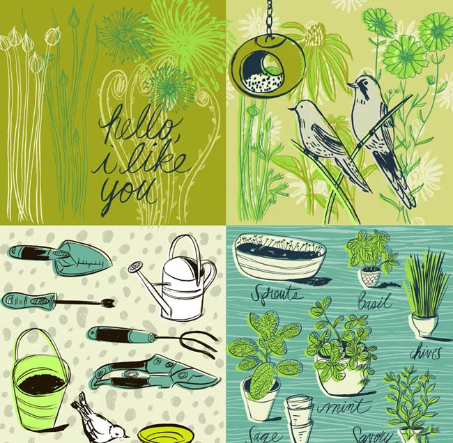
The Victoria Symphony 2017/18 season has begun and illustrator Katy Dockrill has mirrored the excitement with a dynamic and contemporary feel for their signature brochure. With art direction from Lara Minja at Lime Design, Katy worked with a sophisticated, limited palette and beautiful bold lines to create some timeless musical metaphors
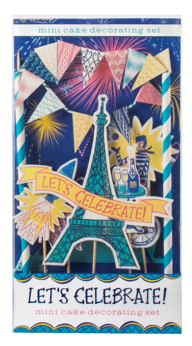
Read MoreKaty Dockrill: Let's Celebrate!
What could be more fun than a soirée Parisian style? Katy Dockrill's whimsical illustration style will help you set the stage perfectly. Designer Timothy Siciliano of Party Partners, asked Katy to create the Let's Celebrate mini cake decorating set to add to the already successful Make a Wish and Queen for a Day party kits.
Want to see more? Visit Katy Dockrill's portfolio.
Katy Dockrill for ALTO
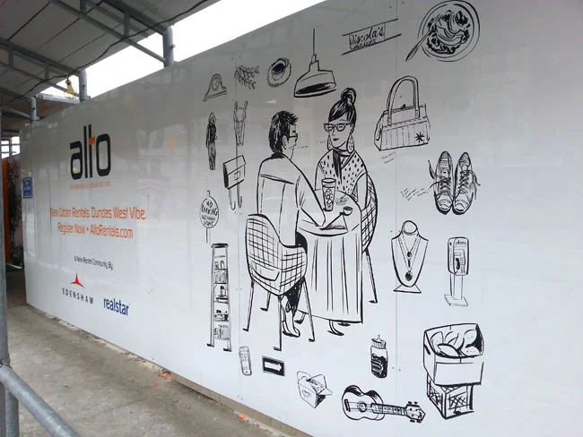
Creative director at Drive Agency, Mark Bulloch, chose Katy Dockrill for the ALTO marketing campaign because her illustration style suited the hip lifestyle drawings he envisioned for the brand. ALTO is a gorgeous new rental condo development located in the heart of trendy Little Portugal, in Toronto. The art needed to speak to the young urbanite seeking to live there.
We spoke to Katy about her work on this campaign and she shared some interesting insights on her process:
i2i Art: At the outset, this campaign looked like it would involve four major illustrations and hundred's of small icons. What was your first response to this request?
Katy Dockrill: Firstly, I saw the direction that Drive agency was working towards, because they gave me a preliminary visual concept, and I loved it. I loved the simplicity, the icons, the central figure idea. I love drawing individual things, and because it was black and white, I could simply focus on the line work.
i2i Art: Can you describe your process?
Katy Dockrill: I felt completely at home, taking pictures of the hood, sitting and sketching. I drew from my pictures, once I got home. I also needed to figure out who was going to be in the middle of all these icons, which took more time because the client was looking for someone in a certain age range, and wanted them doing things that might be particular to them and the neighbourhood.
i2i Art: The art needed to be able to reproduce at any size--blown up huge for signage and small for brochures and Internet advertising. Knowing that you sketch and draw by hand, how did you approach the final art to accommodate these specifications?
Katy Dockrill: I knew that these were going to be reproduced at a large size, but I work quite small, with brush and ink. My process in these cases requires I scan all my art as bitmap tiffs and then vector my line work in illustrator so that it most closely resembles the original work.
i2i Art: What's your impression of the finished campaign materials onsite? If you were looking for a rental condo, do the marketing materials portray an appealing lifestyle choice? In what way?
Katy Dockrill: I'm biased in that I really love how the work onsite turned out. I'm hoping with the icons that surround these figures (who are of a certain age range), that they appeal to the bookworm, the foodie, the nester, the cat lover, the musician, the pal, the mother. Since most of what I drew came from life, the sidewalks and the stores in that neighbourhood I also hope that perhaps someone sees a bit of their story in there too.
A montage of photos Katy took while researching the neighbourhood.
One of the panels with Katy's art mounted on construction hoarding onsite.
ALTO advertising with two of Katy's illustrations.
The art I call 'Lunching', up close.
This hipster musician would fit right in at Alto.
A day in the life of a mom.
To see more of Katy Dockrill's delightful illustrations visit her profile here.
Katy Dockrill illustrates for Diabetic Living
Katy Dockrill created these illustrations for the article: What's Your Exercise Personality, for the Fall 2014 issue of Diabetic Living magazine. I'm a playful dolphin, what are you? For more of Katy's delightful illustrations check out her portfolio.
Katy Dockrill for SHE Magazine
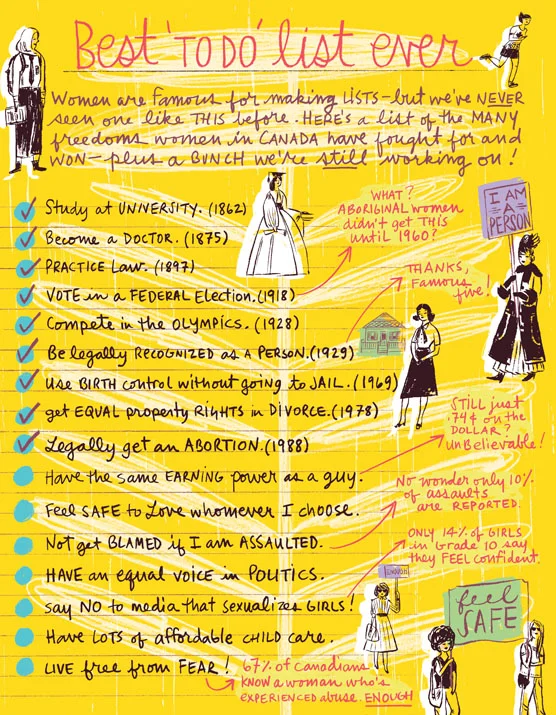
Katy Dockrill contributed this illustration to SHE Magazine published by the Canadian Women's Foundation. We think this illustration tells a remarkable story of strength and optimism with Katy's confident line and hand lettering over the brilliantly optimistic yellow background. When we asked Katy about her inspiration she said: "I felt it was important to illustrate this list of women's accomplishments: Being a woman in 2014 is very different from being a woman 150 years ago and I have all the women before me to thank. I take all these hard won freedoms for granted because I grew up knowing no different. I think that's where we need to get to in order to check off the others on this list, keep voicing opinions and share the dialogue with our children."
To see more of Katy's hand lettering and illustration, check out her updated portfolio here.
Katy Dockrill: Map Out Your Best Summer Ever
Winner of the CASEVIII Grand Gold Award and Alberta Magazines Silver Award for Illustration Katy Dockrill created the cover and interior illustrations for the Spring 2014 Feature: Map Out Your Best Summer Ever, for the University of Alberta's Alumni Magazine, New Trail. Katy's playful style and summery palette is the perfect touch to inspire summer fun! When I asked art director Marcey Andrews what the response to the issue was, she said, "It’s been fantastic, truly. We even received a very complimentary email from another illustrator we’ve worked with, Raymond Biesinger (who is a UofA alumni). When he received his issue of the magazine, he sent us a very nice message, saying, ‘killer cover’." Thank you for the 'killer' compliment Raymond! To see more of Katy's whimsical illustrations visit her portfolio.
Opener for Map Out Your Best Summer Ever
'Rivers Not Roads''Take Up Birdwatching'
Summertime Biking'What Bears Do in the Woods'. Ever wondered?
To check out the magazine online visit the New Trail site here.
Katy Dockrill for Party Partners
Katy Dockrill illustrated the Make a Wish and Queen for a Day bunting kits that are as sweet as the cake they're designed to adorn! Art director Timothy Siciliano of Party Partners fell in love with Katy's work when he discovered her surface design patterns and prints. Her line work is absolutely flirtatious and brings such a fun touch, fit for a party at any age! To see more of Katy's illustration visit her updated portfolio here.
Katy Dockrill for National Drapery
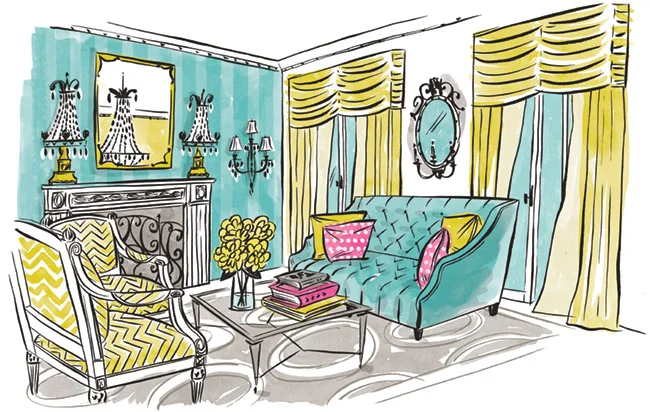
When art director Lila Graham first contacted us to work on the new website she was designing for National Drapery, it was an exciting opportunity for Katy Dockrill to bring her flair for sewing and love of home decor to an illustration assignment! The new ND website was the inspirational vision of Natalie Hartman, who was a delight to work with. Visit the ND homepage and see how Lila and Katy literally brought Natalie's vision to life here.
The new website design also included a series of drawings to highlight the many custom products National Drapery offers. Katy adores creating for surface design, so when Natalie asked her to include an indication of patterns to depict various textiles and bring some flair to these more technical illustrations, she was happy to oblige. The result? These little gems...we've combined a few of our faves here:
Print and Pattern features Katy Dockrill!
SURTEX is only a few days away, and we are super excited to share the post Print and Pattern featured on Katy Dockrill. If you would like to see more of her bright and beautiful work in person, please visit us at booth #340 at the Javits Center in NYC from May 19-21.
Bring on Spring!
Time to look forward to sunny days in the garden!
See more of Katy Dockrill's sunny illustrations here.
'In the Garden' by Katy Dockrill.
i2i art welcomes illustrator and surface designer Katy Dockrill
i2i art is proud to welcome Katy Dockrill into our family of artists. Her work is fresh and fun and full of irresistible personality!
Below is a small sample of her illustration and surface designs. To see more please visit Katy's new i2i art portfolio here.
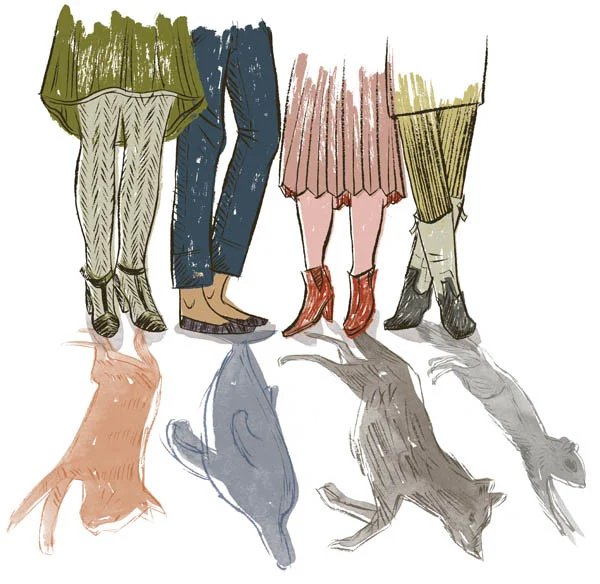
This image (above) called Friends, caught my eye when I first saw it screen printed on a tote bag!
Love the retro car in this illustration!
This is one of her lovely surface design patterns. Can you just imagine it on children's bedding or curtains?