i2i is thrilled to announce that Canadian-based Ukrainian illustrator Daria Lada has joined our talented roster. During her short time working in Canada, Daria’s stunning work has gained international recognition from World Illustration Awards, American Illustration, Applied Arts, Hiii Illustration Awards, and more. Incredibly conceptual and stunningly executed Daria has the ability to communicate ideas quickly and beautifully.
Read MoreWelcoming illustrator Drew Shannon to i2i Art
Wonderfully creative, uniquely compelling and thoughtfully conceptual. Just a few reasons we are absolutely thrilled to welcome Drew Shannon to the incredibly talented group of illustrators here at i2i Art. A London, Ontario native currently based in Toronto, Drew is passionate about storytelling and draws inspiration from a variety of familiar situations and common encounters. Combining vibrant hues with a limited palette, Drew uses colour to lead the eye through their illustration, making connections and building a narrative for the viewer to follow. While playing with perspective and incorporating loads of lovely texture to balance out his artwork and add depth.
Read MoreAne Arzelus creates conceptual illustration
Inspired by ideas, Ane is thrilled at the chance to tackle tough topics. Producing a range of artwork on a variety of subjects, from the climate crisis to mental health, they have a knack for delivering complex concepts with clear and concise visuals. Ane’s illustrations tell a story, with bold colour palettes and graphic shapes guiding the viewer. Whether its a detailed map or a simple visual, Ane definitely doesn’t shy away from making a statement. In fact, they embrace it!
Read MoreWelcome illustrator Kuba Ferenc
We’d like to give a warm i2i Art welcome to incredibly talented conceptual illustrator, Kuba Ferenc. Graphically composed and wonderfully compelling, Kuba’s illustration offers a unique perspective. Passionate about communicating complex ideas his work is well thought out and meticulously constructed. Addressing a variety of topics from politics to psychology, Kuba’s sophisticated yet subtle use of forms, shading and colour bring his illustration to life.
Read MoreThom Sevalrud illustrates for University of Toronto
Conceptual Illustrator Thom Sevalrud spares no detail with his latest illustration. Commissioned to depict the core values for U of T’s Institutional Research and Data Governance, Thom proves he’s up to the task. His classic geometric style captivates; revealing connections and highlighting unique elements.
Read MoreEric Chow for Mount Royal University Summit Magazine
Summit magazine's summer issue is all about the modus operandi at Mount Royal University. With a state-of-the-art campus that aligns with it's future-forward curriculum Mount Royal decided to get the word out about 'why they do what they do, and how," with the help of illustrator Eric Chow.
Read MoreThom Sevalrud for Maryland and Virginia Milk Producers Cooperative
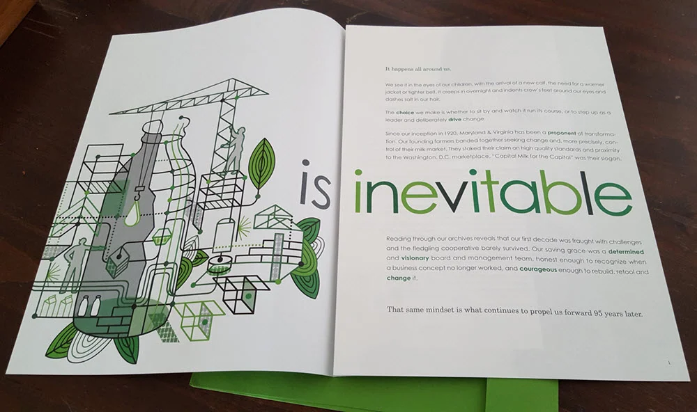
For the Maryland and Virginia Milk Producers Cooperative Association, the theme is change and The Design Office of Ann Marie Ternullo called on Thom Sevalrud to help illustrate this conversation.
For the cooperative's 2015 annual report Thom's clean lines and stylized approach provided a future-forward look at the client's complex industry. The fresh green color palette invites the reader and the illustration is cleverly carried throughout. The report is also printed (what a treat!) in an impressive 10"x13" format creating a stunning impact.
We have a special place in our hearts for great design. The collaboration between Ann Marie Ternullo and Thom Sevalrud created a truly special artifact.
See more of Thom Sevalrud's illustration. Represented by i2i Art Inc.
Thom Sevalrud for 88 Scott
The vision for 88 Scott : "These are the dreamers, the planners, the creators. ... In the earliest planning stages of 88 Scott, fifteen of the country's leading architects, planners and developers were invited to collaborate in a unique process. Their mandate was to create a bold vision for an exceptional, new landmark condominium building..."
In keeping with this creative approach, art by nine local i2i artists was reproduced in large format and presented on hoarding panels (divided by inspirational quotations). The idea was for the developer to support local talent while beautifying the site during the construction phase of development. The images were chosen to represent the many facets of life in the immediate community: green space, culture, recreation, shopping, entertainment etc.
Over the coming weeks we'll bring you pics of the other panels, but we start today with Thom Sevalrud's. It's fantastic to see the art at this size! If you have a chance, pop down and check out the larger-than-life art at 88 Scott in the heart of downtown Toronto. To see more of Thom's art go here.
Rémy Simard: 'Rr' for Relax
Here we are mid summer and what better time to do a little of this... 'Rr' for Relax is another ad in the 'alphabet card' campaign for The Teacher's Credit Union. To see more of Rémy Simard's lighthearted illustrations check out his updated portfolio here.


