Inspired by ideas, Ane is thrilled at the chance to tackle tough topics. Producing a range of artwork on a variety of subjects, from the climate crisis to mental health, they have a knack for delivering complex concepts with clear and concise visuals. Ane’s illustrations tell a story, with bold colour palettes and graphic shapes guiding the viewer. Whether its a detailed map or a simple visual, Ane definitely doesn’t shy away from making a statement. In fact, they embrace it!
Read MoreTim Zeltner illustrates for Canada Post
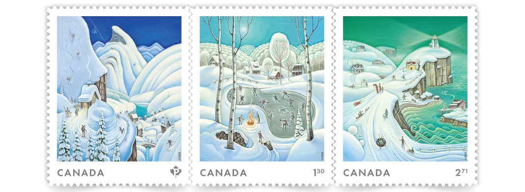
It’s the most wonderful time of the year and Canada Post’s highly anticipated Holiday stamp has arrived! Tim Zeltner was selected to work his folk-art magic alongside Jocelyn Saulnier from Joce Creative, to design a timeless series of collection-worthy stamps. Featuring three distinct and unique regions in Canada, the seamless horizon navigates through a cross-country wintery wonderland. Traveling from perilous mountain peaks to whimsical lighthouses, Tim enchants and enthrals like never before.
Read Morei2i Art illustrators create maps
Illustrated maps are an i2i Art specialty and our artists are taking you places. From Alberta to Antigua and everywhere in between, explore small towns and urban centres with a beautifully composed map. You’ll find notable spots, iconic symbols and unique hand-drawn lettering to name the sights; while punchy colours and unique perspectives keep your eye moving. Take the scenic route to discover charming little details within each city.
Read MoreWelcome Illustrator Migy
Starting the new year with a bang! Please join us in welcoming wonderfully talented illustrator Migy, we are delighted for him to join the i2i Art roster! With art that packs a punch, his dynamic characters and unique lettering are truly captivating. Migy’s visual style combines paint, ink, and digital, adding layers of vibrant colour and texture that offer a fresh, bold, and eye-catching quality. Incredibly fun and wildly entertaining Migy’s illustrations are sure to take you on a thrilling adventure!
Read Morei2i Art welcomes illustrator and animator Kelsey Davis
We are thrilled to announce that our incredibly talented roster of artists is continuing to grow! Please join us in welcoming illustrator and animator Kelsey Davis! Bold shapes, dreamy hues and conceptual creativity are just a few reasons to fall in love with Kelsey’s illustration.
Read MoreMark Hoffmann illustrates for Middlebury Magazine
Middlebury Magazine art director Pamela Fogg acknowledged that she's admired illustrator Mark Hoffmann's work for quite some time. However, the chance to collaborate on a project is not always there...until it is!
Read MoreJanice Kun illustrates for Williams College Magazine
Commissioned by 2 Communiqué creative director Kelly McMurray for Williams College Magazine, illustrator Janice Kun created a series of images to accompany an article on the global impact of Williams College's prestigious Center of Development of Economics (CDE).
Read MoreKaty Dockrill illustrates for Middlebury Magazine
Illustrator Katy Dockrill's first-time collaboration with art director Carey Bass at Middlebury Magazine has resulted in a delightfully whimsical and lighthearted piece.
Read MoreDave Murray illustrates Toronto for Airbnb
The folks at trevor//peter were coordinating a series of events for Airbnb this summer and they needed a wow factor. Taking place in the heart of Toronto, Canada the team decided a map of the city - 10 feet x 15 feet - would be the perfect way to draw the crowd to their booth.
Illustrator Dave Murray, a proud Torontonian, was chosen to work on the project. Dave quickly assembled a brilliant collage of Toronto's coolest neighborhoods and points of interest. Graphic, bold, colorful, the piece beckons you to point out where you live or where you need to visit.
Check out more of Dave Murray's illustration. Represented by i2i Art Inc.
Mark Hoffmann's Mural at the Montserrat Gallery
The exhibition SEVEN: A Peformative Drawing Project at the Montserrat Gallery was a perfect opportunity for illustrator Mark Hoffmann to spread his creative wings even further. Mark, along with six other artists, put their creative process on display by executing a large mural on one of the gallery's walls in an open studio environment. The mural itself was meant to be the "residue of an artistic performance." We found both the process and the final product pretty spectacular.
Mark Hoffmann's 'Men of Mountains' Mural
Close up of Mark Hoffmann's lettering
We chatted with Mark Hoffmann after the show...
i2i Art: How were you approached with this project?
Mark: Leonie Bradbury (the gallery director at Montserrat College of Art, where I teach) contacted me in the fall to see if I had any interest. They usually try to get one faculty member involved and thought I would be a good fit with the other artists.
i2i Art: Was this your first mural?
Mark: Yes, and it was quite overwhelming.
i2i Art: Tell us about the piece. What was your inspiration?
Mark: I really wanted to paint a giant horse and started to research. Somehow I ended up reading about the early exploration of what would later become the first national park of the U.S., Yellowstone. In my research I found the story of the Cook, Folsom, Peterson expedition to explore and survey the land. I thought this might make a fun image with them, a horse, and geysers. I also had a previous color palette worked out that I wanted to apply to the piece.
i2i Art: What was it like working on that scale?
Mark: Difficult. It's hard to get a sense of the scale until it is right in front of you. I found that I had to stand back and look at it a lot, otherwise I wouldn't take the scale into full consideration.
i2i Art: The gallery was open while you were working on the piece, tell us about the atmosphere.
Mark: As I was working, quite a few folks stopped in to look, but very few chatted with me. They later told me they were afraid to interrupt. I must look deep in thought when I paint. It was nice to have the freedom to paint and explore at that scale and really knock people over with an image.
i2i Art: Do you have any tips, tricks or lessons learned you want to share?
Mark: I realized that some of the techniques I planned to use are hard on that scale and surface. Use a paint with primer in it (I used house paints) so you don't have to apply it twice to get good coverage. Bring plenty of Aleve and Tylenol, the work can be a little back breaking.
Hyperlapse: Watch Mark Hoffmann's mural come to life
http://youtu.be/RNxRIeZmY-Y
On view through March 28, 2015 at the Montserrat Gallery.
Mark Hoffmann offers a playfulness to his americana, folk art style. View Mark's entire portfolio.


