It’s the most wonderful time of the year and Canada Post’s highly anticipated Holiday stamp has arrived! Tim Zeltner was selected to work his folk-art magic alongside Jocelyn Saulnier from Joce Creative, to design a timeless series of collection-worthy stamps. Featuring three distinct and unique regions in Canada, the seamless horizon navigates through a cross-country wintery wonderland. Traveling from perilous mountain peaks to whimsical lighthouses, Tim enchants and enthrals like never before.
Read Morei2i Art illustrators create maps
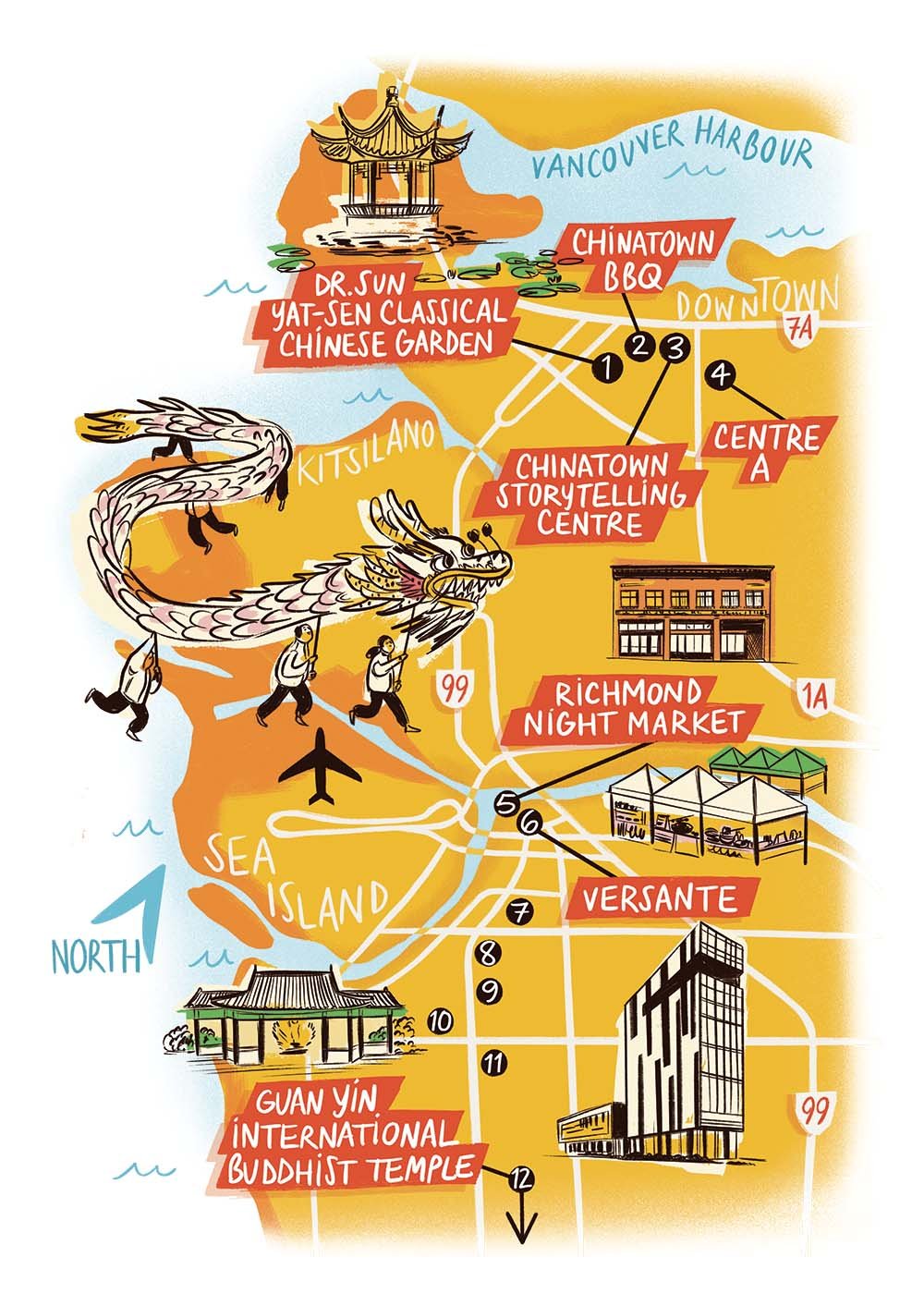
Illustrated maps are an i2i Art specialty and our artists are taking you places. From Alberta to Antigua and everywhere in between, explore small towns and urban centres with a beautifully composed map. You’ll find notable spots, iconic symbols and unique hand-drawn lettering to name the sights; while punchy colours and unique perspectives keep your eye moving. Take the scenic route to discover charming little details within each city.
Read MoreSabina Fenn illustrates dreamy destinations
Escape the everyday and travel to the most dreamy destinations with illustration by Sabina Fenn. Inspired by tropical settings, Sabina’s lush greenery and exotic spaces offer a moment to relax and soak in the sun. An expert at watercolour, you’ll find subtle textures and incredible detail throughout Sabina’s art. Thoughtfully composed, each brushstroke adds depth and dimension all the while making it look effortless.
Read MoreTalya Baldwin illustrates Not the End of the World
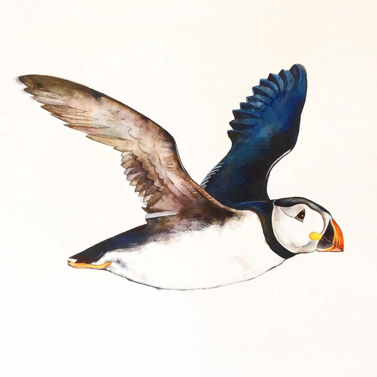
Illustrator Talya Baldwin takes us to St. Kilda, Scotland in her recent book, Not the End of the World. Ethereal landscapes and evocative portraits paint a picture of the history, environment and wildlife in a place often referred to as ‘the end of the world’. Signature to her style, Talya’s stunning watercolour technique combined with her unpretentious writing reveals an important story of the land and the uniqueness of a community that once was.
Read MoreWelcome Illustrator Migy
Starting the new year with a bang! Please join us in welcoming wonderfully talented illustrator Migy, we are delighted for him to join the i2i Art roster! With art that packs a punch, his dynamic characters and unique lettering are truly captivating. Migy’s visual style combines paint, ink, and digital, adding layers of vibrant colour and texture that offer a fresh, bold, and eye-catching quality. Incredibly fun and wildly entertaining Migy’s illustrations are sure to take you on a thrilling adventure!
Read MoreDave Murray illustrates Neighbourhood Stamps
The streets of Toronto have taken a new turn with Neighbourhood Stamps created by illustrator Dave Murray. A self-proclaimed Torontophile, Dave uses his graphic style and bold line work to depict iconic landmarks unique to each neighbourhood. Drawing on his experience working with Canada Post, Dave creates his ever-expanding collection of scenic city views, from the well-known Scarborough Bluffs to hidden gems such as 77 Yarmouth Rd.
Read MoreTim Zeltner illustrates for The Waterford Puzzle Company
Ever wish you could transport yourself into the enchanting world of a Tim Zeltner illustration? Well, now you can get one step closer with a hand-cut wooden puzzle from The Waterford Puzzle Company. Tim’s traditional folk art illustrations were selected for their unique visual appeal and incredible details. The end result is a puzzle that not only shows a work of art but is a work of art!
Read MoreWelcome Illustrator Sabina Fenn
Please join us in welcoming the extraordinarily talented Sabina Fenn to our i2i Art roster! Thrilled to have her join the ranks we are even more pleased to share her work. Inspired by travels to sunny destinations Sabina’s illustration exudes warmth and tranquility. Working with watercolour, Sabina’s use of soft colours combined with gorgeous texture, tone and endearing subject matter make for illustrations that keep you coming back for more.
Read MoreTalya Baldwin illustrates St. Kilda
Illustrator Talya Baldwin’s recent trip to St. Kilda proved to be an inspiring one and she took to her sketchbook to record the awe-inspiring details. Each brush stroke tells a story; from the island’s natural history to its unique community, sharing the ecological history of the land. Almost surreal, Talya’s watercolour paints a magical picture, bringing a sense of hope and beauty to this remote island which seems as though it has stood still in time.
Read MoreTim Zeltner illustrates for Endless Vacation Magazine
Have you ever visited the The Beer Can House, Salvation Mountain or the Enchanted Highway? M Booth’s Derek Eng, art director for Endless Vacation magazine knew that illustrator Tim Zeltner would be just the right person to take us on a road trip through some of ‘America’s Incredible Roadside Attractions’.
Read MoreKaty Dockrill: Map Out Your Best Summer Ever
Winner of the CASEVIII Grand Gold Award and Alberta Magazines Silver Award for Illustration Katy Dockrill created the cover and interior illustrations for the Spring 2014 Feature: Map Out Your Best Summer Ever, for the University of Alberta's Alumni Magazine, New Trail. Katy's playful style and summery palette is the perfect touch to inspire summer fun! When I asked art director Marcey Andrews what the response to the issue was, she said, "It’s been fantastic, truly. We even received a very complimentary email from another illustrator we’ve worked with, Raymond Biesinger (who is a UofA alumni). When he received his issue of the magazine, he sent us a very nice message, saying, ‘killer cover’." Thank you for the 'killer' compliment Raymond! To see more of Katy's whimsical illustrations visit her portfolio.
Opener for Map Out Your Best Summer Ever
'Rivers Not Roads''Take Up Birdwatching'
Summertime Biking'What Bears Do in the Woods'. Ever wondered?
To check out the magazine online visit the New Trail site here.
Tim Zeltner for Emory University
The king of landscapes, city-scapes and make-believe kingdoms, Tim Zeltner works his magic for Emory to accompany a story about the Rollins School of Public Health.
Tim Zeltner for Yankee Magazine
Tim Zeltner illustrated this fantasy winter wonderland for a travel feature, The Town of Our Dreams, art directed by Yankee's Lori Pedrick. From snow covered rolling hills, quaint homes, picture-perfect shops to horse drawn sleigh rides, Tim created this fictitious place called NewEnglandville--the town of New England's dreams!
Thom Sevalrud for Macalester Today
Thom's conceptual style was called upon by Brian Donahue, of Be Design, to illustrate the article Beyond the Auto for the Summer Issue of Macalester Today. The article has Macalester College experts weigh in on the future of travel, predicting that bikes, buses and your own two feet, are the transit options that will reign supreme in the cities of tomorrow. Thom's somewhat futuristic approach to the art brings this discussion to life beautifully.
Sarah Beetson for US Airways Magazine
For those Mad Men fans out there, this story should help you bring back the golden age of the cocktail in style! We think Ann Harvey, Art Director at Pace Communications, chose the perfect artist, when she asked Sarah Beetson to illustrate the splish splash zing of the 60's Essential Summer Cocktails!
Tim Zeltner Maps Out Ontario Wine Regions
Geoff Redwood from Jan Kelley Marketing approached us to see if Tim Zeltner could paint a map showing all the different wine regions of Ontario in his trademark, whimsical style. The map was for a new website Jan Kelley was creating for Ontario Uncorked, which has now been unveiled here. The website allows you to explore and plan customized tours throughout the famed wine regions of Ontario. The little extra details Tim brings to a piece like this, are what makes the viewer engaged in the 'experience' of the map and this is exactly what this new site is all about!
Illustration Married with Photography
We are seeing a growing trend whereby illustration is combined with photography. Below are a few examples of different approaches. Sometimes the client supplies the photos, although frequently the illustrator shoots their own photos or stock photos are used.
Greg Stevenson created the hand-lettering and icons layered over the photo of Jeff Bridges, supplied by the client, Ink Publishing.
Anne Horst created a montage of stock photos and illustration to create this image on social media for the cover of Marymount Manhattan College Magazine.
Alanna Cavanagh's minimal and whimsical line illustrations create a great contrast with the rich fabrics in the photo supplied by Fabricut for this Trend Drapery ad.
John Webster created this piece with stock imagery and client supplied photos of Sorbara Hall on the St.Michael's campus at the University of Toronto. The article was on the history of the use of the campus in film.
Aaron Bihari used a photo with a duo-tone treatment for the background in this piece, to contrast with his illustrated VW bus.
This is an example of how Janice Kun creates a dream-like image with the use of her own original photography as well as stock imagery.
Margaret Lee often sets up her own photo shoots on location and uses a unique colorization to create whimsy and drama.
Bruce Emmett often stages elaborate sets, with himself as a model, in his photo-illustrative work.
Margaret Lee for AAA Traveler Magazine
Margaret Lee illustrates for Midwest Living
Margaret Lee created these beautiful images for an article on "armchair escapes" appearing in the Jan/Feb 2011 issue of Midwest Living. The feature allows the reader to travel with the authors of seven stories to different events and places like skipping stones across a lake or a drive in a convertible along Lakeshore Drive in Chicago.
Ian Phillips on page 28 of Utne Reader
Ian has always wanted to illustrate for Utne Reader and now his illustrations grace page 28 of the Nov/Dec 2010 issue! Check out "Secret Liaisons in the Middle East", an author's experiences while traveling and writing about gay life in the Middle East.