Facing a rare genetic disease diagnosis can be overwhelming, especially when it comes to infants and children. Queen’s Alumni Review article “Twist of Fate”, illustrated by Kelsey Davis explores the hardships parents face in these cases and the journey to find support. Kelsey’s contemporary style and soft colour palette beautifully reveal the joy in parenthood despite the extreme challenges these situations bring. Heartwarming icons depict the obstacles as well as the hope encountered while seeking treatment.
Read MoreThom Sevalrud for Journal of the Norwegian Medical Association
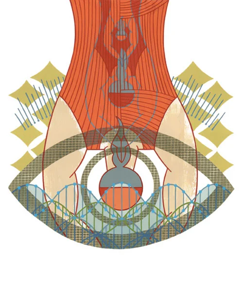
Thom Sevalrud created this powerful image for the cover of the Journal of the Norwegian Medical Association. This is Thom's fourth cover for the JNMA, working with art director Emma Dalby, who seems to match him perfectly with topics that speak to his visual vocabulary. Conceptually, Thom addresses many aspects of whole genome sequencing, which is becoming more and more accessible to us all.
Thom Sevalrud: Journal for the Norwegian Medical Association
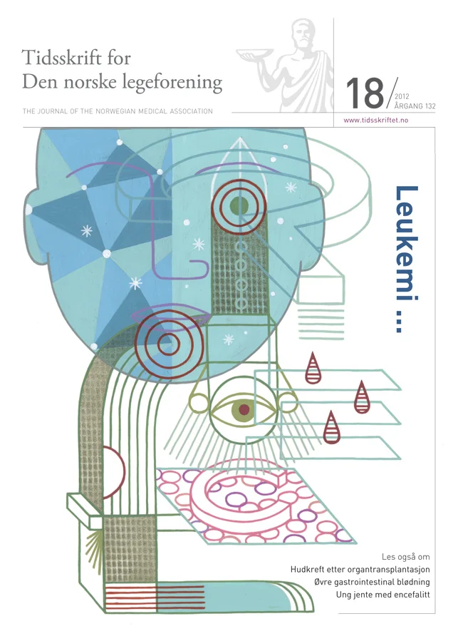
Art Director Emma Dalby commissioned Thom Sevalrud for a third cover for the award winning Journal. His masterful conceptual skills communicate to the scientific community Leukemia's treatments and how to identify the disease through family history and biological markers.
Thom Sevalrud: Journal for the Norwegian Medical Association
Thom Sevalrud illustrated two of the 22 covers (judged as a series), and awarded the best art overall in the prestigious Norwegian Prize (Fagpresseprisen). The Journal's art director, Emma Dalby recently got in touch with Thom to share feedback from the judges: "...communicative and well thought out illustrations on every cover - simply beautiful!". We agree, Thom's images communicate difficult subject matter in a highly creative and yet academic manner. You be the judge. Congratulations Thom, for this outstanding achievement! Click here to view more of Thom's work.
This cover illustrated an article on Electroconvulsive Therapy (ECT).
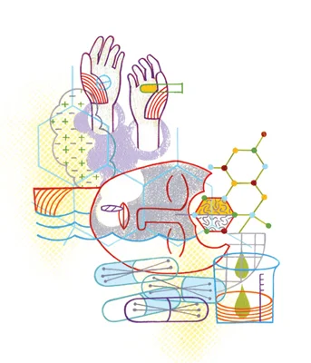
This cover illustrated an article on drug addiction/abuse and drug screening.
Janice Kun illustrates "Boomerangst"
"Boomerangst" is a new term to describe the worry over the financial strain the aging "Boomer" population has and will have on the Canadian health care system. Janice Kun used her photo-illustrative talents to create this hospital corridor/ graph image to accompany the article The Boomer Effect, Is Canada's Health Care Headed for Trouble? in the Nov/Dec issue of Legion Magazine, art directed by Jason Duprau.
Thom Sevalrud Illustrates Mental Health
Thom created these cover images for the Journal of Norwegian Medical Association. The most recent cover, on the use of Electroconvulsive Therapy, was a challenge for Thom. He writes, " I pretty much had to dispel the negative connotations and images that were impressed upon me with films such as One Flew Over The Cuckoo’s Nest. I was asked to create an image that conveyed a sense of hope and positive end results." The article notes that ECT is still used today and with good results on certain types of depression.
The first cover Thom created (issue 6) was on drug addiction and drug screening. The Art Director, Emma Dalby, asked him to illustrate some of the key words. What Thom wanted to convey was "a sense of being 'shackled' to a substance when you are addicted. This comes across in the hands that are almost 'hand-cuffed' by the smoke. The head is floating on purpose......I wanted the head to be almost floating as if you are not present but in your own world. The pills almost form pillows as well. The molecular structure of THC is present on the side. That structure becomes part of the brain structure as if taking over. So the whole image is a mixed up montage to go with the idea of the scattered fragments of logic present in drug addiction. "