Katy Dockrill for SHE magazine

Illustrator Katy Dockrill had the opportunity to contribute again recently to SHE Magazine, published by the Canadian Women’s Foundation.

For this poignant piece on the struggles women still face Katy used the symbol of the quilters.  The visual is perfectly paired with a quote by Rosemary Brown, pioneer of 20th century Canadian politics, who devoted her life to the cause of justice and equality for women and minorities.

See more of Katy’s inspired illustration. Represented by i2i Art Inc.

Monika Melnychuk for Owl Magazine

It always pays to be prepared! Owl Magazine, art directed by Jill Monsod, has put together a pretty handy guide to the 'great outdoors' for their Summer issue. i2i Art illustrator Monika Melnychuk knew quite a bit about this topic already, spending much of her leisure time biking through the backwood trails in Whitehorse, Canada.  

And Monika's illustrations give a humorous twist on those all too important survival lessons. Have a quick read and smile along the way as Monika's characters show us a thing or two about those great outdoors.

Monika Melnychuk for Owl Magazine

See more of Monika's endearing characters and illustrations. Monika Melnychuk is represented by i2i Art Inc.

Mark Hoffmann for The Square Magazine

Mark Hoffmann, New Hampshire resident and illustrator, knows there is nothing better on a nice summer day than some fresh fish on the waterfront. Chip Allen, art director of The Square Magazine and Meganne Febrega, author of the article "Hit the Decks" knew Mark's folk art style would capture the scene perfectly.  

Hit the Decks by Mark Hoffmann

Hit the Decks by Mark Hoffmann

With Mark's distinctive lettering, whimsical imagery and sophisticated color palette used to highlight the premier eateries, you will want to book one more road trip this summer--I certainly did!

Local Restaurants illustrated by Mark Hoffmann

Clare Owen for Cooking Light's Summer Cookbook

Food is a favorite subject matter for Clare Owen so when given the opportunity to contribute her illustrative talents Cooking Light's Summer Cookbook Clare was thrilled.  

The "Farmer's Market" edition was art directed by Sheri Wilson and showcases three fabulous city markets every foodie should know: Portland's market at PSU, Chicago's Logan Square and Philadelphia's Headhouse market.

Clare's main illustration accompanies an article on "how to shop" and features all the elements you look for in a great farmer's market. Clare's rich color palette and use of texture brings the 'scene' to life. Her contemporary style shows just how hip shopping at the market can be.

Summer Farmers Market illustrated by Clare Owen

Summer Farmers Market illustrated by Clare Owen

What's happening in Chicago, Philly and Portland illustrated by Clare Owen

What's happening in Chicago, Philly and Portland illustrated by Clare Owen

Hungry for more? View Clare's complete portfolio. Clare Owen is represented by i2i Art Inc.

Mark Hoffmann for D Magazine

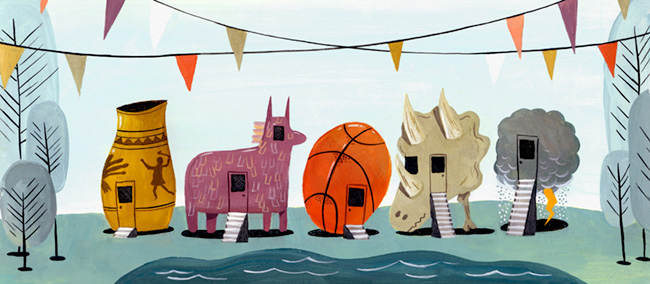
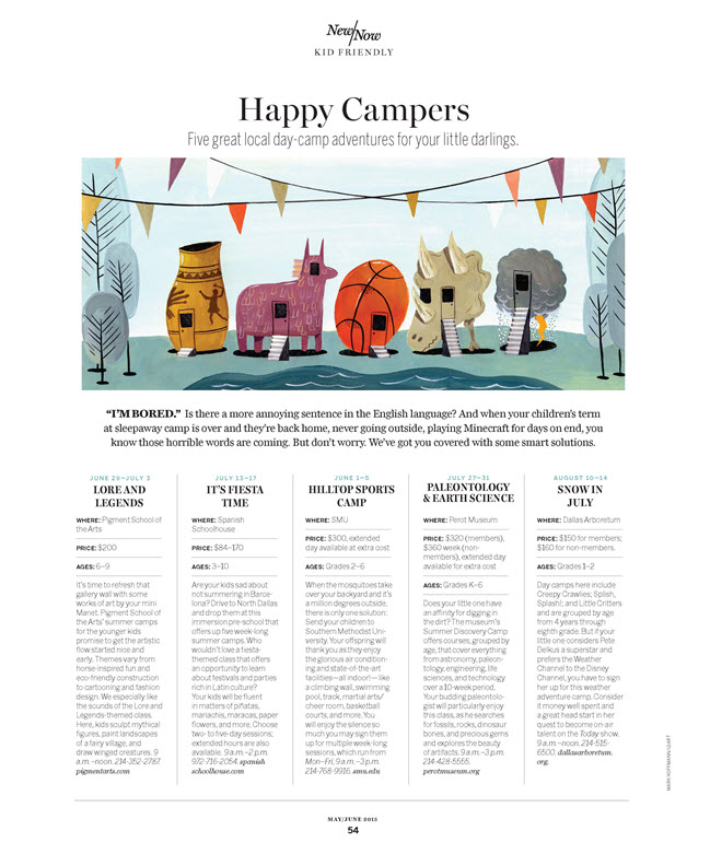
Will your kids be happy campers this summer? From Spanish immersion to paleontology camp, D Magazine handpicked some of the most exciting options in the Dallas, TX area. All that was needed was a terrific illustration to draw the reader in.  

Art director, Jamie Laubhan-Oliver, decided on Mark Hoffmann for the job. Mark let his imagination lead the way, resulting in this playful, folksy piece that is sure to put a smile on your face as you remember those long days of summer past.

Illustrator Mark Hoffmann - Happy CampersMark Hoffmann, Happy Campers Article in D MagazineBrowse Mark Hoffmann's portfolio on i2i Art.

Thom Sevalrud for The Journal of the Norwegian Medical Association

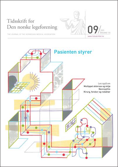
Thom Sevalrud had the pleasure of illustrating yet another cover for The Journal of the Norwegian Medical Association this past month. Art director Lotte Gronneberg chose the prefect topic for Thom's style.  

Thom's piece depicts how technology will change the role of patient care in the years to come. As Thom often does, he gives us the sense of the enormity of these decisions and how very personal they can be.Thom Sevalrud, Patient Technology


'Patient Technology' by Thom Sevalrud

Thom Sevalrud, JNMA Cover

Cover of The Journal of Norwegian Medical Association

See more conceptual illustration by Thom Sevalrud.  Thom Sevalrud is represented by i2i Art Inc.

Dave Murray for National Magazine

When tech collides with the standard way of doing things. Illustrator Dave Murray is often asked to visually interpret this concept. Most recently, art director Tony Delitala of Delitala Design, assigned Dave to illustrate two high tech articles for the Canadian Bar Association's National Magazine.  

Dave's strong use of symbolism, conceptual intelligence and graphical style invites the reader to dive into these stories.

Technology can help make justice more accessible

Dave Murray for the National Magazine

Heavy workload? There’s an app for that.

©Dave Murray_DM205_i2iArt

Check out more of Dave's work. Represented by i2i Art Inc.

Eric Chow for Remodeling Magazine

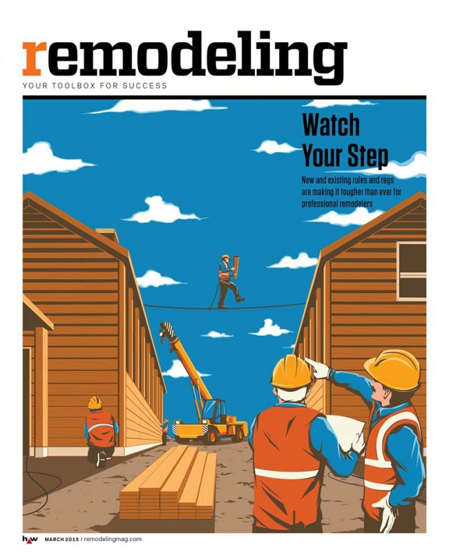
With ever-changing rules and regulations, remodeling you home or office is no picnic. Remodeling Magazine tackled this topic in the feature article "Watch Your Step" for their March 2015 issue.  

The design team at Hanley Wood knew a conceptual solution would be best to illustrate the fine line contractors walk between safety and regulations. Illustrator Eric Chow worked closely with them to come up with this clever tightrope analogy.

Eric Chow Remodeling Magazine Cover

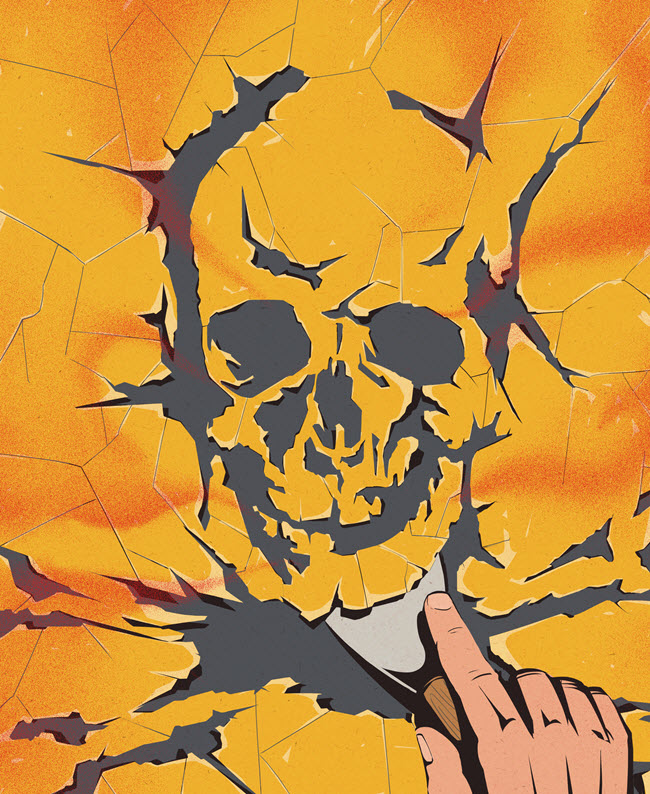
Eric chose to put a menacing face to the dangers of lead paint removal for the inside story.

Eric Chow Lead Paint Remodeling Magazine


Looking for a new way to tell your next story?  Visit Eric Chow's complete portfolio at i2i Art.

Monika Melnychuk for Wine & Spirits Magazine

The Wine & Spirits 26th Annual Restaurant Poll is out this month with their famed list of the top 50 wines Americans love most. This year's cover showcases the elite bunch of sommeliers that help make these decisions.  The sophisticated playfulness of Monika Melnychuk's illustration style couldn't have been a better choice to capture the group's likeness.  

Armed with all the pics art director Michael Rush could get his hands on, Monika meticulously drew each somm's portrait, happily revealing a little (or a lot) of each personality and style.

Cover Wine & Spirits Featuring Monika Melnychuk Illustration
Wine & Spirits Cover Featuring Monika Melnychuk

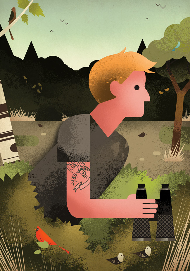
Dave Murray for Reader's Digest, "Birders Unite!"

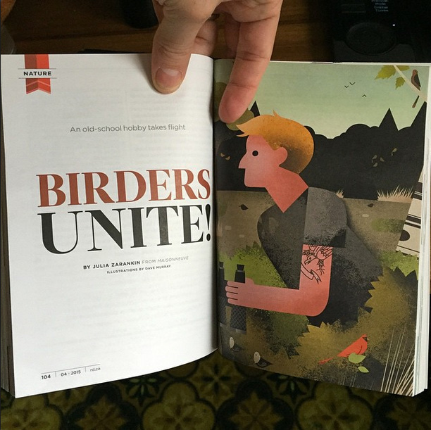
Hipsters: known for ransacking vintage stores, perfecting their beards and gentrifying neighborhoods with their artisanal food stores. It seemed likely they should revitalize some old school hobbies while they are at it. Like bird watching.  

This month's Reader's Digest article, "Birders Unite!" written by Julia Zarankin, dives into the phenomena of the bird watching millennials.  Needing to combine the tattooed with the wilderness, art director Annelise Dekker picked the perfect artist in Dave Murray.


Caution: These are not your grandfather's illustrations:


Dave Murray illustration Birders Unite for Readers Digest


Dave Murray Illustration Birders Unite ©Dave Murray_DM195b_i2iArt

Uniquely stylized, award-winning illustration.  We invite your to check out more of Dave Murray's illustration.


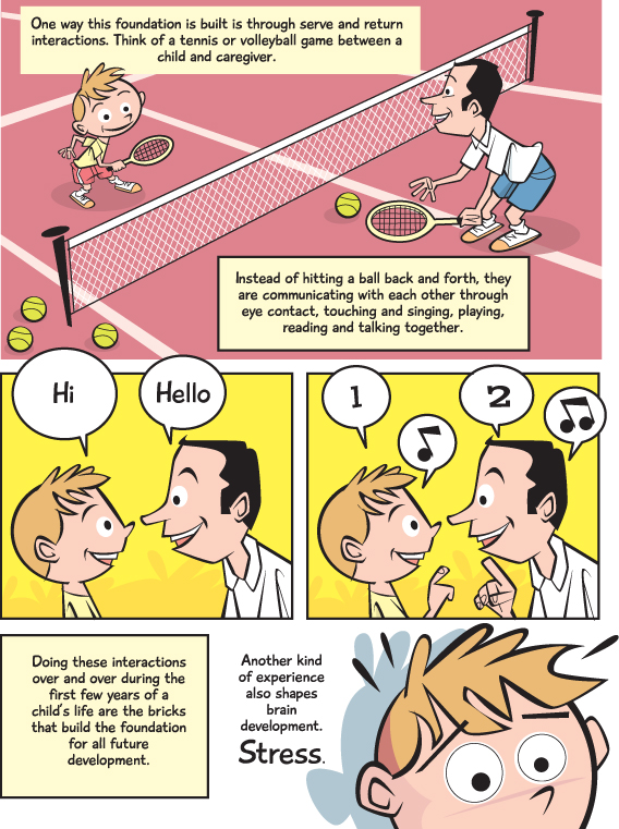
Rémy Simard for apple Magazine

It's never easy to explain a complex theory, never mind making it an enjoyable experience.  When Editor Terry Bullick at apple magazine was tasked with a story about brain development she turned to illustrator Rémy Simard to help her communicate this intricate topic to her readers.  

Rémy's fun, lighthearted, comic book style was the perfect way to break this story down into easy to understand concepts. A quick 5 minute read and you too will be an expert on brain development.

Impression


Impression Impression Impression

Visit Rémy Simard's portfolio for more examples of his unique illustration.

Dave Murray for Canadian Grocer

The always enthusiastic Dave Murray jumped at the chance to work with art director Lindsay Maclachlan again on a feature article for Canadian Grocer. Dave often illustrates technological innovations so the brave new world of in-store technology at our local grocer was a perfect match for Dave's style.

The Future of the Grocery Store

Dave Murray Illustration for Canadian Grocer

smartphones and tablets could dominate our grocery shopping experience

Dave Murray spot illustrations Canadian Grocer

Mark Hoffmann for D Home Magazine

Ever found your kid hanging from a candelabra or climbing a giant holiday decoration?  In his best playful style, Mark Hoffmann illustrated the story Babes in Toyland:  Activities that will make your kids' holiday season more merryfor art director Jamie Laubhan-Oliver, at D Home Magazine. If you like this image, there are a lot more fun Mark Hoffmann illustrations here.

©Mark Hoffmann_MH447_i2iArt

Introducing new i2i Art illustrator, Dave Murray

Meet Dave Murray. DM131_personal_dave


We wanted to share with you a recent conversation with Dave Murray to give you a little insight into the person behind the art.

i2i Art: Why illustration?

Dave Murray:  Well, I've been drawing for as long as I can remember, and it's something I've always enjoyed. I started with drawing my favorite characters from comic books, and went from there. My illustration career formally began at Sheridan College, I guess - I always thought it was kind of a funny thing, to go to school for art, but it's what I loved to do - so giving myself the chance to make my living from it was really the only decision.

i2i Art:  What makes you tick?

Dave Murray:  Maybe it's a boring answer, but it's keeping my life pretty simple and finding pleasure in the small things. Making interesting work, walking my dog, spending time with my wife, and friends...that's pretty much it.

i2i Art: How do you come up with new ideas when presented with a brief? Tell us a bit about your process?

Dave Murray:  I find a lot of success when I break down ideas and concepts into words and definitions - I'm a bit of a crossword fanatic. At that level, I feel like there's a lot of freedom to play with meanings and definitions - and then translate that wordplay into visual metaphors. From there, small thumbnails and sketches in my sketchbook, larger sketches on the computer, and then a mishmash of stuff to create the final piece.

i2i Art: What other creative projects keep you going aside from illustration?

Dave Murray:  I like to keep myself busy. Aside from illustration, I have an ongoing text-based mapping project. It's mostly focused on Toronto, but I've been brought out to cities such as Stratford and Halifax to apply my work there. I'm also a co-founder of the Garrison Creek Bat Co., which is an artisanal baseball bat company based in Toronto. At GCBC, we focus on making each bat a piece of work in itself, and occasionally curate events where we invite other illustrators, artists, and craftspeople to customize our bats however they like.

i2i Art: How do these projects influence your illustration?

Dave Murray: My other creative projects allow me to take a step back from illustration, and put other creative aspects of my brain to work. It's like a breath of fresh air, which allows me to come back invigorated and often with new perspectives in regards to my illustration work.

i2i Art: What are the best parts of being a freelance illustrator?

Dave Murray:  Probably the whole thing. The fact that I'm doing something I love to make my living is incredible in itself, but it's the opportunities and experiences that I've had solely because of illustration that make it truly special.

DM108_budweiserNXNE_poster(killed)

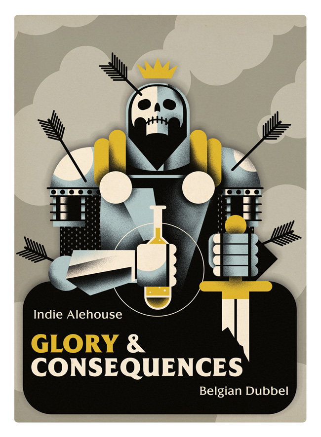
DM123_indiealehouse_glory

Citizen Draper:  Crowd-Sourcing in Advertising

DM158_unitedhemispheres_draperspot

Green Hotels


DM127_lodging_greenhotels_fullpage

Commission Dave Murray to contribute to your next campaign or feature!  Check out Dave Murray's entire portfolio here.
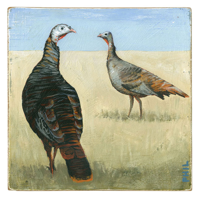
Phil: Wild Turkeys for Country Gardens

  The turkey is one of the most famous birds in North America.  In fact, did you know Benjamin Franklin wanted to make the wild turkey, not the Bald Eagle, the national bird of the United States?


Working with art director Nick Crow,  Phil created this beautifully evocative illustration--in his trademark wistful style, for an article in the Fall 2014 issue of Country Gardens magazine called Bird's-Eye Views.  Visit phil's entire portfolio of hand painted illustrations on wood here.
©Phil_PG381_i2iArt

Thom Sevalrud makes Luerzer's Archive Best Illustrator list, again.

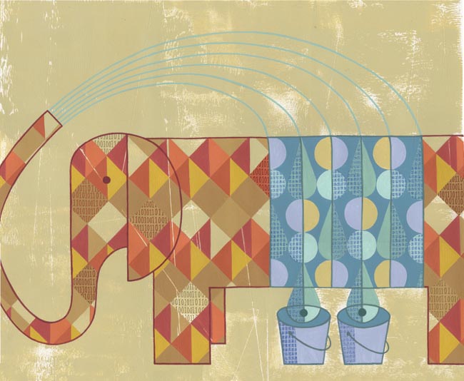
  How do you manage to be named one of the top 200 Best Illustrators Worldwide by Luerzer's Archive, for a second time?  We asked Thom Sevalrud, a master of conceptual illustration, to help us understand his methods and inspiration for his most recent award-winning image 'The Elephant' depicting big data analytics.


i2i Art:  Let's start from the beginning.  How were you approached to create an illustration representing Big Data Analytics?

Thom Sevalrud:  This image was created for the McKinsey Quarterly publication. It was to be a double-page spread to accompany a whole ‘section’ in the journal examining big data analytics. The AD, Jake Godziejewicz, had sent me the articles and a short brief that explained what they needed; including some very specific examples of mine that showed the approach they preferred.


i2i Art:  Why an elephant?

Thom Sevalrud:  I wanted to nail a perfect image of something big, yet something multi-faceted. It all came together fairly quickly once the water provided the metaphor for ‘washing away the complexities’ of data. I sent the idea to Jake and explained that the elephant image would be a perfect way to ‘over-fill’ a double page spread with both sides of the creature being cropped off the page……like it didn’t fit.  I'm glad Jake loved the idea.


i2i Art:  Was this painted traditionally?

Thom Selvarud:  It was acrylic on paper, then I added a subtle binary code into random areas of some of the diamond shapes in the elephant using digital tools.


i2i Art:  And how did you get the nod from Luerzer's Archive?

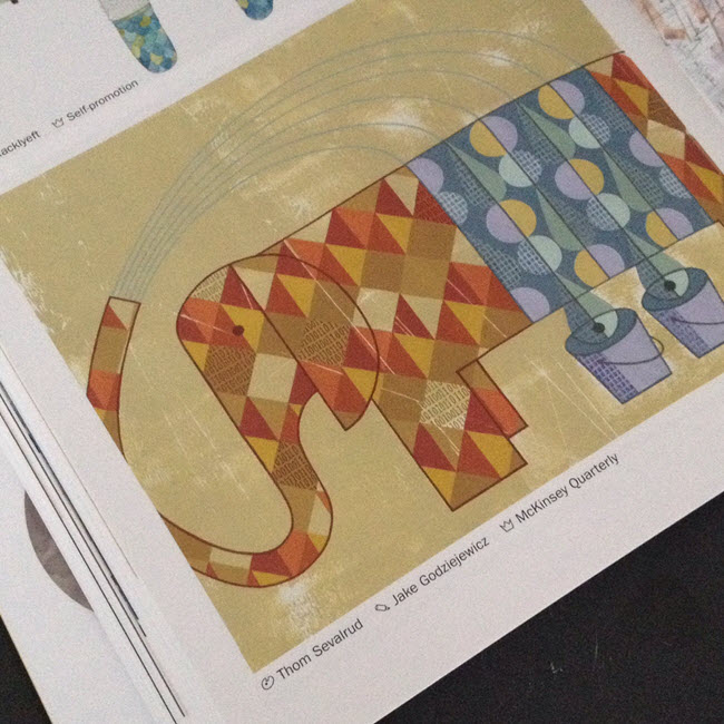
Thom Selvarud:  At about the time I was working with McKinsey Quarterly, I was invited to once again submit to Luerzer’s Archive 200 Best Illustrators Worldwide. Illustrators are first nominated and screened before they are invited to enter. Their work is then taken to another level of judging and are chosen from an international collection of work, where my elephant made the cut. I have now been included in 2 of the 5 collections of The Best Illustrators by Luerzer’s Archive.

©Thom Sevalrud_TS282_i2iArt'The Elephant' as it appears in Luerzer's Archive 200 Best Illustrators Worldwide

Thom Selvarud in Luerzer's Archive

Thom Sevalrud is represented by i2i Art Inc. | View Thom Sevalrud's complete portfolio

Introducing Eric Chow, conceptual illustrator + powerful narrator

A UK-based illustrator from Hong Kong, Eric Chow started his illustration career soon after graduating from the London College of Communication in 2012. He produces his illustrations digitally using a powerful surrealist, often humorous style.  

When asked about his inspiration Eric Chow outlines his process, "my portfolio is based on the idea of recording life and thoughts."  Rather than creating just another good-looking picture, Eric makes his illustration speak.  The sign of a great conceptual illustrator and one of the many reasons i2i Art Inc. is proud to represent Eric Chow.


Eric won second runner-up for the prestigious Serco Prize 2014 with this piece, 'Lady Bridge".  The story behind this thoughtful illustration: Waterloo Bridge was reconstructed mostly by women during the wars in 1945, while men were doing national service thus the bridge's other name – The Lady Bridge."

©Eric Chow_EC139_i2iArt'Lady Bridge'

Eric's work has also been featured in Creative Boom, Shellsuit Zombie, Creative Review, Computer Art and Wired magazine.

©Eric Chow_EC123_i2iArt'Father and Son'
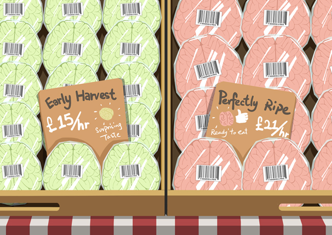
©Eric Chow_EC111_i2iArt'Brain Market'
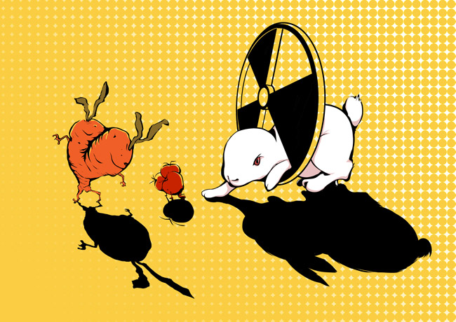
©Eric Chow_EC143_i2iArt'Mutant'
©Eric Chow_EC119_i2iArt'Creative Review'

View Eric Chow's entire portfolio at i2i Art Inc.