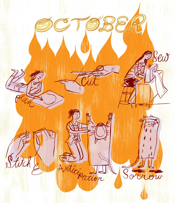
As we begin the wonderful (and sometimes whacky) month of October, we'd like to know what scares you most! Illustrator (and sometimes seamstress) Katy Dockrill, shares a little story about what she's up to this month as she preps for her young daughter's Halloween experience below. Can you relate to this narrative? Check out more of Katy's fun illustrations and hand lettering here.
Monika Melnychuk for Canada Post: Adopt-A-Pet Campaign
We are excited to unveil this special postage stamp series created by Monika Melnychuk for Canada Post. Monika's whimsical line art style serves this playful concept, which features photography of actual homeless pets, in environments that could become reality--if only they are adopted. A brilliant example where the concept is the message! The would-be homes for these pets, are left up to the viewer to fill in, by adopting a pet!
Working with Vancouver based design firm, Subplot, Monika illustrated the collectable Souvenir Sheet, Official First Day Cover, as well as the Five Collectable Stamps for Canada Post's Adopt-A-Pet campaign.
It's great to see Canada Post using their currency to help bring awareness to such an important cause. In 2010, close to 150,000 homeless pets were admitted to shelters across Canada. Partnering with the CFHS, Canada Post wanted to create awareness around the need for animal lovers to adopt from their local Humane Society or SPCA, and give homes to animals who so desperately need them. As of today, April 22 2013, the full package below can be purchased through Canada Post--the collectable Souvenir Sheet Official First Day Cover, complete with all five Canadian stamps.
Project Director: Danielle Trottier, Canada Post.
Designer, Ross Chandler, of Subplot.
Creative Directors: Roy White and Matthew Clark of Subplot Inc.
Photography by: Raeff Miles (cages) and Raina + Wilson (animals).
Greg Stevenson illustrates around the clock!
Ever have one of those days where you can't stop thinking about food? Literally. Greg Stevenson's hand lettering and flowing line technique made him the perfect choice for this conceptual piece, art directed by Jane Edwards Griffin (Griffin Design). The article 'Food for Thought' for Simon Fraser University's alumni publication, aq Magazine, talks about a massive renovation to the SFU dining hall and café in response to a survey in which 6,000 students were in favor of: wider variety, international flavors and healthier foods available around the clock.
Eili-Kaija Kuusniemi for 'Folk!' Website
Eili-Kaija's illustrations are woven into the new website for Folk!- an advertising agency based in Helsinki. She created the portraits that accompany the staff bio's and a map on the contact page. The handmade, approachable quality of Eili-Kaija's work was chosen to help brand the site with the company's down-to-earth and participatory work style.
Thom Sevalrud for GreenSource
Thom Sevalrud, in his architectural layered style, created the following spread to accompany a feature article, "Core Values" in GreenSource magazine, about how sustainable design requires a closer collaboration between architects and structural engineers.
Tech Toys Illustrated by Monika Melnychuk
The November issue of Parenting has a feature on tech toys (just in time for holiday shopping). Amanda Bardwell, the art director, asked Monika Melnychuk to illustrate the retro 'equivalents' of the toys, which were presented in contrast to the photos of the modern tech toys being recommended in the article. We think this is another great example of how illustration combined with photography makes a very compelling layout.
Thom Sevalrud Illustrates Mental Health
Thom created these cover images for the Journal of Norwegian Medical Association. The most recent cover, on the use of Electroconvulsive Therapy, was a challenge for Thom. He writes, " I pretty much had to dispel the negative connotations and images that were impressed upon me with films such as One Flew Over The Cuckoo’s Nest. I was asked to create an image that conveyed a sense of hope and positive end results." The article notes that ECT is still used today and with good results on certain types of depression.
The first cover Thom created (issue 6) was on drug addiction and drug screening. The Art Director, Emma Dalby, asked him to illustrate some of the key words. What Thom wanted to convey was "a sense of being 'shackled' to a substance when you are addicted. This comes across in the hands that are almost 'hand-cuffed' by the smoke. The head is floating on purpose......I wanted the head to be almost floating as if you are not present but in your own world. The pills almost form pillows as well. The molecular structure of THC is present on the side. That structure becomes part of the brain structure as if taking over. So the whole image is a mixed up montage to go with the idea of the scattered fragments of logic present in drug addiction. "
Illustration Married with Photography
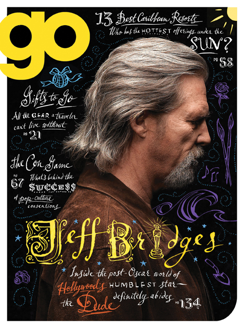
We are seeing a growing trend whereby illustration is combined with photography. Below are a few examples of different approaches. Sometimes the client supplies the photos, although frequently the illustrator shoots their own photos or stock photos are used.
Greg Stevenson created the hand-lettering and icons layered over the photo of Jeff Bridges, supplied by the client, Ink Publishing.
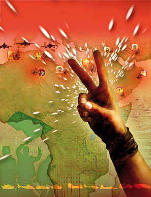
Anne Horst created a montage of stock photos and illustration to create this image on social media for the cover of Marymount Manhattan College Magazine.
Alanna Cavanagh's minimal and whimsical line illustrations create a great contrast with the rich fabrics in the photo supplied by Fabricut for this Trend Drapery ad.
John Webster created this piece with stock imagery and client supplied photos of Sorbara Hall on the St.Michael's campus at the University of Toronto. The article was on the history of the use of the campus in film.
Aaron Bihari used a photo with a duo-tone treatment for the background in this piece, to contrast with his illustrated VW bus.
This is an example of how Janice Kun creates a dream-like image with the use of her own original photography as well as stock imagery.
Margaret Lee often sets up her own photo shoots on location and uses a unique colorization to create whimsy and drama.
Bruce Emmett often stages elaborate sets, with himself as a model, in his photo-illustrative work.
New Illustrations by Eili-Kaija Kuusniemi
Eili-Kaija has created some playful new pieces which showcase her talent for making vintage look new! Check out her updated portfolio for more.
Thom Sevalrud selected for 200 Best Illustrators Worldwide
Thom Sevalrud is featured in Luerzer's Archive - 200 Best Illustrators Worldwide. A selection of top art directors worldwide identifies a list of illustrators for the publication. After an illustrator is selected, they are then invited to enter work commissioned from the prior 18 month period. Thom's winning illustration (below) is on page 210 in the 2011/12 volume.
"Witch" by Sarah Beetson
In time for Halloween, Sarah Beetson worked with Megan D'Orazio to illustrate the story "Witch" for READ Magazine's "Witch Hunt (Salem and Beyond)" issue.
Bookmark by Alanna Cavanagh
If you happen to pick up any of the books illustrated by the i2i illustrators, you could swing by Good Egg in Kengsinton Market to pick up a bookmark, illustrated by Alanna Cavanagh.


