In the heart of St. Paul, Minnesota the students at Macalester College like to embrace winter in all it's frigid, snowy splendor. This hardy community has begun to welcome more and more warm weather international students and introducing them to the myriad of winter activities on and around campus.
Read MoreJanice Kun for USC Dornsife Magazine
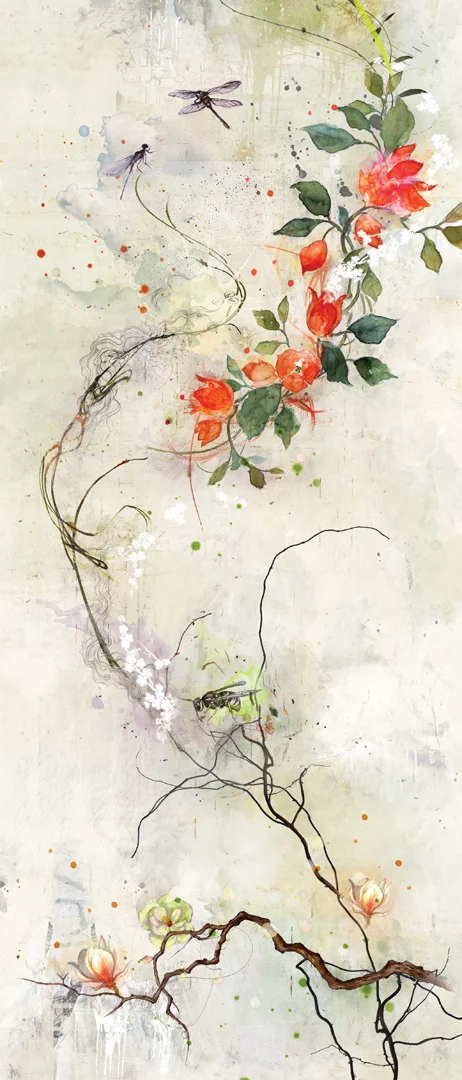
Our genetic blueprint is still a very mysterious concept. For the article "Molecular You" in the most recent issue of USC Dornsife magazine, Janice Kun captures that mystery and intrigue in a series of beautifully atmospheric illustrations. Using a combination of line drawing, watercolor and photography Janice's imagery provides layers of subtle, yet powerful, detail. With incredible art direction by Daniel Knapp we are given the chance to ponder the impact of our DNA through Janice's work.
See more of Janice Kun's illustration. Represented by i2i Art Inc.
Greg Stevenson’s Poster Series for Open Mic Night
Nothing better than catching some live music at the local pub, right? Greg Stevenson has been a regular at Scallywags for quite some time and over the years he’s been responsible for a lot of their terrific poster art. The assignment to brand and help promote their new Open Mic Night was right up Greg’s alley.
Greg used his signature hand-drawn lineart with plenty of color and texture when he designed and illustrated this poster series. Greg’s unique way of contextualizing photos perfectly captures what we know will be a good time.
Check out more of Greg’s illustration work. Represented by i2i Art Inc.
Janice Kun for apple Magazine
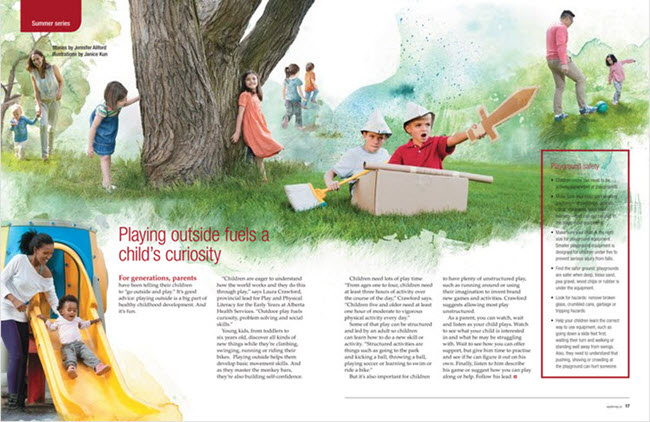
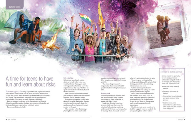
Amy Sawchenko, art director at apple Magazine recently commissioned Janice Kun to illustrate a six-page feature on summer activities for all ages. Amy definitely wanted to capture the fun and excitement the season brings.
Janice combined photography with her bright and beautiful watercolor backgrounds to create these playful and exciting digital collages.
Janice always strives to create the perfect composition; balancing hand-drawn elements and watercolors with photography and other mixed media. Her photo-illustrations range from somber to evocative to fun.
View Janice Kun's portfolio, represented by i2i Art Inc.
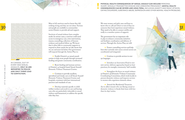
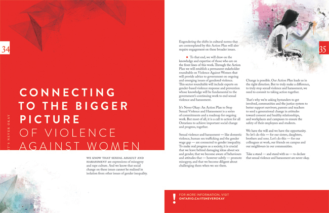
Janice Kun for the Government of Ontario
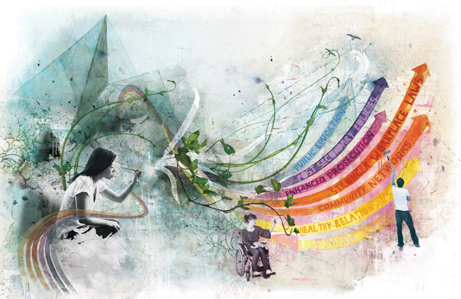
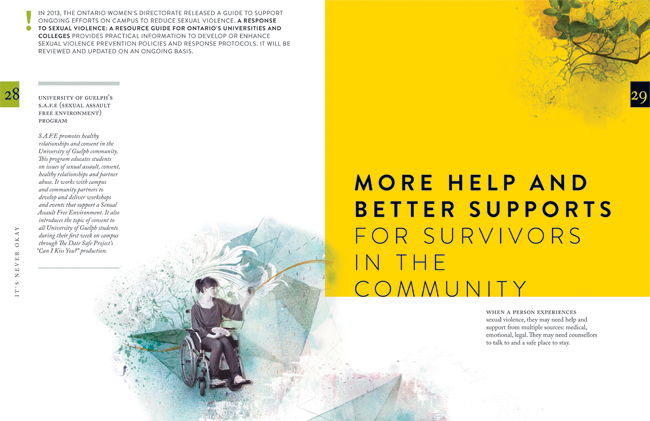
Janice Kun collaborated with Deirdre Hughes, creative director with Agency59, to create the illustration used for Kathleen Wynne's Government of Ontario Sexual Violence and Harassment Action Plan. Both an honour and a challenge, the art needed to show the optimism the new Action Plan promises, while at the same time representing the struggle and the work to be done on this important societal problem.
To accomplish all of this, Janice's illustration needed to take a conceptual approach in showing the urgency and the action to be taken on the issue of sexual violence and harassment. Through her unique blend of photography, hand rendering and digital collage, Janice's mixed media illustration set out to do all this.
Below in the main double page spread of the report, three figures work together to reshape a landscape that moves rhythmically from the darkness of an abstracted, geometric background, into one of brighter, bolder colours, and organic shapes. Their dialogue sparks the process of change by writing a new script, painting a new horizon, and cultivating new growth.
Greg Stevenson for Dreams on Wheels Reader
Greg Stevenson created these instructional illustrations combining his playful doodles, line-work and hand lettering with a photo-collage approach for educational publisher Developmental Studies. SIPPS (Systematic Instruction in Phonological Awareness, Phonics, and Sight Words) is a program for new and struggling readers from kindergarten through grade 12. The main criteria for the art was to decode the stories to visually assist the reader with comprehension.
Check out Greg Stevenson's versatile portfolio.
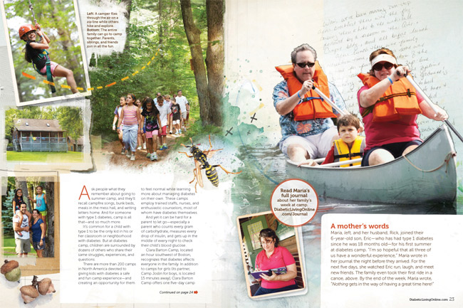
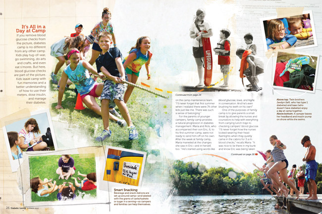
Ozzie Award for Diabetic Living Story Illustrated by Janice Kun
Congratulations to Diabetic Living, on the Folio Ozzie Award for Consumer Publications: Best Use of Digital Imagery for the “Let’s Go to Camp” story illustrated by Janice Kun. Many thanks to art director, Michelle Bilyeu who shared the news with Janice, "Our team loved how this story turned out and you did a fantastic job making it come alive!". Working closely with Michelle Bilyeu, Janice Kun artfully incorporated the many photographic moments with illustrated elements highlighting this true-to-life portrayal of camp life.
Incorporating kids' letters and handwriting really helps make this their personal story.
Love the subtle use of a black and white photo with spots of color (top center).
To see more of Janice Kun's playful illustrations integrating photographic elements, check out her updated portfolio.
Janice Kun for Hewlett Packard
These images are a sample of the art created by Janice Kun that comprised the 'Card of Good Intentions' for HP. With audio design by Randy Knott, Janice's award winning art was animated to count the days of Good Intentions for HP throughout the month of December. An ode to the holiday season! To see more of Janice's ethereal art take a peek at her updated portfolio here.
Clare Owen: Infographic for Verily Magazine
Clare Owen has a way of taking even the most dry material and making it look nothing less than lovely! When approached to illustrate a feature about Building a Budget (Without Breaking a Sweat) for Verily magazine, Clare developed this fun and informative infographic. With the help of this little chart, I think one could easily do it, no sweat! She actually makes is look fun! To see more of Clare's charming infographics and other delightful illustrations, check out her updated portfolio here.
Margaret Lee: Being A Writer
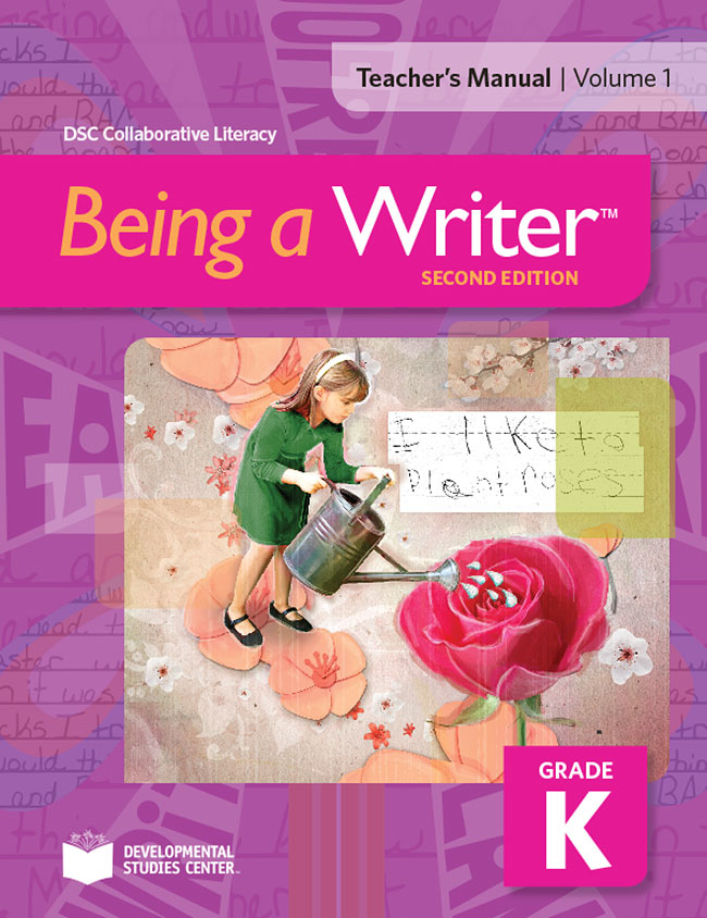
Working with talented art director Roberta Morris, Margaret Lee created these fun book covers for the Being A Writer Program. With a combination of actual student writing and hand created collage elements Margaret brings her clean and graphic layered treatment to these age-appropriate illustrations. To see more of Margaret's inspiring collage style art visit here.
Greg Stevenson for Canadian Living
Combining Greg Stevenson's hand lettering, info graphic icons and layered photo-illustration adds a fun, upbeat mood to these stories of courage, art directed by Stephanie White. In this recurring feature, called A Year of Firsts 2014, meet and be inspired by the people who embraced a whole year of trying new things, whether facing fears or embracing change. Peruse more of Greg's illustration here.
Theresa Albert
Christina Campbell
Janice Kun - Black History Stamps
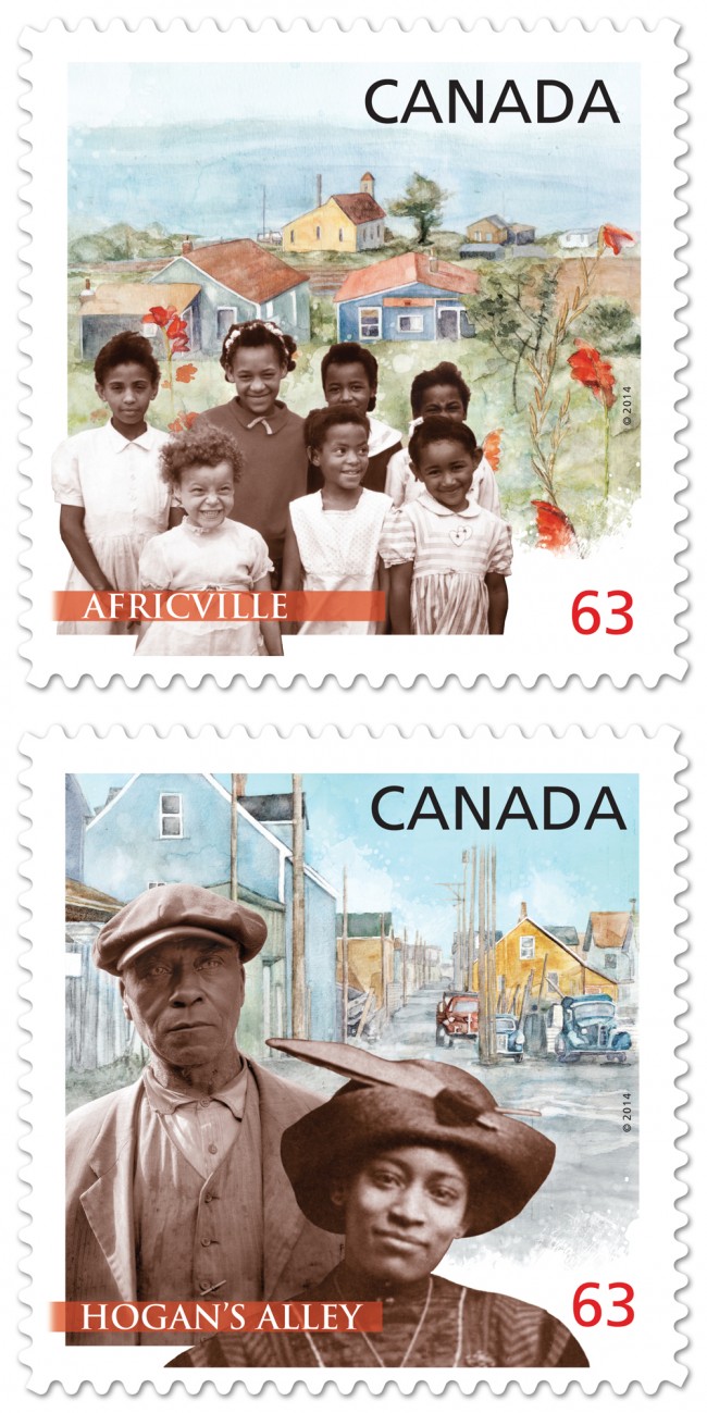
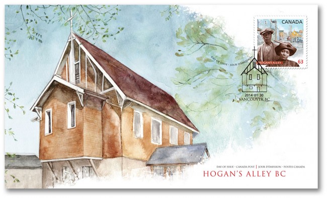
Canada Post celebrates Black History Month by commemorating two distinctive and historic African-Canadian communities: Vancouver's Hogan's Alley and Halifax's Africville.
Working closely with designer, Karen Smith, Janice Kun created the background watercolors depicting historical churches, central to these communities. Typical of Janice Kun's style, the pairing of the paintings with supplied historical photographs is a delicate dream-like balance between these real people and remembered communities.
Greg Stevenson for: Positive Side
Greg Stevenson was commissioned by the Canadian AIDS Treatment Information Exchange (CATIE) for their publication called The Positive Side. This illustration is about how a low viral load can cut the risk of HIV transmission was art directed by David Vereschagin to have an overall optimistic tone. Greg says, "The candle was meant to imply a ‘re-kindling” of desire in both partners (one positive and one negative) while practicing safety and awareness." Notice how the very subtle ('Rothko-esque') variations in the background add beautifully to the mood of the piece.
Tim Zeltner for Emory University
The king of landscapes, city-scapes and make-believe kingdoms, Tim Zeltner works his magic for Emory to accompany a story about the Rollins School of Public Health.
Tim Zeltner for Brewer's Association
Working with Allison Seymour, art director for the American Homebrewer's Association Tim Zeltner created this cover at for the March/April issue of Zymurgy Magazine, featuring the concept of home brewing with locally sourced ingredients. Tim's trademark rural landscape painting with the surrealistic addition of a pint of home brewed beer, create a dreamy utopia for any beer lover.
Janice Kun for Royal Ontario Museum
Art director Tara Winterhalt chose Janice Kun to create a double page spread illustration for the article Threads That Bind which first appeared in ROM, the magazine of the Royal Ontario Museum, Summer 2012 issue. The story is a true account of an archaeologist's search for human origins which became deeply personal. Janice's pictographic method of weaving the elements of the story together is reminiscent of it's ancient references.
[pinterest]
John Webster in Covet Garden Magazine
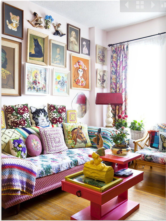
John and his friend Stephanie Power were recently featured in the lovely Covet Garden decor magazine. Their spaces are perfectly aligned with Covet's interest in environments that have not been styled by interior decorators. Both John and Stephanie's artistic esthetic is reflected to a 'tea' in their uniquely delightful homes. John says, "The best part of the house is that for the first time, my apartment feels like a collage--my art and way of living have become one." Look at John's portfolio here and see if you can find some of his "curious curios" living in his art. Photos courtesy of Covet Garden, photographer Ashley Capp.
John in his delicious kitchen!
Greg Stevenson for Nexus
Recently, Greg was asked by the University of Toronto's law magazine Nexus, to create 3 photo illustrations for their contributors page. Using supplied photography, which lacked a consistency, the photo-illustration technique applied, brought a unique continuity to the contributors page. An interesting solution to a recurring problem encountered by art directors.
Janice Kun for Harlequin
Janice Kun illustrates "Boomerangst"
"Boomerangst" is a new term to describe the worry over the financial strain the aging "Boomer" population has and will have on the Canadian health care system. Janice Kun used her photo-illustrative talents to create this hospital corridor/ graph image to accompany the article The Boomer Effect, Is Canada's Health Care Headed for Trouble? in the Nov/Dec issue of Legion Magazine, art directed by Jason Duprau.
