Over this past year illustrator Greg Stevenson had the honour to work with The College of William & Mary, one of the oldest universities in America. Each year W&M Alumni Magazine selects an artist to feature in their quarterly issues. Proud to have been selected and working alongside art director Michael Bartolotta, Greg utilized a unique scratchboard technique that combines digital and traditional methods, each stroke creating depth and adding detail.
Read MoreGreg Stevenson illustrates for Legion Magazine
D-Day and the Battle of Normandy live on as one of the Allies most significant victories in WWII. This victory wouldn’t have been possible without the courageous contribution of many individuals.
Read MoreGary Alphonso illustrates for The College of William & Mary
Illustrator Gary Alphonso's digital scratch board technique honors a historic process while incorporating the benefits of modern advances, much like his subject matter, The College of William and Mary.
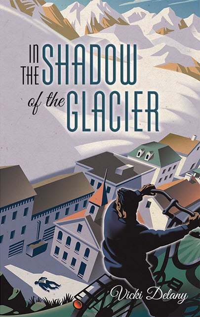
Read MoreGary Alphonso Mystery Book Covers for Harlequin
Gary Alphonso began his career as a scratchboard illustrator in the 1980s. That is where Gary learned the precision of line and shadow evident in his work today. As Gary evolved his technique, he began creating 'scratchboard' art in Adobe Illustrator, in both black and white and full color.
These cover illustrations for Harlequin's Worldwide Mystery Series featuring Vicki Delany's Constable Molly Smith showcases Gary's ability to create drama through perspective and lighting in a retro poster art style. His technique, perfected over many years, creates a stunning outcome.
The latest in the series, Negative Image will be in stores March 2016.
Gary Alphonso for TroDent Magazine
In this summer’s issue TroDent magazine tells the stories of some of their military alumni in the featured “The Military Dentists.” Art director John Hobbs wanted a cover illustration that really captured these special individuals sense of duty and pride. Gary Alphonso used a very classic retro style of illustration to create a powerful cover that evokes our patriotism and reverence for the individuals that serve in our armed forces.
Gary Alphonso for Ensign Magazine
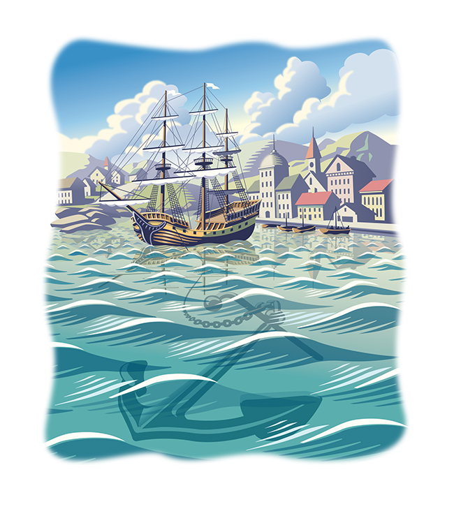
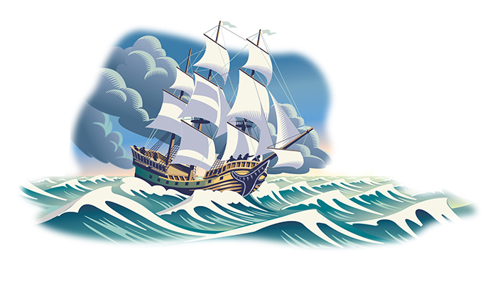
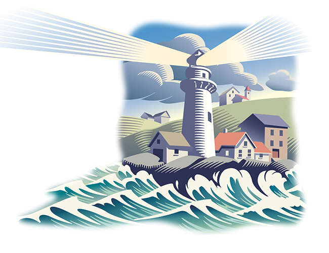
Scott Knudsen, art director for Ensign Magazine, came to Gary Alphonso with a story of faith and sacrifice. Looking at the opening paragraph, the metaphor that inspired these beautiful pieces was clear -- "A ship is safe in the harbor, but that's not what ships are for."
The article, "Faith to leave the harbor" showcases Gary's classic, digitally rendered, scratchboard style and the nautical theme highlights Gary's real ability to capture motion and light in his illustrations.
Gary Alphonso Illustrates Sports Metaphors
Gary discusses a recent project he worked on with Michael Stokely for a campaign for "MCAP Service Corporation", one of Canada's leading independent mortgage financing companies: "The illustrations were to be based on sports metaphors. The challenge here was that the client wanted to keep their former ad format--a full page divided into 2 panels: a dark blue panel (their corporate colour) and a white panel. The illustration was to take up portions of both panels as well as rag around the bilingual headline and body copy. As the work progressed the copy was being written, laid out and edited at the same time. It was kind of like designing with a moving target. The client also requested that the illustrations be able to exist on a completely white background to accommodate future usage. All this said, luckily the designer, Michael Stokely, really understood the challenges and was very helpful in the collaboration."
