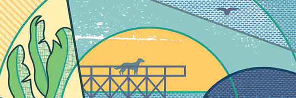
Everyone loves a good murder mystery and no one has a better mystery book collection than Harlequin Enterprises. The same can be said about the cover art for Harlequin’s Worldwide Mystery Series. A dynamic collaboration between i2i Art illustrators and Harlequin’s design team, these covers are a labour of love. The artists enjoy getting their creativity flowing and teaming up with Art Director extraordinaire Tara Scarcello.
Read MoreGary Alphonso illustrates for Oolitic American Gin
Digital scratchboard master Gary Alphonso is at it again! This time, for Oolitic American Gin. Gary collaborated with Art Director Lars Lawson of Timber Design Co. to capture the origin and history of this Indiana made, limestone filtered gin. No detail spared, Gary’s illustrative precision is evident in each stroke, collectively illuminating the highlights, shadows and depth of the 1920’s American quarry
Read MoreGary Alphonso for Ensign Magazine
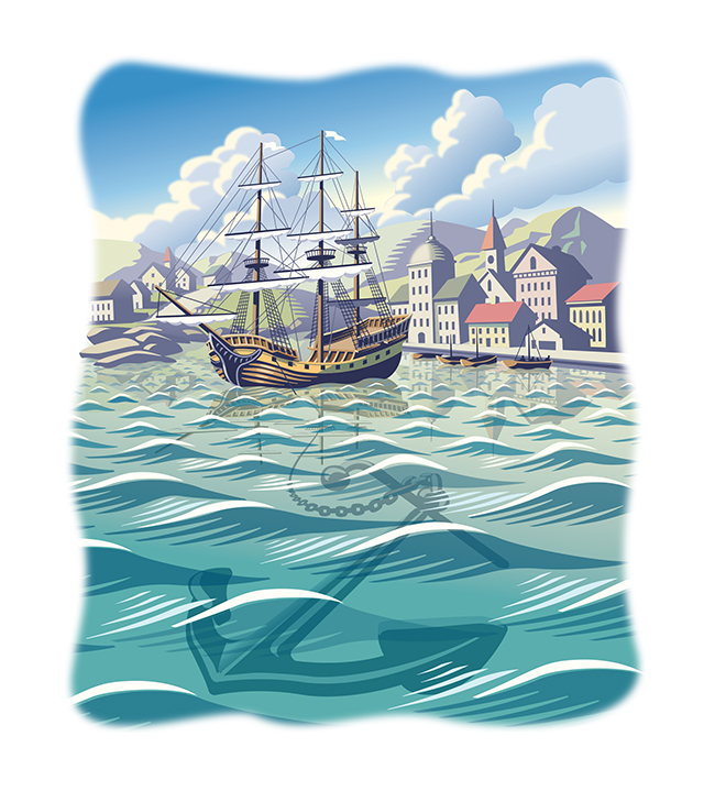
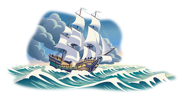
Scott Knudsen, art director for Ensign Magazine, came to Gary Alphonso with a story of faith and sacrifice. Looking at the opening paragraph, the metaphor that inspired these beautiful pieces was clear -- "A ship is safe in the harbor, but that's not what ships are for."
The article, "Faith to leave the harbor" showcases Gary's classic, digitally rendered, scratchboard style and the nautical theme highlights Gary's real ability to capture motion and light in his illustrations.
Gary Alphonso for Tim Hortons
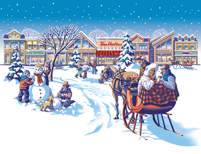
Everyone loves Tim Hortons coffee and doesn't everybody notice the art they use on the Holiday cup every year? The answer is a resounding 'Yes', isn't it?
Commissioned by Tim Hortons' branding and design agency, *PIGEON, Gary Alphonso illustrated the art for Tim Hortons' classic holiday campaign! Working with the Pigeon team, the art came together beautifully and was applied to the hot drink cups, bakery bags and boxes.
Everyone was thrilled with how it turned out and we are proud to share with you Gary's art and a few pics of the finished products.


