Ever wonder how an artist sets up their studio? What motives them? What inspires their creativity? In this studio spotlight Illustrator Greg Stevenson shares how he gets set up to create consistently exceptional illustration.
Read MoreGreg Stevenson illustrates for Foresters Financial
Illustrator Greg Stevenson makes going with the flow look better than ever. In search of a vector-based artist, Foresters Financial commissioned Greg to create a library of illustration to complement their brand. B2B and forward-facing marketing materials expertly combine text, photography and illustration, each element interacting to create a sense of space and movement. Simple at first glance, the execution of these continuous line illustrations is more complex than meets the eye.
Read MoreGreg Stevenson illustrates for William and Mary Alumni Magazine
Over this past year illustrator Greg Stevenson had the honour to work with The College of William & Mary, one of the oldest universities in America. Each year W&M Alumni Magazine selects an artist to feature in their quarterly issues. Proud to have been selected and working alongside art director Michael Bartolotta, Greg utilized a unique scratchboard technique that combines digital and traditional methods, each stroke creating depth and adding detail.
Read MoreGreg Stevenson illustrates for Legion Magazine
D-Day and the Battle of Normandy live on as one of the Allies most significant victories in WWII. This victory wouldn’t have been possible without the courageous contribution of many individuals.
Read MoreIllustrator Greg Stevenson finds inspiration in NYC
If you are looking for inspiration than New York City is the place to go and illustrator Greg Stevenson knows just that! The art world has a long history of one medium offering inspiration to another and this series is a great example of that.
Read MoreGreg Stevenson illustrates for New Jersey Monthly
Illustrator Greg Stevenson recently had the good fortune to work with art director Laura Baer of New Jersey Monthly Magazine. Six contributing authors give you the inside scoop on 16 hot (yet still affordable) towns in the state.
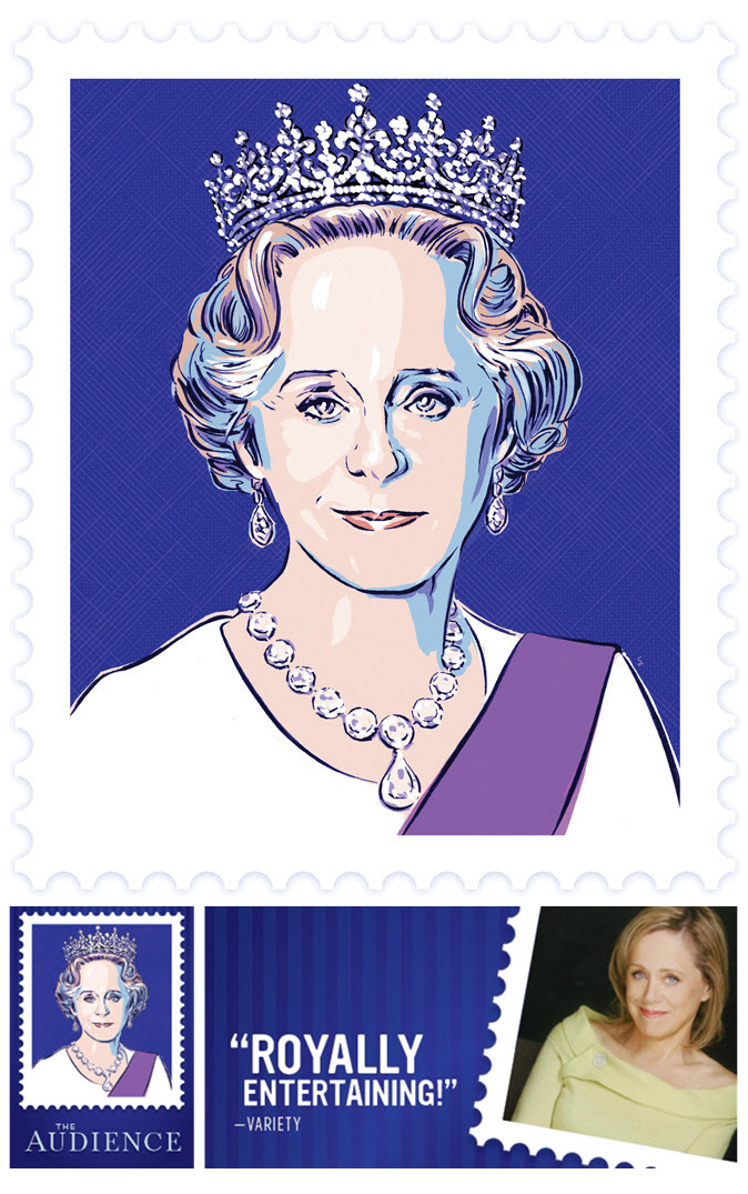
Read MoreGreg Stevenson's Poster for 'The Audience'
It was great to connect with our longstanding client, art director Wade Gilpin at Rossignol Design, for this special assignment. Illustrator Greg Stevenson, with his ability to create an uncanny likeness, was the natural choice for this poster of Fiona Reid as Queen Elizabeth II in the upcoming Mirvish production of "The Audience". Not a small feat, to create two likenesses in one portraiture, but Greg pulls is off beautifully. With the use of luminous, rich color the illustration is undeniably regal and with that smile Fiona's character shines through.
View more of Greg Stevenson's illustration. Greg is represented by i2i Art Inc.
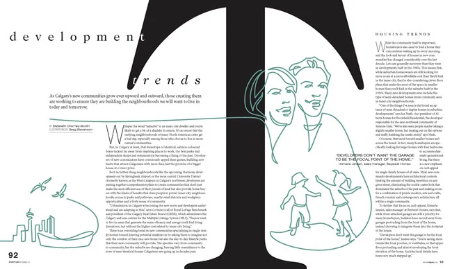
Greg Stevenson for Avenue Magazine
Greg Stevenson recently showcased his vector-based line drawing in a feature for Avenue Magazine, art directed by Venessa Brewer. The article on Calgary's growing communities gave Greg the opportunity to capture family fun along with city and streetscapes. Greg's continuous line art, intermingled with photography captures the expression and movement of Calgary perfectly.
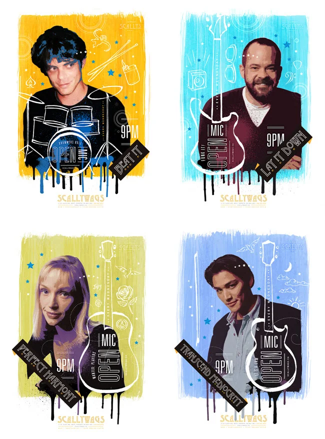
Greg Stevenson’s Poster Series for Open Mic Night
Nothing better than catching some live music at the local pub, right? Greg Stevenson has been a regular at Scallywags for quite some time and over the years he’s been responsible for a lot of their terrific poster art. The assignment to brand and help promote their new Open Mic Night was right up Greg’s alley.
Greg used his signature hand-drawn lineart with plenty of color and texture when he designed and illustrated this poster series. Greg’s unique way of contextualizing photos perfectly captures what we know will be a good time.
Check out more of Greg’s illustration work. Represented by i2i Art Inc.
Greg Stevenson for Dreams on Wheels Reader
Greg Stevenson created these instructional illustrations combining his playful doodles, line-work and hand lettering with a photo-collage approach for educational publisher Developmental Studies. SIPPS (Systematic Instruction in Phonological Awareness, Phonics, and Sight Words) is a program for new and struggling readers from kindergarten through grade 12. The main criteria for the art was to decode the stories to visually assist the reader with comprehension.
Check out Greg Stevenson's versatile portfolio.
Holiday gift ideas featuring Greg Stevenson art!
For the person on your list who has everything, check out Greg's online store with over 1,500 print-on-demand products with surface designs by Greg Stevenson!
I'll give you a sneak peek here...two of my favorite gifts...but check it out for yourself.
You must know a little pooch that needs a special holiday T-Shirt!
And half a dozen of these peace dove ornaments would look beautiful on any tree!
If you like what you see here check out Greg Stevenson's entire updated illustration portfolio here.
Greg Stevenson: Exploring Paris
Greg Stevenson recently worked on a large, yet to be unveiled project which featured this clean line art style. Feeling inspired by this and his love of Paris, Greg has created this map/infographic of Paris and spin-off poster designs. To see more visit Greg's portfolio here.
Greg Stevenson for Canadian Living
Combining Greg Stevenson's hand lettering, info graphic icons and layered photo-illustration adds a fun, upbeat mood to these stories of courage, art directed by Stephanie White. In this recurring feature, called A Year of Firsts 2014, meet and be inspired by the people who embraced a whole year of trying new things, whether facing fears or embracing change. Peruse more of Greg's illustration here.
Theresa Albert
Christina Campbell
Greg Stevenson for: Positive Side
Greg Stevenson was commissioned by the Canadian AIDS Treatment Information Exchange (CATIE) for their publication called The Positive Side. This illustration is about how a low viral load can cut the risk of HIV transmission was art directed by David Vereschagin to have an overall optimistic tone. Greg says, "The candle was meant to imply a ‘re-kindling” of desire in both partners (one positive and one negative) while practicing safety and awareness." Notice how the very subtle ('Rothko-esque') variations in the background add beautifully to the mood of the piece.
Greg Stevenson illustrates around the clock!
Ever have one of those days where you can't stop thinking about food? Literally. Greg Stevenson's hand lettering and flowing line technique made him the perfect choice for this conceptual piece, art directed by Jane Edwards Griffin (Griffin Design). The article 'Food for Thought' for Simon Fraser University's alumni publication, aq Magazine, talks about a massive renovation to the SFU dining hall and café in response to a survey in which 6,000 students were in favor of: wider variety, international flavors and healthier foods available around the clock.
Greg Stevenson for Nexus
Recently, Greg was asked by the University of Toronto's law magazine Nexus, to create 3 photo illustrations for their contributors page. Using supplied photography, which lacked a consistency, the photo-illustration technique applied, brought a unique continuity to the contributors page. An interesting solution to a recurring problem encountered by art directors.
Greg Stevenson Making Headlines
What started out as doodles in his sketchbook, graduated to backgrounds for photographic treatments, now Greg's hand-lettering is making it as cover art--art directed by Kim Larson at Alberta Venture Magazine. To see the fabulous spread for Go Magazine featuring Jeff Bridges as well as the Sun Chips ad campaign, visit Greg's portfolio here.
Steve Jobs: 1955 - 2011
Illustration Married with Photography
We are seeing a growing trend whereby illustration is combined with photography. Below are a few examples of different approaches. Sometimes the client supplies the photos, although frequently the illustrator shoots their own photos or stock photos are used.
Greg Stevenson created the hand-lettering and icons layered over the photo of Jeff Bridges, supplied by the client, Ink Publishing.
Anne Horst created a montage of stock photos and illustration to create this image on social media for the cover of Marymount Manhattan College Magazine.
Alanna Cavanagh's minimal and whimsical line illustrations create a great contrast with the rich fabrics in the photo supplied by Fabricut for this Trend Drapery ad.
John Webster created this piece with stock imagery and client supplied photos of Sorbara Hall on the St.Michael's campus at the University of Toronto. The article was on the history of the use of the campus in film.
Aaron Bihari used a photo with a duo-tone treatment for the background in this piece, to contrast with his illustrated VW bus.
This is an example of how Janice Kun creates a dream-like image with the use of her own original photography as well as stock imagery.
Margaret Lee often sets up her own photo shoots on location and uses a unique colorization to create whimsy and drama.
Bruce Emmett often stages elaborate sets, with himself as a model, in his photo-illustrative work.