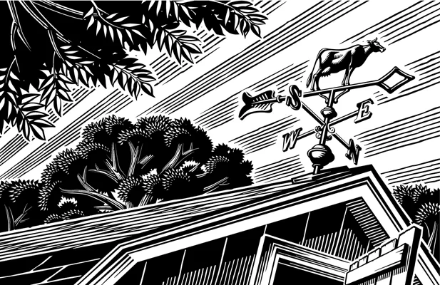
Illustrator Gary Alphonso's digital scratch board technique honors a historic process while incorporating the benefits of modern advances, much like his subject matter, The College of William and Mary.
Read MoreGary Alphonso for Ensign Magazine
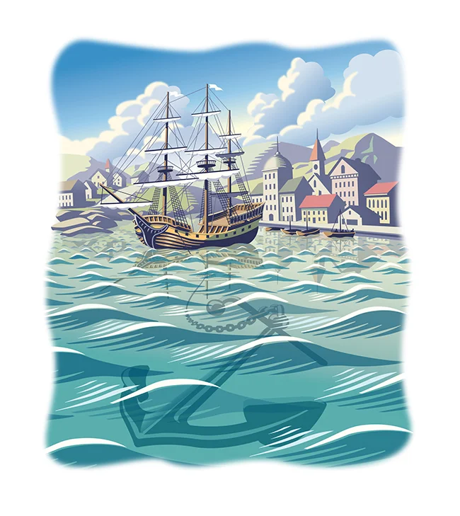
Scott Knudsen, art director for Ensign Magazine, came to Gary Alphonso with a story of faith and sacrifice. Looking at the opening paragraph, the metaphor that inspired these beautiful pieces was clear -- "A ship is safe in the harbor, but that's not what ships are for."
The article, "Faith to leave the harbor" showcases Gary's classic, digitally rendered, scratchboard style and the nautical theme highlights Gary's real ability to capture motion and light in his illustrations.
Gary Alphonso: Creates Facebook and Twitter Banners
Recently, Gary Alphonso was asked by The Design Office of Ann Marie Ternullo to create this art for Maryland & Virginia Milk Producers Cooperative Association’s Facebook and Twitter pages. The art was originally created for the co-op's annual report. Ann Marie’s idea was to have the art modified by Gary, to create digital banners for their social media marketing–a very effective use of the art. Elements within the art were moved around to accommodate the Facebook and Twitter logos while maximizing the impact of the image area. Aside from offering a custom solution for their social media marketing it also took advantage of the branding established by the annual report, creating a nice continuity across platforms.
As a master with Adobe Illustrator, Gary Alphonso creates everything from futuristic high tech art to vintage woodcut illustration--but it's always his dynamic compositions that carry his trademark style into any application so perfectly.
This is the original illustration Gary created for the Annual Report that was modified for use as in social media banners.
Check out Gary Alphonso's entire portfolio.
Gary Alphonso for Canada Post: Unveiling New Community Mailboxes
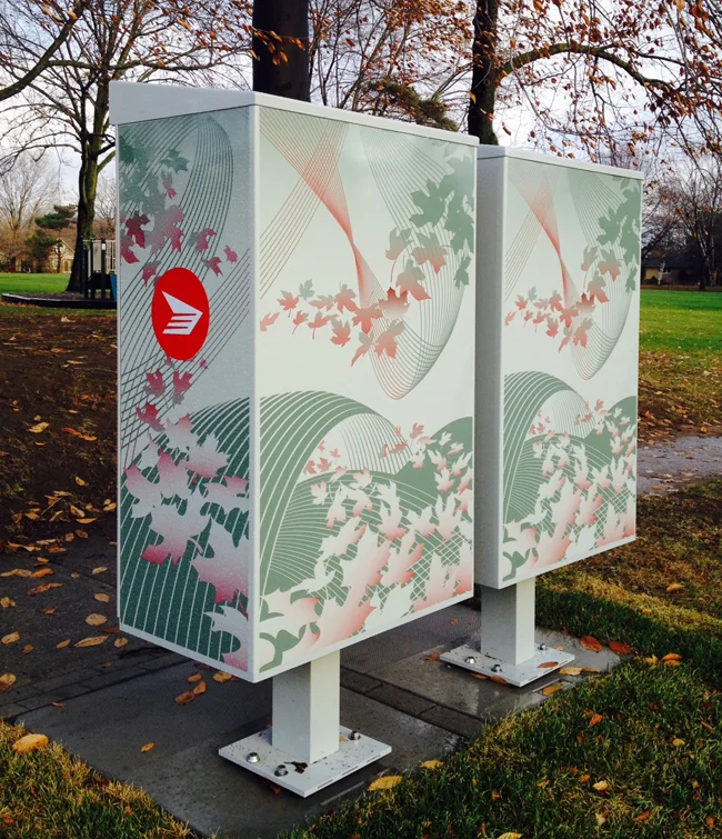
In response to the shrinking demand for snail mail, Canada Post has begun to phase in an expansion of it's Community Mailboxes (CMB's) vs door-to-door delivery. The process of developing the CMB's was carefully executed with a strategy that involved lots of consumer input through focus testing at various stages in the development. Canada Post was looking for the perfect CMB to take it's customers into the 21st Century. One of the key criteria for the new CMB's was to develop an art wrap that would hopefully work as an anti-graffiti barrier. This is where the call for Gary Alphonso's illustration talents came in.
Working with the team at Ove Brand | Design, headed up by creative director Peter Baker, Gary Alphonso was given an open creative brief as they embarked on an exploration of various abstract directions. The art evolved into a beautiful ethereal design that incorporated the maple leaf (a ubiquitous Canadian symbol), floating as if being carried by a gentle wind. The process was a real contest but in the end, we are proud to report that Gary Alphonso's floating leaf design was among the most popular in focus testing.
Gary Alphonso's illustration applied as a wrap to the mailboxes.
Here are some pics of the mailboxes in communities across the country.
View Gary Alphonso's entire portfolio here!
Gary Alphonso for ACC Docket
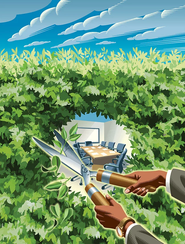
Gary Alphonso created this brilliant conceptual cover illustration for the award winning ACC Docket Magazine, July-August 2014 issue. The feature article, “The Chief Opportunity Counsel: How to Increase Your Value Through Participation in Strategic Business Conversations” is illustrated by use of a hedge as metaphor for the barrier that can be broken down exposing fresh opportunities for open and transparent communication. To see more of Gary Alphonso's powerful illustrations check out his updated portfolio here.
Gary Alphonso for Tim Hortons
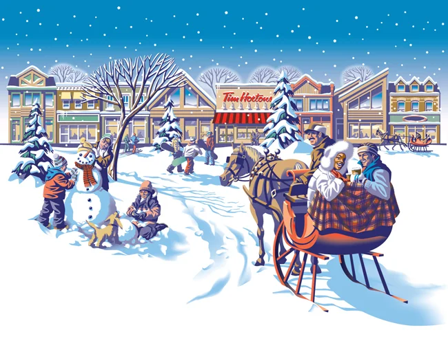
Everyone loves Tim Hortons coffee and doesn't everybody notice the art they use on the Holiday cup every year? The answer is a resounding 'Yes', isn't it?
Commissioned by Tim Hortons' branding and design agency, *PIGEON, Gary Alphonso illustrated the art for Tim Hortons' classic holiday campaign! Working with the Pigeon team, the art came together beautifully and was applied to the hot drink cups, bakery bags and boxes.
Everyone was thrilled with how it turned out and we are proud to share with you Gary's art and a few pics of the finished products.
Gary Alphonso for American Lawyer Magazine
Joan Ferrell, art director at ALM, needed something corporate with a bit of a retro twist for an article commemorating the 10 year anniversary of the firm, Orrick, Herrington & Sutcliffe. Gary Alphonso's powerful style was the perfect choice to illustrate a retro metal stamp logo showing the OHS's Global Operations Center depicting the converted metal stamping plant in Wheeling West Virginia, which they call home.
[pinterest]
Gary Alphonso for Northeastern Law Magazine
Art director Mark Gabrenya, chose Gary's powerfully evocative style for this Northeastern Law Magazine cover to illustrate the revisiting of U.S. labor rights after 75 years. [pinterest]