Greg Stevenson's Poster for 'The Audience'

It was great to connect with our longstanding client, art director Wade Gilpin at Rossignol Design, for this special assignment. Illustrator Greg Stevenson, with his ability to create an uncanny likeness, was the natural choice for this poster of Fiona Reid as Queen Elizabeth II in the upcoming Mirvish production of "The Audience". Not a small feat, to create two likenesses in one portraiture, but Greg pulls is off beautifully. With the use of luminous, rich color the illustration is undeniably regal and with that smile Fiona's character shines through.

 View more of Greg Stevenson's illustration. Greg is represented by i2i Art Inc.
Carl Wiens for National Underwriter Property & Casualty Magazine

Security for cyber coverage, not an easy subject to illustrate and Tim Schafer, art director at National Underwriter Property & Casualty magazine, didn't want any of the typical metaphors. So conceptual illustrator Carl Wiens created this clever image. What could be a better metaphor for the diligence needed to protect oneself from the creep of cyber threats then the ever-present task of mowing your lawn. With bright color and sophisticated shapes the article demands that the reader take notice and quickly the connection is made - you can't let either lapse.

Additional spot illustrations by Carl Wiens use the same bright palette and intriguing imagery to highlight some key tips.

Let Carl Wiens tackle your next assignment. See more of Carl's work.

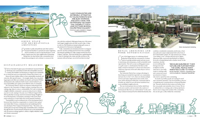
Greg Stevenson for Avenue Magazine

Greg Stevenson recently showcased his vector-based line drawing in a feature for Avenue Magazine, art directed by Venessa Brewer. The article on Calgary's growing communities gave Greg the opportunity to capture family fun along with city and streetscapes. Greg's continuous line art, intermingled with photography captures the expression and movement of Calgary perfectly. 

Eric Chow for Remodeling Magazine

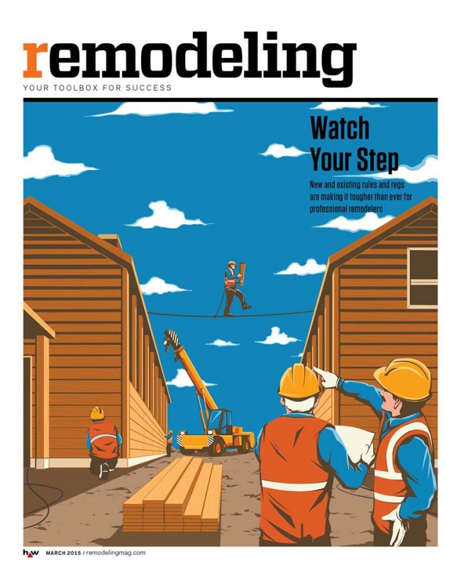
With ever-changing rules and regulations, remodeling you home or office is no picnic. Remodeling Magazine tackled this topic in the feature article "Watch Your Step" for their March 2015 issue.  

The design team at Hanley Wood knew a conceptual solution would be best to illustrate the fine line contractors walk between safety and regulations. Illustrator Eric Chow worked closely with them to come up with this clever tightrope analogy.

Eric Chow Remodeling Magazine Cover

Eric chose to put a menacing face to the dangers of lead paint removal for the inside story.

Eric Chow Lead Paint Remodeling Magazine


Looking for a new way to tell your next story?  Visit Eric Chow's complete portfolio at i2i Art.