Eric Chow for Remodeling Magazine

With ever-changing rules and regulations, remodeling you home or office is no picnic. Remodeling Magazine tackled this topic in the feature article "Watch Your Step" for their March 2015 issue.  

The design team at Hanley Wood knew a conceptual solution would be best to illustrate the fine line contractors walk between safety and regulations. Illustrator Eric Chow worked closely with them to come up with this clever tightrope analogy.

Eric Chow Remodeling Magazine Cover

Eric chose to put a menacing face to the dangers of lead paint removal for the inside story.

Eric Chow Lead Paint Remodeling Magazine


Looking for a new way to tell your next story?  Visit Eric Chow's complete portfolio at i2i Art.

Eric Chow for TroDent

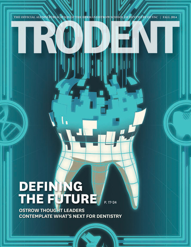
There's a revolution in the fields of diagnostics and treatment that is changing the face of dentistry.  To depict new advances in the field would take an illustrator with a fertile imagination and strong conceptual skills.  Many thanks to John Hobbs, editor of TroDent (a USC School of Dentistry publication), for recognizing Eric Chow's talent and giving him the perfect creative brief to illustrate the cover story, What does the future hold for Dentistry?  Below are the enlightening results.  To see more of Eric Chow's illustration visit his portfolio here.

Cover Image:  What dentistry will look like in 25 years?

Trodent

Eric Chow's visual depiction of DNA in dentistry.

Trodent_Dentistry_Spread

Eric Chow's visual depiction of the future of IT in dentistry.
EC169_The_Future_of_Communication_in_Dentistry_650
Eric Chow's visual depiction of the future treatment of cavities.

EC170_The_Future_of_Fillings_650

Eric Chow's visual depiction of gene therapy for the prevention of cavities.

EC171_Gene_Therapy_in_the_Prevention_of_Cavities_ 650


Rémy Simard: Ad Campaign for Teachers

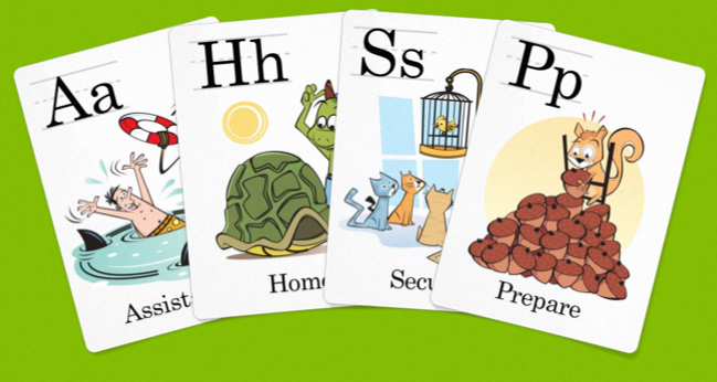
  The Corktown Seed Co., commissioned Rémy Simard to contribute his fun and kid-friendly illustrations to their fresh new branding effort for the Teacher's Credit Union.  Here is a sampling of the alphabet cards for the ongoing, 'It Pays To Be You' campaign, art directed by the lovely Cai Li.  To see more of Rémy Simard's work visit his updated portfolio here.

RS690_Card_Spread
RS690_Card_Spread
TCU Letter Cards ©Rémy Simard/i2iart

Gary Alphonso for Tim Hortons

  Everyone loves Tim Hortons coffee and doesn't everybody notice the art they use on the Holiday cup every year?  The answer is a resounding 'Yes', isn't it?

Commissioned by Tim Hortons' branding and design agency, *PIGEON, Gary Alphonso illustrated the art for Tim Hortons' classic holiday campaign! Working with the Pigeon team, the art came together beautifully and was applied to the hot drink cups, bakery bags and boxes.

Everyone was thrilled with how it turned out and we are proud to share with you Gary's art and a few pics of the finished products.

©Gary Alphonso_GA665_i2iArt
Snowman Finished Art 3b
©Gary Alphonso_GA665-a_i2iArt
©Gary Alphonso_GA665-b_i2iArt