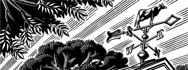
Canadian Business magazine recently published it's Investor's Guide 2017. With a wonderful mix of metaphors Eric Chow's illustration accompanies some great advice on investment strategies and picking the right stocks and brokerage firm.
Read MoreDave Murray illustrates Toronto for Airbnb
The folks at trevor//peter were coordinating a series of events for Airbnb this summer and they needed a wow factor. Taking place in the heart of Toronto, Canada the team decided a map of the city - 10 feet x 15 feet - would be the perfect way to draw the crowd to their booth.
Illustrator Dave Murray, a proud Torontonian, was chosen to work on the project. Dave quickly assembled a brilliant collage of Toronto's coolest neighborhoods and points of interest. Graphic, bold, colorful, the piece beckons you to point out where you live or where you need to visit.
Check out more of Dave Murray's illustration. Represented by i2i Art Inc.
Greg Stevenson for Avenue Magazine
Greg Stevenson recently showcased his vector-based line drawing in a feature for Avenue Magazine, art directed by Venessa Brewer. The article on Calgary's growing communities gave Greg the opportunity to capture family fun along with city and streetscapes. Greg's continuous line art, intermingled with photography captures the expression and movement of Calgary perfectly.
Gary Alphonso: Creates Facebook and Twitter Banners
Recently, Gary Alphonso was asked by The Design Office of Ann Marie Ternullo to create this art for Maryland & Virginia Milk Producers Cooperative Association’s Facebook and Twitter pages. The art was originally created for the co-op's annual report. Ann Marie’s idea was to have the art modified by Gary, to create digital banners for their social media marketing–a very effective use of the art. Elements within the art were moved around to accommodate the Facebook and Twitter logos while maximizing the impact of the image area. Aside from offering a custom solution for their social media marketing it also took advantage of the branding established by the annual report, creating a nice continuity across platforms.
As a master with Adobe Illustrator, Gary Alphonso creates everything from futuristic high tech art to vintage woodcut illustration--but it's always his dynamic compositions that carry his trademark style into any application so perfectly.
This is the original illustration Gary created for the Annual Report that was modified for use as in social media banners.
Check out Gary Alphonso's entire portfolio.
Rémy Simard: Ad Campaign for Teachers
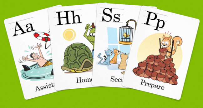
The Corktown Seed Co., commissioned Rémy Simard to contribute his fun and kid-friendly illustrations to their fresh new branding effort for the Teacher's Credit Union. Here is a sampling of the alphabet cards for the ongoing, 'It Pays To Be You' campaign, art directed by the lovely Cai Li. To see more of Rémy Simard's work visit his updated portfolio here.


