Harvey Chan created these richly patterned illustrations for READ's Viva Mexico issue. The story, Xibalba Games, follows a Mayan Creation Myth about two twin brothers, rulers of earth and sky.


Harvey Chan created these richly patterned illustrations for READ's Viva Mexico issue. The story, Xibalba Games, follows a Mayan Creation Myth about two twin brothers, rulers of earth and sky.


Jason Duprau, art director of Legion Magazine, asked Janice Kun to create these haunting illustrations to accompany an article on homeless war veterans and how Canada is approaching the problem.
"Nobody knows the number of homeless veterans in Canada, and this is one of the reasons why: “Aside from struggling with issues of addiction and post traumatic stress disorder (PTSD), a lot of them don’t want to be identified as veterans,” says Joanne Henderson, Legion service officer in Vancouver. Some don’t want their buddies to find out what’s happened to them. “They think back to their time in the services as the good times in their lives and they’re ashamed. They think they should be able to take care of themselves. They’re in hiding; they’re hiding from themselves.” ...
It’s not enough to ask ‘Are you a veteran?’ “We learned you have to ask ‘did you have any military service’ because many don’t feel like veterans—they think veterans are guys from World War Two.” "
excerpt from article by Sharon Adams.
One of the solutions that is proving very successful is Cockrell House in Colwood, B.C. Much more than just housing, it's a full program that expects residents to move out and into more permanent accommodations in two years - helping them develop the life skills they need to do that.
“It’s a hand up, not a hand out,” says Dave Sinclair, President of British Columbia/Yukon Command, which helped fund Cockrell House.

We recently asked Gary Alphonso how he got his start creating Scratchboard/Woodcut style illustrations:
"During my early years a creative director approached me with an opportunity that would lead to my career as a “Scratchboard/woodcut” artist.
The time was the late 80’s just before scratchboard illustration enjoyed a huge surge in popularity. The client was a national clothing store chain called “Beaver Canoe”. It was at the time a major competitor to “Roots”, with an earthy outdoors feel to it’s product line.
The idea was to create a series of diamond shaped logos that would be very illustrative with a wood cut feel to them. They would represent the various product line, and be used in advertising, graphics on the clothing, and on in-store P.O.P. They became their trademark.

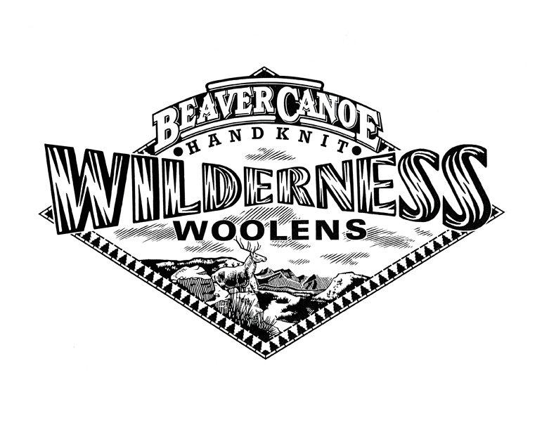
Gary's first traditional scratchboard illustrations (above)
That year (1988) they were featured in “Studio Magazine’s” Awards Annual. The timing couldn’t have been better. Scratchboard was about to become wildly popular in the 90’s. I quickly (and I use that term loosely because of how labour intensive the style is) began creating new samples on my own. I discovered and fell in love with early 20th century wood engravers and printmakers like Lynd Ward, Rockwell Kent, Frans Masereel, Giacomo Patri ...and the likes of. This was added to the passion I already had for the Art Deco period, the propaganda art that came out of Eastern Europe at the time, and the advertising and editorial art from the “West”.
At first the work was mostly black and white because of the nature of the scratchboard medium. This meant a lot of design (logo) packaging, and newspaper editorial work. As I slowly introduced colour to the mix, the advertising, magazine editorial, book, Annual report etc. work would follow. The phone kept ringing. I never looked back.
After years of success as a scratchboard illustrator it was hard to resist the role of the computer in the digital age. Very reluctantly at first, I began trying to adapt my style to the digital realm. As I became comfortable with this it became evident that carving shapes and lines out of black ink and clay had it’s limitations. With the computer I could keep this conceptual way of working (creating negative space while leaving the positive space behind) and carve these shapes out of colour instead of just black. This simple fact opened up many more doors creatively. The result was that I am able to keep evolving the style beyond the limitations of traditional scratchboard."


The evolution of Gary's work continues, however, sometimes the more things change, the more they stay the same--evidenced by a recent logo icon he created for a Bespoke Letterpress Printer in Chicago, Illinois. The retro appeal lives on!
In time for Halloween, Sarah Beetson worked with Megan D'Orazio to illustrate the story "Witch" for READ Magazine's "Witch Hunt (Salem and Beyond)" issue.

John Webster recently created this fun piece, art directed by Shane Lutjens, for an article in Enviva Magazine on odd museums to visit in Houston, Texas. See if you can spot the references to some of the feature locations: The National Museum of Funeral History- everything you ever wanted to know about Funeral Heritage in the United States: Day of the Dead, Civil War Embalming, etc.
Orange Show Center- The Orange Show was started by a Houston postman, Jeff McKissak, to celebrate his favorite fruit. The Orange Show Center for Visionary Art is now a hub for folk art activity.
Beer Can House- yep, a house made out of beer cans. Ripley's Believe it or Not estimated that over 50,000 cans were used to create the house.
Art Car Museum- what better place to visit while on a road trip than a museum showcasing imaginative "art cars" and mobile contraptions. They also feature other works of contemporary artists with a car theme.
The Rothko Chapel - founded in 1971, this is a sanctuary available to people of every belief, inspired by the modern, minimalist work of Mark Rothko.

Doug Martin has been creating the covers for the "Seaside Knitters Mystery Series" by Sally Goldenbaum, published by Penguin. Sally Goldenbaum recently passed on a compliment she received from reader Suzanne Barton, "...I've already bought Moon Spinners and can't wait to start it. Please pass my sincere compliments on to the cover artist. Cover art is definitely something that draws me to a book and, frankly, keeps me from purchasing an e-reader. I saw the other cover on your blog, and love that one too." Thanks Sally and Suzanne! Keep writing and reading, I'm sure Doug is up for another project. Keep your eyes open for the next in the series, due out in November: A Holiday Yarn .


i2i has signed new artist Nausica. She studied Industrial Design and Interior Architecture in Barcelona. Both influences can be seen in her decorative, graphic style. Check out the range of imagery in Nausica's Portfolio 1.Portfolio 2 features some of her animations.
It seems to be "travel" month at i2i. Alanna Cavanagh created a fashionable view of trips to Paris for Hemispheres Magazine,Ian Phillips supplied these incredible maps of walking tours in 5 cities for Viv Magazine and Tim Zeltner continues to create amazing landscapes for United with art direction from Barrie D'Rozario Murphy.

hemispheres
Alanna Cavanagh's cover for Hemispheres Magazine


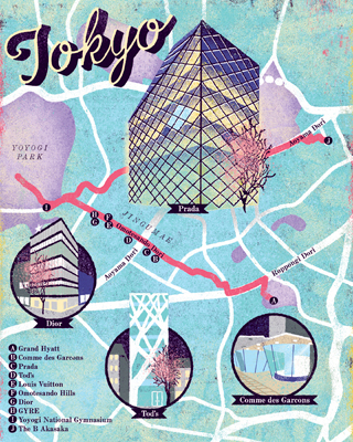

Ian Phillips City Maps for Viv Magazine

Picture 1
Tim Zeltner_TZ213

Tim Zeltner_TZ219

Tim has produced many beautiful Destination paintings for United Airlines over the years. For a very different side of Tim's art, we'd like to share a few of his newest illustrations for United's Travel Options campaign, art directed by Barrie D'Rozario Murphy.

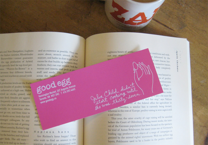
good egg
If you happen to pick up any of the books illustrated by the i2i illustrators, you could swing by Good Egg in Kengsinton Market to pick up a bookmark, illustrated by Alanna Cavanagh.
Doug Martin provided the cover art for Three Bedrooms, Two Baths, One Very Dead Corpse by David James and published by Kensington Publishing. The book will be available September 28, 2010 in hardcover or e-book.


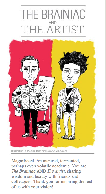
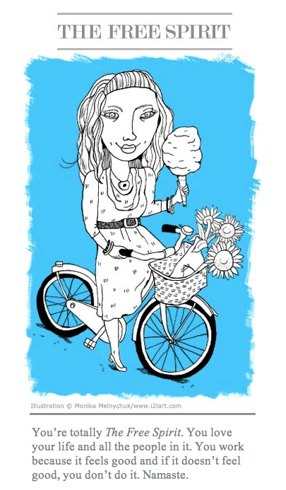
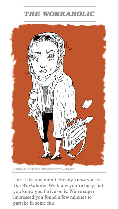
What type are you? The RGD Ontario has been doing a national survey of Design and Communications Professionals on billing and salaries. To make it fun, they set up a site called stoptheguessing.ca where you can take a quiz to find your own "professional archetype". Monika Melnychuk created the fun illustrations for each "archetype". Those that continued to take the survey on billing and salaries were entered in a draw for free registration at this years DesignThinkers conference 2010, to be held in Toronto on November 11 and 12.


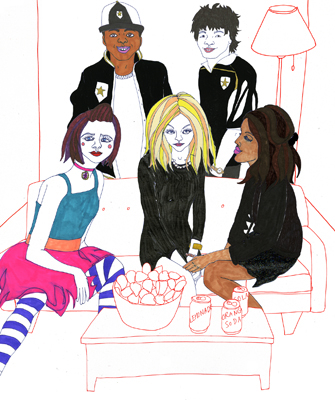
Jillian recently spiced up her palette to create these beautiful images for an article in the August 2010 issue of Latina Magazine on similar values and traditions between the Hispanic and the East Indian cultures.
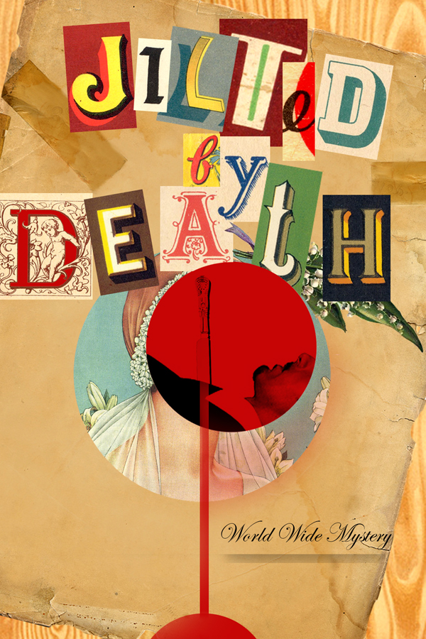
 John Webster gave this recent mystery novel, Jilted by Death , his trademark vintage, collage feel. This cover was an exciting new direction for Harlequin, departing from the previous style of mystery covers. We also wanted to show off some of the alternate versions of the cover he developed for Art Director, Kathleen Oudit.
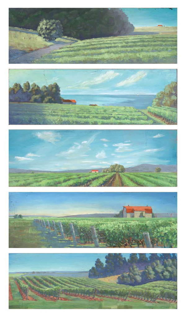
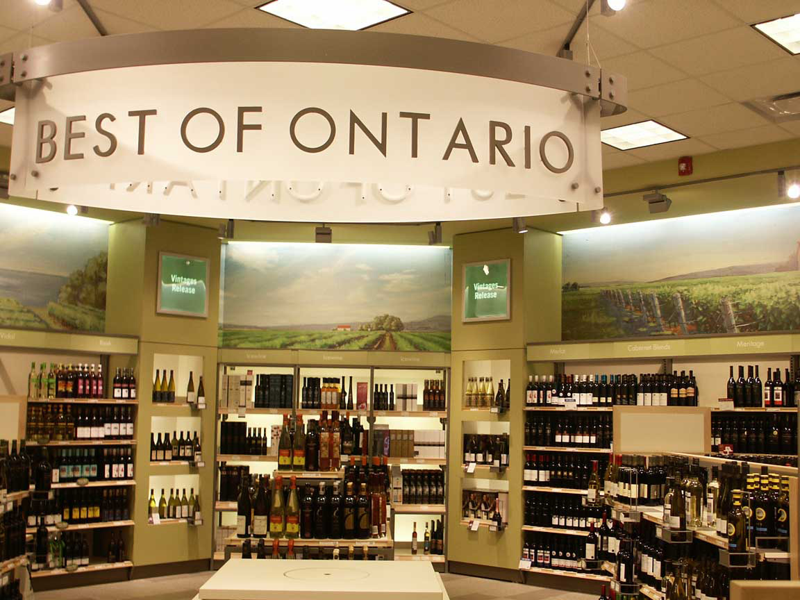
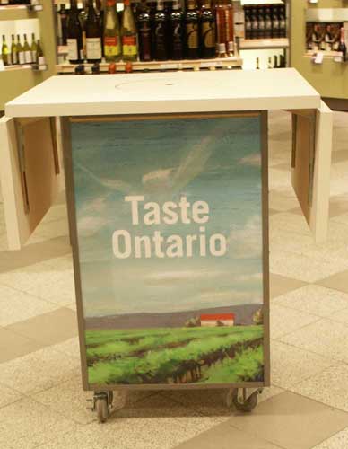
For those lucky people visiting Ontario this summer, stop by the LCBO enroute and see phil's Ontario Vineyard inspired murals while picking up some of Ontario's best wines. For those of you who have never been to Prince Edward County/ Niagara region - let these paintings inspire a late summer - early fall tour of Ontario vineyards.
Here are the paintings as they appear in the boutiques:


the best heartbreak
Alanna Cavanagh worked with Art Director Justinia Baird-Murray to create this fun, whimsical new cover for the Penguin UK paperback edition of of Hello Heartbreak by actress and author Amy Huberman. Alanna says this was a fabulous project as it combined two things she loves to draw: cropped figures and hand lettering. If you're considering adding this to your summer reading list, please note this cover is unfortunately only available in the UK. Maybe the new cover will be picked up in North America as the cover itself is receiving rave reviews, as noted by Leah at Chick Lit Reviews .
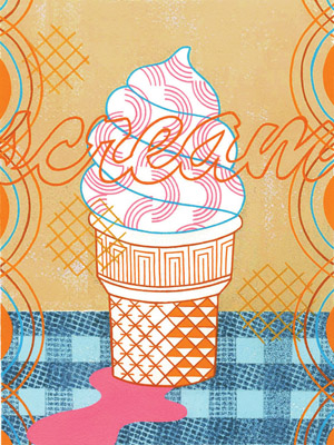
The i2i July Calendar image "Scream" placed as a runner up in Creative Quarterly Magazine's competition. All runners up will be published online in August. If you love this pop art, summery image, visit Thom's website store for Giclee prints.
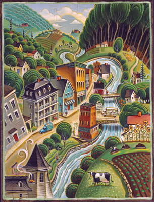
Tim Zeltner had a great article to work with for this detailed ramble down small town Main Street. Yankee Magazine has been writing a series on community- in the article "Hardwick and the New Frontier of Food", Bill McKibben discusses how buying and growing local can build community.
Monika Melnychuk created a funky, fun line of illustrations for Mountain Equipment Co-Op's reusable bags. The series placed in the recent Design and Printing Awards run by Applied Arts magazine - showcasing some of the best work produced this past year. This series has also won awards with The Art Directors Club of Canada, Print Magazine's Creativity and Commerce Competition and Design Edge Regional Awards for the BC and Yukon area.


A sampling of the bags, and below - the full wraparound as a panel image:


