Step into the hustle and bustle of City of Neighbors, the latest book illustrated by Katy Dockrill and written by Andrea Curtis. As the next book in the award-winning Think Cities series published by Groundwood Books, City of Neighbors explores what makes certain cities special. Katy’s charming figures fill the pages, playing, laughing and establishing a sense of community. Her beautiful brushwork highlights city parks, playgrounds and painted murals, showcasing just a few inclusive ideas that can bring public spaces to life.
Read MoreTalya Baldwin illustrates Not the End of the World
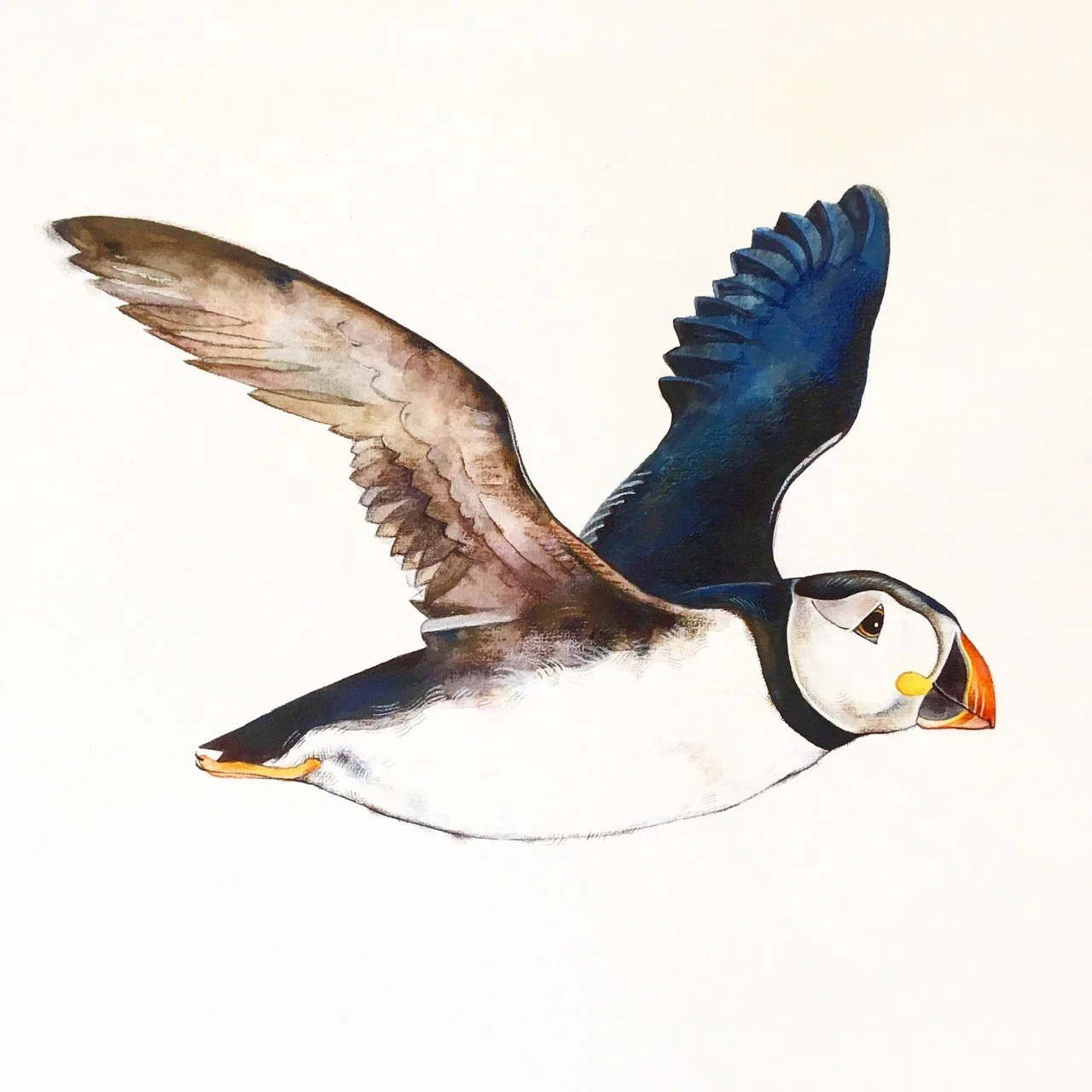
Illustrator Talya Baldwin takes us to St. Kilda, Scotland in her recent book, Not the End of the World. Ethereal landscapes and evocative portraits paint a picture of the history, environment and wildlife in a place often referred to as ‘the end of the world’. Signature to her style, Talya’s stunning watercolour technique combined with her unpretentious writing reveals an important story of the land and the uniqueness of a community that once was.
Read MoreTalya Baldwin illustrates St. Kilda
Illustrator Talya Baldwin’s recent trip to St. Kilda proved to be an inspiring one and she took to her sketchbook to record the awe-inspiring details. Each brush stroke tells a story; from the island’s natural history to its unique community, sharing the ecological history of the land. Almost surreal, Talya’s watercolour paints a magical picture, bringing a sense of hope and beauty to this remote island which seems as though it has stood still in time.
Read MoreMark Hoffmann illustrates the future for Macalester Today
There are few ideas more serious than environmental sustainability. That's why it was such a treat when art director Brian Donahue from bedesign inc. choose Mark Hoffmann with his whimsical style and at times down right silly approach to illustrate this concept for Macalester Today.
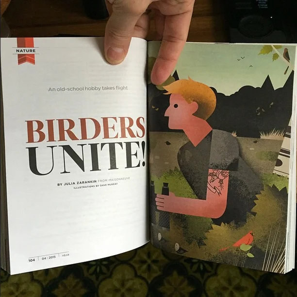
Read MoreDave Murray for Reader's Digest, "Birders Unite!"
Hipsters: known for ransacking vintage stores, perfecting their beards and gentrifying neighborhoods with their artisanal food stores. It seemed likely they should revitalize some old school hobbies while they are at it. Like bird watching.
This month's Reader's Digest article, "Birders Unite!" written by Julia Zarankin, dives into the phenomena of the bird watching millennials. Needing to combine the tattooed with the wilderness, art director Annelise Dekker picked the perfect artist in Dave Murray.
Caution: These are not your grandfather's illustrations:
Uniquely stylized, award-winning illustration. We invite your to check out more of Dave Murray's illustration.
Gary Alphonso for Canada Post: Unveiling New Community Mailboxes
In response to the shrinking demand for snail mail, Canada Post has begun to phase in an expansion of it's Community Mailboxes (CMB's) vs door-to-door delivery. The process of developing the CMB's was carefully executed with a strategy that involved lots of consumer input through focus testing at various stages in the development. Canada Post was looking for the perfect CMB to take it's customers into the 21st Century. One of the key criteria for the new CMB's was to develop an art wrap that would hopefully work as an anti-graffiti barrier. This is where the call for Gary Alphonso's illustration talents came in.
Working with the team at Ove Brand | Design, headed up by creative director Peter Baker, Gary Alphonso was given an open creative brief as they embarked on an exploration of various abstract directions. The art evolved into a beautiful ethereal design that incorporated the maple leaf (a ubiquitous Canadian symbol), floating as if being carried by a gentle wind. The process was a real contest but in the end, we are proud to report that Gary Alphonso's floating leaf design was among the most popular in focus testing.
Gary Alphonso's illustration applied as a wrap to the mailboxes.
Here are some pics of the mailboxes in communities across the country.
View Gary Alphonso's entire portfolio here!
Thom Sevalrud for 88 Scott
The vision for 88 Scott : "These are the dreamers, the planners, the creators. ... In the earliest planning stages of 88 Scott, fifteen of the country's leading architects, planners and developers were invited to collaborate in a unique process. Their mandate was to create a bold vision for an exceptional, new landmark condominium building..."
In keeping with this creative approach, art by nine local i2i artists was reproduced in large format and presented on hoarding panels (divided by inspirational quotations). The idea was for the developer to support local talent while beautifying the site during the construction phase of development. The images were chosen to represent the many facets of life in the immediate community: green space, culture, recreation, shopping, entertainment etc.
Over the coming weeks we'll bring you pics of the other panels, but we start today with Thom Sevalrud's. It's fantastic to see the art at this size! If you have a chance, pop down and check out the larger-than-life art at 88 Scott in the heart of downtown Toronto. To see more of Thom's art go here.
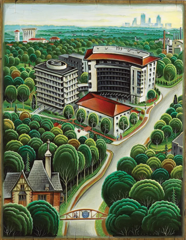
Tim Zeltner for Emory University
The king of landscapes, city-scapes and make-believe kingdoms, Tim Zeltner works his magic for Emory to accompany a story about the Rollins School of Public Health.
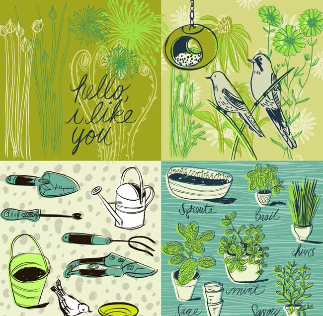
Bring on Spring!
Time to look forward to sunny days in the garden!
See more of Katy Dockrill's sunny illustrations here.
'In the Garden' by Katy Dockrill.
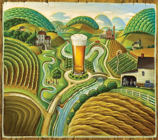
Tim Zeltner for Brewer's Association
Working with Allison Seymour, art director for the American Homebrewer's Association Tim Zeltner created this cover at for the March/April issue of Zymurgy Magazine, featuring the concept of home brewing with locally sourced ingredients. Tim's trademark rural landscape painting with the surrealistic addition of a pint of home brewed beer, create a dreamy utopia for any beer lover.
John Webster in Covet Garden Magazine
John and his friend Stephanie Power were recently featured in the lovely Covet Garden decor magazine. Their spaces are perfectly aligned with Covet's interest in environments that have not been styled by interior decorators. Both John and Stephanie's artistic esthetic is reflected to a 'tea' in their uniquely delightful homes. John says, "The best part of the house is that for the first time, my apartment feels like a collage--my art and way of living have become one." Look at John's portfolio here and see if you can find some of his "curious curios" living in his art. Photos courtesy of Covet Garden, photographer Ashley Capp.
John in his delicious kitchen!
Jillian Ditner: TIFF 2012 Walking Map for Timberland
A little while back marketing agency trevor peter communications contacted us about a walking map for Timberland, an official sponsor of TIFF (The Toronto International Film Festival). When Jillian Ditner was chosen, we were pretty excited about this great opportunity! Creative Director, Alexandra MacDonald and Jillian, along with Josh McKellar, Marketing Manager for Timberland, began the collaborative process of creating the first ever eco friendly tool for navigating TIFF. The initial direction was for Jillian to create her own artistic interpretation of Toronto, the TIFF ‘playground’ and the area venues downtown that host the Festival. One of the key objectives for this user-friendly map was to inspire TIFF-goers to ‘get outside’, walk the festival, and connect with the community. The finished map below is available as a downloadable pdf at the Timberland online Community here. Enjoy the Festival!
Here is a glimpse into Jillian's process.
Thom Sevalrud for Macalester Today
Thom's conceptual style was called upon by Brian Donahue, of Be Design, to illustrate the article Beyond the Auto for the Summer Issue of Macalester Today. The article has Macalester College experts weigh in on the future of travel, predicting that bikes, buses and your own two feet, are the transit options that will reign supreme in the cities of tomorrow. Thom's somewhat futuristic approach to the art brings this discussion to life beautifully.
Thom Sevalrud for GreenSource
Thom Sevalrud, in his architectural layered style, created the following spread to accompany a feature article, "Core Values" in GreenSource magazine, about how sustainable design requires a closer collaboration between architects and structural engineers.
The Green Issue Illustrated
Two of our illustrators - Monika Melnychuk and Margaret Lee, contributed to The Green Issue of Owl Magazine. Monika illustrated the cover emulating chalk writing on a green-board with her fun hand lettered type. Margaret approaches a more technical article called How Solar Power Works with a kid-friendly illustration that's used more like a diagram.
Tim Zeltner illustrates Earth Day Canada 2011 Poster
This year's Earth Day Canada Poster art was created by Tim Zeltner, with art direction from Brad Pearson and Keith Treffry. The theme of this year's program is environmental action at the grassroots level through the four seasons, from coast to coast. A big challenge to illustrate in one poster! I think it's sure to become another sought after "classic" Zeltner landscape.
Tracy Walker a winner in Applied Arts 2011 Illustration Awards
Tracy Walker's Earth day poster, created in collaboration with Brad Pearson and Keith Treffry of Earth Day Canada, has won in the poster category of the Applied Arts 2011 Photography &Illustration Awards. All winning work will be showcased in the May/June 2011 issue of the magazine, the Winners Gallery on the Applied Arts Website and at the annual Winners Exhibit, to be held on Wednesday, October 26 and Thursday, October 27, 2011 at Artscape Wychwood Barns in Toronto.
Tim Zeltner's whimsical landscape in Yankee Magazine, July 2010
Tim Zeltner had a great article to work with for this detailed ramble down small town Main Street. Yankee Magazine has been writing a series on community- in the article "Hardwick and the New Frontier of Food", Bill McKibben discusses how buying and growing local can build community.
i2i Art inc. is now bullfrogpowered™ with 100% green electricity!
In addition to the effort i2i has made over the years to work with Warren's Waterless Printing, one of Ontario's Environmental Leaders, to reduce and re-use paper and to implement environmental methods where possible, we are now proud that the i2i office is bullfrogpowered™ - find out more about green electricity, visit the Bullfrog Power website. We'd like to share a couple of environmentally themed images from some i2i artists.
Tracy Walker Greg Stevenson Monika Melnychuk
Aaron Bihari Kevin Ghiglione Doug Martin
Margaret Lee John Webster Gary Alphonso
Thom Sevlarud Philippe Béha Harvey Chan
Betsy Everitt phil Eili-Kiaja Kuusniemi
Rémy Simard Alanna Cavanagh Ian Phillips
Tracy Walker's Unplugged Studio
Tracy Walker "unplugs" in warm weather and retreats to her backyard studio for some painting, sketching and contemplation. The studio was built with reclaimed materials from Habitat for Humanity, the local junkyard and neighbours (and still looks more design magazine worthy than my house). With our world becoming so "plugged in" (the "electronic cottage" Alvin Toffler predicted in his book Third Wave), it's important to find the balance and return to the tactile and physical world from time to time. Luckily, the virtual workplace seems to be allowing more of us to find that work/life balance. With the lush, serene surroundings of Tracy's studio and garden, we can understand from where Tracy gets her inspiration.
The metal sculpture is from made from "reclaimed" materials as well - from an African Artist Co-op
Inspiration!
Tracy's unplugged studio.