Whether it’s a refreshing swim, ice cold drink of water or washing the dishes, City of Water illustrated by Katy Dockrill reminds us that water is at the centre of our existence. Written by Andrea Curtis and published by Groundwood Books, this second book in the ThinkCities series has been met with resounding enthusiasm, earning a Junior Library Guild selection.
Read MoreIllustrator Thom Sevalrud Awarded 3x3 Magazine's Educator of the Year
We are thrilled to announce that our very own Thom Sevalrud has been named this year’s Illustrator/ Educator of the Year by 3x3 Magazine.
Thom’s bold colour choices and geometric patterns are just a few elements that make his illustration so intriguing. Thom attributes his light and airy style to growing up in the open space of the prairies. Combing his unique use of line and texture, Thom’s conceptual illustration has an added a layer of depth that draws you in and tells a story.
Read MoreIn loving memory of illustrator Janice Kun
It is with great sadness that we share the recent passing of one of our artists, Janice Kun. More than a talented illustrator, Janice was a beloved daughter and sister, friend and cherished partner who will be greatly missed. Our heart-felt condolences to those who knew her best.
Read MoreThom Sevalrud's award-winning illustration
American Illustration, Communication Arts, The Society of Illustrators, Luerzer’s Archive, 3x3 Magazine, Creative Quarterly, How Magazine and Applied Arts, these are just some of the organizations that have recognized Thom Sevalrud’s illustration over the years. While abstraction, color and pattern have always been major themes in Thom’s work it’s been the evolution of Thom’s style that has kept his illustration in the spotlight.
‘Call of the Forest’ is Thom’s latest award-winning piece. It will be featured in Creative Quarterly’s issue CQ55. Inspired by the documentary of the same title, Thom sought to pay homage to the ‘song of nature’. His art delights with its rich contrast and decoration.
View more of Thom Sevalrud’s illustration. Represented by i2i Art Inc.
Ozzie Award for Diabetic Living Story Illustrated by Janice Kun
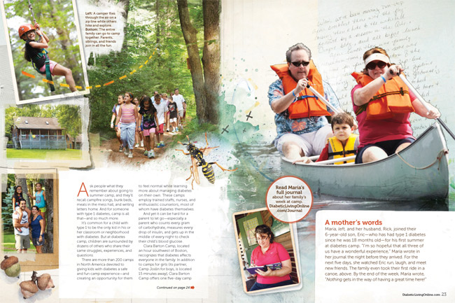
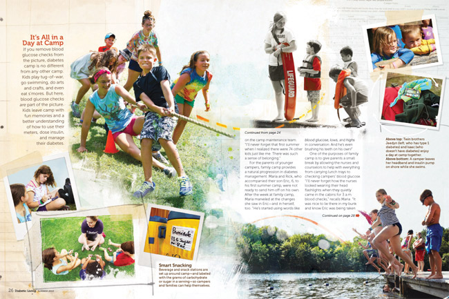
Congratulations to Diabetic Living, on the Folio Ozzie Award for Consumer Publications: Best Use of Digital Imagery for the “Let’s Go to Camp” story illustrated by Janice Kun. Many thanks to art director, Michelle Bilyeu who shared the news with Janice, "Our team loved how this story turned out and you did a fantastic job making it come alive!". Working closely with Michelle Bilyeu, Janice Kun artfully incorporated the many photographic moments with illustrated elements highlighting this true-to-life portrayal of camp life.
Incorporating kids' letters and handwriting really helps make this their personal story.
Love the subtle use of a black and white photo with spots of color (top center).
To see more of Janice Kun's playful illustrations integrating photographic elements, check out her updated portfolio.
Dave Murray: Illlustration 57 Reception, SOI, NYC
Big congratulations to Dave Murray on his Indie Alehouse poster illustration--Glory & Consequences, selected for the Society of Illustrators' Illustration 57 annual. Last week Dave Murray attended an opening reception of the exhibition at the SOI in NYC. Of this great honor the SOI website says, "the exhibit features works by leading contemporary illustrators worldwide, selected by a prestigious jury of professionals". If you're in New York this month, drop by and check out the show. You won't be disappointed. Details on the show, which runs until January 31, 2015, are on the SOI website.
We caught up with Dave to get his reflections on the experience and share some of his pics from the opening reception:
i2i Art: What comes to mind from the SOI reception in speaking with fellow illustrators and art directors?
Dave Murray: I got a real feeling of community from everyone there. It was my first time at the SOI (and in the annual), so it was a completely new experience. It was pretty amazing just to soak in the atmosphere. I had a bit of a chuckle talking to one illustrator who's work is currently being displayed in the NYC Subway system, but never manages to catch a train that has the work in it. I saw it on nearly every train I took over the few days I was there.
i2i Art: Did any trends or themes emerge for you in looking at the advertising and institutional art on display at the show?
Dave Murray: Themes were harder to nail down - I feel like the SOI does a great job of varying the style of the selections - no one style was represented more than another.
i2i Art: What did you think of the overall quality of the art in the show?
Dave Murray: The quality of the art on display was amazing. Conceptually and technically, pretty much everything blew me away. Going back to the variety of work - there was such a mix of styles and media...Coming home, I feel incredibly re-energized and inspired.
i2i Art: What piece of art by a fellow illustrator was the highlight of the show for you?
Dave Murray: My personal favorite from the show - Andie Dinkins' absolutely unreal "New Years Eve at the Beverley Hills Hotel" piece.
Dave with the poster he designed and illustrated for Indie Alehouse's Glory & Consequences, hanging on those historic SOI walls.
Dave's personal fave, Andie Dinkin's, New Years Eve at the Beverley Hills Hotel.
To see more of Dave Murray's award winning illustration, visit his portfolio here.
Rémy Simard honoured at the 37th Salon du livre de Montreal
i2i Art Inc. is proud to congratulate Rémy Simard, a guest of honour at the 37th Salon du livre de Montreal. With over 80 titles to his name, Rémy both authors and illustrates children's books. His humour is ever present.
The book fair runs this Wednesday November 19th through Monday November 24th, if you're in Montreal don't miss this opportunity to pick up some perfect holiday gifts!
Rémy's latest book, Mes Dinky is published in the Pomelo Éditions by La Watermelon. This beautifully colorful book is perfect for anyone with a passion for cars--especially small ones. Rémy has his own collection of 140! In Rémy Simard's own words, "I can not remain indifferent to a car, it is beautiful or ugly."
This the cover of Mes Dinky
And here's a sneak peek of the delightful illustrations you'll find inside.
Rémy is probably best known for his popular series Boris, which he wrote and illustrated.
Thom Sevalrud makes Luerzer's Archive Best Illustrator list, again.
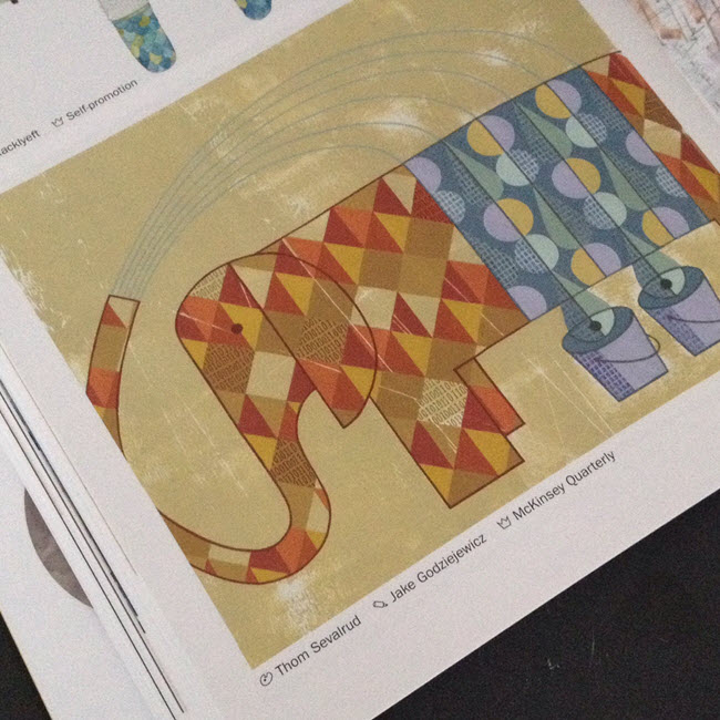
How do you manage to be named one of the top 200 Best Illustrators Worldwide by Luerzer's Archive, for a second time? We asked Thom Sevalrud, a master of conceptual illustration, to help us understand his methods and inspiration for his most recent award-winning image 'The Elephant' depicting big data analytics.
i2i Art: Let's start from the beginning. How were you approached to create an illustration representing Big Data Analytics?
Thom Sevalrud: This image was created for the McKinsey Quarterly publication. It was to be a double-page spread to accompany a whole ‘section’ in the journal examining big data analytics. The AD, Jake Godziejewicz, had sent me the articles and a short brief that explained what they needed; including some very specific examples of mine that showed the approach they preferred.
i2i Art: Why an elephant?
Thom Sevalrud: I wanted to nail a perfect image of something big, yet something multi-faceted. It all came together fairly quickly once the water provided the metaphor for ‘washing away the complexities’ of data. I sent the idea to Jake and explained that the elephant image would be a perfect way to ‘over-fill’ a double page spread with both sides of the creature being cropped off the page……like it didn’t fit. I'm glad Jake loved the idea.
i2i Art: Was this painted traditionally?
Thom Selvarud: It was acrylic on paper, then I added a subtle binary code into random areas of some of the diamond shapes in the elephant using digital tools.
i2i Art: And how did you get the nod from Luerzer's Archive?
Thom Selvarud: At about the time I was working with McKinsey Quarterly, I was invited to once again submit to Luerzer’s Archive 200 Best Illustrators Worldwide. Illustrators are first nominated and screened before they are invited to enter. Their work is then taken to another level of judging and are chosen from an international collection of work, where my elephant made the cut. I have now been included in 2 of the 5 collections of The Best Illustrators by Luerzer’s Archive.
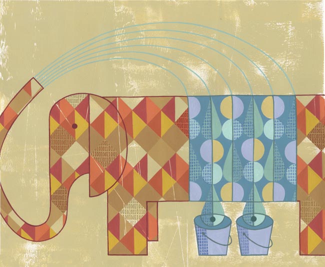 'The Elephant' as it appears in Luerzer's Archive 200 Best Illustrators Worldwide
Thom Sevalrud is represented by i2i Art Inc. | View Thom Sevalrud's complete portfolio
Thom Sevalrud's Surface Design Recognized by American Illustration
Thom Sevalrud's 'Abstractions' were recognized by American Illustration and chosen for their website award archive. The clean graphic images were used in different configurations as surface design on gift bags for the annual Buddies In Bad Times Art Auction last fall. Congratulations Thom!
Greg Stevenson: Sin & Self-Improvement
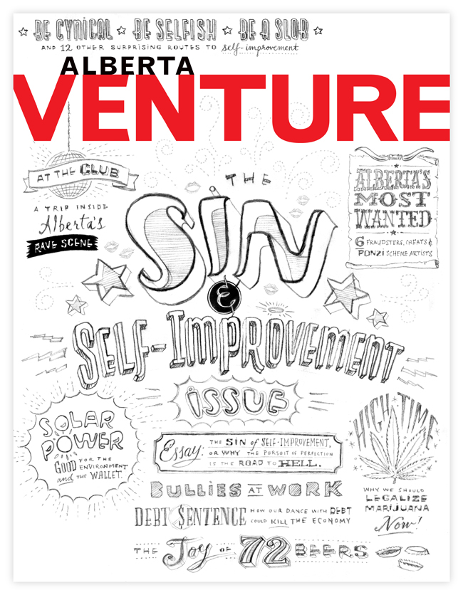
The Alberta Magazine Publishers Association is pleased to announce the finalists of the 2013 Alberta Magazine Awards and we are delighted that this cover art created by Greg Stevenson for art director Kim Larson, is one of the award winning covers.
Feeling inspired by the subject matter, Greg went to town covering all the sinful bases with his first sketch (above)!
(we just thought you'd enjoy this behind the scenes sneak peek into Greg's process)
And this is the award winning cover art!
Thom Sevalrud: Society of Illustrators 54th Annual Show
Thom Sevalrud's image, Stovetop, was just accepted into The Society Of Illustrators 54 Annual and Show (book category). The prestigious competition is held each fall and the winning artwork is published in the new year. All work is also exhibited at a show at the Society in NYC.
This new work is a piece Thom created for the recently released Work/Life 2, an international illustration directory. The book was designed, art directed and curated by Janine Vangool and published by Uppercase Books. Thom loved the conceptual challenge of interpreting an image specifically for the theme of Work + Life and how those two things co-exist side-by-side. He likes this quote from David Sedaris: "One burner represents your family, one is your friends, the third is your health, and the fourth is your work."
Thom feels the quote is highly appropriate considering how many of us live our lives, with many 'pots on the stove', and definitely applies to himself, as multi-tasking is pretty much the norm for an illustrator.
Tracy Walker: Illustrators Unlimited
i2i art is honored to announce that Tracy Walker's work is featured in the new publication, Illustrators Unlimited, a collection of international contemporary illustrators. Gestalten (the publisher) says, "In recent years, illustration has evolved from a purely service-oriented trade to an expressive, poetic, and esteemed voice in contemporary visual culture". The book can be browsed and purchased on the Gestalten site. It will also be available through Indigo and Amazon (fall 2011). To see more of Tracy Walker's illustration go here.

Sarah Beetson's "I Dream in Celluloid", opens in Ottawa, Canada
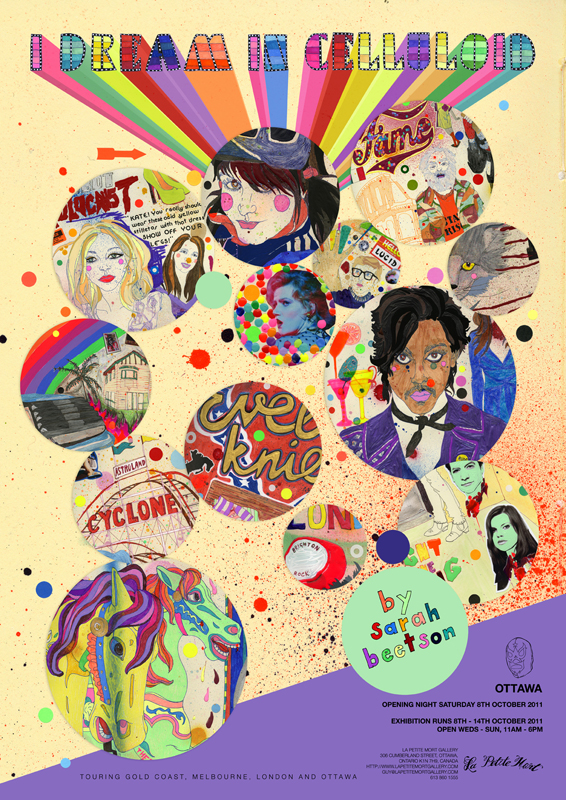
Sarah opened her fourth solo show in February in Mermaid Beach, Queensland Australia. "I Dream in Celluloid" toured across Australia and the UK and finishes up in Ottawa, at La Petite Mort Gallery in October. Five of the images from this show won "best in book" in the Creative Review 2011 Illustration Annual. The show, "I Dream in Celluloid", is a collection of work based on dreams and memories inspired by and affected by Sarah's obsession with film.
Thom Sevalrud in Work/Life 2 and Communication Arts Annual 52
This illustration is a new piece Thom Sevalrud created for the recently published Work/Life 2 Illustration Directory, designed, art directed and curated by Janine Vangool. The book was published and is available through Uppercase Gallery. The image was also selected for the 52nd Illustration Annual of Communication Arts Magazine .
Jillian Ditner an Applied Arts Illustration Award Winner
Jillian's piece "Sunrise", created for the Globe and Mail Facts and Arguments Section, won in the Young Bloods category of the 2011 Applied Arts Awards. All winning work will be showcased in the May/June issue of Applied Arts.
Thom Sevalrud selected for 200 Best Illustrators Worldwide
Thom Sevalrud is featured in Luerzer's Archive - 200 Best Illustrators Worldwide. A selection of top art directors worldwide identifies a list of illustrators for the publication. After an illustrator is selected, they are then invited to enter work commissioned from the prior 18 month period. Thom's winning illustration (below) is on page 210 in the 2011/12 volume.
Tracy Walker a winner in Applied Arts 2011 Illustration Awards
Tracy Walker's Earth day poster, created in collaboration with Brad Pearson and Keith Treffry of Earth Day Canada, has won in the poster category of the Applied Arts 2011 Photography &Illustration Awards. All winning work will be showcased in the May/June 2011 issue of the magazine, the Winners Gallery on the Applied Arts Website and at the annual Winners Exhibit, to be held on Wednesday, October 26 and Thursday, October 27, 2011 at Artscape Wychwood Barns in Toronto.
Thom Sevalrud's illustration a runner-up in CQ20
The i2i July Calendar image "Scream" placed as a runner up in Creative Quarterly Magazine's competition. All runners up will be published online in August. If you love this pop art, summery image, visit Thom's website store for Giclee prints.
MEC Bags in 2010 Applied Arts Design and Printing Awards
Monika Melnychuk created a funky, fun line of illustrations for Mountain Equipment Co-Op's reusable bags. The series placed in the recent Design and Printing Awards run by Applied Arts magazine - showcasing some of the best work produced this past year. This series has also won awards with The Art Directors Club of Canada, Print Magazine's Creativity and Commerce Competition and Design Edge Regional Awards for the BC and Yukon area.
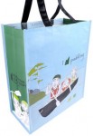
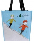

A sampling of the bags, and below - the full wraparound as a panel image:
Ian Phillips in 3X3 ProShow No. 7!
Ian Phillips has placed in both the Gallery and Self-Promotion categories of 3x3 ProShow No. 7. The listing of all ProShow winners is currently on the 3x3 blog. The actual issue won't be out until the fall - but below is a sneak peek at Ian's winning entries. Also involved in the 3 x 3 International Student Show No. 7 is Thom Sevalrud , another i2i illustrator and teacher at Sheridan Institute. Thom is one of the judges for this year's competition. (winners to be notified mid-June).
From Ian's Carnival Series -Peanuts and Popcorn placed in the Gallery Category.
Fancy in Space placed in self-promotion 49 Smiles placed in self-promotion













![COILS 2006 - 3 sketch [Converted]](http://static1.squarespace.com/static/5456aa00e4b0750e1090a911/55a020bde4b05f3d8b66720e/55a020bfe4b05f3d8b667295/1274956087000/IanPhillipsFancy.jpg?format=original)
