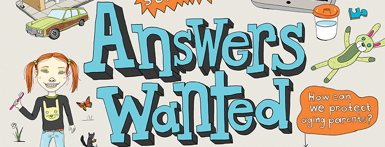
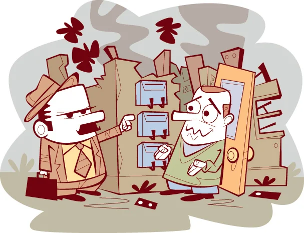
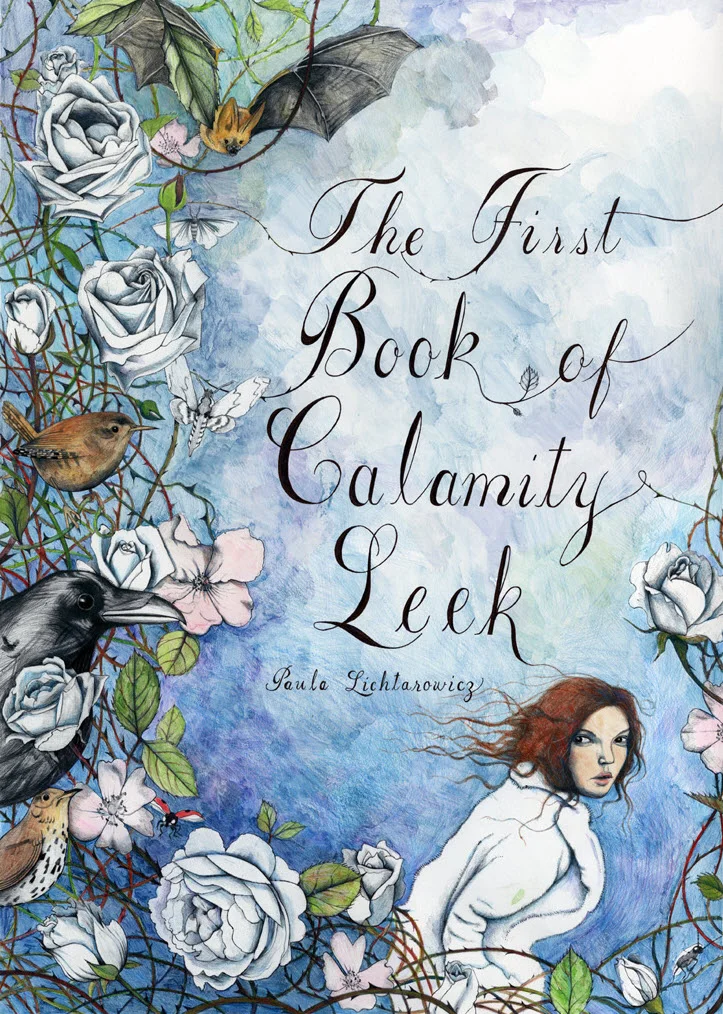
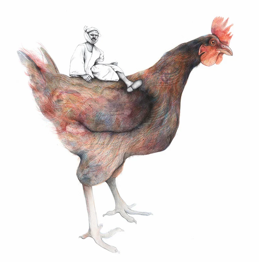
We just got our copy of illustrator Tim Zeltner's newest picture book, John Deere, That's Who! and we are blown away! The recent Kirkus review said it best, "the illustrations are gorgeous."
Read MoreMark Hoffmann illustrates for New Jersey Monthly
Mark Hoffmann's mouth-watering illustrations for the Best Bars issue of New Jersey Monthly were a big hit with the happy hour crowd. Tasked with highlighting the different areas of this great garden state Mark Hoffmann, with art direction by Laura Baer, envisioned signature drinks and turnpike signage.
Read MoreMark Hoffmann illustrates You Can Read
With shear delight we announce illustrator Mark Hoffmann's first children's book - You Can Read. Written by Helaine Becker and published by Orca Books, You Can Read takes kids on an exciting (and often very funny) adventure to literacy.
Read MoreClare Owen illustrates for Vintages magazine
Illustrator Clare Owen takes us on a luxurious tour through vineyards and quaint towns on our quest to become a wine geek. Working with art director Eugene Chan, Clare sets the perfect scene as Vintages Magazine walks us through what every connoisseur knows in three easy steps.
Read MoreJanice Kun illustrates for Macalester Today
In the heart of St. Paul, Minnesota the students at Macalester College like to embrace winter in all it's frigid, snowy splendor. This hardy community has begun to welcome more and more warm weather international students and introducing them to the myriad of winter activities on and around campus.
Read MoreEric Chow illustrates for Canadian Business
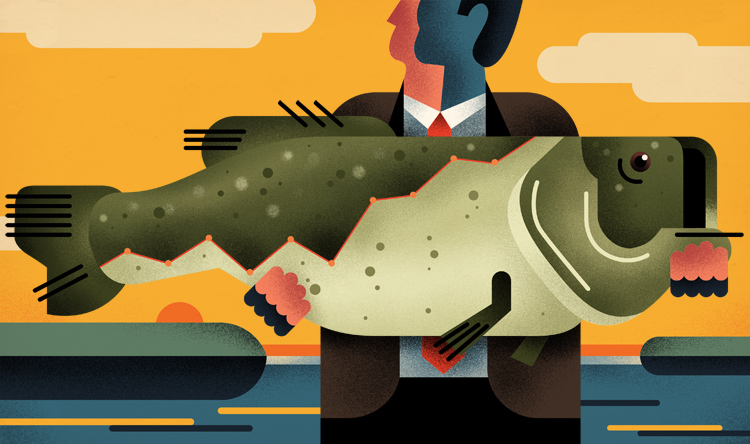
Canadian Business magazine recently published it's Investor's Guide 2017. With a wonderful mix of metaphors Eric Chow's illustration accompanies some great advice on investment strategies and picking the right stocks and brokerage firm.
Read MoreThom Sevalrud illustrates for Nobles Magazine
In their latest issue, Nobles magazine, published by the Noble and Greenough School, brings us a fascinating look at teens and their social networks. With some exceptional art direction from 2 Communique, Thom Sevalrud's illustration captures our curiosity on the subject.
Read MoreMonika Melnychuk illustrates for New Trail
Just received our copy of New Trail magazine with illustration by Monika Melnychuk. Another terrific assignment with the award-winning team at the University of Alberta. This issue of New Trail explores how the alumni is solving everyday problems.
Read MoreRemy Simard for Canadian Underwriter
Life is full of mishaps and new adventures. Illustrator Remy Simard puts a comedic spin on these stories for a recent issue of Canadian Underwriter. Art directed by Gerald Heyden, Remy creates some priceless scenarios (and the expressions we imagine go along with them) that capture all that life could throw at you. Hopefully you bought the insurance!
View more of Remy Simard's illustration. Represented by i2i Art Inc.
Carl Wiens illustrates for Toronto Life
Illustrator Carl Wiens was the perfect fit for Toronto Life magazine art director Brian Anson Wong's vision of the 'Toronto of Tomorrow'. Using a stylized, diagrammatical approach, Carl Wiens is able to transport us to a future of mile-high skyscrapers, underground dwellings and ecopod pads. Looking inside these fascinating structures we get a glimpse of what life in this bustling city could look like.
Of course, the future is also synonymous with automation. Carl's retro-looking robo-advisor is a clever juxtaposition to Toronto Life's prediction of jobs on the verge of obsolescence.
Carl Wiens offers great illustration for whatever the future might hold.
View more of Carl Wiens' inspired illustration. Represented by i2i Art Inc.
Welcome illustrator Talya Baldwin
Welcome to the illustrated world of Talya Baldwin. Armed with her inks, paints, biros, coloured pencils, pastels, wax crayons and felt tips Talya astounds us with her technical brilliance and the beauty she sees in the most interesting of subjects. We had to find out more about Talya.
What first inspired you to be an illustrator?
When I was three or four, my dad made me a tiny and very beautiful wooden table and chair. I kept my crayons and paper on them and that’s where I’d sit for hours, drawing castles and witches and fairies. My desk is slightly bigger these days, but essentially I’m still doing the same thing.
Can you give us some insight into your creative process?
My creative process is intense and a bit chaotic but always the same: I wake up in the middle of the night and think ‘I know EXACTLY how I want this drawing to look. I can see the colours and the direction of the lines and the way there’s so much energy in it it’s almost humming with life.’ And then I leap out of bed in the morning and make such a pale, disappointing imitation of that image that I feel completely bereft and inadequate. It was a relief to discover, over the years, that almost all artists feel this way, and that the trick is to keep working - you’ll never re-create the shining image in your head, but you might get a bit closer!
Whatever was imagined, we find Talya's efforts extraordinary.
How would you describe your work?
For me, it’s mostly about making the invisible visible. I like drawing things that might otherwise be overlooked because they aren’t grand or celebrated, like weeds, feral pigeons and minor characters from the edges of fairy tales. As a child I was always fascinated by the last prince in the story of the Six Swans; the one who was left with a single white wing because the magical jersey he was meant to put on to regain his human form had a missing sleeve. What on earth happened to him in later life? How did he explain it to people? And how did he ever open a tin of beans? I draw him over and over again because he seems to represent everything I’m interested in: fragility, tenacity and not quite fitting in with everyone else.
Talya Baldwin has been recording the stories of asylum seekers at Yarl's Wood Immigration Centre, and at the refugee camps in Calais. Yarl's Wood is effectively a women's prison for migrants, except that none of them have committed any crime. These illustrations below are a testament to Talya's commitment to make the invisible visible.
Are there certain themes you enjoy illustrating?
I draw birds endlessly. I love corvids - crows and ravens especially - because they’re so mistrusted. Our culture is full of images of ravens as bad omens and symbols of death, witchcraft and so on, but in reality they’re hugely intelligent and I’ve always thought they were very beautiful, too.
What are you working on currently?
I’m part of the NOMAD collective which makes art in unconventional spaces; we’ve been working on the Phytology Project, an apothecary garden on an East London estate in which all the plants are weeds with proven medicinal properties. At the moment, I’m also working on a new project with illustrator Simon Manfield in collaboration with the Scottish Seabird Centre. We’re raising awareness of endangered sea birds by making a series of drawings, copies of which will be floated at sea in tiny, GPS-tagged boats.
I also work on arts and health initiatives with children. These are creative projects designed to raise self-esteem, give children a sense of pride in their work and help them generate artworks that bring communities together.
Interior illustrations from Talya's recent picture book, Fox's Party, below.
Talya Baldwin studied at the Wimbledon School of Art, and then later at Edinburgh, and Saint Martin’s (in London) for her Master's degree. Talya is represented by i2i Art Inc.
Dave Murray illustrates Toronto for Airbnb
The folks at trevor//peter were coordinating a series of events for Airbnb this summer and they needed a wow factor. Taking place in the heart of Toronto, Canada the team decided a map of the city - 10 feet x 15 feet - would be the perfect way to draw the crowd to their booth.
Illustrator Dave Murray, a proud Torontonian, was chosen to work on the project. Dave quickly assembled a brilliant collage of Toronto's coolest neighborhoods and points of interest. Graphic, bold, colorful, the piece beckons you to point out where you live or where you need to visit.
Check out more of Dave Murray's illustration. Represented by i2i Art Inc.
Dave Murray illustrates for Canadian Business
Inspired by the upcoming summer weather illustrator Dave Murray has created some pretty clever 'sand and surf' metaphors for investing now featured in the Canadian Business Investor 500 Guide. Art directed by John Montgomery.
See more of Dave Murray's conceptual illustration. Represented by i2i Art Inc.
Janice Kun for USC Dornsife Magazine
Our genetic blueprint is still a very mysterious concept. For the article "Molecular You" in the most recent issue of USC Dornsife magazine, Janice Kun captures that mystery and intrigue in a series of beautifully atmospheric illustrations. Using a combination of line drawing, watercolor and photography Janice's imagery provides layers of subtle, yet powerful, detail. With incredible art direction by Daniel Knapp we are given the chance to ponder the impact of our DNA through Janice's work.
See more of Janice Kun's illustration. Represented by i2i Art Inc.
Thom Sevalrud for Stanford Social Innovation Review
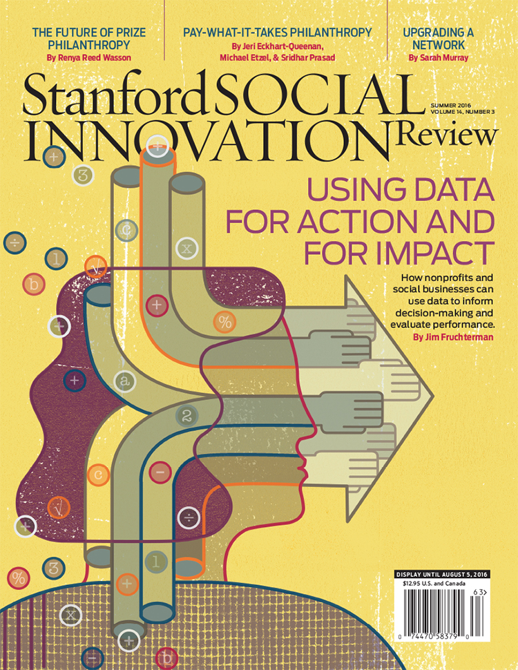
The Stanford Social Innovation Review tackles some of the more interesting questions asked in the social sector today and thoughtful, conceptual illustration plays an important role in creating a visual understanding of these topics. And so art director David Herbick chose illustrator Thom Sevalrud for the Review's latest cover; a story on how nonprofits and social businesses can use data for action and for impact. Thom's elegant use of symbolism, strong lines and composition truly captures the transforming nature of this article.
See more of Thom Sevalrud's conceptual illustration. Represented by i2i Art Inc.
Katy Dockrill for LCBO 'Hello Spring' Campaign
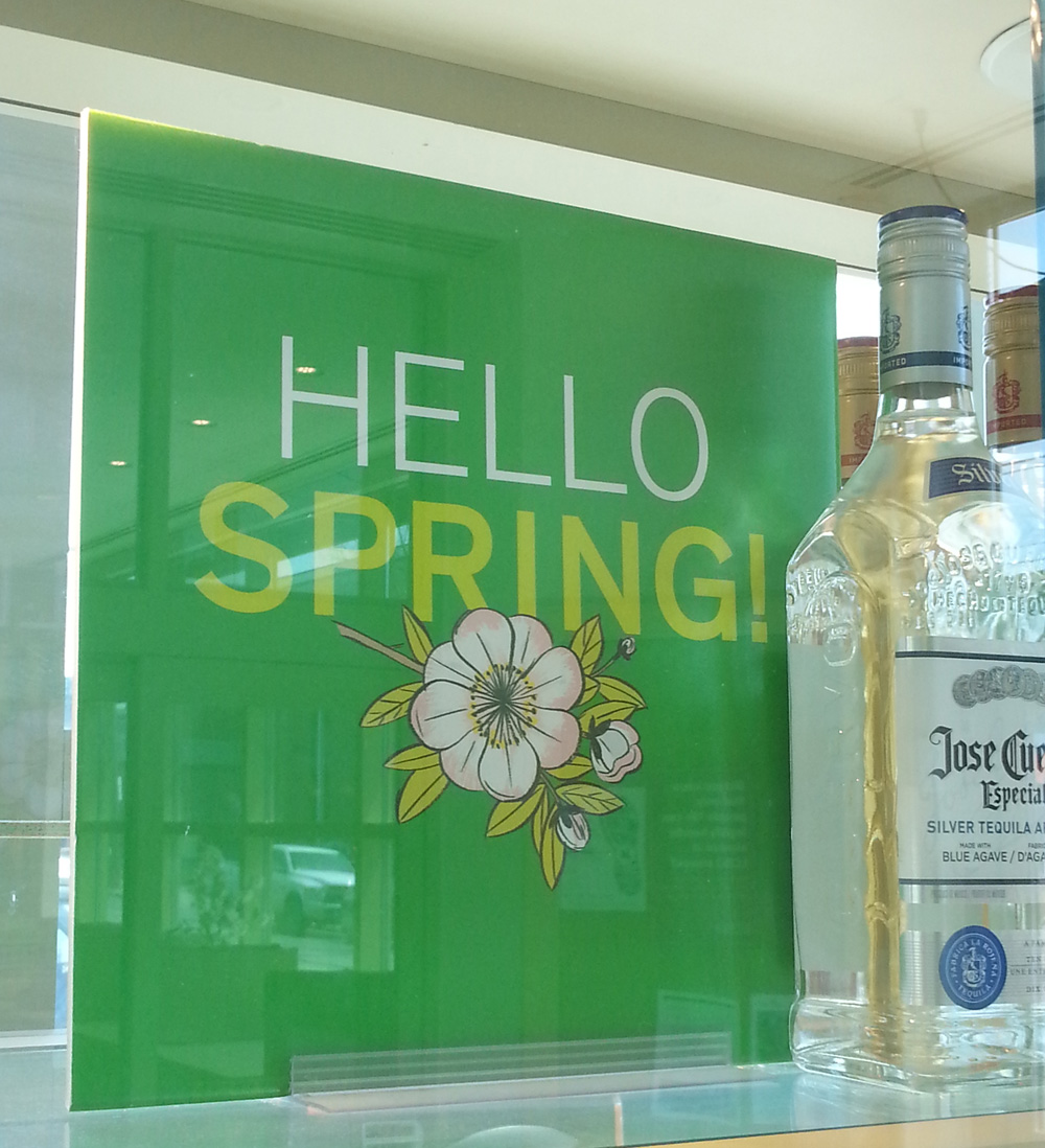
Nothing symbolizes Spring quite like a cherry blossom. When you walk into any LCBO this month you will be greeted by the bright and simple beauty of this bloom. Brad MacIver, creative director at the Liquor Control Board of Ontario, had worked with illustrator Katy Dockrill in the past and knew the wow-factor her lines could create.
The bold signage for the 'Hello Spring' campaign adorns the shelves and windows of the stores, beckoning you to pick up a bottle of something for those evenings on the porch.
See more of Katy's beautiful work. Represented by i2i Art Inc.
Thom Sevalrud for Maryland and Virginia Milk Producers Cooperative
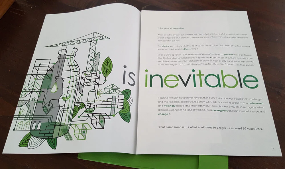
For the Maryland and Virginia Milk Producers Cooperative Association, the theme is change and The Design Office of Ann Marie Ternullo called on Thom Sevalrud to help illustrate this conversation.
For the cooperative's 2015 annual report Thom's clean lines and stylized approach provided a future-forward look at the client's complex industry. The fresh green color palette invites the reader and the illustration is cleverly carried throughout. The report is also printed (what a treat!) in an impressive 10"x13" format creating a stunning impact.
We have a special place in our hearts for great design. The collaboration between Ann Marie Ternullo and Thom Sevalrud created a truly special artifact.
See more of Thom Sevalrud's illustration. Represented by i2i Art Inc.
Adirondack Icons by Phil
When I first spoke with art director Kelly Hofschneider at Adirondack Life Magazine she told me Phil's work has been pinned up at her desk for years. That's when you know it's a perfect match. Phil's nostalgic style captures the spirit of the beautiful Adirondack region. Described as rustic, naive and iconic Phil's illustration tells the story of the area through its landscape, animals and people.
Prints available. See more of Phil's illustration. Represented by i2i Art Inc.
Monika Melnychuk Posters for 24 Hours of Light
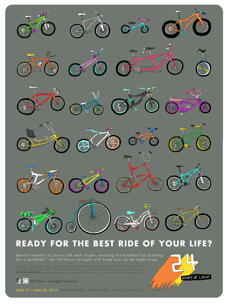
"Ride all night long in the glow of the midnight sun" is the enticing caption to this year's 24 Hours of Light. This is a mountain biking event held each summer in the rugged wilderness of Whitehorse, Yukon. Mountain biking is one of Monika Melnychuk's biggest passions--illustration being the other.
When asked to create the posters for this event Monika tapped into her funky sense of style to illustrate some out of this world bike designs along with a couple kick-butt characters. Wild pops of color, original lettering, great expression and a serious sense of whimsy typifies Monika Melncyhuk's illustration.
Check out more of Monika Melnychuk's illustration. Represented by i2i Art Inc.
Mark Hoffmann for Cooking Light
Not an easy task, illustrating a story about love, loss, and fruit salad. The author and copy director for Cooking Light, Susan Roberts McWilliams, "wanted the article to have a lot of hope and thankfulness to it." Mark Hoffmann's illustration was the perfect compliment to this touching story about how we respond with food when someone loses a loved one.
Delight in the details and composition of these richly painted down-home pieces. Feature art directed by Sheri Wilson and 2015 winner of the SPD merit award for Single/Spread Illustration in the Lifestyle, Travel/Food/Shelter category.


