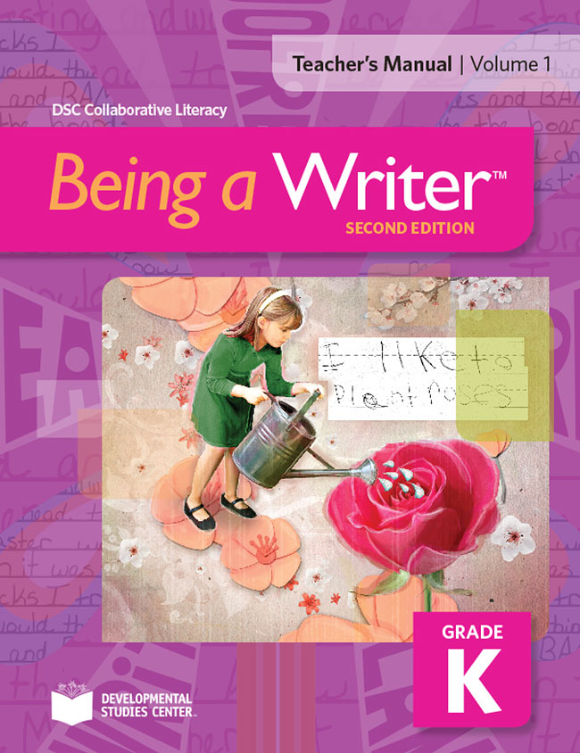
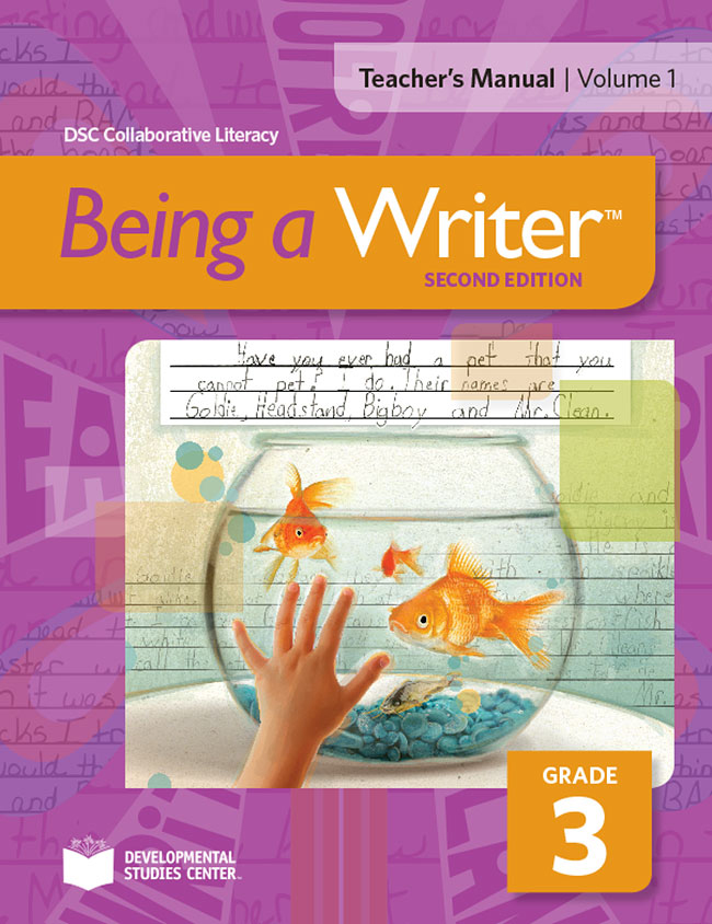
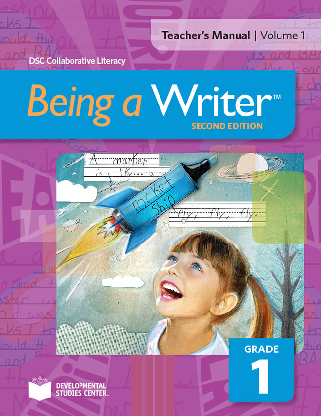
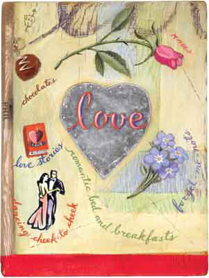
Working with talented art director Roberta Morris, Margaret Lee created these fun book covers for the Being A Writer Program. With a combination of actual student writing and hand created collage elements Margaret brings her clean and graphic layered treatment to these age-appropriate illustrations. To see more of Margaret's inspiring collage style art visit here.
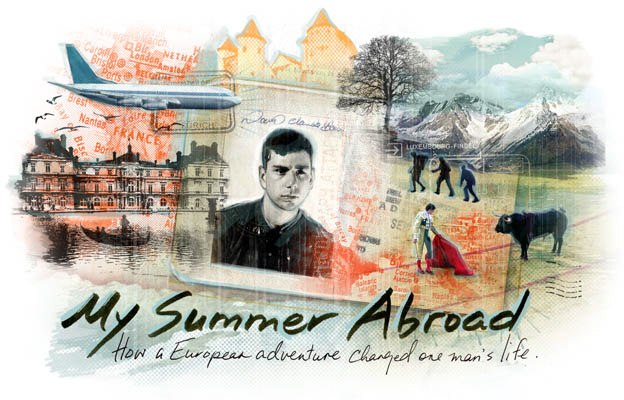
Margaret Lee for AAA Traveler Magazine
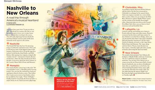
Lymari Acevedo, art director for AAA Traveler, repurposed an image created by Margaret Lee exploring the musical heritage from Nashville to New Orleans.
The Green Issue Illustrated
Two of our illustrators - Monika Melnychuk and Margaret Lee, contributed to The Green Issue of Owl Magazine. Monika illustrated the cover emulating chalk writing on a green-board with her fun hand lettered type. Margaret approaches a more technical article called How Solar Power Works with a kid-friendly illustration that's used more like a diagram.
Margaret Lee Illustrates a One Woman Zoo
Margaret Lee produced these dreamy, evocative images to accompany an article on Diane Ackerman's book, One Hundred Names For Love- A Stroke, A Marriage and the Language of Healing. The article, published in the Penn Stater, the alumni magazine for Pennsylvania State University, where Paul West (Diane Ackerman's husband) taught. The book chronicles their journey through Paul's stoke and how they adapted to recover his use of language. The two illustrations were based on a chapter in which Paul mourns the loss of the pet names he used to have for Diane. She notes "It was true. Once upon a time, in the Land of Before, Paul had so many pet names for me I was a one-woman zoo...In our mythology there were golden baby owls, ring-tailed lemurs, axolotls, shoulder rabbits, honeybunnies, bunnyskins...and many more." She encourages Paul to re-invent pet names and endearments for her. Some he creates are : Celandine Hunter, My Little Spice Owl, and Spy Elf of the Morning Hallelujahs.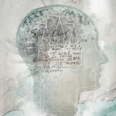

Illustration Married with Photography
We are seeing a growing trend whereby illustration is combined with photography. Below are a few examples of different approaches. Sometimes the client supplies the photos, although frequently the illustrator shoots their own photos or stock photos are used.
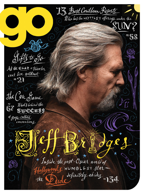
Greg Stevenson created the hand-lettering and icons layered over the photo of Jeff Bridges, supplied by the client, Ink Publishing.
Anne Horst created a montage of stock photos and illustration to create this image on social media for the cover of Marymount Manhattan College Magazine.
Alanna Cavanagh's minimal and whimsical line illustrations create a great contrast with the rich fabrics in the photo supplied by Fabricut for this Trend Drapery ad.
John Webster created this piece with stock imagery and client supplied photos of Sorbara Hall on the St.Michael's campus at the University of Toronto. The article was on the history of the use of the campus in film.
Aaron Bihari used a photo with a duo-tone treatment for the background in this piece, to contrast with his illustrated VW bus.
This is an example of how Janice Kun creates a dream-like image with the use of her own original photography as well as stock imagery.
Margaret Lee often sets up her own photo shoots on location and uses a unique colorization to create whimsy and drama.
Bruce Emmett often stages elaborate sets, with himself as a model, in his photo-illustrative work.
Margaret Lee for AAA Traveler Magazine
Happy Valentine's Day from i2i
Margaret Lee illustrates for Midwest Living
Margaret Lee created these beautiful images for an article on "armchair escapes" appearing in the Jan/Feb 2011 issue of Midwest Living. The feature allows the reader to travel with the authors of seven stories to different events and places like skipping stones across a lake or a drive in a convertible along Lakeshore Drive in Chicago.


A Timely Alibi - paperback version now out
Margaret Lee worked with Art Director Kathleen Oudit of Harlequin to create the new paperback version of A Timely Alibi by Ilsa Mayr.
