 Aaron Bihari recently created a series of 5 illustrations to accompany the story of the castaways from " The Wreck of the Grafton". This play appears in READ issue 9, Survival.

Aaron Bihari recently created a series of 5 illustrations to accompany the story of the castaways from " The Wreck of the Grafton". This play appears in READ issue 9, Survival.
 John Webster created this chalkboard collage to accompany an article on social networking and kids in the school context. The article "What's The Skinny On Social Networking For Teens?" by Cindy Matthews, appeared in the recent issue of OPC Register. It gives an overview of how teens use social networking, some guidelines for teachers and students as to how to use social media appropriately and the possible benefits social media may play in the school setting.
We would like to introduce the newest illustrator to join i2i art, Bruce Emmett. Bruce studied illustration at the Syracuse University School of Art. He lived and freelanced for many years in NYC. In the mid-1990's he plunged into digital art and now juggles his time between the computer and the easel in his studio in France.


Fairy Liquid Posters done with Grey London

Final Style at Home mural
Margot Austin, the Senior Design Editor of Style at Home, recently hired Alanna to create a mural (wallpaper) for their booth at this year's IDS11. The interior design show is held at the Metro Toronto Convention Centre from January 27 to January 30, 2011.
Alanna in front of the mural on opening night.
Canada Post has released the next in their popular Lunar New Year stamp series. Tracy Walker illustrated this elegant rabbit to celebrate the Chinese year of the metal rabbit. Embossed foil stamping was used on the stamps as a reference to the "metal" element of this Year of the Rabbit. For more information about the stamp and the traits of the Year of the Rabbit, pick up a free copy of Details magazine from Canada Post. This year should feel more peaceful than the previous Year of the Tiger. The Year of the Rabbit will begin February 3, 2011, but these stamps might sell out before then - so hop on down to the post office today!
Design by Paul Haslip and Lauren Rand of HM&E Design Communications.


Margaret Lee created these beautiful images for an article on "armchair escapes" appearing in the Jan/Feb 2011 issue of Midwest Living. The feature allows the reader to travel with the authors of seven stories to different events and places like skipping stones across a lake or a drive in a convertible along Lakeshore Drive in Chicago.


In Canada, winter = hockey. Gary Alphonso recently provided new imagery for a "Hockeyville" logo for Kraft Foods, working with Gerald George of Brandid. Kraft, in partnership with the CBC and the NHL holds the "Hockeyville" contest, asking communities across Canada to submit stories about their hockey community spirit - who has the most and why? The winning communities receive prizes such as $100,000 to upgrade the home arena, an NHL pre-season hockey game hosted in the community arena and other events.

Greg Stevenson created the playful handwriting and doodle style illustration that overlay the photographs on the cover story for Go Magazine's December 2010 issue.

Anne created this conceptual illustration to accompany a recent article in UUWorld Magazine. "Dinner with Monsanto" by Michelle Bates Deakin, covers the potluck dinner that occurred between Rev. Nathan Walker and some of the members of The Philadelphia Unitarian and two spokespeople from Monsanto. The dinner occurred after a sermon the Rev. Nathan Walker gave got the attention of scientists, media and Monsanto. The Rev. Nathan Walker wrote a sermon, "Sovereign Seeds", as an open letter to Hugh Grant, the CEO of Monsanto. In the sermon, Walker challenged Grant to respond to seven “moral questions” about Monsanto’s relationships with farmers, consumers, scientists, the government and others.

Margaret Lee worked with Art Director Kathleen Oudit of Harlequin to create the new paperback version of A Timely Alibi by Ilsa Mayr.

Ian has always wanted to illustrate for Utne Reader and now his illustrations grace page 28 of the Nov/Dec 2010 issue! Check out "Secret Liaisons in the Middle East", an author's experiences while traveling and writing about gay life in the Middle East.

Harvey Chan created these richly patterned illustrations for READ's Viva Mexico issue. The story, Xibalba Games, follows a Mayan Creation Myth about two twin brothers, rulers of earth and sky.


Jason Duprau, art director of Legion Magazine, asked Janice Kun to create these haunting illustrations to accompany an article on homeless war veterans and how Canada is approaching the problem.
"Nobody knows the number of homeless veterans in Canada, and this is one of the reasons why: “Aside from struggling with issues of addiction and post traumatic stress disorder (PTSD), a lot of them don’t want to be identified as veterans,” says Joanne Henderson, Legion service officer in Vancouver. Some don’t want their buddies to find out what’s happened to them. “They think back to their time in the services as the good times in their lives and they’re ashamed. They think they should be able to take care of themselves. They’re in hiding; they’re hiding from themselves.” ...
It’s not enough to ask ‘Are you a veteran?’ “We learned you have to ask ‘did you have any military service’ because many don’t feel like veterans—they think veterans are guys from World War Two.” "
excerpt from article by Sharon Adams.
One of the solutions that is proving very successful is Cockrell House in Colwood, B.C. Much more than just housing, it's a full program that expects residents to move out and into more permanent accommodations in two years - helping them develop the life skills they need to do that.
“It’s a hand up, not a hand out,” says Dave Sinclair, President of British Columbia/Yukon Command, which helped fund Cockrell House.

We recently asked Gary Alphonso how he got his start creating Scratchboard/Woodcut style illustrations:
"During my early years a creative director approached me with an opportunity that would lead to my career as a “Scratchboard/woodcut” artist.
The time was the late 80’s just before scratchboard illustration enjoyed a huge surge in popularity. The client was a national clothing store chain called “Beaver Canoe”. It was at the time a major competitor to “Roots”, with an earthy outdoors feel to it’s product line.
The idea was to create a series of diamond shaped logos that would be very illustrative with a wood cut feel to them. They would represent the various product line, and be used in advertising, graphics on the clothing, and on in-store P.O.P. They became their trademark.

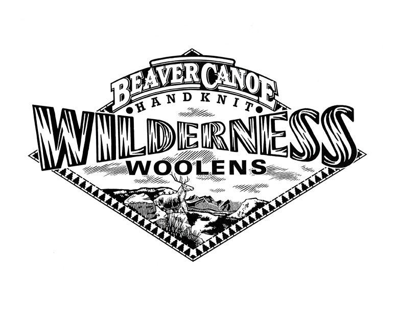
Gary's first traditional scratchboard illustrations (above)
That year (1988) they were featured in “Studio Magazine’s” Awards Annual. The timing couldn’t have been better. Scratchboard was about to become wildly popular in the 90’s. I quickly (and I use that term loosely because of how labour intensive the style is) began creating new samples on my own. I discovered and fell in love with early 20th century wood engravers and printmakers like Lynd Ward, Rockwell Kent, Frans Masereel, Giacomo Patri ...and the likes of. This was added to the passion I already had for the Art Deco period, the propaganda art that came out of Eastern Europe at the time, and the advertising and editorial art from the “West”.
At first the work was mostly black and white because of the nature of the scratchboard medium. This meant a lot of design (logo) packaging, and newspaper editorial work. As I slowly introduced colour to the mix, the advertising, magazine editorial, book, Annual report etc. work would follow. The phone kept ringing. I never looked back.
After years of success as a scratchboard illustrator it was hard to resist the role of the computer in the digital age. Very reluctantly at first, I began trying to adapt my style to the digital realm. As I became comfortable with this it became evident that carving shapes and lines out of black ink and clay had it’s limitations. With the computer I could keep this conceptual way of working (creating negative space while leaving the positive space behind) and carve these shapes out of colour instead of just black. This simple fact opened up many more doors creatively. The result was that I am able to keep evolving the style beyond the limitations of traditional scratchboard."


The evolution of Gary's work continues, however, sometimes the more things change, the more they stay the same--evidenced by a recent logo icon he created for a Bespoke Letterpress Printer in Chicago, Illinois. The retro appeal lives on!
In time for Halloween, Sarah Beetson worked with Megan D'Orazio to illustrate the story "Witch" for READ Magazine's "Witch Hunt (Salem and Beyond)" issue.

John Webster recently created this fun piece, art directed by Shane Lutjens, for an article in Enviva Magazine on odd museums to visit in Houston, Texas. See if you can spot the references to some of the feature locations: The National Museum of Funeral History- everything you ever wanted to know about Funeral Heritage in the United States: Day of the Dead, Civil War Embalming, etc.
Orange Show Center- The Orange Show was started by a Houston postman, Jeff McKissak, to celebrate his favorite fruit. The Orange Show Center for Visionary Art is now a hub for folk art activity.
Beer Can House- yep, a house made out of beer cans. Ripley's Believe it or Not estimated that over 50,000 cans were used to create the house.
Art Car Museum- what better place to visit while on a road trip than a museum showcasing imaginative "art cars" and mobile contraptions. They also feature other works of contemporary artists with a car theme.
The Rothko Chapel - founded in 1971, this is a sanctuary available to people of every belief, inspired by the modern, minimalist work of Mark Rothko.

Doug Martin has been creating the covers for the "Seaside Knitters Mystery Series" by Sally Goldenbaum, published by Penguin. Sally Goldenbaum recently passed on a compliment she received from reader Suzanne Barton, "...I've already bought Moon Spinners and can't wait to start it. Please pass my sincere compliments on to the cover artist. Cover art is definitely something that draws me to a book and, frankly, keeps me from purchasing an e-reader. I saw the other cover on your blog, and love that one too." Thanks Sally and Suzanne! Keep writing and reading, I'm sure Doug is up for another project. Keep your eyes open for the next in the series, due out in November: A Holiday Yarn .


i2i has signed new artist Nausica. She studied Industrial Design and Interior Architecture in Barcelona. Both influences can be seen in her decorative, graphic style. Check out the range of imagery in Nausica's Portfolio 1.Portfolio 2 features some of her animations.
It seems to be "travel" month at i2i. Alanna Cavanagh created a fashionable view of trips to Paris for Hemispheres Magazine,Ian Phillips supplied these incredible maps of walking tours in 5 cities for Viv Magazine and Tim Zeltner continues to create amazing landscapes for United with art direction from Barrie D'Rozario Murphy.

hemispheres
Alanna Cavanagh's cover for Hemispheres Magazine


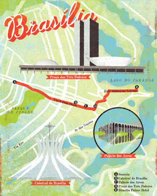
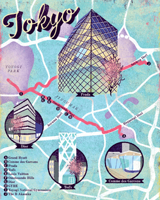

Ian Phillips City Maps for Viv Magazine

Picture 1
Tim Zeltner_TZ213

Tim Zeltner_TZ219

Tim has produced many beautiful Destination paintings for United Airlines over the years. For a very different side of Tim's art, we'd like to share a few of his newest illustrations for United's Travel Options campaign, art directed by Barrie D'Rozario Murphy.