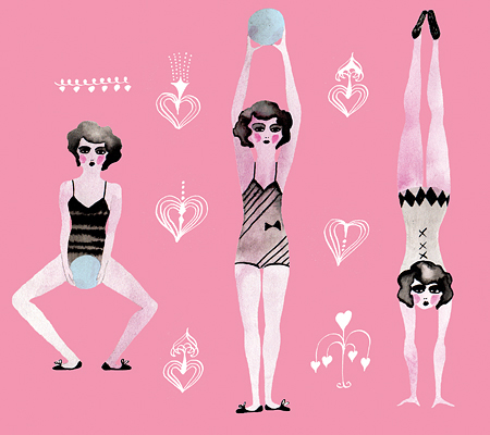
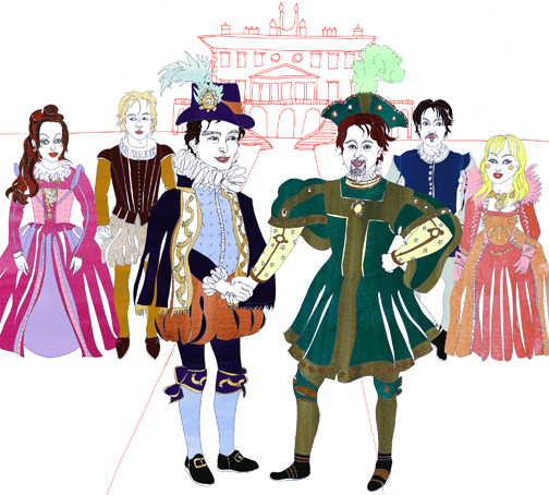
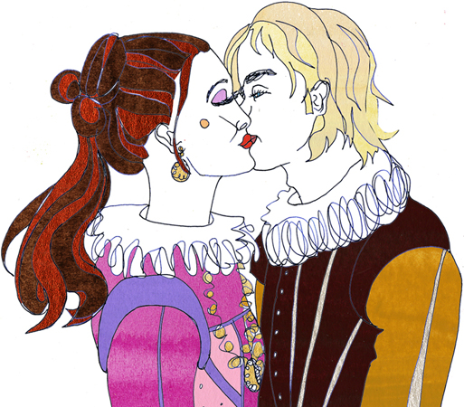
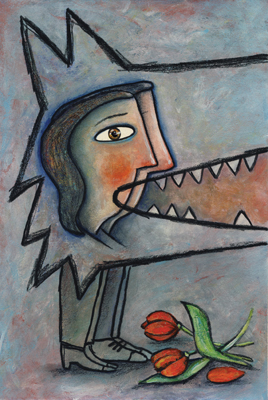
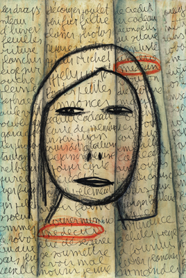
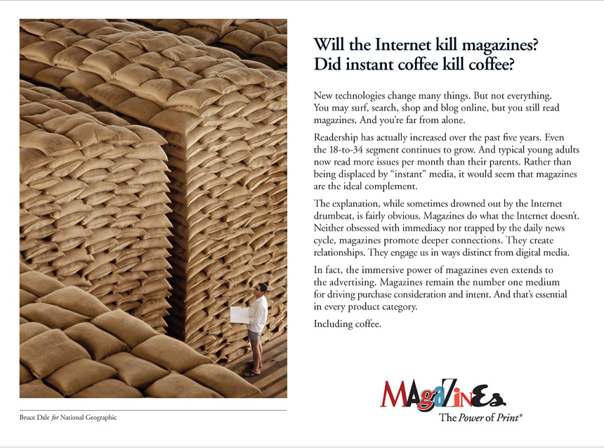
Rémy was chosen to illustrate Duped! for his graphic novel style. Duped!, published by Annick Press and written by Andreas Schroeder, is a collection of eight stories of the most outrageous scams of all time! Rémy is now at work on a second book for the "It Actually Happened" series.
Jillian Illustrates for Canadian Underwriter
Jillian lends her conceptual hand to demonstrate catastrophic insurance circumstances for Canadian Underwriter.
Ian Lends Whimsy to Serious Subject
 Recently Ian Phillips was commissioned to bring his humor and whimsy to a very serious story about bone health for the summer issue of Positive Side magazine. The story investigates HIV-related issues with regard to bone density. Bones can be healthy, brittle or too soft… Ian says, "First Goldilocks and The Three Bears came to mind. Then the Three Little Pigs and their houses of straw, sticks and bricks flashed through my mind as a better analogy. The smart-thinking pig built his house with bricks, demonstrating a proactive role in one’s health as the better choice."
Illustration Married with Photography
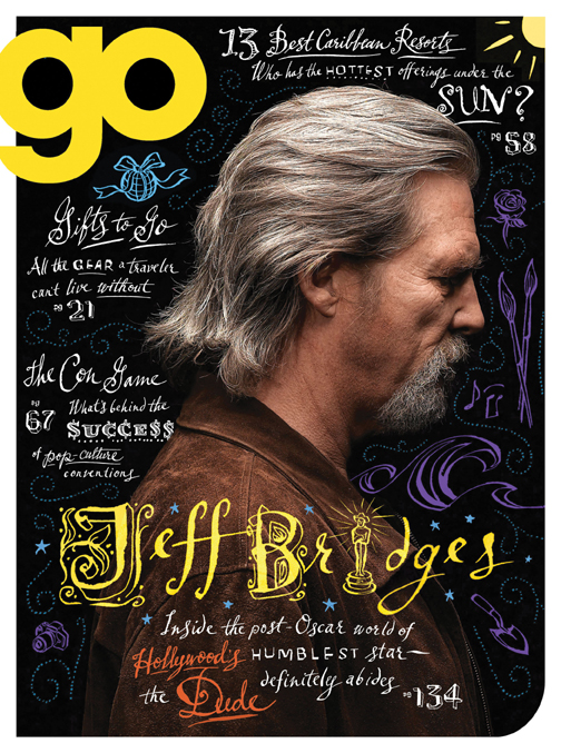
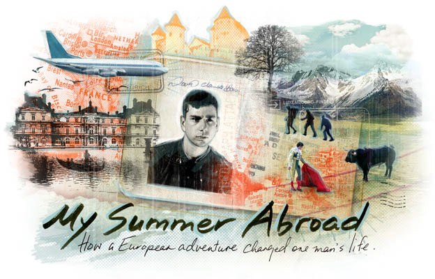
We are seeing a growing trend whereby illustration is combined with photography. Below are a few examples of different approaches. Sometimes the client supplies the photos, although frequently the illustrator shoots their own photos or stock photos are used.
Greg Stevenson created the hand-lettering and icons layered over the photo of Jeff Bridges, supplied by the client, Ink Publishing.
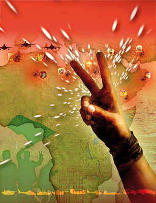
Anne Horst created a montage of stock photos and illustration to create this image on social media for the cover of Marymount Manhattan College Magazine.
Alanna Cavanagh's minimal and whimsical line illustrations create a great contrast with the rich fabrics in the photo supplied by Fabricut for this Trend Drapery ad.
John Webster created this piece with stock imagery and client supplied photos of Sorbara Hall on the St.Michael's campus at the University of Toronto. The article was on the history of the use of the campus in film.
Aaron Bihari used a photo with a duo-tone treatment for the background in this piece, to contrast with his illustrated VW bus.
This is an example of how Janice Kun creates a dream-like image with the use of her own original photography as well as stock imagery.
Margaret Lee often sets up her own photo shoots on location and uses a unique colorization to create whimsy and drama.
Bruce Emmett often stages elaborate sets, with himself as a model, in his photo-illustrative work.
Margaret Lee for AAA Traveler Magazine
Philippe Béha Illustrates Entrepreneurial Endeavours
Philippe recently created a cover illustration and 6 portraits for the University of New Hampshire magazine. The article, "Launch Pad: Young Entrepreneurs Follow their Dreams", is about recent alumni and their innovative companies.

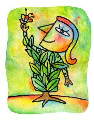
Nausica Serves Up Fresh Art!
For more, check out her updated portfolio 1 and while you're there, take a look at portfolio 2, which showcases her animations.
Bruce Emmett's Magic Realism Springs to Life
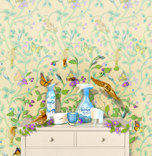
Febreze launched a welcome to Spring campaign using an illustration created by Bruce Emmett, art directed by Tricia Piasecki of Elvis ( a branch of Cossette formerly known as Blitz).
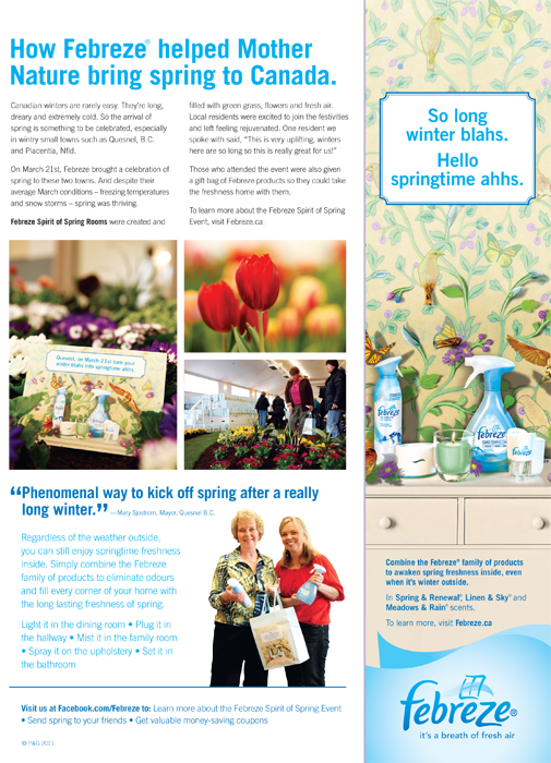
Here's a detail of the wallpaper "springing" to life:
Gary Alphonso illustrates for SmartMoney
Gary has produced another trademark, heroic landscape for an article in the June issue of SmartMoney on Germany and their current explosion in exports - the bullet train being one of their many exports.
Janice Kun illustrates For Canada Post
Janice Kun collaborated with Karen Smith to showcase the history of mail delivery in Canada. In her usual collage style, Janice combined hand drawn and painted elements with her usual sensitivity to demonstrate the use of the dog sled and Ponchon -- two key historical methods of mail delivery in Canada. Visit Canada Post for more information.
New Illustrations by Eili-Kaija Kuusniemi
Eili-Kaija has created some playful new pieces which showcase her talent for making vintage look new! Check out her updated portfolio for more.
New work from Aaron Bihari
This image, featured in our Spring mailer, shows a unique juxtaposition of Aaron's photographic elements and his trademark clean line and textural illustration style.
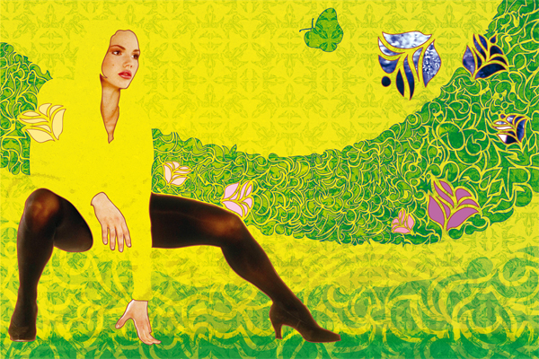
Here are some new pieces Aaron has been working on. Check out his updated portfolio to see more.
For all you mystery loving knitters out there!
Doug Martin continues to provide beautiful and detail rich paintings for the covers of the Seaside Knitters Series, written by national bestselling author Sally Goldenbaum. You can see the other four books in the series - all illustrated by Doug Martin- at Sally's site and browse knitting patterns and recipes as well.

Tim Zeltner illustrates article on talent
Tim lent his conceptual talents to illustrating this article on finding, growing and cultivating "talents" - the article appeared in the Spring 2011 issue of Brigham Young University Magazine.
Sarah Beetson illustrates "Much Ado About Nothing"
Betsy Everitt illustrates article on play in Kindergarten
Betsy, in her usual playful, naive style, was the perfect choice to illustrate the article "Are We Paving Paradise?" by Elizabeth Grue, in the April issue of Educational Leadership. The article tackles the shift that has occurred in education that promotes achievement over play. Elizabeth Grue also argues a case for including unstructured play in the curriculum.
Philippe Béha illustrates 2011-2012 Season for Theatre Francais
Théâtre Français de Toronto has another exciting line-up of plays for 2011-2012. In his creative conceptual style Philippe Béha has illustrated four of the plays along with the cover image for this Season's brochure.
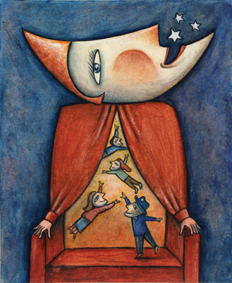
Brochure Cover
God of Carnage The Zone
The List The Pain in the Ass
Janice Kun - Shedding Layers for Spring
Janice Kun has created these two new pieces which include elements of drawing, collage, watercolor, and photography. The elements are digitally manipulated in Photoshop and combined with multiple effects layers. Janice wanted to allude to the search for a truer sense of self and the shedding of the layers of constraint. Spring often seems to be a natural time for transformation and transition- a stripping away of the old to make way for the new.
Tim Zeltner illustrates Earth Day Canada 2011 Poster
This year's Earth Day Canada Poster art was created by Tim Zeltner, with art direction from Brad Pearson and Keith Treffry. The theme of this year's program is environmental action at the grassroots level through the four seasons, from coast to coast. A big challenge to illustrate in one poster! I think it's sure to become another sought after "classic" Zeltner landscape.
