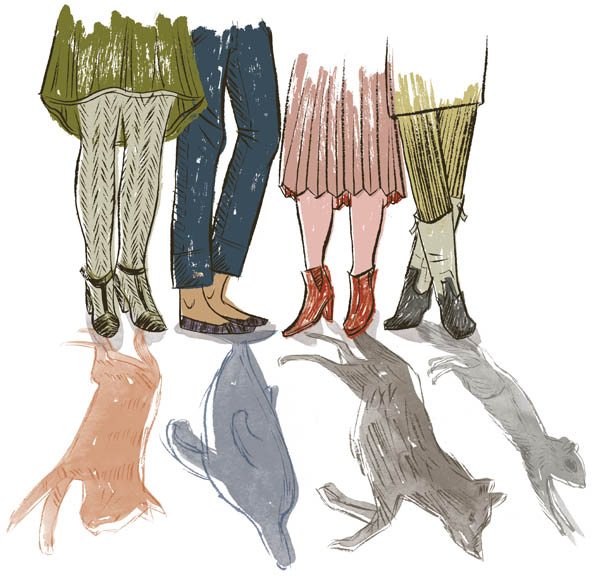
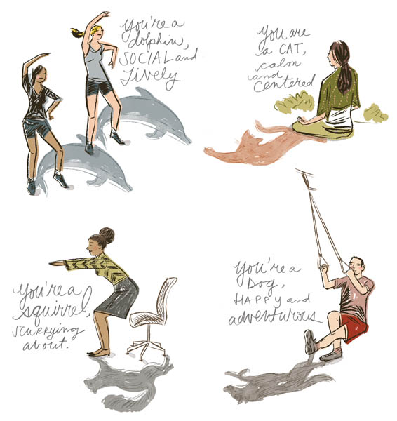
Katy Dockrill created these illustrations for the article: What's Your Exercise Personality, for the Fall 2014 issue of Diabetic Living magazine. I'm a playful dolphin, what are you? For more of Katy's delightful illustrations check out her portfolio.
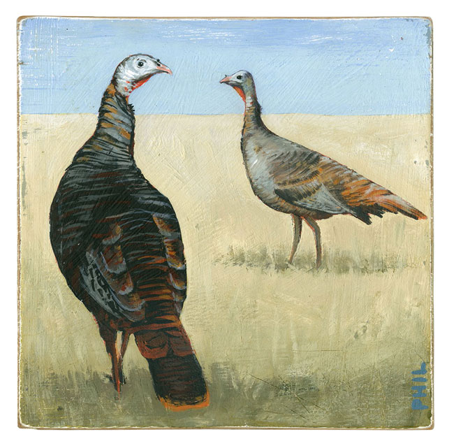
Phil: Wild Turkeys for Country Gardens
The turkey is one of the most famous birds in North America. In fact, did you know Benjamin Franklin wanted to make the wild turkey, not the Bald Eagle, the national bird of the United States?
Working with art director Nick Crow, Phil created this beautifully evocative illustration--in his trademark wistful style, for an article in the Fall 2014 issue of Country Gardens magazine called Bird's-Eye Views. Visit phil's entire portfolio of hand painted illustrations on wood here.
Rémy Simard for Animal Sheltering Magazine
Art director Jamie Mitchell wanted to take the need for a diagrammatic illustration for the article "Do a good scan, Stan!" and have a little fun with it.
He chose Rémy Simard for his ability to do just this! Jamie envisioned "...a very cute, funny dog in multiple positions/facial expressions, being scanned by a microchipwand." Our favorite part of this illustration is in fact the dogs facial expressions.
Here is a peek into Rémy Simard's process. Upon receiving Jamie's brief, Rémy began sketches for presentation.
...and after a bit of back and forth as Jamie and Rémy tweaked the sketches, here is the finished art
Katy Dockrill for SHE Magazine
Katy Dockrill contributed this illustration to SHE Magazine published by the Canadian Women's Foundation. We think this illustration tells a remarkable story of strength and optimism with Katy's confident line and hand lettering over the brilliantly optimistic yellow background. When we asked Katy about her inspiration she said: "I felt it was important to illustrate this list of women's accomplishments: Being a woman in 2014 is very different from being a woman 150 years ago and I have all the women before me to thank. I take all these hard won freedoms for granted because I grew up knowing no different. I think that's where we need to get to in order to check off the others on this list, keep voicing opinions and share the dialogue with our children."
To see more of Katy's hand lettering and illustration, check out her updated portfolio here.
Thom Sevalrud makes Luerzer's Archive Best Illustrator list, again.
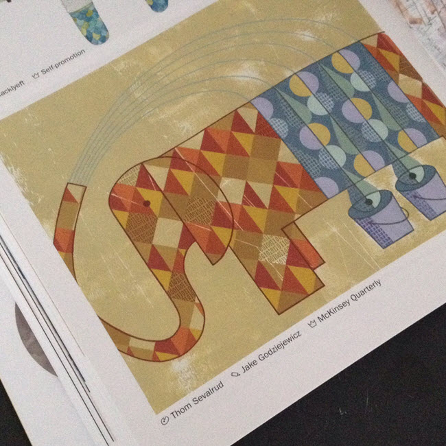
How do you manage to be named one of the top 200 Best Illustrators Worldwide by Luerzer's Archive, for a second time? We asked Thom Sevalrud, a master of conceptual illustration, to help us understand his methods and inspiration for his most recent award-winning image 'The Elephant' depicting big data analytics.
i2i Art: Let's start from the beginning. How were you approached to create an illustration representing Big Data Analytics?
Thom Sevalrud: This image was created for the McKinsey Quarterly publication. It was to be a double-page spread to accompany a whole ‘section’ in the journal examining big data analytics. The AD, Jake Godziejewicz, had sent me the articles and a short brief that explained what they needed; including some very specific examples of mine that showed the approach they preferred.
i2i Art: Why an elephant?
Thom Sevalrud: I wanted to nail a perfect image of something big, yet something multi-faceted. It all came together fairly quickly once the water provided the metaphor for ‘washing away the complexities’ of data. I sent the idea to Jake and explained that the elephant image would be a perfect way to ‘over-fill’ a double page spread with both sides of the creature being cropped off the page……like it didn’t fit. I'm glad Jake loved the idea.
i2i Art: Was this painted traditionally?
Thom Selvarud: It was acrylic on paper, then I added a subtle binary code into random areas of some of the diamond shapes in the elephant using digital tools.
i2i Art: And how did you get the nod from Luerzer's Archive?
Thom Selvarud: At about the time I was working with McKinsey Quarterly, I was invited to once again submit to Luerzer’s Archive 200 Best Illustrators Worldwide. Illustrators are first nominated and screened before they are invited to enter. Their work is then taken to another level of judging and are chosen from an international collection of work, where my elephant made the cut. I have now been included in 2 of the 5 collections of The Best Illustrators by Luerzer’s Archive.
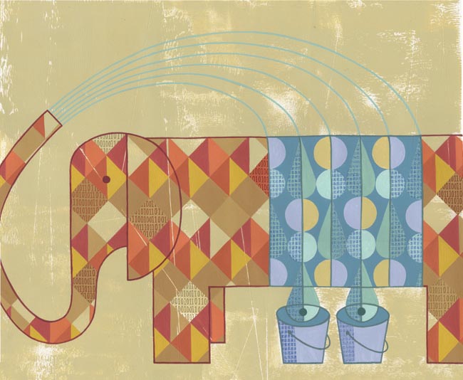 'The Elephant' as it appears in Luerzer's Archive 200 Best Illustrators Worldwide
Thom Sevalrud is represented by i2i Art Inc. | View Thom Sevalrud's complete portfolio
Gary Alphonso for ACC Docket
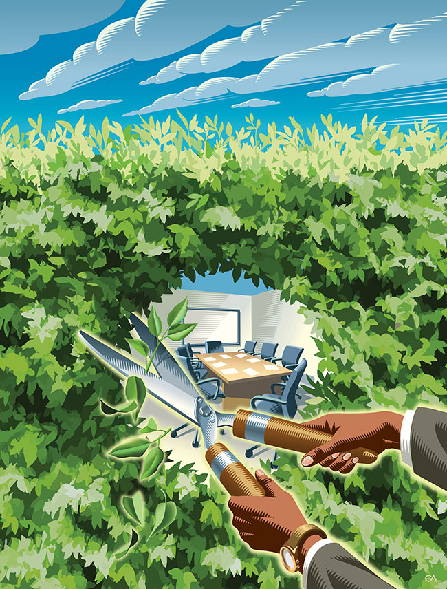
Gary Alphonso created this brilliant conceptual cover illustration for the award winning ACC Docket Magazine, July-August 2014 issue. The feature article, “The Chief Opportunity Counsel: How to Increase Your Value Through Participation in Strategic Business Conversations” is illustrated by use of a hedge as metaphor for the barrier that can be broken down exposing fresh opportunities for open and transparent communication. To see more of Gary Alphonso's powerful illustrations check out his updated portfolio here.
Phil for Country Gardens
Perhaps you have some recent memories of the summer campfire that will warm your heart as you head back to work or school. Check out this lovely painterly scene that literally takes you there. Phil, illustrated A Blaze of Glory for Country Gardens. To see more of phil's art, please visit his portfolio here.
Katy Dockrill: Map Out Your Best Summer Ever
Winner of the CASEVIII Grand Gold Award and Alberta Magazines Silver Award for Illustration Katy Dockrill created the cover and interior illustrations for the Spring 2014 Feature: Map Out Your Best Summer Ever, for the University of Alberta's Alumni Magazine, New Trail. Katy's playful style and summery palette is the perfect touch to inspire summer fun! When I asked art director Marcey Andrews what the response to the issue was, she said, "It’s been fantastic, truly. We even received a very complimentary email from another illustrator we’ve worked with, Raymond Biesinger (who is a UofA alumni). When he received his issue of the magazine, he sent us a very nice message, saying, ‘killer cover’." Thank you for the 'killer' compliment Raymond! To see more of Katy's whimsical illustrations visit her portfolio.
Opener for Map Out Your Best Summer Ever
'Rivers Not Roads''Take Up Birdwatching'
Summertime Biking'What Bears Do in the Woods'. Ever wondered?
To check out the magazine online visit the New Trail site here.
Clare Owen: Infographic for Verily Magazine
Clare Owen has a way of taking even the most dry material and making it look nothing less than lovely! When approached to illustrate a feature about Building a Budget (Without Breaking a Sweat) for Verily magazine, Clare developed this fun and informative infographic. With the help of this little chart, I think one could easily do it, no sweat! She actually makes is look fun! To see more of Clare's charming infographics and other delightful illustrations, check out her updated portfolio here.
Tim Zeltner for Marriott Magazine
Tim Zeltner created these beautiful illustrations with dramatic compositions that draw one into the story for Marriott Magazine. Tim's trademark paintings on wood reveal the richness and intrigue of the worlds they depict.
Aspire to be Inspired
All Aboard!
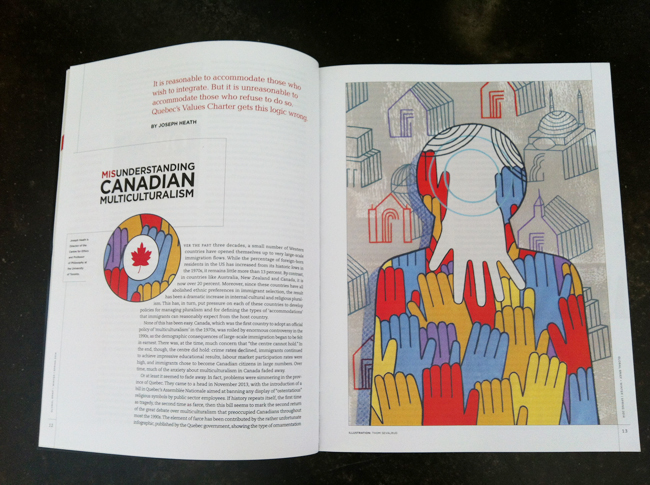
Thom Sevalrud for Global Brief
Mark Hoffman for D Magazine
For an article in D Magazine about "growing up in a town that is no longer there", Mark Hoffman created this conceptual illustration depicting the houses as haunting shells with a foreboding sky that further sets the mood for West, Texas, as a Ghost Town. Mark's primitive art style has a dream-like quality perfect for the way the story is told through childhood memories. To see more of Mark's evocative conceptual art, visit his updated portfolio here.
Ghost Town by Mark Hoffmann
Greg Stevenson for Canadian Living
Combining Greg Stevenson's hand lettering, info graphic icons and layered photo-illustration adds a fun, upbeat mood to these stories of courage, art directed by Stephanie White. In this recurring feature, called A Year of Firsts 2014, meet and be inspired by the people who embraced a whole year of trying new things, whether facing fears or embracing change. Peruse more of Greg's illustration here.
Theresa Albert
Christina Campbell
Greg Stevenson for: Positive Side
Greg Stevenson was commissioned by the Canadian AIDS Treatment Information Exchange (CATIE) for their publication called The Positive Side. This illustration is about how a low viral load can cut the risk of HIV transmission was art directed by David Vereschagin to have an overall optimistic tone. Greg says, "The candle was meant to imply a ‘re-kindling” of desire in both partners (one positive and one negative) while practicing safety and awareness." Notice how the very subtle ('Rothko-esque') variations in the background add beautifully to the mood of the piece.
Thom Sevalrud for Journal of the Norwegian Medical Association
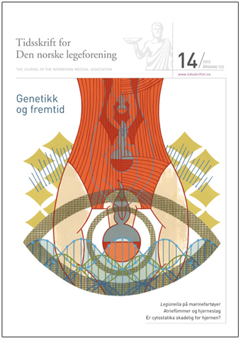
Thom Sevalrud created this powerful image for the cover of the Journal of the Norwegian Medical Association. This is Thom's fourth cover for the JNMA, working with art director Emma Dalby, who seems to match him perfectly with topics that speak to his visual vocabulary. Conceptually, Thom addresses many aspects of whole genome sequencing, which is becoming more and more accessible to us all.
Tim Zeltner for Emory University
The king of landscapes, city-scapes and make-believe kingdoms, Tim Zeltner works his magic for Emory to accompany a story about the Rollins School of Public Health.
Tim Zeltner for Brewer's Association
Working with Allison Seymour, art director for the American Homebrewer's Association Tim Zeltner created this cover at for the March/April issue of Zymurgy Magazine, featuring the concept of home brewing with locally sourced ingredients. Tim's trademark rural landscape painting with the surrealistic addition of a pint of home brewed beer, create a dreamy utopia for any beer lover.
Greg Stevenson: Sin & Self-Improvement
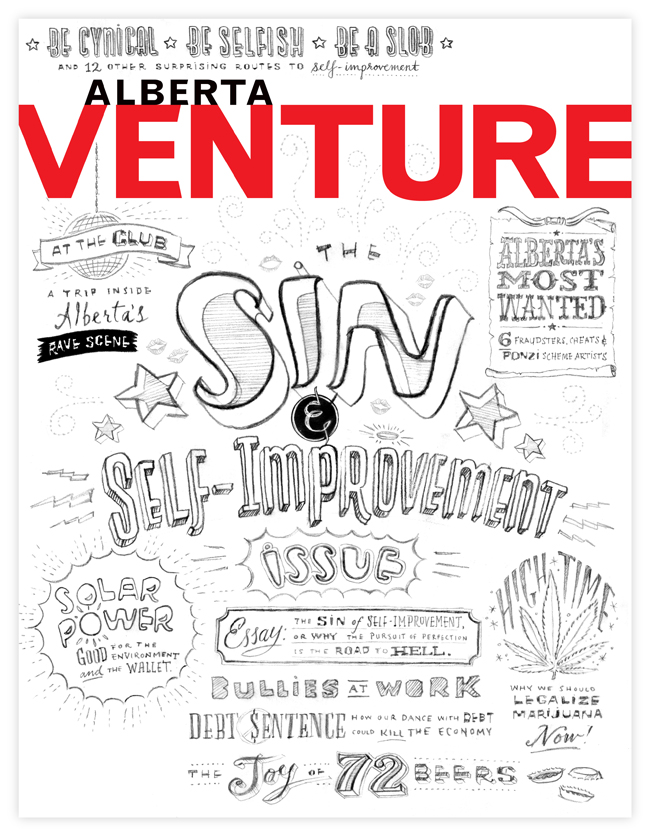
The Alberta Magazine Publishers Association is pleased to announce the finalists of the 2013 Alberta Magazine Awards and we are delighted that this cover art created by Greg Stevenson for art director Kim Larson, is one of the award winning covers.
Feeling inspired by the subject matter, Greg went to town covering all the sinful bases with his first sketch (above)!
(we just thought you'd enjoy this behind the scenes sneak peek into Greg's process)
And this is the award winning cover art!
Thom Sevalrud: Big Data
The Wikipedia definition of Big Data is: "a collection of data sets so large and complex that it becomes difficult to process using on-hand database management tools..."
Thom Sevalrud has a way with taking just this type of complexity and in his very unique visual vocabulary communicating the idea clearly, like no other. That's why Brian Donahue of Be Design called upon Thom to illustrate Why Big Data is a Big Deal for Macalester Today. Brian is also a big fan of Thom's hand lettering so he also asked him to illustrate the headline for this feature as well.
Tim Zeltner for Yankee Magazine
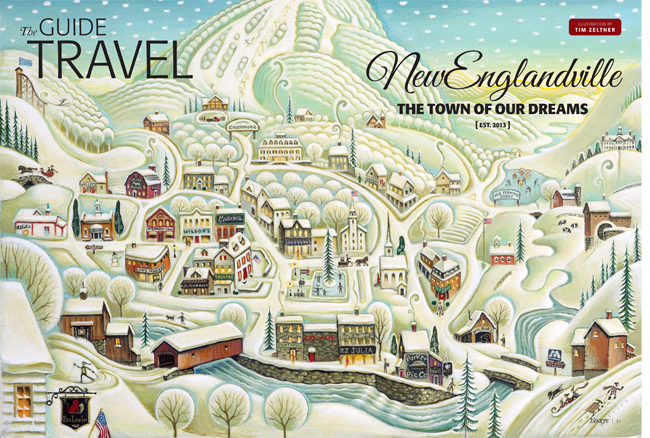
Tim Zeltner illustrated this fantasy winter wonderland for a travel feature, The Town of Our Dreams, art directed by Yankee's Lori Pedrick. From snow covered rolling hills, quaint homes, picture-perfect shops to horse drawn sleigh rides, Tim created this fictitious place called NewEnglandville--the town of New England's dreams!
