Thom Sevalrud for Stanford Social Innovation Review

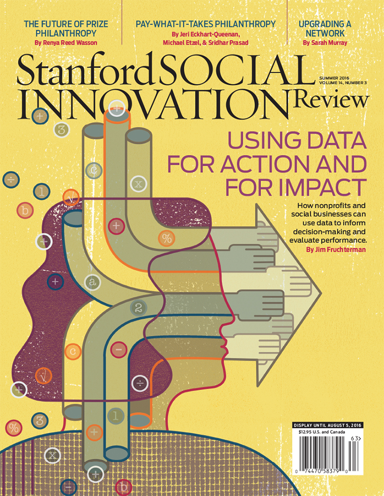
The Stanford Social Innovation Review tackles some of the more interesting questions asked in the social sector today and thoughtful, conceptual illustration plays an important role in creating a visual understanding of these topics. And so art director David Herbick chose illustrator Thom Sevalrud for the Review's latest cover; a story on how nonprofits and social businesses can use data for action and for impact. Thom's elegant use of symbolism, strong lines and composition truly captures the transforming nature of this article. 

Mark Hoffmann for Cooking Light

Not an easy task, illustrating a story about love, loss, and fruit salad. The author and copy director for Cooking Light, Susan Roberts McWilliams, "wanted the article to have a lot of hope and thankfulness to it." Mark Hoffmann's illustration was the perfect compliment to this touching story about how we respond with food when someone loses a loved one.

Delight in the details and composition of these richly painted down-home pieces. Feature art directed by Sheri Wilson and 2015 winner of the SPD merit award for Single/Spread Illustration in the Lifestyle, Travel/Food/Shelter category.

SPD merit award for Single/Spread Illustration

SPD merit award for Single/Spread Illustration

Love, Loss & Fruit Salad

Love, Loss & Fruit Salad

Friends, Family and Casserole

Friends, Family and Casserole

Pot Pie With Love

Pot Pie With Love

Home is Where the Slow Cooker Is

Home is Where the Slow Cooker Is

Dave Murray for William & Mary

We are in "a new universe of information overload" and our education needs to reflect that. The College of William & Mary was excited to share their strategy for addressing this new age of information and enlisted the help of illustrator Dave Murray to do so.

Featured in the W&M Alumni Magazine, Dave captures the rich potential of a liberal arts degree from this prestigious school. "The liberal arts is, in fact, going to be necessary to navigate the coming world." Dave's colorful palette and mosaic of elements brings out the wonder and complexity William and Mary is preparing it's students for.

Lift Off! An education to prepare you for a new universe of information overload.

Lift Off! An education to prepare you for a new universe of information overload.

A liberal arts degree will be a necessity in navigating the coming world.

A liberal arts degree will be a necessity in navigating the coming world.

It's a matter of training your mind in a new way.

It's a matter of training your mind in a new way.

Carl Wiens for National Underwriter Property & Casualty Magazine

Security for cyber coverage, not an easy subject to illustrate and Tim Schafer, art director at National Underwriter Property & Casualty magazine, didn't want any of the typical metaphors. So conceptual illustrator Carl Wiens created this clever image. What could be a better metaphor for the diligence needed to protect oneself from the creep of cyber threats then the ever-present task of mowing your lawn. With bright color and sophisticated shapes the article demands that the reader take notice and quickly the connection is made - you can't let either lapse.

Additional spot illustrations by Carl Wiens use the same bright palette and intriguing imagery to highlight some key tips.

Let Carl Wiens tackle your next assignment. See more of Carl's work.

Katy Dockrill for Oregon Home

Illustrator Katy Dockrill is often inspired by the color, texture and lines found in her garden, so the "Tiny Gardens" article in Oregon Home magazine was a great opportunity to emulate nature's flora. Art directed by Snow Blackwood, Katy imagined four different tiny garden spaces and with a lot of attention to detail and her gorgeous hand lettering Katy educates us on the right tiny plants to fit each space.

Want to see more? Visit Katy Dockrill's portfolio

Carl Wiens for Global Brief

"To Do or Not To Do" was the inspiration for this cover illustration by Carl Wiens for Global Brief magazine, art directed by Louis Fishauf of Fishauf Design. Carl's illustration perfectly captures the complexity and confusion in the discussion of action vs. inaction when it comes to international crises. 

In the same issue Carl was asked to create another powerful piece for the article, "Man and His Economic-Financial Crises." The lowly repairman about to ascend into this massive machine again punctuates the enormity of the issue outlined. 

In both pieces, intricate symbolism in the machinery and compasses, a signature of Carl's work, form bold, undeniable visual statements and tell the story in an instant.

See more of Carl Wiens' conceptual illustration. Represented by i2i Art Inc. 


Greg Stevenson for Avenue Magazine

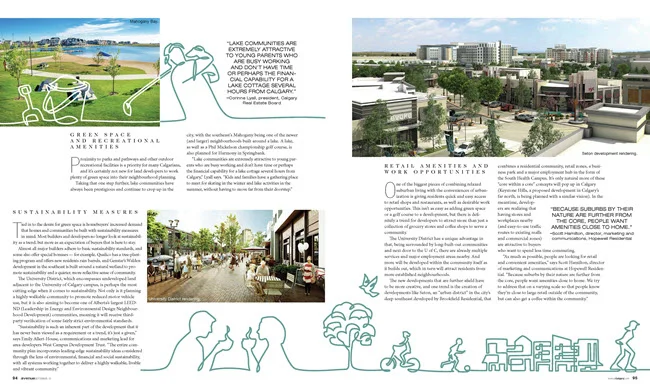
Greg Stevenson recently showcased his vector-based line drawing in a feature for Avenue Magazine, art directed by Venessa Brewer. The article on Calgary's growing communities gave Greg the opportunity to capture family fun along with city and streetscapes. Greg's continuous line art, intermingled with photography captures the expression and movement of Calgary perfectly. 

Janice Kun for Reader's Digest

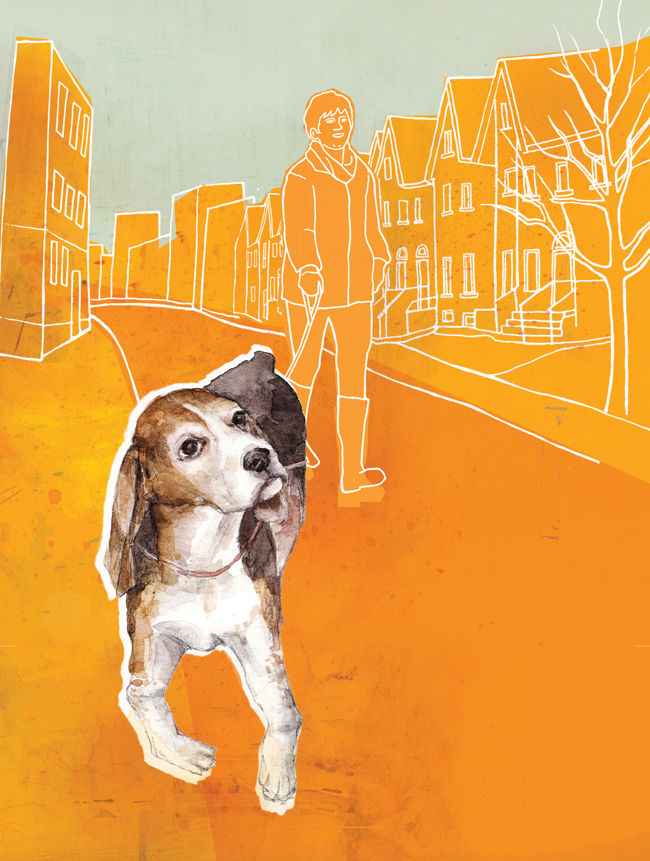
Janice Kun's latest illustrations for Reader's Digest were a big hit and so we asked Janice to tell us, in her own words, why this assignment was so successful.

"It was a pleasure working again with Annelise Dekker, Art Director for Reader's Digest. As always, she provided clear and detailed direction, and her keen sense for pulling out the perfect combination of my mixed media skills really helped me stretch in this particular project.

For these illustrations, I was asked to take a simple approach, but with a boost in color, and a lighter tone. It was a bit challenging at first to work this way– blending simple line drawings with more fleshed-out painted elements, thrown into colorful planes– as it was counter-intuitive to my usual complex digital layering and subtle palette. In the end, this project really opened my eyes to a new way of adding clean lines, bold colors and a refreshing sense of minimalism to my work."

The article "An Uncomplicated Love", written by Elizabeth Abbott tells the story of our bond with dogs.

An Uncomplicated Love, Joey the Bulldog

An Uncomplicated Love, Joey the Bulldog

Therapy Dog

Therapy Dog

Man's Best Friend

Man's Best Friend

Janice Kun has been busy creating. Check out Janice's updated portfolio.

Gary Alphonso for TroDent Magazine

In this summer’s issue TroDent magazine tells the stories of some of their military alumni in the featured “The Military Dentists.” Art director John Hobbs wanted a cover illustration that really captured these special individuals sense of duty and pride. Gary Alphonso used a very classic retro style of illustration to create a powerful cover that evokes our patriotism and reverence for the individuals that serve in our armed forces.