"Boomerangst" is a new term to describe the worry over the financial strain the aging "Boomer" population has and will have on the Canadian health care system. Janice Kun used her photo-illustrative talents to create this hospital corridor/ graph image to accompany the article The Boomer Effect, Is Canada's Health Care Headed for Trouble? in the Nov/Dec issue of Legion Magazine, art directed by Jason Duprau.
Gary Alphonso: Cover Image for ACC Docket
Gary worked with Jamie Mitchell, Creative Director at Bussolati, to create this powerful cover image for ACC Docket, The Journal of the Association of Corporate Counsel, on "How Tomorrow Moves: CSX Uses Scorecards to Help Outside Counsel Stay on Track". He uses the analogy of a child's toy train to illustrate how legal firms stay 'on track' with this program.
Tech Toys Illustrated by Monika Melnychuk
The November issue of Parenting has a feature on tech toys (just in time for holiday shopping). Amanda Bardwell, the art director, asked Monika Melnychuk to illustrate the retro 'equivalents' of the toys, which were presented in contrast to the photos of the modern tech toys being recommended in the article. We think this is another great example of how illustration combined with photography makes a very compelling layout.
Thom Sevalrud Illustrates Mental Health
Thom created these cover images for the Journal of Norwegian Medical Association. The most recent cover, on the use of Electroconvulsive Therapy, was a challenge for Thom. He writes, " I pretty much had to dispel the negative connotations and images that were impressed upon me with films such as One Flew Over The Cuckoo’s Nest. I was asked to create an image that conveyed a sense of hope and positive end results." The article notes that ECT is still used today and with good results on certain types of depression.
The first cover Thom created (issue 6) was on drug addiction and drug screening. The Art Director, Emma Dalby, asked him to illustrate some of the key words. What Thom wanted to convey was "a sense of being 'shackled' to a substance when you are addicted. This comes across in the hands that are almost 'hand-cuffed' by the smoke. The head is floating on purpose......I wanted the head to be almost floating as if you are not present but in your own world. The pills almost form pillows as well. The molecular structure of THC is present on the side. That structure becomes part of the brain structure as if taking over. So the whole image is a mixed up montage to go with the idea of the scattered fragments of logic present in drug addiction. "
Sarah Beetson: Exotic Wall Decor
Sarah Beetson's vibrant bird and botanical illustrations, from toucans to flamingos and more, are now available in canvas prints. These prints are available for purchase through Graphique de France.
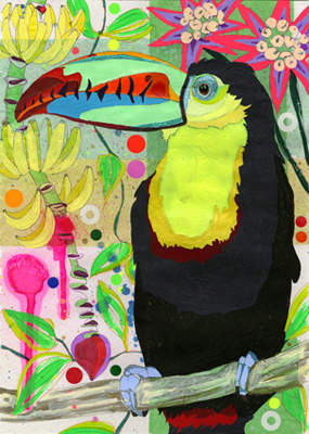
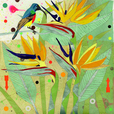
Greg Stevenson Making Headlines
What started out as doodles in his sketchbook, graduated to backgrounds for photographic treatments, now Greg's hand-lettering is making it as cover art--art directed by Kim Larson at Alberta Venture Magazine. To see the fabulous spread for Go Magazine featuring Jeff Bridges as well as the Sun Chips ad campaign, visit Greg's portfolio here.
Steve Jobs: 1955 - 2011
Eili-Kaija: Mural Art
Eili-Kaija's airy, watercolour illustrations provide a face-lift to the walls and menus for restaurant F8 in Stockmann department store in downtown Helsinki. To see these illustrations in Eili-Kaija's updated portfolio click here.
John Webster Illustrates the Queer Point of View on Catholic School Funding
John Webster created these graphic, punchy images for a three part article on Catholic School funding in Xtra magazine. John describes his thoughts behind the images: "Since the article was about Catholic education and the monies they receive, I wanted to use the money sign for each of the three illustrations. It becomes part of the character's face (see illustrations 1 & 2) and replaces a cross on the rosary worn by the nun (illustration 3). To illustrate how the Catholic schools will not allow queer kids to have a voice, I used the classic pink triangle symbol in all three illustrations. We see the symbol being destroyed in the first illustration, being worn proudly as a belt in the second and in and amongst the "taboo" words in the third."
Survival Guide for RIM
Peter Zaver, art director for Marketing Magazine asked Jillian Ditner to illustrate conceptually, in a how-to instructional guide format, an article on RIM and a marketing strategy for Blackberry: How Blackberry can stay alive—and thrive—in the hearts and minds of a jilted market.
Spoof 'Movie Poster' Web Campaign
Bruce Emmett has created a series of movie poster spoofs for EMC on solutions for back-up and restoration of computer data.
Rémy Simard Illustrates Risky Business
How do you insure a golf cart? Earthquake insurance and other weighty topics are given a humorous twist by Rémy Simard in a recent issue of Canadian Underwriter.
The Green Issue Illustrated
Two of our illustrators - Monika Melnychuk and Margaret Lee, contributed to The Green Issue of Owl Magazine. Monika illustrated the cover emulating chalk writing on a green-board with her fun hand lettered type. Margaret approaches a more technical article called How Solar Power Works with a kid-friendly illustration that's used more like a diagram.
phil illustrates a year in the "Slow Lane"
phil's folk style painting on wood is the perfect "slow" method for illustrating the column called "Slow Lane". Here are the images for the four 2011 gardening seasons for Country Gardens :
Winter/Spring - Snowdrops
Late Spring - Rhubarb
Summer - Spiderweb
Fall- Fall Fruit
Tim Zeltner Maps Out Ontario Wine Regions
Geoff Redwood from Jan Kelley Marketing approached us to see if Tim Zeltner could paint a map showing all the different wine regions of Ontario in his trademark, whimsical style. The map was for a new website Jan Kelley was creating for Ontario Uncorked, which has now been unveiled here. The website allows you to explore and plan customized tours throughout the famed wine regions of Ontario. The little extra details Tim brings to a piece like this, are what makes the viewer engaged in the 'experience' of the map and this is exactly what this new site is all about!
Margaret Lee Illustrates a One Woman Zoo
Margaret Lee produced these dreamy, evocative images to accompany an article on Diane Ackerman's book, One Hundred Names For Love- A Stroke, A Marriage and the Language of Healing. The article, published in the Penn Stater, the alumni magazine for Pennsylvania State University, where Paul West (Diane Ackerman's husband) taught. The book chronicles their journey through Paul's stoke and how they adapted to recover his use of language. The two illustrations were based on a chapter in which Paul mourns the loss of the pet names he used to have for Diane. She notes "It was true. Once upon a time, in the Land of Before, Paul had so many pet names for me I was a one-woman zoo...In our mythology there were golden baby owls, ring-tailed lemurs, axolotls, shoulder rabbits, honeybunnies, bunnyskins...and many more." She encourages Paul to re-invent pet names and endearments for her. Some he creates are : Celandine Hunter, My Little Spice Owl, and Spy Elf of the Morning Hallelujahs.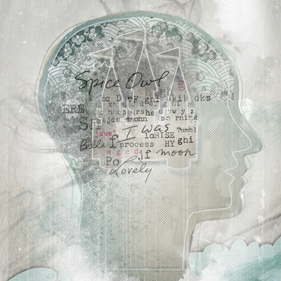

Eili-Kaija Kuusniemi Illustrates The Perfect Legal Personality
Eili-Kaija was asked to take a slightly more conceptual approach with her rich patterned style to illustrate the cover and feature article in ACC Docket, "The Perfect Legal Personality".
John Webster Creates Nostalgic Cover
John's nostalgic collage style with his quirky humor was the perfect choice for READ's new issue, What's Old is New Again. The image features some Literary great's, Poe, Twain and Shakespeare.
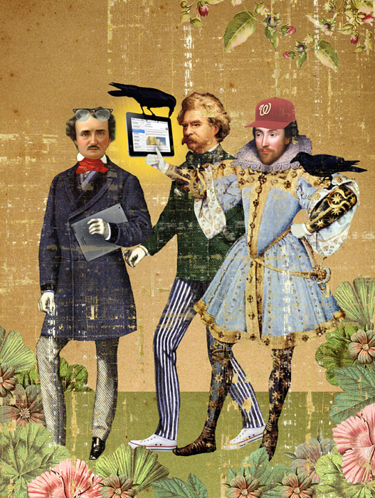
He also used the same collage imagery to create a more moody piece, appropriate for the story Virigina's Final Journey, about Edgar Allan Poe.
Gary Alphonso Illustrates the Village Voice 9/11 Cover
When John Dixon, art director for the Village Voice, called, he said, "We want a really powerful cover for this story about who has profited off of 9/11. We're naming names and dollar amounts." Gary Alphonso quickly got to work on the cover and I think his style was the perfect media for the message.
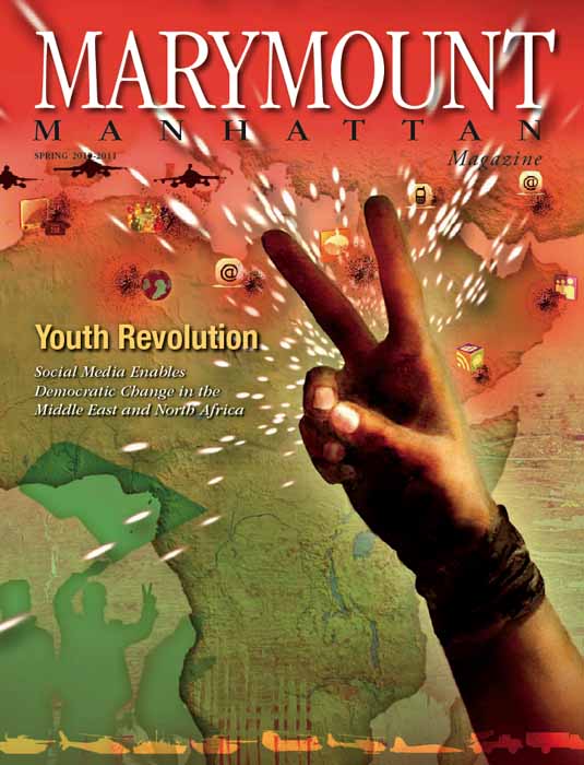
Social Media and Democratic Change illustrated by Anne Horst
Anne Horst illustrated an intriguing feature article for Marymount Manhattan Magazine recently. The article dealt with Social Media and and it's recent role in the revolutions occurring in the Middle East and North Africa. Her use of photography combined with graphic elements make a compelling cover image.
