Graduate, BFA, from Rhode Island School of Design in illustration. He's just gone live on our website so you can check out his work here. A great big i2i welcome to our new artist Mark Hoffmann!
©Mark Hoffmann_MH138
©Mark Hoffmann_mh139
Graduate, BFA, from Rhode Island School of Design in illustration. He's just gone live on our website so you can check out his work here. A great big i2i welcome to our new artist Mark Hoffmann!


This was a super fun project for the Marquis Wine Cellar, a specialty wine store in Vancouver, BC. They wanted to show off Vancouver's amazing attractions and culture with a twist. So, we had wine be a part of each illustration. From downhill skis in the shape of wine bottles to Inukshuk's holding wine glasses. The art featured on the van creates an eye catching 'out-of-home' advertisement for Marquis.


Some new "Spring" images from phil, created for the Country Gardens Slow Lane column. The image below accompanies the article "Chicken Run" and captures the wonder of picking up a box of freshly hatched chicks. The second image is from the article "Lotus Watching", about a trip by canoe down the Alabama delta and the discovery of an acre-size floating garden of lotus.

Sarah Beetson has an exciting new surface design collection she has put together for the 2012 Somerset House Pick Me Up show. The exhibition is a contemporary graphic art fair, showcasing work from the best illustrators, graphic novelists and designers from the UK. The exhibition opens March 22nd and runs until April 1, 2012 at Somerset House, Embankment Galleries, Strand, London.

Sarah's new collection includes cushions, skirts, totes and handbags, some made-to-order dresses and screen printed t-shirts.


Art printed to fabric (from L to R: Mirror Repeat on Silk Viscose Velvet, Celluloid Repeat on needlecord and the quilt from cotton poplin.) These fabrics were also used in quilts and cushions


Below are some of the handbags and totes she has created:


For a peek into the creation of the t-shirts check out Sarah's blog here.
Eili-Kaija's illustrations are woven into the new website for Folk!- an advertising agency based in Helsinki. She created the portraits that accompany the staff bio's and a map on the contact page. The handmade, approachable quality of Eili-Kaija's work was chosen to help brand the site with the company's down-to-earth and participatory work style.


Gary discusses a recent project he worked on with Michael Stokely for a campaign for "MCAP Service Corporation", one of Canada's leading independent mortgage financing companies: "The illustrations were to be based on sports metaphors. The challenge here was that the client wanted to keep their former ad format--a full page divided into 2 panels: a dark blue panel (their corporate colour) and a white panel. The illustration was to take up portions of both panels as well as rag around the bilingual headline and body copy. As the work progressed the copy was being written, laid out and edited at the same time. It was kind of like designing with a moving target. The client also requested that the illustrations be able to exist on a completely white background to accommodate future usage. All this said, luckily the designer, Michael Stokely, really understood the challenges and was very helpful in the collaboration."


Thom Sevalrud, in his architectural layered style, created the following spread to accompany a feature article, "Core Values" in GreenSource magazine, about how sustainable design requires a closer collaboration between architects and structural engineers.

Gary Alphonso created a cover for the paperback edition of Hazards of the Game by Norma Tadlock Johnson. The art director wanted a very graphic feel to the cover where type would be a major element. They decided to place the text within the shape of the sand trap since the story takes place on a golf course. Another requirement of the illustration was to include some of the clues to the mystery: the pink golf ball, the discarded putter and the Siamese cat. The challenge was to design the illustration with the type from the early rough stages as opposed to creating the illustration and having the designer apply type after the fact. Here are two versions to show the importance of type - an early draft and the tweaked type that became the cover.


Thom Sevalrud's image, Stovetop, was just accepted into The Society Of Illustrators 54 Annual and Show (book category). The prestigious competition is held each fall and the winning artwork is published in the new year. All work is also exhibited at a show at the Society in NYC.
This new work is a piece Thom created for the recently released Work/Life 2, an international illustration directory. The book was designed, art directed and curated by Janine Vangool and published by Uppercase Books. Thom loved the conceptual challenge of interpreting an image specifically for the theme of Work + Life and how those two things co-exist side-by-side. He likes this quote from David Sedaris: "One burner represents your family, one is your friends, the third is your health, and the fourth is your work."
Thom feels the quote is highly appropriate considering how many of us live our lives, with many 'pots on the stove', and definitely applies to himself, as multi-tasking is pretty much the norm for an illustrator.
Ian Phillips worked with Art Director, Peter Zaver, to create this cover for Marketing Magazine's Top 2011 Marketers issue. Peter wanted to see a cityscape with the logos of 10 marketers incorporated into the illustration. To Ian's delight, Peter suggested an Andy Warhol style soup can for Campbell's! Take a peek behind the process - below we've posted some of the early sketches.

Ian begins with some quick sketches and picks his favourite. He then creates a tight linear to show the client the idea as close to final as possible.


The next step after the above tight linear drawing is choosing colors. A PDF of the cover is helpful to make sure there is room for the masthead. These were some of the color comps. Ian loves drawing buildings and people and even managed to create a cameo appearance of his dog "Fancy". Check out the final image to see if you can spot "Fancy".


"Boomerangst" is a new term to describe the worry over the financial strain the aging "Boomer" population has and will have on the Canadian health care system. Janice Kun used her photo-illustrative talents to create this hospital corridor/ graph image to accompany the article The Boomer Effect, Is Canada's Health Care Headed for Trouble? in the Nov/Dec issue of Legion Magazine, art directed by Jason Duprau.

Gary worked with Jamie Mitchell, Creative Director at Bussolati, to create this powerful cover image for ACC Docket, The Journal of the Association of Corporate Counsel, on "How Tomorrow Moves: CSX Uses Scorecards to Help Outside Counsel Stay on Track". He uses the analogy of a child's toy train to illustrate how legal firms stay 'on track' with this program.
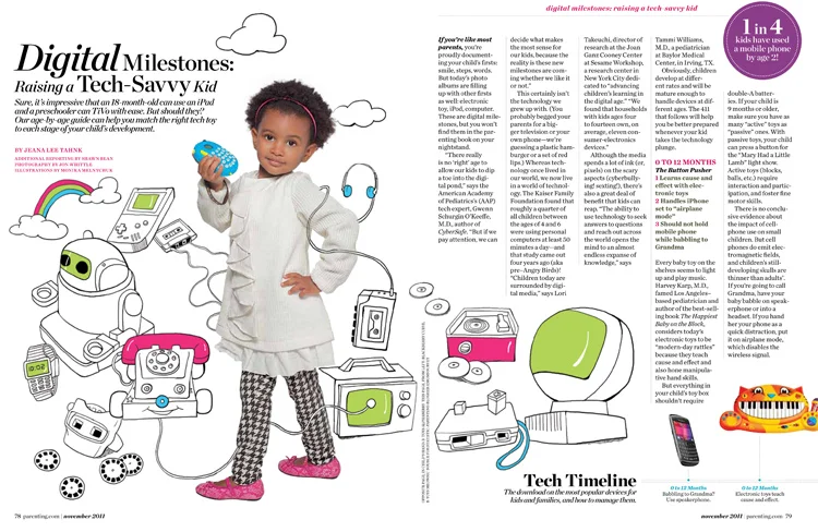
The November issue of Parenting has a feature on tech toys (just in time for holiday shopping). Amanda Bardwell, the art director, asked Monika Melnychuk to illustrate the retro 'equivalents' of the toys, which were presented in contrast to the photos of the modern tech toys being recommended in the article. We think this is another great example of how illustration combined with photography makes a very compelling layout.


Thom created these cover images for the Journal of Norwegian Medical Association. The most recent cover, on the use of Electroconvulsive Therapy, was a challenge for Thom. He writes, " I pretty much had to dispel the negative connotations and images that were impressed upon me with films such as One Flew Over The Cuckoo’s Nest. I was asked to create an image that conveyed a sense of hope and positive end results." The article notes that ECT is still used today and with good results on certain types of depression.
The first cover Thom created (issue 6) was on drug addiction and drug screening. The Art Director, Emma Dalby, asked him to illustrate some of the key words. What Thom wanted to convey was "a sense of being 'shackled' to a substance when you are addicted. This comes across in the hands that are almost 'hand-cuffed' by the smoke. The head is floating on purpose......I wanted the head to be almost floating as if you are not present but in your own world. The pills almost form pillows as well. The molecular structure of THC is present on the side. That structure becomes part of the brain structure as if taking over. So the whole image is a mixed up montage to go with the idea of the scattered fragments of logic present in drug addiction. "

Sarah Beetson's vibrant bird and botanical illustrations, from toucans to flamingos and more, are now available in canvas prints. These prints are available for purchase through Graphique de France.


i2i art is honored to announce that Tracy Walker's work is featured in the new publication, Illustrators Unlimited, a collection of international contemporary illustrators. Gestalten (the publisher) says, "In recent years, illustration has evolved from a purely service-oriented trade to an expressive, poetic, and esteemed voice in contemporary visual culture". The book can be browsed and purchased on the Gestalten site. It will also be available through Indigo and Amazon (fall 2011). To see more of Tracy Walker's illustration go here.


What started out as doodles in his sketchbook, graduated to backgrounds for photographic treatments, now Greg's hand-lettering is making it as cover art--art directed by Kim Larson at Alberta Venture Magazine. To see the fabulous spread for Go Magazine featuring Jeff Bridges as well as the Sun Chips ad campaign, visit Greg's portfolio here.
Greg Stevenson created this iconic image as a tribute to Steve Jobs, co-founder of Apple Inc.

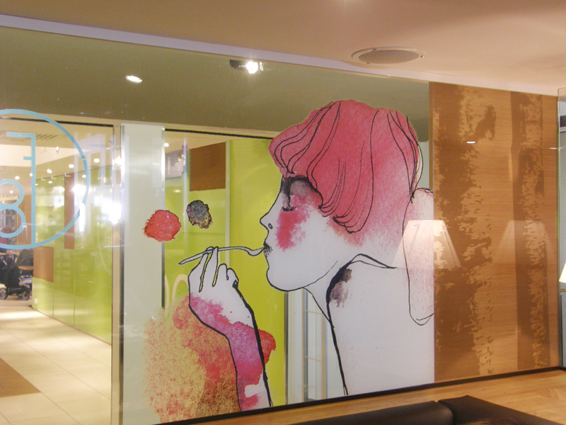
Eili-Kaija's airy, watercolour illustrations provide a face-lift to the walls and menus for restaurant F8 in Stockmann department store in downtown Helsinki. To see these illustrations in Eili-Kaija's updated portfolio click here.


 li
li