Tracy Walker illustrated this piece for an article entitled “Blood of Life” which appeared in the July 2012 issue of St. Anthony Messenger, art directed by Jeanne Kortekamp. The story is about a woman with leukemia whose life is saved by her newborn baby’s umbilical cord stem cells. With her delicate and yet graphic approach, Tracy weaves the story in a conceptual manner where colors, textures and symbols all speak to this very poignant story.

Sarah Beetson for US Airways Magazine
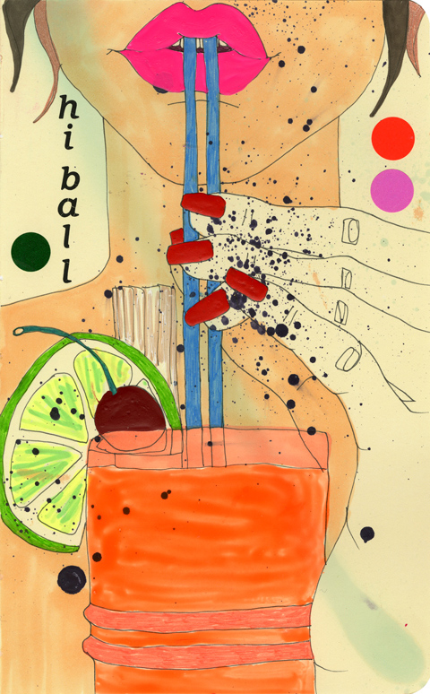
For those Mad Men fans out there, this story should help you bring back the golden age of the cocktail in style! We think Ann Harvey, Art Director at Pace Communications, chose the perfect artist, when she asked Sarah Beetson to illustrate the splish splash zing of the 60's Essential Summer Cocktails!

Ian Phillips for Viv Magazine
Ian Phillips loves making maps and is a bit of a self-proclaimed foodie so when Viv Magazine called for maps to highlight food "hot spots" in Cape Town, Graz, Hong Kong, Glasgow, and Kansas City, he was all over it. Of the series, these are his two faves.

Thom Sevalrud: Journal for the Norwegian Medical Association
Thom Sevalrud illustrated two of the 22 covers (judged as a series), and awarded the best art overall in the prestigious Norwegian Prize (Fagpresseprisen). The Journal's art director, Emma Dalby recently got in touch with Thom to share feedback from the judges: "...communicative and well thought out illustrations on every cover - simply beautiful!". We agree, Thom's images communicate difficult subject matter in a highly creative and yet academic manner. You be the judge. Congratulations Thom, for this outstanding achievement! Click here to view more of Thom's work.
This cover illustrated an article on Electroconvulsive Therapy (ECT).
This cover illustrated an article on drug addiction/abuse and drug screening.
i2i Welcomes Giulio Iurissevich!
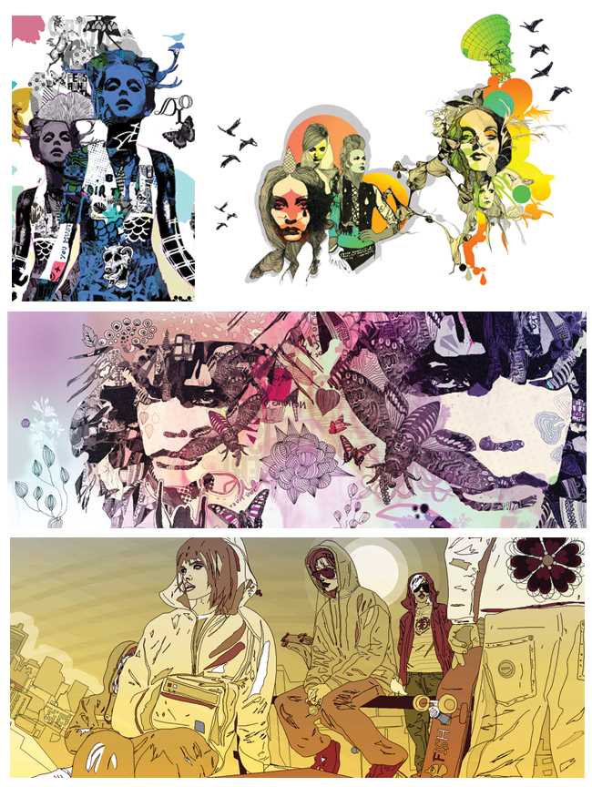
Italian fashion illustrator Giulio Iurissevich's award winning work has become known globally since he began illustrating in 1988. A skater and punk rocker at heart, Giulio's work explores youth, music, curves, and culture. Clients include: Pepsi, Gap, Banana Republic, Brooks Bros, Burlington, Warner Bros, Mazda, Vancouver Olympics 2010, Marie Claire, Elle, The Source, Computer Arts, Creative Digital Arts. His art has appeared in Luerzer's Archive 200 Best Illustrators Worldwide (a number of times), Images 29 The Best British Contemporary Illustration, Images 30 The Best British Contemporary Illustration, Big Book of Fashion Illustration, New Fashion Illustration, Artaq Book 01- Urban Arts Awards 2010 and 2011. Finalist for the Warner Bros DC 75th Anniversary of Superheroes 2010: Batman, Superman, Wonder Woman, Green lantern. Selected artist by "USA By Designers" 2010 and as a finalist @ the Saatchi Abstract Showdown 2012. Check out his portfolio here--you may find he's the perfect choice for your next assignment!
Gary Alphonso for the ROM's "God's Among Men" Exhibition
Gary was commissioned by Hambly and Wooley to create an illustration for research testing of an ad campaign for the Royal Ontario Museum (ROM). The results of the testing would determine the final concept direction for the "Gods Among Men" (Mayan Civilization) exhibition at the ROM. The client wanted to explore a more colorful vibrant direction that would only be possible with illustration, with the focal point being a Mayan King in full flamboyant costume, in the context of a Mayan village with pyramids and lush scenery. Gary says "The challenging part was to take bits and pieces from the mountains of research material provided by the ROM and depict how colorful these these "Gods among Men" would dress. The strange gestural pose was not accidental! It was important to show the stance these kings would strike to differentiate themselves from mere mortals." In the end the ROM, opted for a more photo based approach. Click here to see more of Gary's illustration.
Janice Kun for Orca Books
The illustration Janice created for the Hummingbird Heart bookcover shows her elegant, delicate lettering and atmospheric illustration style. The concept was designed to look like tattoo art on skin. To see more of Janice's lyrical illustrations, please check out her portfolio on the i2i website.
Thom Sevalrud in Season Opener: Art Show + Launch Party
Garrison Creek Bat Co. is kicking it off in style with an art show! Come check out the custom-painted bats by a ton of great illustrators and artists tonight (April 26th) at AWOL Gallery, 76 Ossington Ave. Opening runs from 7pm to 10pm--more info here. Here's a sneak peek of Thom Sevalrud's bat in progress.
Tim Zeltner for Presbyterian Record
Tim Zeltner's dramatic approach to landscapes is beautifully portrayed in this piece on Niagara-on-the-Lake to accompany a story on migrant workers who come to the area.
Meet Mark Hoffmann
Graduate, BFA, from Rhode Island School of Design in illustration. He's just gone live on our website so you can check out his work here. A great big i2i welcome to our new artist Mark Hoffmann!
Monika Melnychuk for Marquis Wine Cellar
This was a super fun project for the Marquis Wine Cellar, a specialty wine store in Vancouver, BC. They wanted to show off Vancouver's amazing attractions and culture with a twist. So, we had wine be a part of each illustration. From downhill skis in the shape of wine bottles to Inukshuk's holding wine glasses. The art featured on the van creates an eye catching 'out-of-home' advertisement for Marquis.
Phil for Country Gardens
Some new "Spring" images from phil, created for the Country Gardens Slow Lane column. The image below accompanies the article "Chicken Run" and captures the wonder of picking up a box of freshly hatched chicks. The second image is from the article "Lotus Watching", about a trip by canoe down the Alabama delta and the discovery of an acre-size floating garden of lotus.
Sarah Beetson in 'Pick Me Up 2012'
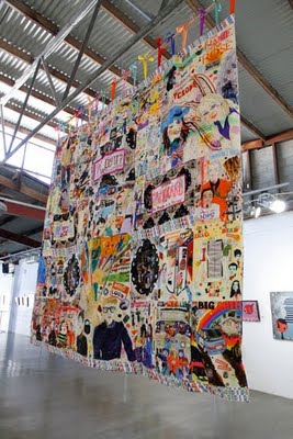
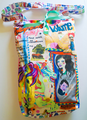
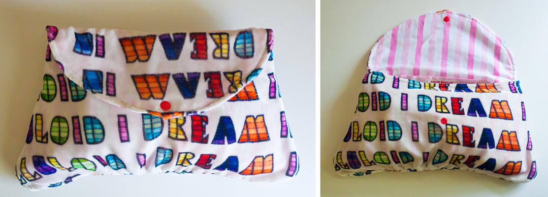
Sarah Beetson has an exciting new surface design collection she has put together for the 2012 Somerset House Pick Me Up show. The exhibition is a contemporary graphic art fair, showcasing work from the best illustrators, graphic novelists and designers from the UK. The exhibition opens March 22nd and runs until April 1, 2012 at Somerset House, Embankment Galleries, Strand, London.
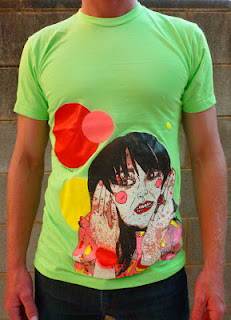
Sarah's new collection includes cushions, skirts, totes and handbags, some made-to-order dresses and screen printed t-shirts.
Art printed to fabric (from L to R: Mirror Repeat on Silk Viscose Velvet, Celluloid Repeat on needlecord and the quilt from cotton poplin.) These fabrics were also used in quilts and cushions
Below are some of the handbags and totes she has created:
For a peek into the creation of the t-shirts check out Sarah's blog here.
Eili-Kaija Kuusniemi for 'Folk!' Website
Eili-Kaija's illustrations are woven into the new website for Folk!- an advertising agency based in Helsinki. She created the portraits that accompany the staff bio's and a map on the contact page. The handmade, approachable quality of Eili-Kaija's work was chosen to help brand the site with the company's down-to-earth and participatory work style.
Gary Alphonso Illustrates Sports Metaphors
Gary discusses a recent project he worked on with Michael Stokely for a campaign for "MCAP Service Corporation", one of Canada's leading independent mortgage financing companies: "The illustrations were to be based on sports metaphors. The challenge here was that the client wanted to keep their former ad format--a full page divided into 2 panels: a dark blue panel (their corporate colour) and a white panel. The illustration was to take up portions of both panels as well as rag around the bilingual headline and body copy. As the work progressed the copy was being written, laid out and edited at the same time. It was kind of like designing with a moving target. The client also requested that the illustrations be able to exist on a completely white background to accommodate future usage. All this said, luckily the designer, Michael Stokely, really understood the challenges and was very helpful in the collaboration."
Janice Kun for Harlequin
Thom Sevalrud for GreenSource
Thom Sevalrud, in his architectural layered style, created the following spread to accompany a feature article, "Core Values" in GreenSource magazine, about how sustainable design requires a closer collaboration between architects and structural engineers.
Gary Alphonso for Harlequin
Gary Alphonso created a cover for the paperback edition of Hazards of the Game by Norma Tadlock Johnson. The art director wanted a very graphic feel to the cover where type would be a major element. They decided to place the text within the shape of the sand trap since the story takes place on a golf course. Another requirement of the illustration was to include some of the clues to the mystery: the pink golf ball, the discarded putter and the Siamese cat. The challenge was to design the illustration with the type from the early rough stages as opposed to creating the illustration and having the designer apply type after the fact. Here are two versions to show the importance of type - an early draft and the tweaked type that became the cover.
Thom Sevalrud: Society of Illustrators 54th Annual Show
Thom Sevalrud's image, Stovetop, was just accepted into The Society Of Illustrators 54 Annual and Show (book category). The prestigious competition is held each fall and the winning artwork is published in the new year. All work is also exhibited at a show at the Society in NYC.
This new work is a piece Thom created for the recently released Work/Life 2, an international illustration directory. The book was designed, art directed and curated by Janine Vangool and published by Uppercase Books. Thom loved the conceptual challenge of interpreting an image specifically for the theme of Work + Life and how those two things co-exist side-by-side. He likes this quote from David Sedaris: "One burner represents your family, one is your friends, the third is your health, and the fourth is your work."
Thom feels the quote is highly appropriate considering how many of us live our lives, with many 'pots on the stove', and definitely applies to himself, as multi-tasking is pretty much the norm for an illustrator.
Ian Phillips for Marketing Magazine - Top 2011 Marketers
Ian Phillips worked with Art Director, Peter Zaver, to create this cover for Marketing Magazine's Top 2011 Marketers issue. Peter wanted to see a cityscape with the logos of 10 marketers incorporated into the illustration. To Ian's delight, Peter suggested an Andy Warhol style soup can for Campbell's! Take a peek behind the process - below we've posted some of the early sketches.

Ian begins with some quick sketches and picks his favourite. He then creates a tight linear to show the client the idea as close to final as possible.
The next step after the above tight linear drawing is choosing colors. A PDF of the cover is helpful to make sure there is room for the masthead. These were some of the color comps. Ian loves drawing buildings and people and even managed to create a cameo appearance of his dog "Fancy". Check out the final image to see if you can spot "Fancy".




 li
li


