Mark Hoffmann has a quirky sense of humor and an uncanny way of communicating his ideas--often in a word or two! To see more of what he has to say with his fun (if not irreverent) conceptual art, take a peek at his updated portfolio here.
Clare Owen: Infographic for Verily Magazine
Clare Owen has a way of taking even the most dry material and making it look nothing less than lovely! When approached to illustrate a feature about Building a Budget (Without Breaking a Sweat) for Verily magazine, Clare developed this fun and informative infographic. With the help of this little chart, I think one could easily do it, no sweat! She actually makes is look fun! To see more of Clare's charming infographics and other delightful illustrations, check out her updated portfolio here.
Katy Dockrill for Party Partners
Katy Dockrill illustrated the Make a Wish and Queen for a Day bunting kits that are as sweet as the cake they're designed to adorn! Art director Timothy Siciliano of Party Partners fell in love with Katy's work when he discovered her surface design patterns and prints. Her line work is absolutely flirtatious and brings such a fun touch, fit for a party at any age! To see more of Katy's illustration visit her updated portfolio here.
Margaret Lee: Being A Writer
Working with talented art director Roberta Morris, Margaret Lee created these fun book covers for the Being A Writer Program. With a combination of actual student writing and hand created collage elements Margaret brings her clean and graphic layered treatment to these age-appropriate illustrations. To see more of Margaret's inspiring collage style art visit here.
Tim Zeltner for Marriott Magazine
Tim Zeltner created these beautiful illustrations with dramatic compositions that draw one into the story for Marriott Magazine. Tim's trademark paintings on wood reveal the richness and intrigue of the worlds they depict.
Aspire to be Inspired
All Aboard!
Thom Sevalrud's Surface Design Recognized by American Illustration
Thom Sevalrud's 'Abstractions' were recognized by American Illustration and chosen for their website award archive. The clean graphic images were used in different configurations as surface design on gift bags for the annual Buddies In Bad Times Art Auction last fall. Congratulations Thom!
Thom Sevalrud for Global Brief
Rémy Simard: Ad Campaign for Teachers
The Corktown Seed Co., commissioned Rémy Simard to contribute his fun and kid-friendly illustrations to their fresh new branding effort for the Teacher's Credit Union. Here is a sampling of the alphabet cards for the ongoing, 'It Pays To Be You' campaign, art directed by the lovely Cai Li. To see more of Rémy Simard's work visit his updated portfolio here.
Mark Hoffman for D Magazine
For an article in D Magazine about "growing up in a town that is no longer there", Mark Hoffman created this conceptual illustration depicting the houses as haunting shells with a foreboding sky that further sets the mood for West, Texas, as a Ghost Town. Mark's primitive art style has a dream-like quality perfect for the way the story is told through childhood memories. To see more of Mark's evocative conceptual art, visit his updated portfolio here.
Ghost Town by Mark Hoffmann
Monika Melynchuk has the St. Patrick's Day Groove
Happy St. Patrick's Day!
To see more of Monika's groovy illustrations visit her portfolio here.
Happy 180th Birthday Toronto!
Birthday cake courtesy of Ian Phillips Illustration
...to see more of what he's got cookin' visit here!
Gary Alphonso for Tim Hortons
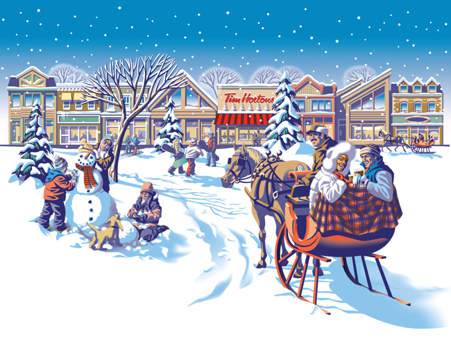
Everyone loves Tim Hortons coffee and doesn't everybody notice the art they use on the Holiday cup every year? The answer is a resounding 'Yes', isn't it?
Commissioned by Tim Hortons' branding and design agency, *PIGEON, Gary Alphonso illustrated the art for Tim Hortons' classic holiday campaign! Working with the Pigeon team, the art came together beautifully and was applied to the hot drink cups, bakery bags and boxes.
Everyone was thrilled with how it turned out and we are proud to share with you Gary's art and a few pics of the finished products.
Greg Stevenson for Canadian Living
Combining Greg Stevenson's hand lettering, info graphic icons and layered photo-illustration adds a fun, upbeat mood to these stories of courage, art directed by Stephanie White. In this recurring feature, called A Year of Firsts 2014, meet and be inspired by the people who embraced a whole year of trying new things, whether facing fears or embracing change. Peruse more of Greg's illustration here.
Theresa Albert
Christina Campbell
Share the love.
Katy Dockrill for National Drapery
When art director Lila Graham first contacted us to work on the new website she was designing for National Drapery, it was an exciting opportunity for Katy Dockrill to bring her flair for sewing and love of home decor to an illustration assignment! The new ND website was the inspirational vision of Natalie Hartman, who was a delight to work with. Visit the ND homepage and see how Lila and Katy literally brought Natalie's vision to life here.
The new website design also included a series of drawings to highlight the many custom products National Drapery offers. Katy adores creating for surface design, so when Natalie asked her to include an indication of patterns to depict various textiles and bring some flair to these more technical illustrations, she was happy to oblige. The result? These little gems...we've combined a few of our faves here:
Janice Kun - Black History Stamps
Canada Post celebrates Black History Month by commemorating two distinctive and historic African-Canadian communities: Vancouver's Hogan's Alley and Halifax's Africville.
Working closely with designer, Karen Smith, Janice Kun created the background watercolors depicting historical churches, central to these communities. Typical of Janice Kun's style, the pairing of the paintings with supplied historical photographs is a delicate dream-like balance between these real people and remembered communities.
Happy Holidays!
Suddenly the holidays are upon us.
Wishing you all happy trails and happy times!
Clare Owen was commissioned by Lori Pedrick for Yankee Magazine to illustrate The Legacy of Family by Edie Clark. Voila, the lovely piece above!
Greg Stevenson for: Positive Side
Greg Stevenson was commissioned by the Canadian AIDS Treatment Information Exchange (CATIE) for their publication called The Positive Side. This illustration is about how a low viral load can cut the risk of HIV transmission was art directed by David Vereschagin to have an overall optimistic tone. Greg says, "The candle was meant to imply a ‘re-kindling” of desire in both partners (one positive and one negative) while practicing safety and awareness." Notice how the very subtle ('Rothko-esque') variations in the background add beautifully to the mood of the piece.
Thom Sevalrud for Journal of the Norwegian Medical Association
Thom Sevalrud created this powerful image for the cover of the Journal of the Norwegian Medical Association. This is Thom's fourth cover for the JNMA, working with art director Emma Dalby, who seems to match him perfectly with topics that speak to his visual vocabulary. Conceptually, Thom addresses many aspects of whole genome sequencing, which is becoming more and more accessible to us all.
Happy Halloween!
Tim Zeltner illustrated Little Boo, a wonderful new Halloween picture book for Henry Holt, Books for Young Readers. Shh though, this is just a sneak peek...You're going to have to wait until August 2014 when the book is released to learn all about the journey of Little Boo from tiny pumpkin seed to his first Halloween night!